
ionic-header-parallax
v6.1.2
Published
This directive enables parallax effect on `ion-header` elements to display a cover photo while on top of the page and transition it to the normal navbar when content is scrolled down.
Maintainers
 raschidjfr
Readme
Parallax Header Directive for Ionic
This directive enables a parallax effect on ion-header elements to display a cover photo while on top of the page and transition to the normal toolbar when scrolling down.
Compatibility
| Stack | Tag |
| -------------------------------------------------------------------------------------------------------------- | ------------------------------------------------------------------------------- |
| 
Live Demo
Checkout the Live Demo here
| iOS | Android |
| ----------------------------------------------------------------------------------------- | --------------------------------------------------------------------------------------------- |
| 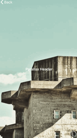 |
|  |
|
Set Up
Install package:
npm i ionic-header-parallax.Import the directive into your desired Module:
// app.module.ts

import { IonicHeaderParallaxModule } from 'ionic-header-parallax';

@NgModule({
  imports: [
    IonicHeaderParallaxModule,  // <-
    ...
…or standalone Component:
// my-component.page.ts

import { ParallaxDirective } from 'ionic-header-parallax';

@Component({
  imports: [
    ParallaxDirective,    // <-
    ...
Usage
Just add the attribute parallax to any <ion-header> element:
<ion-header parallax imageUrl="https://picsum.photos/350" height="350" bgPosition="top">
  <ion-toolbar color="primary">
    <ion-title> Parallax Header </ion-title>
  </ion-toolbar>
</ion-header>

<ion-content> Some content here </ion-content>
| Parameter | Type | Description |
| ---------- | ------------------------------- | ----------------------------------------------------------------------------------------------------------------------------------------------------------- |
| imageUrl | string | The background image to show while expanded. |
| height | number \| string | The height for the header when expanded. If the value is a number, it will be set in px. If the value is a string it will be passed as is (eg: "20rem") |
| color | string | The color (web hex formatted) to show while the header is expanded when no imageUrl is set. When scrolled, it will fade to the toolbar's color. |
| bgPosition | 'top' \| 'center' \| 'bottom' | The position of the image in the header. This parameter slightly changes the feeling of the animation. Default: 'top' |