jt-notice
v0.0.6
Published
更新readme文档
Downloads
13

Readme
JtNotice提示弹框
模拟系统的消息提示框而实现的一个组件,用于消息提示和消息确认等。
【使用】
import { JtNotice } from 'jt-notice'【提示】如果样式没有加载就在使用处导入组件的样式文件
import "../node_modules/jt-notice/style.css"@[TOC]
API
配置项
基础用法
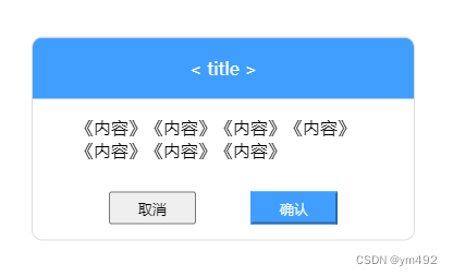
弹窗在中部出现,可对其进行拖拽移动位置, Title 与正文内容可自定义更改。可通过组件返回值chosen确定用户点击选项。chosen:hideModal 取消 ; chosen: submit确认。若需要点击按钮或背景弹窗消失效果可根据返回值自主实现。
显示选项
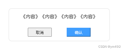
无标题
无标题通知 title_show
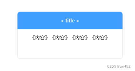
无按钮
仅通知功能,无需按钮确认 button_show
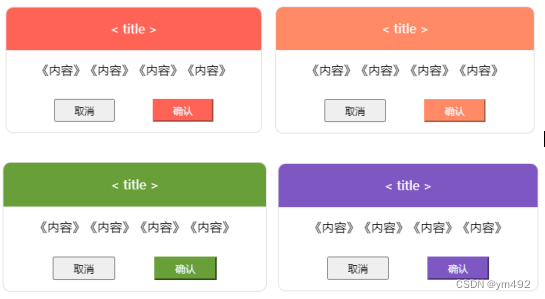
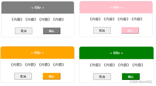
主题颜色
可选择主题颜色color
可输入颜色名称选择
示例(color = "grey/ pink/ orange/ green/......"):
也可以使用自定义颜色
示例(color = "#FF6356/ #ff8a65/ #689f38/ #7e57c2/......"):