
kdn-devkit
v1.3.11
Published
KDN DevKit: Utility-first SDK for React apps
Downloads
59

Readme
WebKDN SDK
The WebKDN SDK is a utility-first layout and theming toolkit that helps rapidly scaffold consistent, modern web apps. The SDK provides opinionated building blocks with full customisation support.
✨ Features
- App Shell System: The AppShell is a prebuilt layout system that provides a consistent page structure with navigation, theming, and view switching support. It’s designed to simplify building full-page apps with minimal setup, responsive behavior, and integrated theming.
App Shell
📦 Usage (with Menu)
<AppLayoutContext
  header="My Application"
  accent="navy"
  nav={
    <>
      <NavItem name="Home" href="/" />
      <NavItem name="Admin" href="/admin" />
      <NavItem name="External URL" href="https://google.com" />
    </>
  }
>
  <AppContentWrapper>
    <AppContent title="Profile" jsx={<div>Your Custom JSX Component</div>} />
  </AppContentWrapper>
</AppLayoutContext>
📦 Usage (without Menu)
You can skip the menu view entirely by wrapping your content in inside . This renders your JSX directly without needing AppContent views or navigation cards.
<AppContentWrapper>
  <AppJSX>
    <YourComponent />
    <AnotherComponent />
  </AppJSX>
</AppContentWrapper>
🖼 Logo as Header
The header prop accepts either a string or a JSX element. You can pass a logo like so:
<AppLayoutContext
  header={<img src="image.com/src" alt="Logo" width={120} />}
  ...
>
Warning: The size of the logo depends on the width prop you set.
🎨 Custom Themes
The app wrapper comes with built-in themes (navy, white, indigo, red, green, blue, yellow, gray, purple, and pink). You can use any of the built-in themes, or pass your own custom Tailwind classes as a theme object to the accent prop.
Example of a custom theme:
accent={{
  navBg: "bg-red-500",
  navText: "text-gray-900",
  navBorder: "border-yellow-300",
  navHover: "hover:bg-yellow-400",
  contentBg: "bg-yellow-100",
  contentText: "text-gray-900",
  skeleton: "bg-red-200"
}}
Each theme must include all required keys for layout and skeleton color to work correctly.
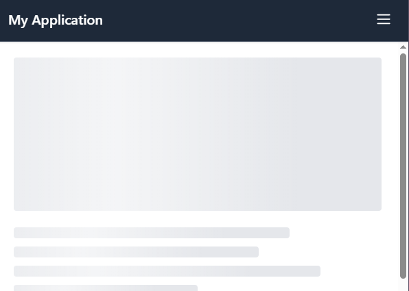
🦴 Skeleton Loader Support
The App Shell supports skeleton loading states thanks to the SkeletonWrapper component.
It ensures a smooth, professional experience where users are never left staring at empty spaces.
By wrapping your content and passing a loading boolean, the layout gracefully transitions between
skeleton placeholders and real data. You can also supply custom skeleton components, allowing full
control over the appearance and matching it perfectly to your app’s theme for a cohesive, polished UI.
const App = () => {
  const [loading, setLoading] = useState(true);
  const [data, setData] = useState<string | null>(null);

  useEffect(() => {
    const fetchData = async () => {
      setLoading(true);
      // Simulated API call
      const result = await new Promise<string>((resolve) =>
        setTimeout(() => resolve('This is the profile page content.'), 3000),
      );
      setData(result);
      setLoading(false);
    };

    fetchData();
  }, []);

  return <SkeletonWrapper loading={loading}>{data}</SkeletonWrapper>;
};
The SkeletonWrapper automatically uses the correct color based on your current theme.
Tip: It is highly recommended to wrap your entire content block in a single SkeletonWrapper instead of wrapping multiple smaller components individually. This ensures consistent styling and layout during loading transitions.