
kdu-numeric-input
v1.0.6-alpha.0
Published
Kdu Numeric Input Component

Maintainers
 nkduy
nkduyReadme
Kdu Numeric Input
Number input component based on Kdu that is a replacement of native input number with optional control.
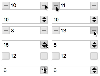
Installation
Install via NPM
$ npm install kdu-numeric-input --save
Install via CDN
<script src="https://unpkg.com/kdu"></script>
<script src="https://unpkg.com/kdu-numeric-input"></script>
Global
Register KduNumericInput globally:
import Kdu from 'kdu';
import KduNumericInput from 'kdu-numeric-input';

Kdu.use(KduNumericInput)
Local
Include the KduNumericInput directly into your component using import:
import KduNumericInput from 'kdu-numeric-input'

export default {
  components: {
    KduNumericInput
  }
}
Usage
Basic usage
<template>
  <div>
    <kdu-numeric-input  k-model="value" :min="1" :max="10" :step="2"></kdu-numeric-input>
  </div>
</template>

<script>
  export default {
    data() {
      return {
        value: 1,
      };
    },
  };
</script>
PROPS:
| Name | Description | Type | Default | Options | | ----------- | --------------- | ------------ | ------------ | ------------ | | name | Component name | String | - | - | | value | Binding value | Number | - | - | | placeholder | Input placeholder | String | - | - | | min | Minimum allowed value | Number | -Infinity | - | | max | Maximum allowed value | Number | Infinity | - | | step | Incremental Step | Number | 1 | - | | align | Alignment of Numeric Value | String | left | left, center, right | | size | Component Size | String | Inherit | size in px, em, rem etc e.g. '20px' | | precision | Number of decimals | Number | 0 | Integer value| | controls | Enable/Disable Controls | Boolean | true | true/false| | controlsType | Controls Type | String | plusminus | plusminus/updown| | autofocus | Autofocus on Page Load | Boolean | false | true/false| | readonly | Is Readonly | Boolean | false | true/false| | disabled | Is Disabled | Boolean | false | true/false|
EVENTS:
Event Name | Description | Parameters -----------|--------------------|-------------- input | triggers when input| (newValue) change | triggers when the value changes| (newValue) blur | triggers when Input blurs| (event: Event) focus | triggers when Input focus| (event: Event)
METHODS:
Method | Description | Parameters ---|--- | ---- focus | focus the Input component| - blur | blur the Input component| -
License
MIT