
kit-components-ui
v2.0.1
Published
Conjunto de componentes UI funcionales y personalizables
Maintainers
 dariomvg
Readme
kit-components from Kit-elements
kit-components es un catalogo de componentes de UI, funcionales y personalizables
Instalacion
Instala con npm:
npm install kit-components-uiLista de componentes
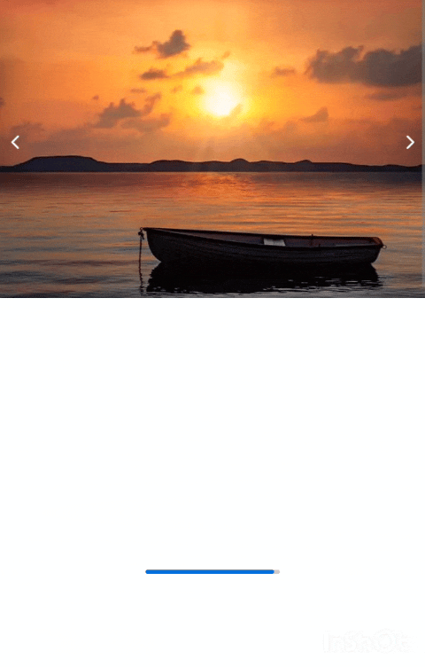
- CarrouselImages
- Collapse
- Loader
- Modal
- Toggle
- Experience
- BoxLinks
- Chat
- Message
Uso
CarrouselImages
import { CarrouselImages } from "kit-components-ui";

function App() {
  const arrImages = [img1, img2, img3, ...]
  return (
    <CarrouselImages images={arrImages} width="100%"  />
  );
};
| Props | Uso | Tipo | | ------ | --------------------------------- | --------------------- | | images | imagenes de muestra el slider | array | | auto | para el paso de images automatico | boolean | | time | tiempo de muestra de cada imagen | number | | width | ancho del componente | string, recibe px o % | | height | alto del componente | string, recibe px o % | | widthImage | alto de la imagen, por defecto 100% | string, recibe px o % | | heightImage | alto de la imagen, por defecto 100% | string, recibe px o % |
Collapse
import { Collapse } from "kit-components-ui";

function App() {
  return (
    <Collapse title="titulo del componente" bg="dark">
      <p>lorem ipsum... </p>
    </Collapse>
  );
}
| Props | Uso | Tipo | | -------- | --------------------- | --------------------------- | | children | Componente contenedor | ReactNode | | title | titulo del componente | string | | bg | nombre de background | string, recibe dark o light | | width | ancho del componente | string, recibe px o % |
Loader
import { Loader } from "kit-components-ui";

function App() {
  return <Loader />;
}
Modal
import { Modal } from "kit-components-ui";

function App() {
  return (
    <Modal titleButton="Click">
      <h2>Titulo del modal</h2>
      <p>lorem ipsum... </p>
    </Modal>
  );
}
| Props | Uso | Tipo | | ----------- | ------------------------------------- | --------- | | children | Componente contenedor | ReactNode | | titleButton | titulo del botton para abrir el modal | string |
Toggle
import { Toggle } from "kit-components-ui";

function App() {
  const showMessage = () => {
    alert("¡Hello world!");
  };

  return <Toggle onClick={showMessage} />;
}
| Props | Uso | | ------- | ---------------------------------------- | | onClick | para ejecutar una función al hacer click |
Experience
import { Experience } from "kit-components-ui";

function App() {
  const experience = {
    job_name: "Web development",
    company: "Your company",
    first_date: "22 April",
    last_date: "20 December",
    description:
      "Lorem ipsum dolor sit amet consectetur adipisicing elit. Harum, magni numquam delectus, autem fugiat ipsa nesciunt optio provident distinctio, dicta enim fugit ducimus? Nobis placeat quia quos labore amet? Animi!",
    link: "your-link",
    theme: "dark",
  };

  return <Experience experience={experience} />;
}
| Props | Uso | | ----------- | --------------------------------------------- | | job_name | Nombre del puesto de trabajo | | company | Nombre de la empresa en la que estuviste | | first_date | Fecha de inicio del trabajo | | last_date | Fecha de término del trabajo | | description | Descrición de tu función dentro de la empresa | | link | Puedes agregar un link si quieres | | theme | Por defecto es light, puedes agregar dark |
BoxLinks
import { BoxLinks } from "kit-components-ui";

function App() {
  const links = [
    { id: 0, link: "https://www.facebook.com", name: "Facebook" },
    { id: 1, link: "https://github.com", name: "Github" },
    { id: 2, link: "https://astro.build", name: "Astro" },
    { id: 3, link: "https://x.com", name: "X - Twitter" },
  ];

  return <BoxLinks links={links} title="" theme="" width="" />;
}
| Props | Uso | | ----- | ---------------------------------------------------------------------------------------------- | | links | Array de objetos con id(única), link(url) y name(Nombre del sitio) | | title | Nombre principal del contenido | | theme | Tema dark o light, según tu proyecto, por defecto está en dark | | width | Largo del contenedor, por defecto el 100% del contendor padre, colocar los px, porcentaje, etc |
Chat
import { Chat } from "kit-components-ui";

function App() {
  return <Chat theme="" width="" height=""></Chat>;
}
| Props | Uso | | -------- | ------------------------------------------------------------------ | | children | Recibe los mensajes dentro | | theme | Tema dark o light. Por defecto dark | | width | Largo adaptable. Por defecto 100%, agregar los px, porcentaje, etc | | height | Ancho adaptable. Por defecto auto, agregar los px, porcentaje, etc |
Message
import { Message } from "kit-components-ui";

function App() {
  return <Message theme="" content="" username="" />;
}
| Props | Uso | | -------- | ----------------------------------------------- | | content | Contenido del mensaje a mostrar | | username | Nombre del usuario emisor del mensaje. Opcional | | theme | Tema dark o light. Por defecto dark |
Probar
Ejecuta y visita localhost
npm run dev