
layout-inspector
v1.0.2
Published
DevTools-style layout inspector for React. Hover any element for tag, selector, dimensions, font, WCAG contrast, ARIA role, accessible name, and a11y state.
Maintainers
 shakcho
Readme
layout-inspector
DevTools-style layout inspector for React. Hover any element in your app to see its tag, selector, dimensions, font, WCAG contrast ratio, ARIA role, accessible name, and a11y state — without ever leaving the page.
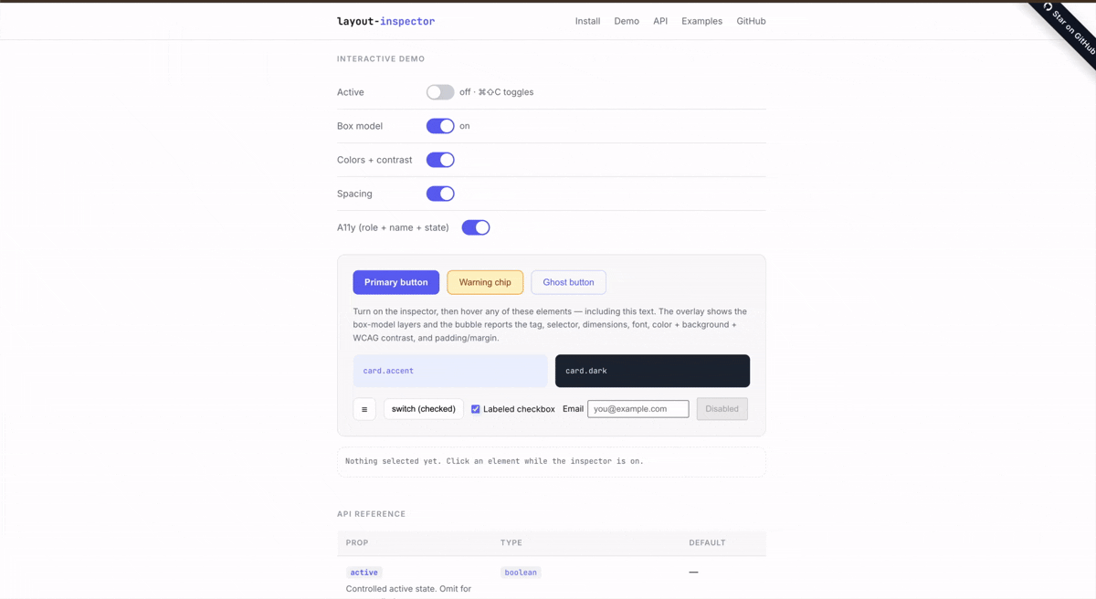
- 4-layer box-model overlay (margin / border / padding / content), just like Chrome DevTools
- Floating info bubble that auto-positions and stays glued during scroll & resize
- WCAG contrast check between text and the nearest non-transparent background
- A11y snapshot: implicit/explicit role, accessible name, focusable, disabled, expanded, pressed, checked, selected
- Hotkey toggle, click-to-select, escape-to-exit
- Controlled or uncontrolled
- Zero dependencies, ~6 kB gzipped, React 18 & 19
Install
npm install layout-inspectorQuick start
import { LayoutInspector } from 'layout-inspector';

export default function App() {
  return (
    <>
      <YourApp />
      <LayoutInspector defaultActive behavior={{ hotkey: 'cmd+shift+c' }} />
    </>
  );
}
Press cmd+shift+c (or ctrl+shift+c on Windows/Linux) to toggle. Hover to inspect, click to select, escape to exit.
Controlled mode
const [active, setActive] = useState(false);

<button onClick={() => setActive((v) => !v)}>Inspect</button>
<LayoutInspector
  active={active}
  on={{ activeChange: setActive, select: (el, info) => console.log(info) }}
/>
API
<LayoutInspector /> props
| Prop | Type | Default | Description |
| --------------- | -------------------------- | ------------ | ------------------------------------------------- |
| active | boolean | — | Controlled active state. |
| defaultActive | boolean | false | Uncontrolled initial active state. |
| on | LayoutInspectorEvents | — | activeChange, select, hover callbacks. |
| behavior | LayoutInspectorBehavior | — | Hotkey, ignore selector, exit-on-select, etc. |
| highlight | LayoutInspectorHighlight | {} | Box-model / outline rendering and overlay colors. |
| bubble | LayoutInspectorBubble | {} | Info-bubble visibility, fields, custom renderer. |
| zIndex | number | 2147483647 | z-index for the overlay portal. |
| className | string | '' | Extra class on the default bubble. |
| style | CSSProperties | {} | Inline styles merged into the default bubble. |
Events (on)
on: {
  activeChange?: (active: boolean) => void;
  select?: (element: Element, info: ElementInfo) => void;
  hover?: (element: Element | null, info: ElementInfo | null) => void;
}
Behavior
behavior: {
  hotkey?: string;            // e.g. 'cmd+shift+c'
  ignoreSelector?: string;    // CSS selector to skip
  exitOnSelect?: boolean;     // default true
  exitOnEscape?: boolean;     // default true
}
To exclude part of your UI from inspection (e.g. a debug toolbar), either use behavior.ignoreSelector or add the data-layout-inspector-ignore attribute on the element.
Highlight
highlight: {
  boxModel?: boolean;          // default true — renders 4-layer DevTools box model
  outline?: boolean;           // default !boxModel — single outline
  colors?: {
    margin?: string; border?: string; padding?: string;
    content?: string; outline?: string;
  };
}
Bubble
bubble: {
  enabled?: boolean;           // default true
  fields?: {
    tag?: boolean; selector?: boolean; dimensions?: boolean;
    font?: boolean; colors?: boolean; spacing?: boolean;
    role?: boolean; accessibleName?: boolean; a11yState?: boolean;
  };
  render?: (info: ElementInfo) => ReactNode;  // escape hatch
}
ElementInfo
The snapshot passed to on.hover, on.select, and bubble.render:
interface ElementInfo {
  element: Element;
  tag: string; // 'button'
  selector: string; // 'button.btn.primary[data-testid="x"]'
  rect: DOMRect;
  font: {
    family: string;
    rendered: string;
    size: string;
    weight: string;
    lineHeight: string;
  };
  color: string; // computed text color
  backgroundColor: string; // walks ancestors for first opaque bg
  contrastRatio: number | null; // WCAG ratio
  padding: BoxEdges;
  margin: BoxEdges;
  border: BoxEdges;
  a11y: A11yInfo; // role, accessibleName, ariaLabel, etc.
}
Recipes
Custom bubble
<LayoutInspector
  bubble={{
    render: (info) => (
      <div style={{ background: 'black', color: 'white', padding: 8 }}>
        {info.tag} — {Math.round(info.rect.width)}×{Math.round(info.rect.height)}
      </div>
    ),
  }}
/>
Outline only (no box-model layers)
<LayoutInspector defaultActive highlight={{ boxModel: false }} />Disable contrast check & ignore your dev toolbar
<LayoutInspector
  defaultActive
  behavior={{ ignoreSelector: '#dev-toolbar, #dev-toolbar *' }}
  bubble={{ fields: { colors: false } }}
/>
Development
npm install
npm test           # vitest run
npm run lint       # eslint
npm run format     # prettier --write
npm run typecheck  # tsc --noEmit
npm run build      # vite build + .d.ts emit
A pre-commit hook (husky + lint-staged) runs format, lint, typecheck, and tests on every commit.
License
MIT © Sakti Kumar Chourasia