
leicht
v0.2.0
Published
A tiny classless-first CSS library in modern CSS: cascade layers, light-dark(), squircles, glass and liquid refraction. Link one file, write ordinary HTML.

Maintainers
 moji2002
Readme
leicht


A tiny classless-first CSS library, written in modern CSS. Link one file, write ordinary HTML, and it's styled. 6.8 kB gzipped, no build step, no dependencies.
<link rel="stylesheet" href="https://cdn.jsdelivr.net/npm/[email protected]/dist/leicht.min.css">npm i leichtScreenshots
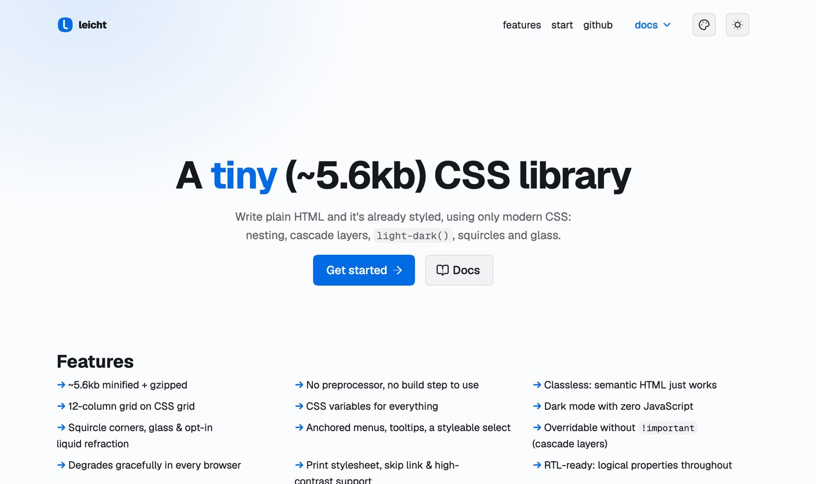
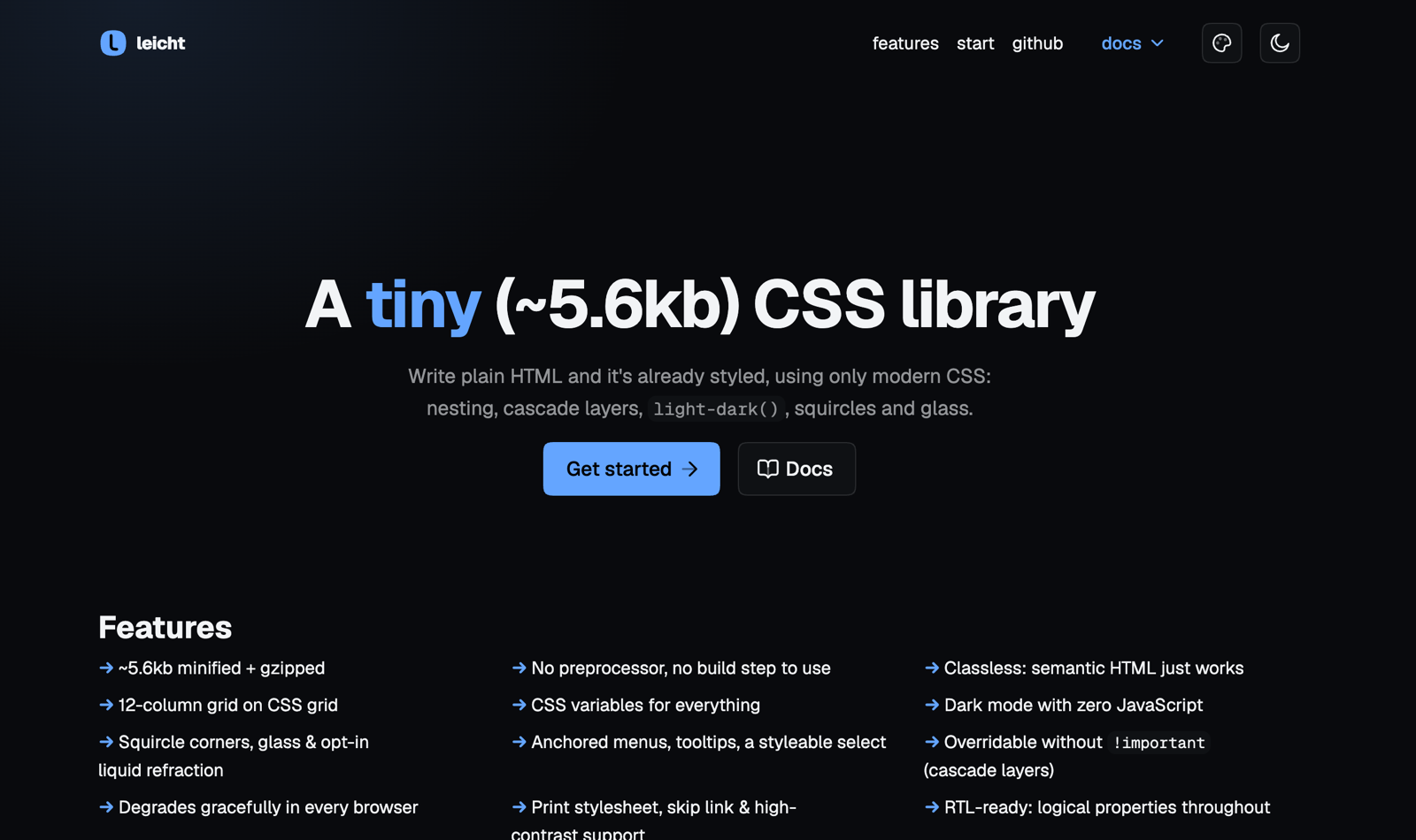
Plain HTML, no classes — light and dark follow the OS:
| | |
|---|---|
|  |
|  |
|
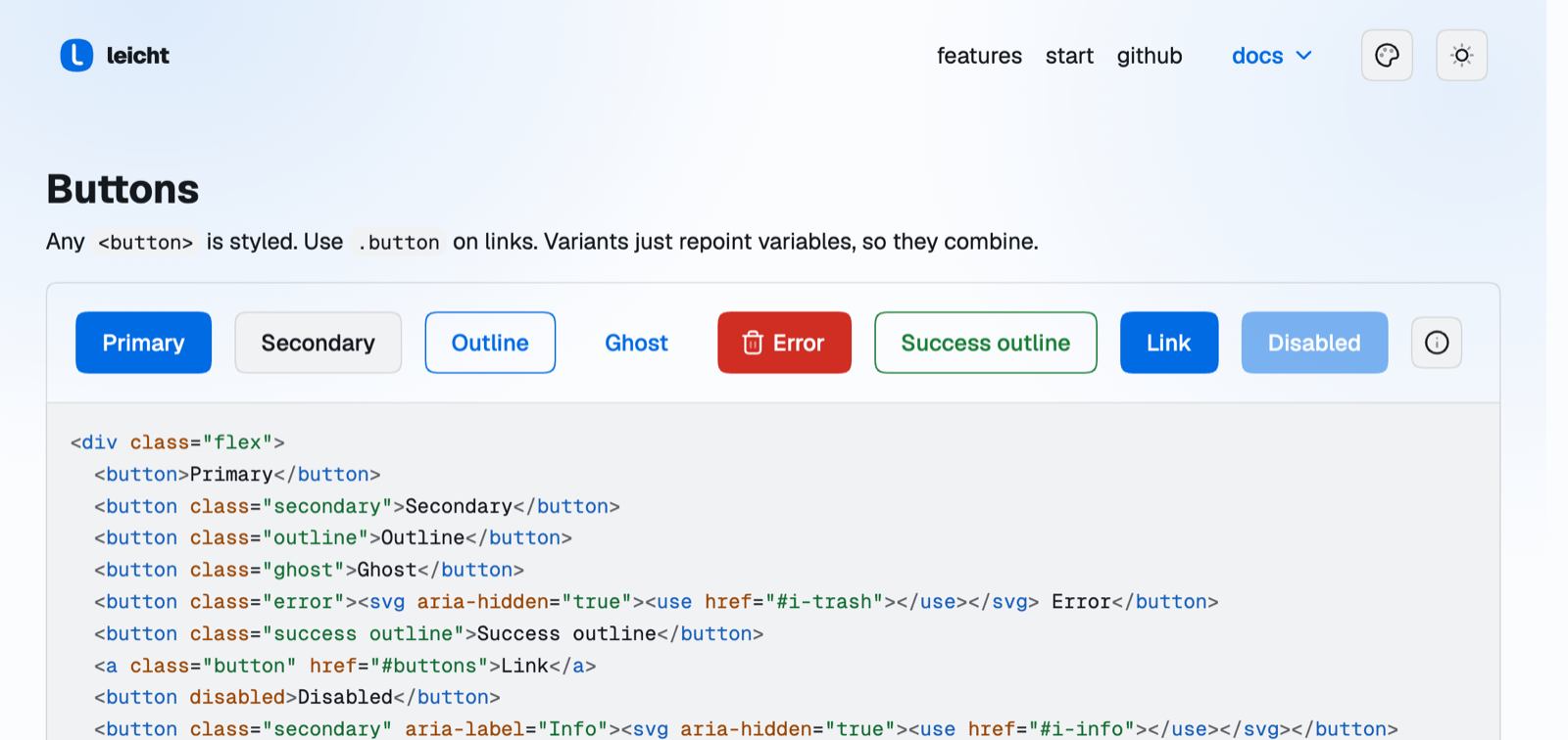
Every variant is a repointed variable, so they combine, and the markup underneath each demo is generated from the demo itself:
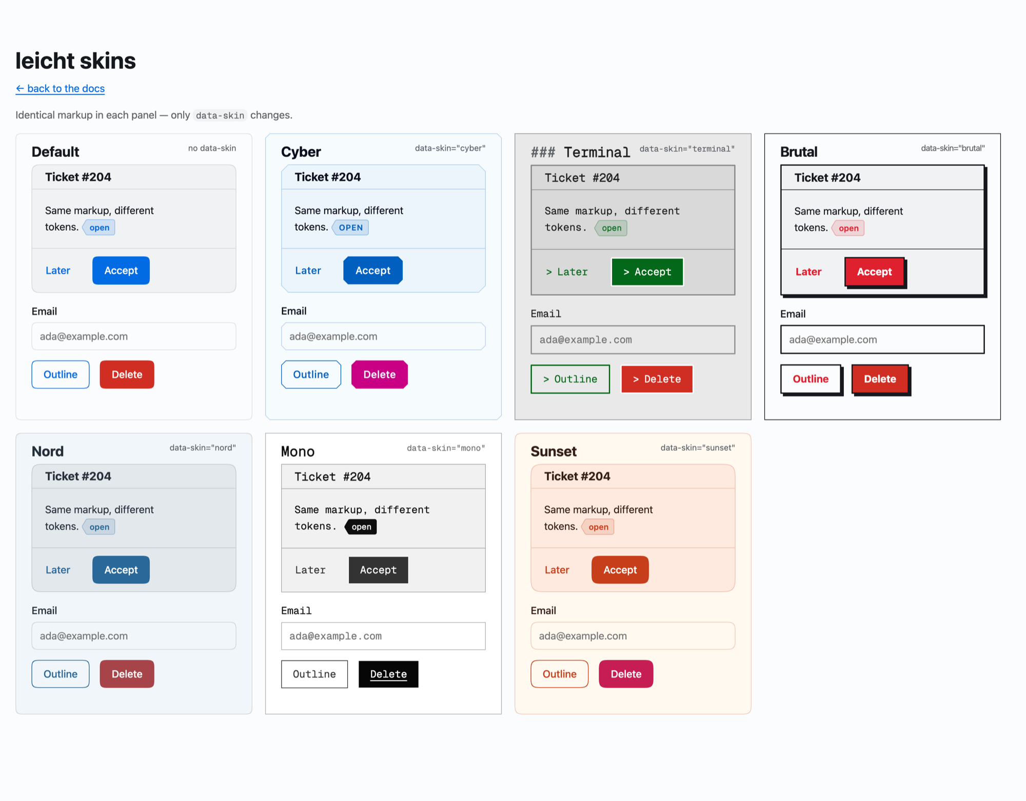
Six skins in an optional 1.6 kB file — identical markup in every panel, only data-skin changes:
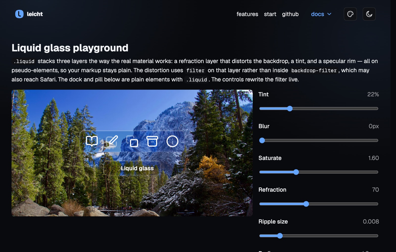
.liquid stacks refraction, tint and a specular rim on pseudo-elements, with live controls in the docs:
What you get without writing a single class
Headings, links, lists, tables, <code>/<pre>, <blockquote>, <details>, forms and
fieldsets, <nav>, <article> as a card, <dialog> as a modal, [popover] menus anchored to
their button, popover="hint" tooltips, <progress>, <meter>, and a checkbox with
role="switch" as a real toggle.
And a whole application, still without a class
Each of these keys off the markup that already makes it accessible, so you write the correct HTML and the styling follows:
| Markup | What you get |
|---|---|
| <aside> as a child of <body> | An app shell: sidebar column plus content. Add popover to the <aside> and a popovertarget button, and below 60rem it becomes an off-canvas drawer the browser opens, light-dismisses and animates — no JavaScript. |
| <figure> around a <table> | A data table: framed, horizontally scrolling inside its own box instead of pushing the page sideways, with <figcaption> as the caption row. Set --l-table-max to cap the height and the <thead> sticks. |
| <aside> <nav> | A vertical sidebar nav, with [aria-current] marking the page. |
| [role=tablist] + [role=tab][aria-selected] | Tabs with an indicator. |
| <output> as a child of <body> | A toast stack, pinned to the corner. It is already a live region. |
| [aria-busy=true] | A shimmering skeleton — or, on a <button>, a spinner and a disabled state. |
| <nav aria-label="…"> around an <ol> | Pagination, with [aria-current] marking the page. |
| <dl> | A two-column key/value grid: invoice totals, metadata, spec sheets. |
| <td class="num"> or <td><data value="…"> | A right-aligned numeric cell. |
The acceptance test is a full billing console — shell, data table, tabs, row menus, a modal, a filter panel, toasts, a settings form — written with no custom CSS at all. A test asserts it stays that way.
And a few classes when you need them
| | |
|---|---|
| .row / .col-1….col-12 | 12-column grid on CSS grid; a bare .row splits evenly |
| .card | what <article> already gets, on anything |
| .button, .secondary, .outline, .ghost, .error, .success | variants repoint variables, so they combine |
| .alert | callout; takes the same variants |
| .group | join buttons into one segmented bar |
| .tag, .carousel, .glass, .liquid | badge, scroll-snap list with dots, and the two glass materials |
| .warning, .neutral | the third and fourth semantic states, alongside .error and .success |
| .sm, .lg | control sizes. They set only font-size, because control padding is em |
| .field | a row an <input> can share with a $ prefix, a search icon or a unit suffix |
| .avatar (takes --size), .dot | initials or an image in a round box, and a status dot that inherits the variant colour |
| .flex, .stack, .between, .end, .truncate, .text-center, .text-muted, .hide-sm, .sr-only, .container | utilities |
Theming
Everything is a token. Your CSS sits outside leicht's cascade layers, so it always wins — you
never need !important.
:root {
  --l-primary: #0a66c2;   /* a brand colour; everything else mixes from it */
  --l-hue: 150;           /* or re-tint neutrals and accent together */
  --l-radius: .25rem;
  --l-corner: round;      /* opt out of squircles */
  --l-space: .75rem;      /* one knob for density: every component tightens */
}
--l-space is the density control. Layout spacing derives from it through
--l-space-xs/sm/md/lg/xl, so changing it compacts or loosens cards, dialogs, alerts, the
sidebar and the toast stack together. Component interiors — buttons, tags, table cells, form
controls — stay in em on purpose, so they scale with their own font size instead. That is what
lets .sm and .lg resize a whole control with one declaration.
The other application-layer tokens: --l-aside (sidebar width, 15rem), --l-table-max (table
height cap, none), --l-warning (the third state), --l-focus (the focus ring, so a skin can
re-point it), and --l-width: none to opt a page out of the 72rem measure entirely.
Because the palette is OKLCH and holds lightness fixed, changing --l-hue measures the same
contrast at every hue — 4.86:1 against the page. A raw brand colour is the one that can fail:
check it if it's light.
Dark mode follows the OS. Force it with <html data-theme="dark">.
Skins
leicht-themes.css (1.6 kB gzipped, optional) adds six looks as token blocks — cyber, terminal,
brutal, nord, mono, sunset. They compose with light/dark.
<link rel="stylesheet" href="leicht.min.css">
<link rel="stylesheet" href="leicht-themes.min.css">
<html data-skin="terminal" data-theme="dark">
Modern CSS, degrading quietly
The baseline is cascade layers, native nesting, light-dark(), color-mix(), :has() and
container queries. On top of that, features are used as progressive enhancement and fall back to
the plain look where they're missing: squircle corners, border-shape, a specular rim painted
with background-clip: border-area, liquid-glass refraction from a data-URI SVG filter, anchor
positioning, customizable <select>, scroll-driven animations, @container scroll-state,
::scroll-marker, the CSS Custom Highlight API, typed attr() and contrast-color().
Also included, because nobody ships them: a real print stylesheet, forced-colors and reduced-transparency support, a skip link that needs no class, and RTL through logical properties.
Build
No build is needed to use leicht. To change it:
npm run build     # inlines src/ imports, minifies, checks a gzip budget
npm run dev       # rebuild on change
The build is plain Node with no dependencies. It deliberately uses no CSS parser — parsers lag the syntax this library is built on.
License
MIT © Mojtaba Beheshti