
lensglass
v0.1.1
Published
Liquid glass for the web, with real edge refraction. An SVG displacement map traced through Snell's law bends whatever is behind each surface, plus an iOS-accurate control kit that still looks right on engines that cannot lens. No dependencies, no build s

Maintainers
 yaser-allahim
Readme
lensglass
Liquid glass for the web, with the refraction actually done. Each surface gets an SVG displacement map traced through Snell's law, so its rim bends whatever is behind it instead of just blurring it. On top of that, an iOS-accurate control kit that still looks right on engines that cannot lens at all.
No dependencies, no build step. Two CSS files and three ES modules.
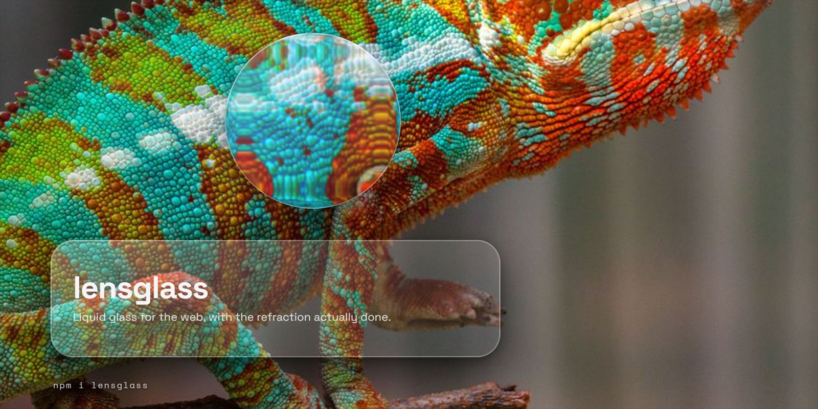
Every image in this README is a screenshot of the library running, not a mockup of it. The bead above holds a wide rim bezel, so a small core stays clear glass while everything around it bends, which is a difference you cannot get from a blur at any radius.
One disclosure, since the whole point of this page is not overselling: the
screenshots run data-lg-strength between 1.35 and 1.5, above its default of 1.
A still frame has to make its case in a single glance, where a live page has
motion and a cursor to help it. Everything else is stock, and the default still
bends light, just more quietly than this.
The honest part, first
Real edge refraction needs url() inside backdrop-filter, and only Chromium
implements that. Safari and Firefox parse it and drop it, which would take the
blur down with it. There is no version of this library that bends light in
Safari, and anybody who tells you otherwise is blurring and calling it done.
So lensglass ships three tiers and tells you which one you got:
| tier | where | what you see |
| --- | --- | --- |
| refract | Chromium | rims bend the backdrop. the real thing. |
| blur | Safari, Firefox | blur, vibrancy, specular rim. convincing glass, flat rims. |
| solid | prefers-reduced-transparency, or no backdrop-filter at all | opaque panels that keep the shape and the depth. |
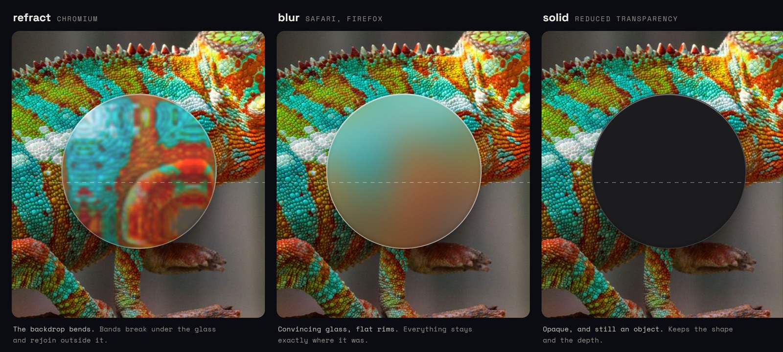
Same crop, same bead, same blur radius. The only variable is the tier. The dashed rule is drawn over the glass rather than through it, so it stays straight in all three and gives the bands something to be measured against. If you only ever look at one picture here, look at the middle one: that is what your Safari users get, and it is what most libraries are shipping to everybody.
The tier lands on <html> as lg-tier-refract / lg-tier-blur /
lg-tier-solid, so your own CSS can branch on it too. Everything in
glass.css is written to stand up without the engine ever running, which means
a page that loads the stylesheet and never calls init() is already correct.
Install
npm i lensglassOr off a CDN with no bundler involved:
<link rel="stylesheet" href="https://cdn.jsdelivr.net/npm/[email protected]/glass.css">
<link rel="stylesheet" href="https://cdn.jsdelivr.net/npm/[email protected]/controls.css">
<script type="module">
  import { init } from 'https://cdn.jsdelivr.net/npm/[email protected]/src/index.js';
  init();
</script>
Start
<link rel="stylesheet" href="lensglass/glass.css">
<link rel="stylesheet" href="lensglass/controls.css">

<div class="lg-panel lg-spec" data-lg>
  glass
</div>
import { init } from 'lensglass';
init(); // returns 'refract' | 'blur' | 'solid'Two things worth knowing before you wonder why it looks like nothing happened.
Put something behind it. Refraction is invisible over a flat colour; it needs
an image, a gradient, content, anything with structure. And data-lg is the
opt-in. Adding it to every surface on the page means a GPU pass per surface, so
tag the panels and the nav and leave the small stuff to .lg-lite.
A third one, which cost me an afternoon: do not let the blur get as wide as the
bezel. The default blur is 30px, so a surface at data-lg-bezel="30" smears its
own refraction into nothing and no amount of data-lg-strength will bring it
back, because the bending is happening inside the radius the blur is averaging
over. If a surface looks like frosted glass and nothing else, widen the bezel or
pin a smaller data-lg-blur before you reach for strength.
Tagging a surface
<div class="lg-panel lg-spec"
     data-lg
     data-lg-bezel="24"
     data-lg-strength="0.7"
     data-lg-blur="8">
| attribute | what it does |
| --- | --- |
| data-lg | this is a glass surface, lens it |
| data-lg-bezel | width of the lensing ring in px, or full to lens through the middle |
| data-lg-strength | per-surface refraction multiplier, default 1 |
| data-lg-blur | pin the blur in px instead of inheriting --lg-blur |
bezel="full" is the one to reach for on small controls. A panel is glass with a
rounded edge, so it only bends at the rim; a slider thumb or a switch knob is a
solid bead, and lensing it all the way through is what stops it looking like a
tiny picture frame. The slider in this package does exactly that.
The engine also puts data-lg-on on any surface that is genuinely lensing, which
is how the material thins its own painted border out only where refraction is
already holding the edge. It is an attribute rather than a class on purpose:
frameworks own className and rewrite it on re-render, and a marker that lives
there gets silently wiped.
Driving it
import { init, setLevel, refresh, tier, destroy } from 'lensglass';

init({ force: 'blur' });    // pin a tier to see what Safari gets
setLevel(0.4);              // global refraction multiplier
refresh(el);                // rebuild one surface
tier();                     // what you actually got
setLevel is the cheap one. It rewrites the filter's scale and nothing else,
no maps are rebuilt, so it is safe to drive straight from a slider being dragged.
Building a map rasterises a canvas and encodes a PNG, which is why that only
happens when a surface actually changes size.
refresh(el) matters in one specific case: a surface that was display: none
when the engine found it had no measurable box, so it has no map yet. The engine
notices on its own, but it is watching from outside and has to wait for a resize
notification. If you are the one revealing the thing, say so. The select in
this package calls refresh on its own menu for exactly this reason.
The material
Set --lg-tint and you are mostly done.
| property | default | what it does |
| --- | --- | --- |
| --lg-tint | #0a84ff | accent, used by fills, focus rings and tinted panes |
| --lg-frost | 0.34 | base alpha of the pane |
| --lg-blur | 30px | backdrop blur radius |
| --lg-vibrancy | 1.8 | backdrop saturation, the vibrancy in Apple's stack |
| --lg-spec | 1 | specular rim strength, 0 turns it off |
| --lg-radius, --lg-r-lg, --lg-r-md, --lg-r-sm | 30/20/14/10px | the corner scale |
Dark mode follows prefers-color-scheme, and data-lg-theme="dark" or
"light" on <html> overrides it in either direction so your own theme toggle
wins. Ink, fills, separators and shadows all flip with it.
Classes:
.lg-panelthe real material, with a backdrop pass.lg-litethe same look faked with alpha alone, no backdrop pass. Use this by default. Every realbackdrop-filteris a separate GPU pass, re-run every frame anything behind it moves; they are worth spending on large surfaces and nothing else..lg-specthe specular rim, drawn on a 1.2px ring withmask-composite, so it costs no extra element and follows whateverborder-radiusyou already set.lg-tintedaccent bled through the glass.lg-nav,.lg-tabbar,.lg-sheet,.lg-popover,.lg-listcontainer shapes.lg-grabber,.lg-row,.lg-row-chevronthe furniture inside them
The controls
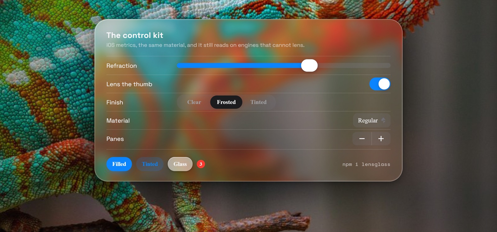
That sheet is the kit with nothing custom on it: a slider, a toggle, a segmented
control, a select, a stepper, the three button styles and a badge, sitting on a
lg-panel at data-lg-bezel="30". The metrics are iOS ones, so a toggle is
51 by 31 and a slider thumb is a real bead of glass rather than a circle with a
shadow under it.
Everything visual is markup plus a class from controls.css. The ones with
behaviour have factories, and they all return the same shape:
import { slider, toggle, segmented, stepper, search, select } from 'lensglass';

const vol = slider({ min: 0, max: 1, value: 0.6, onChange: (v) => audio.volume = v });
document.body.appendChild(vol.el);

vol.value;          // read
vol.set(0.3);       // write, fires onChange
vol.set(0.3, true); // write quietly, for syncing from outside
vol.destroy();
slider({ min, max, step, value, label, ticks, fat, onChange })— pointer capture, step snapping, arrows, Home/End, and RTL mirroring.ticksdraws marks,fatis the volume/brightness variant where the track is the control.toggle({ checked, label, onChange })— 51 by 31, 27px knob, 20px travel.segmented({ options, value, onChange })— thumb placed by percentage, so it cannot mis-track when the page scrolls mid-transition.stepper({ min, max, step, value, onChange })— disables its own ends.search({ placeholder, value, onInput, onSubmit })— drawn magnifier, Escape clears, and the clear button only exists when there is something to clear.select({ options, value, onChange })— a button and a glass menu, because no platform lets you give a native<select>a material. Listbox roles, arrow keys, Escape, outside-click.spinner(size),progress(value),dots(count, current),mark(size)— markup helpers. The spinner is the iOS activity indicator, eight spokes fading in sequence rather than a rotating arc.
Also in controls.css with no JS needed: .lg-btn in four variants and three
sizes plus .lg-btn-round, .lg-field and .lg-chip and .lg-badge,
.lg-check for checkbox and radio, .lg-progress, .lg-alert with iOS hairline
action rows, and .lg-toast.
React
import { useLensGlass, Panel, Slider, Switch, Segmented, Button } from 'lensglass/react';
import 'lensglass/glass.css';
import 'lensglass/controls.css';

function Settings() {
  const tier = useLensGlass();
  const [vol, setVol] = useState(0.6);

  return (
    <Panel spec bezel={28}>
      <Slider value={vol} onChange={setVol} label="Volume" />
      <Switch checked={on} onChange={setOn} />
      <Segmented options={[{ id: 'a', label: 'Clear' }, { id: 'b', label: 'Frosted' }]} value={m} onChange={setM} />
      <Button variant="filled">Save</Button>
    </Panel>
  );
}
React is an optional peer; importing lensglass never touches it. The entry
point ships as createElement calls rather than JSX, so there is no build step
here either.
The interactive components mount the vanilla factories behind a
display: contents wrapper instead of reimplementing them. That is on purpose. A
slider has pointer capture, RTL mirroring, step snapping and keyboard handling in
it, and writing that twice means maintaining two subtly different sliders and
learning which one is wrong from a bug report.
Motion and comfort
prefers-reduced-motion flattens the transitions on every control and stops the
spinner animating. prefers-reduced-transparency drops the whole thing to the
solid tier, both from CSS and from the engine's own probe, so it holds even if
your JavaScript never runs. prefers-contrast: more firms up the borders.
Browser support
Plain modern web platform: ES modules, canvas 2d, ResizeObserver,
MutationObserver, mask-composite, color-mix. Any evergreen browser renders
the material. Only Chromium bends light, as covered at the top.
Credit
The refraction approach follows Chris Feijoo's writeup, "Liquid Glass in the Browser: Refraction with CSS and SVG", at kube.io/blog/liquid-glass-css-svg, which is the same source the engine header cites. The optics here are traced rather than eyeballed: a circular lens profile sampled 128 times across the bezel, each sample refracted through Snell's law at n=1.5 and projected down to the backdrop plane.
If it looks like a smeared emboss rather than a magnifying rim, the displacement sign is inverted. Rays entering a denser medium bend toward the normal, so bezel pixels have to sample inward. That one sign is the difference between glass and a bevel filter from 1998.
The panther chameleon in the screenshots is a stock photograph, used here because fine repeating scale texture is the honest test of a lens: a fake one smears it. It is demo dressing and is not part of the published package.
License
MIT. Written for Mowzoon at a fintech hackathon, then pulled out and boxed on its own.