
linecraft
v0.5.8
Published
High-performance terminal UI library for Node.js

Maintainers
 matthew-dean
Readme
Linecraft
Build terminal UIs with components. Create progress bars, spinners, code error displays, and responsive layouts without the hassle.
Installation
npm install linecraft
# or
pnpm add linecraft
Quick Start
import { Region, Styled, Spinner, Section, Grid } from 'linecraft';

const r = Region();

// Set some content
r.set(
  Section({ title: 'Hello' },
    Grid({ template: [20, '1*'], columnGap: 2 },
      Styled({ color: 'cyan' }, 'Status:'),
      Styled({ color: 'green' }, 'Ready')
    )
  )
);

// Add a spinner
r.set(
  Section({ title: 'Loading' },
    Grid({ template: [3, '1*'], columnGap: 1 },
      Spinner({ style: 'classic-dots', color: 'green' }),
      Styled({ color: 'white' }, 'Installing packages...')
    )
  )
);

// Clean up when done
r.destroy(true);
Terminal Management Features
Linecraft provides advanced terminal management capabilities that go beyond basic terminal logging:
Color-Aware Line Wrapping
Unlike basic terminal output, Linecraft's text wrapping is fully ANSI-aware. When text wraps across multiple lines, ANSI color codes are preserved and correctly re-applied to each wrapped line. This means:
- Color preservation: Colored text maintains its styling across line breaks
- Accurate width calculation: Wrapping is based on visible character width, not raw string length
- Smart word breaking: Text never breaks mid-word, ensuring readability
- Multi-line styling: Complex styled text (like error codes with underlines) wraps correctly
This is especially important for components like CodeDebug, where error messages with colored error codes need to wrap across multiple lines while maintaining their visual styling.
ANSI Code Handling
Linecraft correctly handles ANSI escape sequences throughout the rendering pipeline:
- Width measurement: All width calculations account for ANSI codes (colors, styles, cursor movements)
- Text splitting: When truncating or splitting text, ANSI codes are preserved and re-applied
- Grid layouts: Grid components correctly measure and align ANSI-styled content
- Text alignment: Alignment operations work correctly with styled text
Terminal State Management
Linecraft manages terminal state to prevent common terminal UI issues:
- Auto-wrap disabled: Prevents unwanted line breaks from terminal auto-wrapping
- Cursor positioning: Precise cursor control using absolute positioning
- Viewport awareness: Only renders visible content within the terminal viewport
- Clean restoration: Properly restores terminal state on cleanup
Responsive Layouts
Components automatically adapt to terminal size changes:
- Grid layouts: Flex columns adjust to available width
- Text wrapping: Wraps at appropriate boundaries based on terminal width
- Component sizing: Components receive updated
availableWidthcontext on resize
These features make Linecraft suitable for building complex, interactive terminal UIs that work reliably across different terminal sizes and configurations.
Performance
Linecraft is built for high-performance terminal rendering from Node.js. The renderer includes several optimizations to minimize terminal updates and CPU usage:
Frame Diffing
Only updates lines that actually changed. Unchanged lines are skipped entirely, reducing terminal writes by up to 90% for static content.
Render Throttling
Uses high-resolution timing (process.hrtime.bigint()) to limit frame rate (default: 30 FPS). Prevents excessive rendering during rapid updates while maintaining smooth animations.
Batched ANSI Operations
All ANSI escape sequences are batched into a single stdout.write() call per frame, minimizing syscalls and improving throughput.
Efficient Cursor Movement
Optimized ANSI cursor positioning that only moves when necessary. The renderer tracks viewport state to avoid redundant cursor movements.
Viewport Management
Only renders visible lines within the terminal viewport. Content that extends beyond the viewport is efficiently managed without unnecessary rendering.
Auto-Wrap Disabled
Disables terminal auto-wrap to prevent unwanted line breaks, ensuring precise control over terminal output layout.
These optimizations make Linecraft suitable for real-time terminal UIs, progress displays, and animated components without overwhelming the terminal or consuming excessive CPU.
Core API
Region
A region is a managed area of your terminal. It handles rendering, resizing, and component updates.
const r = Region({
  width: 80,        // Optional: auto-detects if not set
  height: 1,        // Optional: expands as needed
  debugLog: 'debug.log' // Optional: log rendering for debugging
});
Setting Content
// Replace all content
r.set('Hello, world!');

// Or use components
r.set(Styled({ color: 'green' }, 'Success!'));

// Append content (returns a reference you can use to delete later)
const ref = r.add('Line 2');
ref.delete(); // Remove it
Cleanup
r.destroy(true); // Clean up and restore terminal (true = clear first)Semantic Themes
Linecraft includes a built-in semantic theme system that automatically adapts colors based on whether the terminal is in light or dark mode. Instead of hardcoding ANSI colors, you can use semantic tokens:
base: The default text color (gray in both themes)muted: Dimmed text for line numbers or separators (dimmed white on dark, dimmed gray on light)highlight: Emphasized text (white on dark, bold black on light)accent: Primary accent color (bold blue in both themes)location: For file paths and locations (magenta in both themes)success: Success messages (bright green on dark, green on light)warning: Warning messages (bright yellow on dark, bright magenta on light)error: Error messages (bright red on dark, red on light)info: Informational messages (blue in both themes)
You can use these tokens anywhere a Color is expected:
import { Styled } from 'linecraft';

// Automatically uses appropriate color based on terminal theme
const text = Styled({ color: 'base' }, 'Auto-themed text');
const error = Styled({ color: 'error' }, 'Error message');
const path = Styled({ color: 'location' }, '/path/to/file.ts');

// You can also resolve them manually if needed
import { autoColor, autoStyle } from 'linecraft';
const color = autoColor('warning'); // Returns just the color
const style = autoStyle('accent'); // Returns full TextStyle (color, bold, etc.)
Components
Styled
Apply colors and styling to text.
import { Styled } from 'linecraft';

r.set(Styled({
  color: 'brightGreen',
  bold: true
}, 'Bold green text'));
Options:
color?: Color- Text colorbackgroundColor?: Color- Background colorbold?: boolean- Bold textitalic?: boolean- Italic textunderline?: boolean- Underlined textoverflow?: 'none' | 'ellipsis-end' | 'ellipsis-start' | 'ellipsis-middle' | 'wrap'- Text overflow handlingalign?: 'left' | 'right' | 'center'- Text alignment
Section
Wrap content in a bordered box with an optional title.
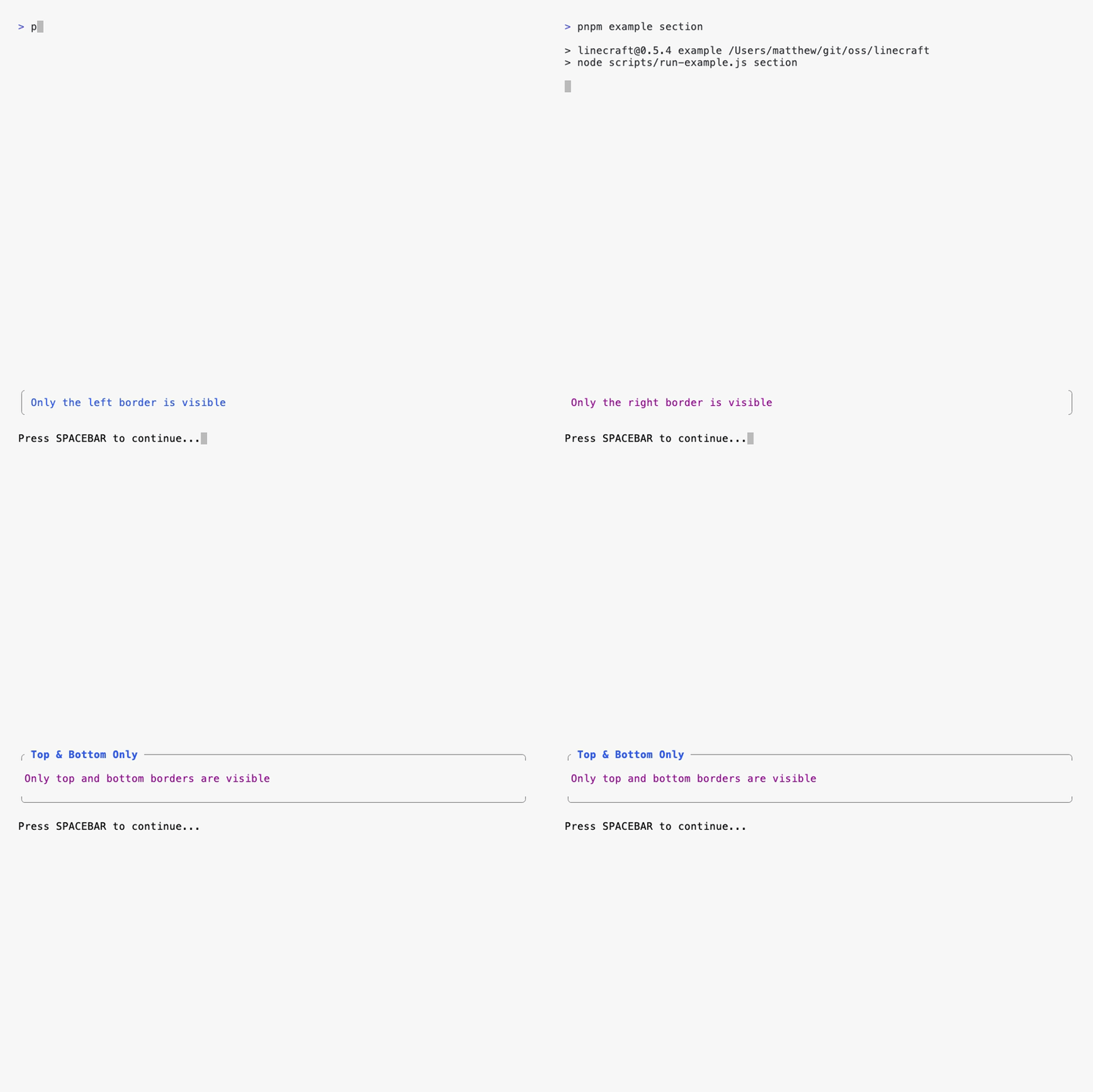
import { Section } from 'linecraft';

r.set(Section(
  { title: 'My Section' },
  'Content goes here'
));
Options:
title?: string- Title shown in a tab at the toptitleColor?: Color- Color of the titleborderColor?: Color- Color of borderspadding?: number- Internal padding (default: 1)left?: boolean- Show left border (default: true)right?: boolean- Show right border (default: true)top?: boolean- Show top border (default: true)bottom?: boolean- Show bottom border (default: true)
CodeDebug
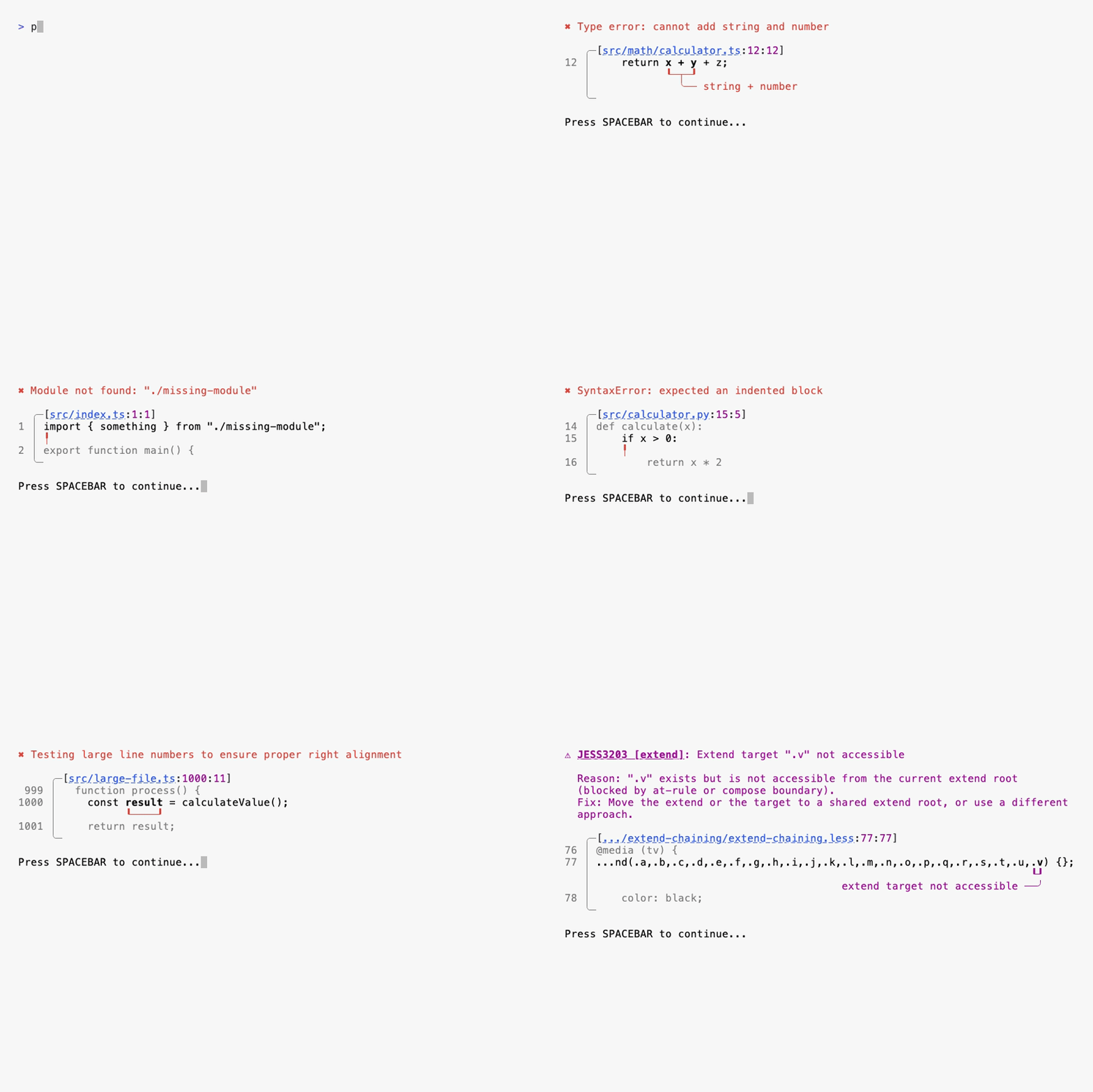
Display code errors and warnings with line numbers, context, and clickable file paths. Perfect for linters, compilers, and development tools that need to show diagnostic information.
import { CodeDebug } from 'linecraft';

r.set(CodeDebug({
  startLine: 42,
  startColumn: 10,
  endLine: 42,
  endColumn: 20,
  errorLine: '    const result = fetchData();',
  lineBefore: '  async function load() {',
  lineAfter: '    return process(result);',
  message: 'Type error: fetchData is not defined',
  errorCode: 'typescript(2304)', // Optional: error code with underline
  shortMessage: 'not defined', // Optional: short message connected to underline
  filePath: 'src/loaders/data.ts',
  fullPath: '/absolute/path/to/src/loaders/data.ts',
  baseDir: process.cwd(),
  type: 'error' // 'error' | 'warning' | 'info'
}));
Features:
- OSC 8 Hyperlinks: File paths are clickable in modern terminals (VS Code, iTerm2, etc.). Ctrl+Click (or Cmd+Click) opens the file at the correct line and column.
- Smart Line Overflow: Long code lines automatically truncate with ellipsis while keeping the error range visible. Supports ellipsis at start, end, or both sides.
- Error Range Highlighting: The error range (startColumn to endColumn) is highlighted with a brighter color for easy identification.
- Context Lines: Show lines before and after the error for better context (slightly dimmed for visual hierarchy).
- Message Wrapping: Long error messages wrap across multiple lines while preserving ANSI styling and color codes.
- Terminal Theme Adaptation: Line numbers and colors adapt to dark/light terminal themes automatically.
- Curved Underlines: Visual indicators with curved edges (┖─┚) point to the exact error location, with optional T-bar for short messages.
- Responsive Layout: Automatically adjusts to terminal width, truncating paths and code as needed.
Spinner
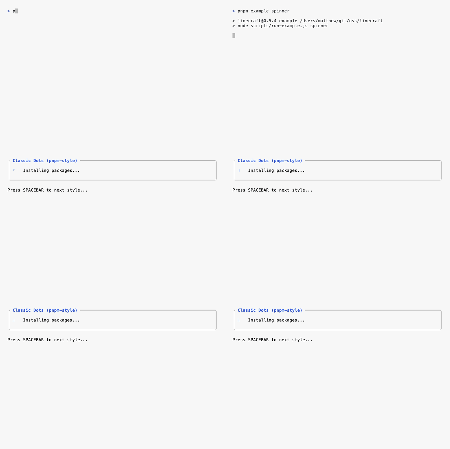
Animated spinners for loading states. Includes built-in styles or use custom frames.
import { Spinner } from 'linecraft';

// Built-in styles
r.set(Spinner({
  style: 'classic-dots', // or 'bouncing-bar'
  color: 'green',
  interval: 100
}));

// Custom frames
r.set(Spinner({
  frames: ['⠋', '⠙', '⠹', '⠸'],
  color: 'yellow',
  interval: 80
}));
Options:
style?: 'classic-dots' | 'bouncing-bar'- Built-in animation styleframes?: string[]- Custom frames (overrides style if provided)interval?: number- Milliseconds between frames (default: 80)color?: Color- Spinner colorautoStart?: boolean- Start automatically (default: true)
Spinners automatically stop when components are replaced or the region is destroyed.
ProgressBar
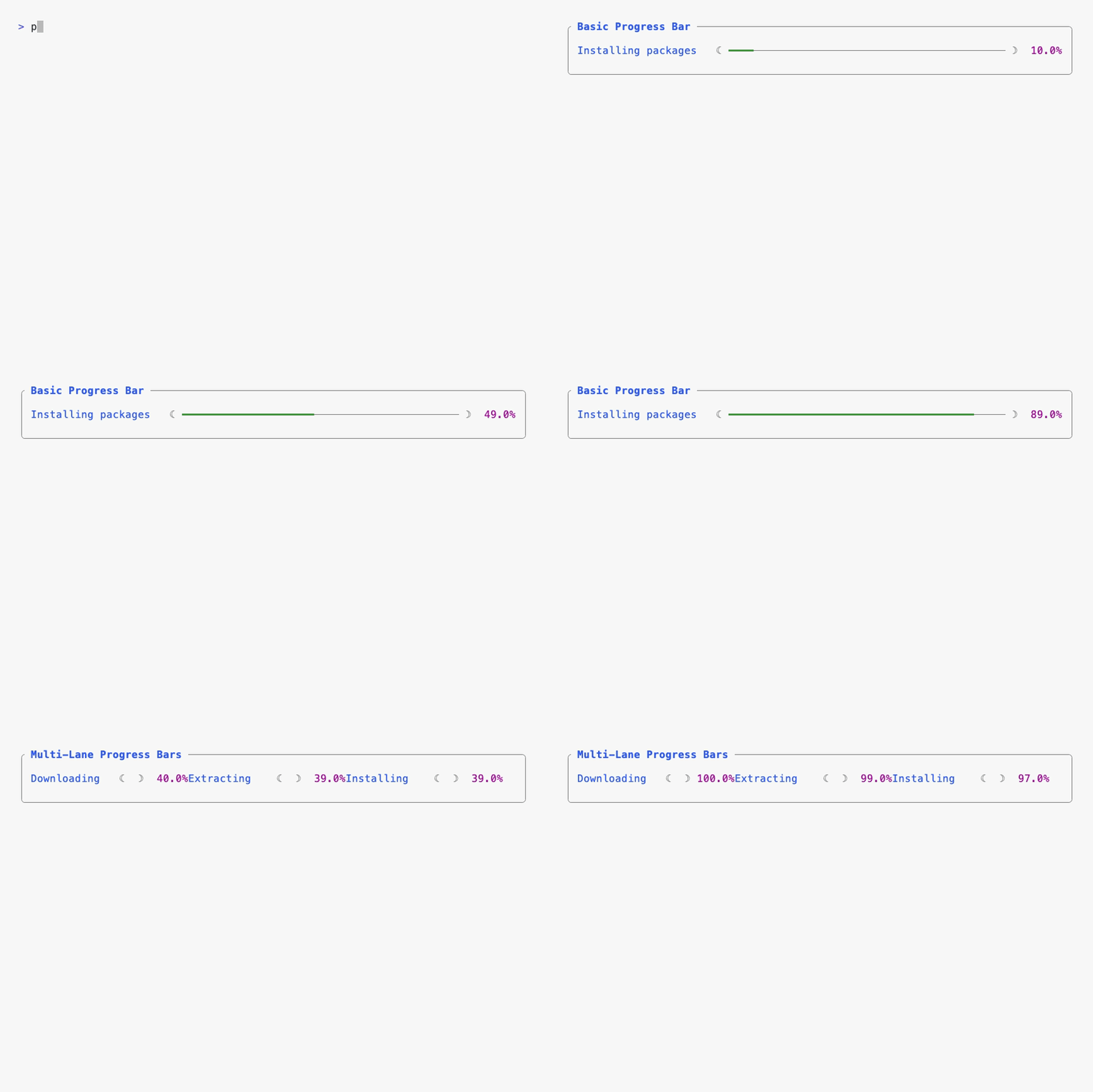
Progress bars with customizable colors and styling.
import { progressBar } from 'linecraft';

r.set(progressBar({
  current: 75,
  total: 100,
  barColor: 'green',
  bracketColor: 'brightBlack',
  percentColor: 'yellow'
}));
Options:
current: number- Current progress valuetotal: number- Total/max valuebarColor?: Color- Color of the filled barbracketColor?: Color- Color of bracketspercentColor?: Color- Color of percentage text
Segments
Create segmented displays (like oh-my-zsh style prompts).
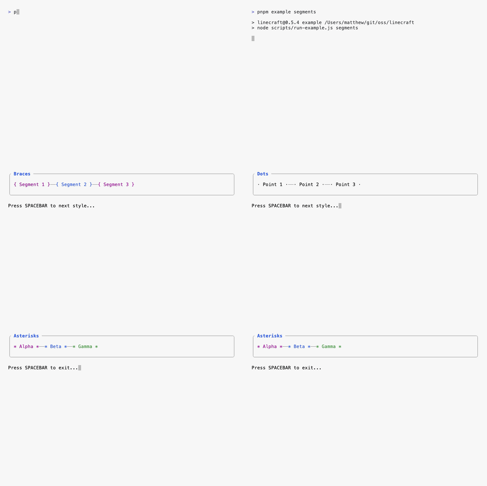
import { Segments } from 'linecraft';

r.set(Segments({
  segments: [
    { content: 'user@host', color: 'brightGreen', backgroundColor: 'blue' },
    { content: '~/projects', color: 'white', backgroundColor: 'brightBlue' },
    { content: 'main', color: 'black', backgroundColor: 'white' }
  ],
  borderStyle: 'cap' // 'cap' | 'brace' | 'round' | 'square' | 'none'
}));
Options:
segments: Array<{ content: string, color?: Color, backgroundColor?: Color, borderStyle?: BorderStyle }>- Array of segmentsborderStyle?: BorderStyle- Style for segment borders ('cap', 'brace', 'round', 'square', 'none')
Grid
Create responsive grid layouts. Children automatically wrap to new rows when they exceed the number of explicit columns.
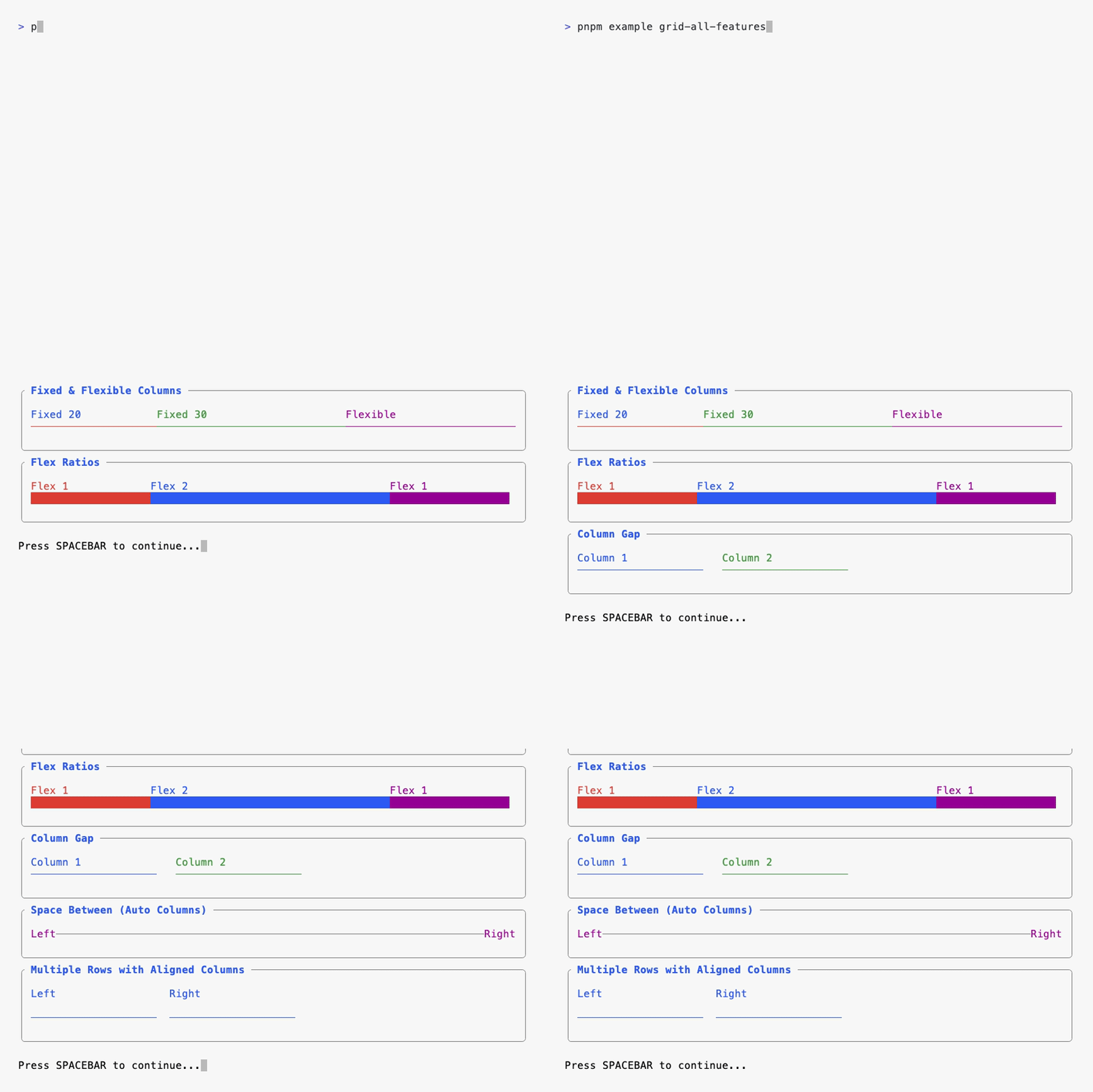
import { Grid } from 'linecraft';

// Basic grid
r.set(Grid({ template: [20, '1*'], columnGap: 2 },
  Styled({ color: 'cyan' }, 'Label:'),
  Styled({ color: 'yellow' }, 'Value')
));

// Multiple rows (children wrap automatically)
r.set(Grid({
  columns: [20, 20],  // 2 columns per row
  autoColumns: 20,     // Size for extra columns
  columnGap: 2,
  rowGap: 1
},
  Styled({ color: 'cyan' }, 'Left'),
  Styled({ color: 'cyan' }, 'Right'),
  fill({ char: '─', color: 'brightCyan' }),
  fill({ char: '─', color: 'brightCyan' })
));
Options:
columns?: GridTemplateEntry[]- Explicit column definitions (like CSSgrid-template-columns)autoColumns?: GridTemplateEntry- Size for implicitly created columns (like CSSgrid-auto-columns)columnGap?: number- Spaces between columns (default: 0)rowGap?: number- Spaces between rows (default: 0)spaceBetween?: FillChar | FillChar[]- Characters to draw between columnsjustify?: 'start' | 'end' | 'center' | 'space-between'- Justify content
Template entries:
- Fixed width:
20,30 - Flex units:
'1*','2*'(like CSS1fr,2fr) - Minmax:
{ min: 40, width: '2*' } - Auto:
'auto'(content-based sizing)
Fill
Fill available space with a character. Typically used within grids.

import { fill } from 'linecraft';

r.set(fill({ char: '─', color: 'brightBlack' }));
Utilities
Prompt
Wait for user input before continuing.
import { prompt } from 'linecraft';

await prompt(r, {
  message: 'continue',
  key: 'spacebar', // 'spacebar' | 'enter' | 'q' | 'any'
  color: 'brightBlack'
});
Colors
Available colors:
black,red,green,yellow,blue,magenta,cyan,whitebrightBlack,brightRed,brightGreen,brightYellow,brightBlue,brightMagenta,brightCyan,brightWhite
Examples
Check out the examples/ directory:
progress.ts- Progress bars (basic and multi-lane)spinner.ts- Animated spinnerscode-debug.ts- Code error displaygrid-all-features.ts- Grid layout examplessegments.ts- Segmented displays
Run examples with:
pnpm example <name>API Reference
Region Methods
set(content)- Replace all contentadd(content)- Append content, returnsComponentReferenceorSectionReferencedestroy(clearFirst?)- Clean up and restore terminalwidth- Current region width (read-only)height- Current region height (read-only)
ComponentReference
delete()- Remove the component from the region
SectionReference
update(content)- Update the section contentdelete()- Remove the section from the region
Contributing
Contributions welcome! Please open an issue or PR.
Creating example recordings? See docs/creating-recordings.md for a guide on using vhs to create animated GIFs.
License
This project is licensed under the Fair Labor License (FLL) v1.2.
- If you are an individual with a net worth under $5M USD, or
- Your organization is Fair Labor Compliant (your CEO or highest-paid executive makes no more than 15× your median employee's total annual compensation),
then you may use this software for free, subject to the terms of the license.
If you do not meet these conditions and use this software in production or for business value, you must obtain a paid license, for example via fllicense.org.
You may freely evaluate and test this software for up to 90 days before deciding.
See the full license text in LICENSE.