
live-icons
v1.0.2
Published
Plain JS Webcomponents Live Icons based upon SVG
Maintainers
 roba1993
Readme
Live-Icons
Plain JS Interactive Icons based upon SVG demo here
Library goals
- Dependency free library
- Easy to use, understand and to extend
- Native es6 with Classes and webcomponents
- Open to contribute for everyone
Installation
NPM
To use this library with npm, just install it with the following command.
npm i live-iconsIn your JavaScript file, import the project like following
import 'live-icons';Plain HTML
You can use this library by just downloading the index.js file and include it into your project.
Usage
The library can be used in two different ways:
- As ready to use webcomponents as shown in the examples below.
After the
.jsfile is loaded, just call the functionregisterInteractiveIcons()to register the icons as webcomponents. - As es6 classes to manually create objects and attach them to your DOM programmatically or enhance them with additional functionality.
Light Demo
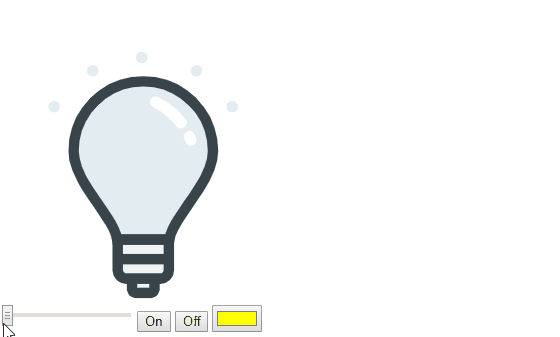
Light icon visualized as a light-bulb to show status and color.
Attributes:
- power: Float value between 0.0 and 1.0
- color: HTML color string for the light bulb on color
Example:
<div>
    <div style="width: 300px; height: 300px;">
        <live-icon-light />
    </div>
    <input type="range" min="0" max="1" value="0" step="0.001"
        oninput="document.querySelector('live-icon-light').power = this.value">
    <button onclick="document.querySelector('live-icon-light').setAttribute('power', 1)">On</button>
    <button onclick="document.querySelector('live-icon-light').power = 0">Off</button>
    <input type="color" name="favcolor" value="#ff0000"
        onchange="document.querySelector('live-icon-light').color = this.value; console.log(this.value);">
</div>
Blind Demo
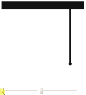
Blind icon to show the position of a blind
Attributes:
- open: Float between 0.0 and 1.0 to define how much the blind is lowered
- angle: Float between 0.0 and 1.0 to define how much the blind is tilted
Example:
<div>
    <div style="width: 300px; height: 300px;">
        <live-icon-blind />
    </div>
    <input type="range" min="0" max="1" value="0" step="0.001"
        oninput="document.querySelector('live-icon-blind').open = this.value">
    <input type="range" min="0" max="1" value="0" step="0.001"
        oninput="document.querySelector('live-icon-blind').angle = this.value">
</div>
Socket Demo
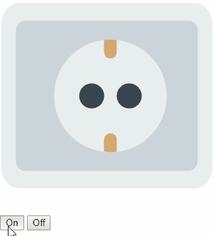
Socket icon to visualize if something is plugged in.
Attributes:
- power: Integer either 0 or 1 to visualize the status
Example:
<div>
    <div style="width: 300px; height: 300px;">
        <live-icon-socket />
    </div>
    <button onclick="document.querySelector('live-icon-socket').setAttribute('power', 1)">On</button>
    <button onclick="document.querySelector('live-icon-socket').power = 0">Off</button>
</div>
Meter Demo
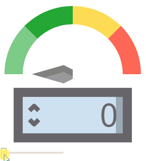
Meter icon to visualize a consumption.
Attributes:
- value: The actual value of consumption to show
- max: The maximal value reachable (red area)
Example:
<div>
    <div style="width: 300px; height: 300px;">
        <live-icon-meter max="9999" />
    </div>
    <input type="range" min="0" max="9999" value="0" step="0.001"
        oninput="document.querySelector('live-icon-meter').value = this.value">
</div>
Contributing
Please contribute!
The goal is to make this library as usefull as possible :)
If you need any kind of help, open an issue or write me an mail. Pull requests are welcome!
License
Copyright © 2019 Robert Schütte
Distributed under the MIT License.