lxj-ui
v1.2.4
Published
``` 本项目是本人在校期间完成的基于vue2的ui组件库

Readme
本项目是本人在校期间完成的基于vue2的ui组件库
安装组件库 npm i lxj-ui
全局引入
import LxjUi from 'lxj-ui'
import 'lxj-ui/dist/lxj-ui.css'
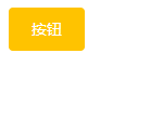
Vue.use(LxjUi)一、button组件
1.参数支持
| 参数名 | 参数描述 | 参数类型 | 默认值 | | -------- | ----------------------------------------------- | -------- | ------- | | type | 按钮类型(primary/success/warning/danger/info) | string | default | | plain | 是否是朴素按钮 | boolean | false | | round | 是否是圆角按钮 | boolean | false | | circle | 是否是圆形按钮 | boolean | false | | disabled | 是否禁用按钮 | boolean | fals |
2.事件支持:
| 事件名 | 事件描述 | | :----- | :------- | | click | 点击事件 |
3.样式参考:
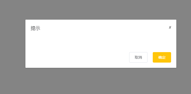
二、dialog组件
1.参数支持
| 参数名 | 参数描述 | 参数类型 | 默认值 | | ------- | -------------------------------- | -------- | ------ | | title | 对话框标题 | string | 提示 | | width | 宽度 | string | 50% | | top | 与顶部的距离 | string | 15vh | | visible | 是否显示dialog(支持sync修饰符) | boolean | false |
2.事件支持
| 事件名 | 事件描述 | | ------ | ---------------- | | opend | 模态框显示的事件 | | closed | 模态框关闭的事件 |
3.插槽的说明
| 插槽名称 | 插槽描述 | | -------- | ------------------ | | default | dialog的内容 | | title | dialog的标题 | | footer | dialog的底部操作区 |
4.样式参考:
三、input组件
1.参数支持
| 参数名称 | 参数描述 | 参数类型 | 默认值 | | ------------- | ------------------------- | -------- | ------ | | placeholder | 占位符 | string | 无 | | type | 文本框类型(text/password) | string | text | | disabled | 禁用 | boolean | false | | clearable | 是否显示清空按钮 | boolean | false | | show-password | 是否显示密码切换按钮 | boolean | false | | name | name属性 | string | 无 |
2.事件支持
| 事件名称 | 事件描述 | | -------- | -------------- | | blur | 失去焦点事件 | | change | 内容改变事件 | | focus | 获取的焦点事件 |
3.样式参考:
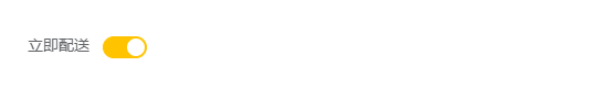
四、switch
1.参数支持
| 参数名称 | 参数描述 | 参数类型 | 默认值 | | ------------- | ------------------ | -------- | ------ | | v-model | 双向绑定 | 布尔类型 | false | | name | name属性 | string | text | | activeColor | 自定义的激活颜色 | string | | | inactiveColor | 自定义的不激活颜色 | string | |
2.事件支持
| 事件名称 | 事件描述 | | -------- | ------------------ | | change | change时触发的事件 |
3.样式参考
五、radio组件
1.参数支持
| 参数名称 | 参数描述 | 参数类型 | 默认值 | | :------- | :-------------- | :------------------- | :----- | | v-model | 双向绑定 | 布尔类型 | false | | label | 单选框和value值 | string,num,Boolean | ' ' | | name | radio的name值 | String | '' |
2.样式参考:

六、radio-group组件
1.参数支持
| 参数名称 | 参数描述 | 参数类型 | 默认值 | | :------- | :------- | :------- | :----- | | v-model | 双向绑定 | 布尔类型 | false |
七、checkout组件
1.参数支持
| 参数名称 | 参数描述 | 参数类型 | 默认值 | | :------- | :-------------- | :------------------- | :----- | | v-model | 双向绑定 | 布尔类型 | false | | label | 单选框和value值 | string,num,Boolean | ' ' | | name | radio的name值 | String | '' |
2.样式参考:

八、checkout-group组件
1.参数支持
| 参数名称 | 参数描述 | 参数类型 | 默认值 | | :------- | :------- | :------- | :----- | | v-model | 双向绑定 | 布尔类型 | false |
九、form组件
1.参数支持
| 参数名称 | 参数描述 | 参数类型 | 默认值 | | :---------- | :--------------- | :------- | :----- | | model | 表单数据对象 | object | | | label-width | 表单域标签的宽度 | string | 80px |
十、form-item
| 参数名称 | 参数描述 | 参数类型 | 默认值 | | :------- | :--------- | :------- | :----- | | label | 表单项内容 | string | '' |
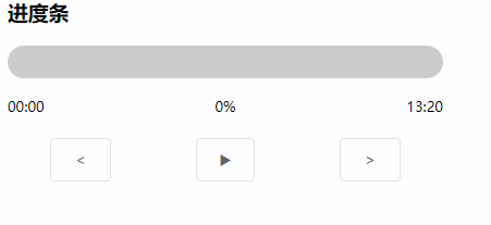
十一、progressBar
| 参数名称 | 参数描述 | 参数类型 | 默认值 | | :--------- | :------------------- | :------- | :----- | | finishBg | 完成部分背景色 | string | 无 | | unfinishBg | 未完成部分背景色 | String | 无 | | sliderBg | 滑块背景色 | String | 无 | | height | 进度条高度,传像素值 | String | 无 | | percent | 百分数 | Number | 0 |
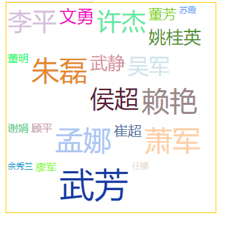
十二、wordCloud
| 参数名称 | 参数描述 | 参数类型 | 默认值 | | -------- | -------------- | -------- | ------ | | list | 需要展示的数据 | Array | 无 | | width | 组件宽度 | Number | 400 | | height | 组件高度 | Number | 500 | | temp | 步频 | Number | 5 | | font-max | 最大文字大小 | Number | 80 | | font-min | 最小文字大小 | Number | 25 |
十三、floatBall
| 参数名称 | 参数描述 | 参数类型 | 默认值 | | -------- | -------------- | -------- | ------ | | x | 横坐标百分比 | Number | 1 | | y | 纵坐标百分比 | Number | 0.4 | | isShow | 是否显示悬浮球 | Boolean | true |
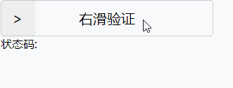
十四、slide
1.参数支持
| 参数名称 | 参数描述 | 参数类型 | 默认值 | | -------- | -------------- | -------- | ------ | | width | 滑块宽度 | Number | 300 | | height | 滑块高度 | Number | 50 | | fontSize | 文字大小 | Number | 24 | | limit | 滑块的速率限制 | Number | 100 |
2.事件支持
| 事件名称 | 事件描述 | | -------- | -------------------- | | getMsg | 验证通过或不通过事件 |
3.样式参考
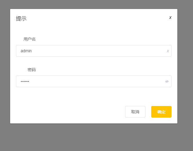
demo
代码
<template>
  <div id="app">
    <xj-button type="primary"
               @click="visible = true">按钮</xj-button>
    <xj-dialog title="提示"
               :visible.sync="visible"
               width="30%">
      <xj-form :model="model">
        <xj-form-item label="用户名">
          <xj-input placeholder="请输入用户名"
                    v-model="model.username"
                    clearable></xj-input>
        </xj-form-item>
        <xj-form-item label="密码">
          <xj-input placeholder="请输入密码"
                    type="password"
                    v-model="model.userpwd"
                    show-password></xj-input>
        </xj-form-item>
        <xj-form-item label="立即配送">
          <xj-switch v-model="model.soon"></xj-switch>
        </xj-form-item>
        <xj-form-item label="性别">
          <xj-radio-group v-model="model.gender">
            <xj-radio label="1">男</xj-radio>
            <xj-radio label="0">女</xj-radio>
          </xj-radio-group>
        </xj-form-item>
        <xj-form-item label="爱好">
          <xj-checkbox-group v-model="model.hobby">
            <xj-checkbox label="篮球">篮球</xj-checkbox>
            <xj-checkbox label="足球">足球</xj-checkbox>
            <xj-checkbox label="乒乓球">乒乓球</xj-checkbox>
          </xj-checkbox-group>
        </xj-form-item>
      </xj-form>
      <template v-slot:footer>
        <xj-button>取消</xj-button>
        <xj-button @click="btn"
                   type="primary">确定</xj-button>
      </template>
    </xj-dialog>
  </div>
</template>

<script>

export default {
  name: 'App',
  data () {
    return {
      model: {
        username: 'admin',
        userpwd: '123456',
        soon: true,
        gender: '1',
        hobby: ['篮球']
      },
      visible: false
    }
  }
}
</script>
效果