
markdown-wysiwyg-editor
v0.3.8
Published
Lightweight Markdown WYSIWYG editor with TipTap, Mermaid support
Downloads
381
Maintainers
 y.noguchi
Readme
markdown-wysiwyg-editor
Lightweight Markdown WYSIWYG editor for React, powered by TipTap.
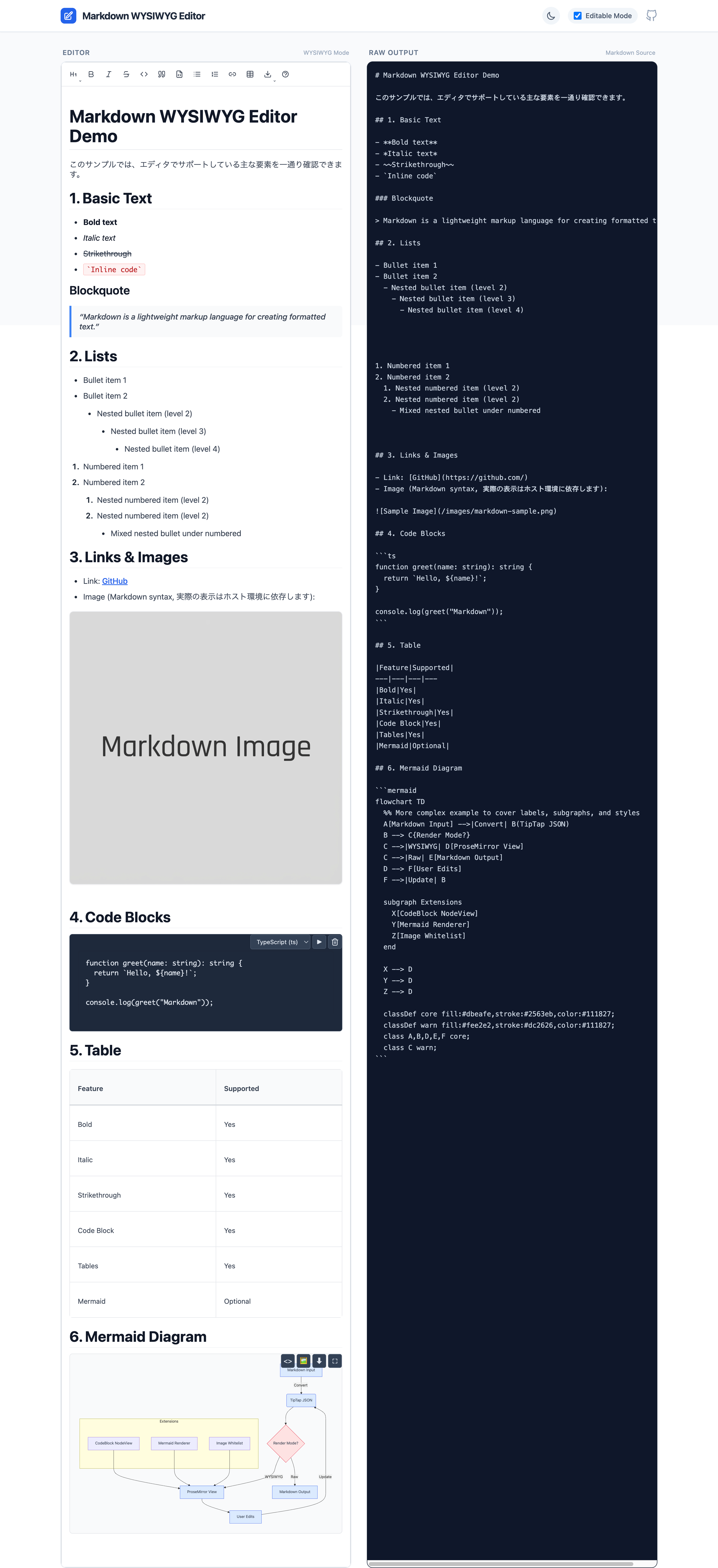
Features
- Rich text editing with Markdown syntax
- Code blocks with syntax highlighting (19 languages)
- Table editing with context menu and resize controls
- Optional Mermaid diagram support
- Optional image insertion
- Emoji picker for inserting emojis
- Bidirectional Markdown conversion
- Link context menu
- TypeScript support
Installation
[!WARNING] This package requires Tailwind CSS v4 or later. It uses v4's CSS-first configuration. If you are using Tailwind v3, you must upgrade.
This editor is a React component targeting React 19+ / ReactDOM 19+.
This package is Tailwind CSS v4 + shadcn/ui token compatible. It uses Tailwind utility classes (e.g. bg-background, text-foreground, bg-popover) that are compiled by your host app's Tailwind.
pnpm add markdown-wysiwyg-editor tailwindcss@^4.0.0
# or
npm install markdown-wysiwyg-editor tailwindcss@^4.0.0
# or
yarn add markdown-wysiwyg-editor tailwindcss@^4.0.0
Quick Start
⚠️ IMPORTANT
- Tailwind CSS v4 is required.
- React 19 or later is required.
- Import the CSS bundle in your app's entry point (e.g.,
main.tsx,App.tsx, orindex.css):
@import "markdown-wysiwyg-editor/dist/bundle.css";- Use the component:
import { useState } from 'react';
import { MarkdownEditor } from 'markdown-wysiwyg-editor';

function App() {
  const [content, setContent] = useState('');

  return <MarkdownEditor value={content} onChange={setContent} />;
}
CSS Integration Guide
Since version 0.3.0, the CSS integration strategy has changed to support Tailwind CSS v4.
✅ Recommended: Zero-Config (Pre-built Bundle)
Builds are simplified by using the pre-compiled bundle. This file includes:
- All required Tailwind utilities
- The default shadcn/ui-compatible theme
- Core editor styles
- Dark mode support
Just import it once:
@import "markdown-wysiwyg-editor/dist/bundle.css";🛠️ Advanced: Custom Tailwind Integration
Only use this method if you want to:
- Share your application's
themeconfiguration with the editor. - Minimize bundle size by compiling only utilized classes (though the bundle is already optimized).
Requirements:
- Tailwind CSS v4 installed in your project.
@tailwindcss/viteor@tailwindcss/postcssconfigured.
In your CSS entry point:
@import "tailwindcss";

/* 1. Scan package source for Tailwind classes */
@source "./node_modules/markdown-wysiwyg-editor/dist/*.js";

/* 2. Import package theme (Optional: If you have your own theme, skip this) */
@import "markdown-wysiwyg-editor/theme.css";

/* 3. Import core editor styles */
@import "markdown-wysiwyg-editor/style.css";

/* 4. Ensure your theme defines the required shadcn variables (see below) */
@theme {
    --color-background: hsl(var(--background));
    --color-foreground: hsl(var(--foreground));
    /* ... map other variables as needed ... */
    --variant-dark: .dark &;
}
Theming Options
Option A: Use Package Default Theme
Import theme.css to get shadcn-compatible light/dark mode defaults:
@import "markdown-wysiwyg-editor/theme.css";Option B: Use Your Own Theme
If you already use shadcn/ui or have your own CSS variables defined, skip importing theme.css:
@import "tailwindcss";
@source "./node_modules/markdown-wysiwyg-editor/dist/*.js";
@import "markdown-wysiwyg-editor/style.css";

/* Your own theme variables */
@layer base {
  :root {
    --background: 0 0% 100%;
    --foreground: 222.2 84% 4.9%;
    --popover: 0 0% 100%;
    --popover-foreground: 222.2 84% 4.9%;
    /* ... other variables */
  }

  .dark {
    --background: 222.2 84% 4.9%;
    --foreground: 210 40% 98%;
    --popover: 222.2 84% 4.9%;
    --popover-foreground: 210 40% 98%;
    /* ... other variables */
  }
}
Required CSS Variables
The editor expects these shadcn-style CSS variables (HSL triplets without hsl()):
| Variable | Light Mode Example | Description |
|----------|-------------------|-------------|
| --background | 0 0% 100% | Page background |
| --foreground | 222.2 84% 4.9% | Primary text color |
| --popover | 0 0% 100% | Dropdown/menu background |
| --popover-foreground | 222.2 84% 4.9% | Dropdown/menu text |
| --primary | 222.2 47.4% 11.2% | Primary action color |
| --primary-foreground | 210 40% 98% | Primary action text |
| --secondary | 210 40% 96.1% | Secondary elements |
| --secondary-foreground | 222.2 47.4% 11.2% | Secondary text |
| --muted | 210 40% 96.1% | Muted backgrounds |
| --muted-foreground | 215.4 16.3% 46.9% | Muted text |
| --accent | 210 40% 96.1% | Hover states |
| --accent-foreground | 222.2 47.4% 11.2% | Hover text |
| --border | 214.3 31.8% 91.4% | Border color |
| --input | 214.3 31.8% 91.4% | Input border |
| --ring | 222.2 84% 4.9% | Focus ring |
| --radius | 0.5rem | Border radius |
Dark Mode
Dark mode works automatically when you add the .dark class to <html> or <body>:
// Toggle dark mode
document.documentElement.classList.toggle('dark');
If you imported theme.css, dark mode colors are already defined. Otherwise, define them under .dark selector in your CSS.
Height and Scroll Configuration
The editor needs proper height configuration to enable scrolling. Choose one approach:
Option A: Fixed Height (Recommended)
<MarkdownEditor
  value={content}
  onChange={setContent}
  className="h-96" // Fixed height (384px)
  enableVerticalScroll={true} // Enable internal scrolling
/>
Option B: Flex Layout (For Full-Height Containers)
// Parent container must have defined height
<div className="flex flex-col h-screen">
  <MarkdownEditor
    value={content}
    onChange={setContent}
    className="flex-1" // Fill remaining space
    enableVerticalScroll={true} // Enable internal scrolling
  />
</div>
Option C: Auto-Height (No Scroll)
<MarkdownEditor
  value={content}
  onChange={setContent}
  autoHeight={true} // Grow with content
  enableVerticalScroll={false} // No internal scrolling
/>
Common Issues and Solutions
Issue: Lists not displaying correctly
- Make sure the CSS is imported properly
- The CSS file contains all necessary styles for headings, lists, tables, etc.
Issue: No scrollbar appears
- Set a fixed height using
className="h-96"or similar - Enable scroll with
enableVerticalScroll={true}
Issue: Styles not applying
- Check that you've added
@sourcedirective pointing to this package - Verify the
@themeblock maps CSS variables correctly - Check browser console for CSS loading errors
Issue: Toolbar / menus look unstyled or transparent
- Ensure Tailwind CSS v4 is installed and configured
- Verify
@source "./node_modules/markdown-wysiwyg-editor/dist/*.js"is in your CSS - Check that CSS variables (
--popover,--background, etc.) are defined - Make sure
.darkclass toggle updates the CSS variables correctly
Issue: Dark mode not working
- Ensure
.darkclass is applied to<html>or<body> - Import
theme.cssor define dark mode variables under.darkselector - Check that
--variant-dark: .dark &;is in your@themeblock
With Mermaid
mermaid is an optional peer dependency. Install it only if you enable Mermaid:
pnpm add mermaid
# or
npm install mermaid
import { useState } from 'react';
import mermaid from 'mermaid';
import { MarkdownEditor } from 'markdown-wysiwyg-editor';
mermaid.initialize({ startOnLoad: false });
function App() {
const [content, setContent] = useState('');
return (
<MarkdownEditor value={content} onChange={setContent} enableMermaid mermaidLib={mermaid} />
);
}Disable Features
<MarkdownEditor value={content} onChange={setContent} enableImage={false} enableTable={false} />Emoji insertion is available via the built-in toolbar. To hide it, hide the toolbar:
<MarkdownEditor value={content} onChange={setContent} showToolbar={false} />Image whitelist (local images)
For security reasons, local image paths are not rendered by default.
- Remote images are allowed only with
http/https. - For local paths (e.g.
/images/foo.png), setpublicImagePathPrefixand thesrcmust start with that prefix. - The following are rejected:
javascript:/data:/file:/ protocol-relative (//...) / path traversal (../).
Example:
<MarkdownEditor
  value={content}
  onChange={setContent}
  publicImagePathPrefix="/images"
/>
API (Props)
| Prop | Type | Default | Description |
| ----------------- | ------------------------- | ------------------- | --------------------------------------------------- |
| value | string | - | Markdown content (required) |
| onChange | (value: string) => void | - | Change handler (required) |
| editable | boolean | true | Enable editing |
| enableMermaid | boolean | false | Enable Mermaid diagrams |
| enableImage | boolean | true | Enable image insertion |
| enableTable | boolean | true | Enable table editing |
| enableCodeBlock | boolean | true | Enable code blocks |
| enableLink | boolean | true | Enable links |
| publicImagePathPrefix | string | - | Allow local image src only when it starts with this prefix (e.g. /images) |
| mermaidLib | typeof mermaid | - | Mermaid instance (required if enableMermaid=true) |
| debug | boolean | false | Show debug info (syntax status, paste debug) |
| className | string | - | Additional CSS class |
| style | React.CSSProperties | - | Inline styles |
| onBlur | () => void | - | Blur event handler |
| onFocus | () => void | - | Focus event handler |
| extensions | Extension[] | - | Custom TipTap extensions |
Supported Languages (Code Blocks)
- JavaScript / TypeScript
- Python
- Java
- Go
- Rust
- PHP
- HTML / CSS
- SQL
- Bash / Shell (sh, zsh, tcsh)
- JSON / YAML / XML
- Mermaid (if enabled)
Bundle Size (rough guideline)
- Without Mermaid: ~150KB (gzipped)
- With Mermaid: +2.5MB
Consider your app's performance and whether you really need Mermaid.
Limitations / Notes
- Focused on Markdown-based WYSIWYG. It is not a full block editor like Notion.
- Styling assumes a relatively neutral, Tailwind-friendly base; you are expected to adapt it to your design system.
- TipTap / Mermaid and other internals may receive major updates; this library will follow with its own major bumps.
Browser Support
- Chrome / Edge: latest 2 versions
- Firefox: latest 2 versions
- Safari: latest 2 versions
- Mobile: iOS Safari 15+, Chrome Android
Advanced Usage
Internationalization (i18n)
This editor uses a host-driven i18n strategy.
- Your app provides a translator function
t(key)viaI18nProvider. - All UI labels are defined by
I18N_KEYS(translation keys). - If you don't provide a translator, the default behavior is to render the key itself.
With react-i18next
import { I18nProvider, MarkdownEditor, type Translator } from 'markdown-wysiwyg-editor';
import { useTranslation } from 'react-i18next';

function App() {
  const { t: t18n } = useTranslation();
  const [content, setContent] = useState('');

  const t: Translator = (key, fallback) => t18n(key, { defaultValue: fallback ?? key });

  return (
    <I18nProvider t={t}>
      <MarkdownEditor value={content} onChange={setContent} />
    </I18nProvider>
  );
}
Add to your i18n JSON files
en.json:
{
  "markdown_editor": {
    "table": {
      "row_operations": "Row Operations",
      "add_row_above": "Add Row Above",
      "add_row_below": "Add Row Below",
      "delete_row": "Delete Row",
      "column_operations": "Column Operations",
      "add_column_left": "Add Column Left",
      "add_column_right": "Add Column Right",
      "delete_column": "Delete Column",
      "delete_table": "Delete Entire Table",
      "cancel": "Cancel"
    }
  }
}
ja.json:
{
  "markdown_editor": {
    "table": {
      "row_operations": "行の操作",
      "add_row_above": "上に行を追加",
      "add_row_below": "下に行を追加",
      "delete_row": "行を削除",
      "column_operations": "列の操作",
      "add_column_left": "左に列を追加",
      "add_column_right": "右に列を追加",
      "delete_column": "列を削除",
      "delete_table": "テーブル全体を削除",
      "cancel": "キャンセル"
    }
  }
}
See docs/i18n.md for more details.
Custom Toolbar
You can hide the built-in toolbar and provide your own UI:
<MarkdownEditor value={content} onChange={setContent} showToolbar={false} />Custom Extensions
You can inject TipTap extensions directly:
import TextAlign from '@tiptap/extension-text-align';

<MarkdownEditor
  value={content}
  onChange={setContent}
  extensions={[
    TextAlign.configure({
      types: ['heading', 'paragraph'],
    }),
  ]}
/>;
Troubleshooting
Styles not loading
/* Recommended */
@import "markdown-wysiwyg-editor/dist/bundle.css";
Ensure the CSS is imported in your app entry.
If using Custom Integration (Advanced) and the toolbar is unstyled:
- Verify
@sourceis pointing correctly tonode_modules/markdown-wysiwyg-editor/dist/*.js. - Check that your
theme.cssimports or@themeconfiguration are correct.
"ReferenceError: global is not defined"
With some Vite setups you may need:
define: {
  global: 'window',
},
Development
pnpm install
pnpm dev
pnpm build
pnpm test
pnpm lint
License
MIT
Credits
Built with: