
master-js-utils
v1.0.9
Published
[](https://www.npmjs.org/package/master-js-utils) [](https:/

Readme
Master JS Utils


A powerful collection of JavaScript/TypeScript utilities and React UI components for modern web development.
🚀 Features: Essential utility functions for common development tasks
⚡ Performance: Native CSS animations with reduced motion support
🎨 Beautiful: GSAP-powered scroll animations and modern UI components
📦 TypeScript: Full TypeScript support with comprehensive type definitions
🎯 Customizable: Flexible props for styling and data customization
✨ Live Demo
ScrollTimeline Component in Action
Experience smooth scroll-triggered animations with our interactive timeline component featuring progressive content reveal, animated year indicators, and responsive design.
ScrollProgressBar Component

Native CSS scroll timeline API powers this performance-optimized progress indicator with beautiful gradient effects.
Table of Contents
- Live Demo
- Features
- Installation
- Quick Start
- Utilities API
- UI Components
- Browser Support
- TypeScript
- Troubleshooting
- Contributing
- License
Features
- ⚡ Essential Utilities: Debouncing, date manipulation, API error handling, parameter filtering, object key extraction, text measurement, and request abort control
- 🎨 React UI Components: Beautiful, customizable components with smooth GSAP animations, intersection observers, intelligent menu systems, and horizontal scroll experiences
- 📱 Responsive Design: Mobile-first components that adapt seamlessly to all screen sizes
- 🌟 Native CSS Animations: Performance-optimized scroll progress with CSS scroll timeline API
- 🎭 GSAP ScrollTrigger: Advanced scroll-based animations with bubble effects, timeline reveals, and horizontal scroll experiences
- 🔄 Intersection Observer: Efficient viewport detection for lazy loading and trigger events
- 🎯 Smart Navigation: Magic triangle menu system for enhanced user experience
- 🎪 Horizontal Scroll: Smooth horizontal scrolling sections with GSAP ScrollTrigger integration
- 🖼️ Interactive Cards: Flip cards with scale and clip-path animations triggered by scroll
- 📐 Text Measurement: Precise text dimension calculation for dynamic layouts
- 🛑 Request Management: Centralized abort controller for API request cancellation
- 🎯 TypeScript First: Comprehensive type definitions and interfaces for better developer experience
- 📦 Tree Shakeable: Import only what you need to minimize bundle size
- ♿ Accessibility: Respects user preferences for reduced motion
- 🎨 Customizable: Props for styling customization and data configuration
- 🚀 Production Ready: Optimized and tested for production environments
Installation
Using npm:
npm install master-js-utilsUsing yarn:
yarn add master-js-utilsUsing pnpm:
pnpm add master-js-utilsQuick Start
Prerequisites: Make sure you have React, React-DOM, and GSAP installed:
Step 1: Install the package
npm install master-js-utilsStep 2: Import the CSS (required for UI components)
import "master-js-utils/style.css";Basic Usage
import React from "react";
import {
  ScrollProgressBar,
  ScrollTimeline,
  DetectIntersectionObserver,
  MagicMenuTriangle,
  FlipCard,
  debounce,
  utils,
} from "master-js-utils";
import "master-js-utils/style.css";

function App() {
  const debouncedFn = debounce(() => console.log("Hello!"), 300);

  // Text measurement example
  const textSize = utils.measureText("Sample Text", "16px Arial");

  // Request controller example
  const aborter = new utils.Aborter();

  const handleIntersection = () => {
    console.log("Element is visible!");
  };

  const menuData = [
    {
      label: "Home",
      path: "/",
      subs: [
        { label: "Dashboard", path: "/dashboard" },
        { label: "Profile", path: "/profile" },
      ],
    },
  ];

  return (
    <div>
      <ScrollProgressBar />

      <MagicMenuTriangle
        data={menuData}
        ulClsStyles="flex space-x-4"
        liClsStyles="px-4 py-2 hover:bg-gray-100"
      />

      <ScrollTimeline />

      <DetectIntersectionObserver onProcess={handleIntersection}>
        <div className="h-96 bg-blue-100 p-8">
          <h2>This triggers when visible</h2>
          <p>
            Text dimensions: {textSize.width}x{textSize.height}
          </p>
        </div>
      </DetectIntersectionObserver>

      <button onClick={debouncedFn}>Test Debounce</button>
    </div>
  );
}

export default App;
Import Specific Utilities
import { utils } from "master-js-utils";

const {
  debounce,
  dates,
  apis,
  params,
  measureText,
  extractObjectKeys,
  Aborter,
} = utils;

// Or import individual utilities
import { debounce, measureText, Aborter } from "master-js-utils";
Import Specific UI Components
import {
  ScrollProgressBar,
  ScrollTimeline,
  DetectIntersectionObserver,
  MagicMenuTriangle,
  FlipCard,
} from "master-js-utils";
import "master-js-utils/style.css"; // Required for styling

const App = () => (
  <div>
    <ScrollProgressBar clsStyles="h-2 bg-red-500" />
    <ScrollTimeline
      list={customTimelineData}
      clsYearStyles="text-blue-600"
      clsDescStyles="text-gray-600"
    />
  </div>
);
Utilities API
Debounce
Delays function execution until after a specified time has elapsed since the last time it was invoked.
import { utils } from "master-js-utils";

const debouncedSearch = utils.debounce((query) => {
  console.log("Searching for:", query);
}, 300);

// Usage
debouncedSearch("React"); // Will only execute after 300ms of no more calls
Parameters:
callback(Function): The function to debouncedelayTime(number): The delay in milliseconds
Date Utilities
Comprehensive date manipulation utilities for common date operations.
import { utils } from "master-js-utils";

const { dates } = utils;

// Get various date ranges
const lastMonth = dates.getLastMonth();
const currentMonth = dates.getCurrentMonth();
const lastYear = dates.getLastYear();
const currentYear = dates.getCurrentYear();
const tomorrow = dates.getTomorrow();
const yesterday = dates.getYesterday();

console.log("Last month:", lastMonth);
console.log("Yesterday:", yesterday);
Available Methods:
getLastMonth(): Returns the previous month's dategetCurrentMonth(): Returns the current month's dategetLastYear(): Returns the previous year's dategetCurrentYear(): Returns the current year's dategetTomorrow(): Returns tomorrow's dategetYesterday(): Returns yesterday's dategetToday(): Returns today's date
API Error Handling
Elegant error handling for async operations and API calls.
import { utils } from "master-js-utils";

const fetchUserData = async (userId) => {
  const [error, data] = await utils.catchError(
    fetch(`/api/users/${userId}`).then((res) => res.json())
  );

  if (error) {
    console.error("Failed to fetch user:", error);
    return null;
  }

  return data;
};

// Usage
const userData = await fetchUserData(123);
Returns: A tuple [error, data] where either error is null and data contains the result, or error contains the caught exception.
Parameter Filtering
Clean and serialize URL parameters by removing empty, null, or undefined values.
import { utils } from "master-js-utils";

const { params } = utils;

// Filter out empty parameters
const cleanParams = params.filteredParams({
  name: "John",
  age: null,
  city: "",
  country: "USA",
});
// Result: { name: 'John', country: 'USA' }

// Serialize parameters for URL
const queryString = params.filteredParamsSerializer({
  categories: ["tech", "science"],
  sort: "date",
  limit: 10,
});
// Result: "categories=tech&categories=science&sort=date&limit=10"
Methods:
filteredParams(params): Removes empty, null, and undefined valuesfilteredParamsSerializer(params): Converts object to URL query string
Object Key Extraction
Recursively extract all keys from nested objects, useful for form validation and data processing.
import { utils } from "master-js-utils";

const user = {
  name: "John",
  address: {
    street: "123 Main St",
    city: "New York",
    coordinates: {
      lat: 40.7128,
      lng: -74.006,
    },
  },
  hobbies: ["reading", "coding"],
};

const allKeys = utils.extractObjectKeys(user);
// Result: ['name', 'street', 'city', 'lat', 'lng', 'hobbies']
Parameters:
obj(Object): The object to extract keys from
Returns: Array of all keys found in the object and its nested objects
Text Measurement
Precisely measure text dimensions for dynamic layouts and responsive design calculations.
import { utils } from "master-js-utils";

const textDimensions = utils.measureText("Hello World!", "16px Arial");
console.log(textDimensions); // { width: 85.5, height: 19 }

// Useful for dynamic sizing
const calculateContainerWidth = (text, font) => {
  const { width } = utils.measureText(text, font);
  return width + 20; // Add padding
};
Parameters:
text(string): The text to measurefont(string): CSS font specification (e.g., "16px Arial", "bold 14px sans-serif")
Returns: Object with width and height properties in pixels
Use Cases:
- Dynamic tooltip sizing
- Text truncation calculations
- Responsive layout adjustments
- Canvas text rendering
Request Abort Controller
Centralized management of API request cancellation with named abort signals.
import { utils } from "master-js-utils";

const aborter = new utils.Aborter();

// Create abort signal for a specific request
const signal = aborter.newSignal("user-fetch");

// Use with fetch API
fetch("/api/users", { signal })
  .then((response) => response.json())
  .then((data) => console.log(data))
  .catch((err) => {
    if (err.name === "AbortError") {
      console.log("Request was cancelled");
    }
  });

// Cancel the request
aborter.abort("user-fetch");

// Multiple requests
const searchSignal = aborter.newSignal("search");
const profileSignal = aborter.newSignal("profile");

// Previous "search" request is automatically cancelled when creating a new one
const newSearchSignal = aborter.newSignal("search");
Methods:
newSignal(key: string): Creates a new abort signal for the given key. If a signal with the same key exists, it's automatically aborted first.abort(key: string): Manually abort a specific request by key
Use Cases:
- Search autocomplete (cancel previous searches)
- Component unmounting cleanup
- User navigation (cancel pending requests)
- Preventing race conditions
UI Components
ScrollProgressBar
A beautiful, animated progress bar that fills as the user scrolls down the page using native CSS scroll timeline API.
import React from "react";
import { ScrollProgressBar } from "master-js-utils";

const App = () => (
  <div>
    {/* Basic usage */}
    <ScrollProgressBar />

    {/* Custom styling */}
    <ScrollProgressBar clsStyles="h-2 bg-gradient-to-r from-purple-500 to-pink-500" />

    {/* Your page content */}
    <div style={{ height: "200vh" }}>
      <h1>Scroll down to see the progress bar in action!</h1>
    </div>
  </div>
);
Props:
clsStyles(string, optional): Additional CSS classes for customization
Features:
- 🎨 Native CSS Animation: Uses CSS scroll timeline API for optimal performance
- ⚡ Zero JavaScript: Pure CSS implementation with smooth transforms
- 📱 Responsive Design: Works seamlessly across all devices
- 🎯 Fixed Positioning: Stays at the top of the page while scrolling
- ♿ Accessibility: Respects
prefers-reduced-motionuser preference - 🎨 Customizable: Override styles via
clsStylesprop - 🌈 Beautiful Gradient: Default indigo to teal gradient
Default Styling: The component uses Tailwind CSS classes with a beautiful gradient. The progress bar:
- Has a height of 4px (
h-1) - Uses a gradient from indigo-500 to teal-500
- Is positioned fixed at the top with highest z-index
- Transforms from scale 0 to 1 based on scroll progress
Accessibility:
@media (prefers-reduced-motion: no-preference) {
  /* Animations only play if user hasn't requested reduced motion */
}
ScrollTimeline
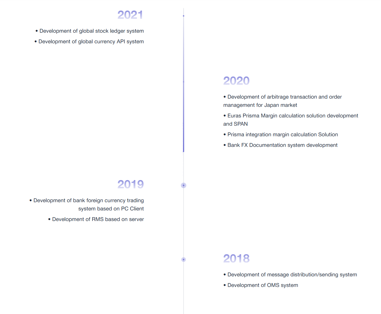
An interactive, animated timeline component that reveals content as the user scrolls, powered by GSAP ScrollTrigger with bubble effects and smooth animations.
Interactive timeline showing company development milestones with animated reveals and smooth scroll effects
import React from "react";
import { ScrollTimeline, TimelineItem } from "master-js-utils";

// Using default demo data
const App = () => (
  <div>
    <h1>Company History</h1>
    <ScrollTimeline />
  </div>
);

// Using custom data
const customTimeline: TimelineItem[] = [
  {
    year: "2024",
    items: ["Launched new product line", "Expanded to international markets"],
  },
  {
    year: "2023",
    items: ["Series B funding round", "Team expansion to 100+ employees"],
  },
];

const CustomApp = () => (
  <div>
    <ScrollTimeline
      list={customTimeline}
      clsYearStyles="text-purple-600 font-extrabold"
      clsDescStyles="text-gray-700 leading-relaxed"
    />
  </div>
);
Props:
list(TimelineItem[], optional): Custom timeline data. Uses demo data if not providedclsYearStyles(string, optional): Additional CSS classes for year stylingclsDescStyles(string, optional): Additional CSS classes for description styling
TypeScript Interface:
export interface TimelineItem {
  year: string;
  items: string[];
}
Features:
- 📅 Interactive Timeline: Years and events revealed with smooth scroll animations
- 🎭 GSAP Animations: Powered by GSAP ScrollTrigger for performant animations
- 🫧 Bubble Effects: Year dots have animated pulse and ripple effects
- 📱 Responsive Design: Mobile-first design with different layouts for desktop/mobile
- 🎨 Beautiful Styling: Modern design with gradient text and purple accent colors
- 🎯 Progressive Reveal: Purple timeline line grows as user scrolls
- ⚙️ Demo Data Included: Comes with comprehensive sample timeline data
- 🎨 Customizable: Override year and description styles via props
- 🔄 Bi-directional: Animations reverse when scrolling back up
- ♿ Accessible: Smooth animations that respect user preferences
Animation Details:
- Title Animation: Fades in from bottom with scale effect
- Timeline Items: Alternating slide-in animations (left/right on desktop)
- Year Dots: Scale up with bounce effect + continuous pulse when in view
- Purple Line: Progressive height growth synced with scroll position
- Ripple Effects: Expanding circles around year dots when visible
Sample Timeline Data: The component includes rich demo data covering development milestones from 2012-2021, including:
- Global stock ledger systems
- Currency API development
- Trading platform solutions
- Market data solutions
- And comprehensive development history
Mobile vs Desktop:
- Desktop: Alternating left/right layout with centered timeline
- Mobile: Consistent left-aligned layout with timeline on the left edge
Responsive design automatically adapts layout for optimal viewing on all devices
DetectIntersectionObserver
A React component that triggers callbacks when elements enter the viewport, perfect for lazy loading, analytics, and scroll-based animations.
import React, { useState } from "react";
import { DetectIntersectionObserver } from "master-js-utils";

const LazySection = () => {
  const [isVisible, setIsVisible] = useState(false);
  const [loadCount, setLoadCount] = useState(0);

  const handleIntersection = () => {
    setIsVisible(true);
    setLoadCount((prev) => prev + 1);
    console.log("Element is now visible!");
  };

  return (
    <DetectIntersectionObserver onProcess={handleIntersection}>
      <div className="min-h-screen bg-gradient-to-r from-blue-500 to-purple-600">
        {isVisible ? (
          <div className="p-8 text-white">
            <h2>Content Loaded! (Triggered {loadCount} times)</h2>
            <p>
              This content was lazy-loaded when the element entered the
              viewport.
            </p>
          </div>
        ) : (
          <div className="p-8 text-white">
            <p>Scroll to trigger the intersection observer...</p>
          </div>
        )}
      </div>
    </DetectIntersectionObserver>
  );
};
Props:
onProcess(VoidFunction): Callback function triggered when the element intersects with the viewportchildren(React.ReactNode, optional): Child elements to render inside the observer wrapper
Features:
- 🎯 Efficient Detection: Uses native Intersection Observer API for optimal performance
- 🔄 Automatic Cleanup: Properly disconnects observers to prevent memory leaks
- 📱 Cross-Platform: Works consistently across all modern browsers
- ⚡ Zero Dependencies: Pure React implementation with no external dependencies
Use Cases:
- Lazy loading images and content
- Triggering animations on scroll
- Analytics and user behavior tracking
- Infinite scroll implementations
- Progressive content loading
MagicMenuTriangle
An intelligent navigation component that implements the "magic triangle" UX pattern for enhanced dropdown menu interaction, preventing accidental menu closes when navigating to submenus.
import React from "react";
import { MagicMenuTriangle, MenuItem } from "master-js-utils";
import "./style.css";

const navigationData: MenuItem[] = [
  {
    label: "Products",
    path: "/products",
    subs: [
      { label: "Web Development", path: "/products/web" },
      { label: "Mobile Apps", path: "/products/mobile" },
      { label: "Desktop Software", path: "/products/desktop" },
    ],
  },
  {
    label: "Services",
    path: "/services",
    subs: [
      { label: "Consulting", path: "/services/consulting" },
      { label: "Support", path: "/services/support" },
      { label: "Training", path: "/services/training" },
    ],
  },
  {
    label: "About",
    path: "/about",
    target: "_self",
  },
];

const Navigation = () => {
  return (
    <nav>
      <MagicMenuTriangle
        data={navigationData}
        ulClsStyles="flex space-x-6 bg-white shadow-lg"
        liClsStyles="relative group hover:bg-gray-100 px-4 py-2"
      />

      {/* Magic triangle SVG for visualization (automatically managed) */}
      <svg className="absolute top-0 left-0 pointer-events-none opacity-25">
        <polygon id="magic-triangle" fill="red" />
      </svg>
    </nav>
  );
};
Props:
data(MenuItem[], optional): Array of menu items with optional submenusulClsStyles(string, optional): CSS classes for the main menu containerliClsStyles(string, optional): CSS classes for individual menu items
TypeScript Interface:
export interface MenuItem {
  label: string;
  path: string;
  target?: "_blank" | "_self";
  subs?: MenuItem[];
}
Features:
- 🎯 Magic Triangle Algorithm: Implements sophisticated geometry calculations to create an invisible triangle zone
- 🖱️ Enhanced UX: Prevents accidental submenu closures when moving cursor toward submenu
- 📐 Geometric Precision: Uses triangle area calculations for precise mouse position detection
- ⚡ Performance Optimized: Efficient event handling with minimal DOM manipulation
- 🎨 Highly Customizable: Full control over styling via CSS classes
- 📱 Responsive Ready: Works seamlessly across different screen sizes
How it Works:
The component creates an invisible triangle between the cursor position and the submenu corners. If the user's mouse stays within this triangle while moving toward the submenu, the menu remains open. This prevents the frustrating experience of menus closing when users navigate diagonally toward submenus.
Algorithm Details:
- Triangle Formation: Creates a triangle using cursor position as one vertex and submenu corners as other vertices
- Area Calculation: Uses mathematical area calculation to determine if mouse is within triangle
- Direction Detection: Monitors mouse movement direction to enable/disable triangle detection
- Smart Cleanup: Automatically manages event listeners and memory cleanup
Use Cases:
- Complex navigation menus with multiple levels
- E-commerce category navigation
- Dashboard and admin panel menus
- Any UI requiring precise hover interactions
FlipCard
An interactive card component with scroll-triggered animations featuring scale and clip-path effects for stunning visual reveals.
import React from "react";
import { FlipCard } from "master-js-utils";

const Gallery = () => {
  const images = [
    "https://images.unsplash.com/photo-1506426305266-2b7e740fd828?q=80&w=2070",
    "https://images.unsplash.com/photo-1527685609591-44b0aef2400b?q=80&w=2066",
    "https://images.unsplash.com/photo-1523419163445-589ebf1785c8?q=80&w=1740"
  ];

  return (
    <div className="flex flex-row space-x-4">
      {images.map((img, index) => (
        <FlipCard
          key={index}
          img={img}
          className="w-[400px] h-[500px]"
        />
      ))}
    </div>
  );
};
Props:
img(string): Image URL to display in the cardclassName(string): Additional CSS classes for styling customization
Features:
- 🎬 Scroll-Triggered Animation: Automatically animates when entering viewport
- 📐 Clip-Path Animation: Smooth reveal effect using CSS clip-path property
- 🔍 Scale Animation: Subtle scale transformation for depth perception
- ⚡ GSAP ScrollTrigger: Powered by high-performance GSAP animations
- 📱 Responsive: Adapts to different screen sizes and orientations
- 🎯 Smooth Scrubbing: Animation progress tied to scroll position
Animation Details:
The FlipCard component features a sophisticated animation sequence:
- Initial State: Card starts with
scale: 0.9and fully clipped (inset(49% 49% 49% 49%)) - Scroll Trigger: Animation begins when card enters viewport
- Final State: Card scales to normal size and clips reveal the full image (
inset(0% 0% 0% 0%)) - Scrub Animation: Progress tied to scroll position for smooth, responsive animation
Use Cases:
- Image galleries with scroll reveals
- Portfolio showcases
- Product displays
- Interactive storytelling sections
- Landing page hero sections
Horizontal Scroll Experience
Create immersive horizontal scrolling sections that convert vertical scroll into smooth horizontal movement using GSAP ScrollTrigger and Lenis.
import React, { useEffect, useRef } from "react";
import { FlipCard } from "master-js-utils";
import Lenis from "lenis";
import { gsap } from "gsap";
import { ScrollTrigger } from "gsap/ScrollTrigger";
import "lenis/dist/lenis.css";

gsap.registerPlugin(ScrollTrigger);

const HorizontalScrollSection = () => {
  const containerRef = useRef<HTMLDivElement>(null);
  const horizontalRef = useRef<HTMLDivElement>(null);

  useEffect(() => {
    // Initialize Lenis for smooth scrolling
    const lenis = new Lenis({
      autoRaf: true,
    });

    lenis.on("scroll", ScrollTrigger.update);

    const horizontalSection = horizontalRef.current;
    const container = containerRef.current;

    if (horizontalSection && container) {
      const cards = horizontalSection.children;
      const cardWidth = 2000;
      const gap = 4;
      const totalWidth = (cardWidth + gap) * cards.length - gap;
      const viewportWidth = window.innerWidth;
      const scrollDistance = Math.max(0, totalWidth - viewportWidth);

      // Create horizontal scroll timeline
      const tl = gsap.timeline({
        scrollTrigger: {
          trigger: container,
          start: "top top",
          end: () => `+=${scrollDistance + window.innerHeight}`,
          scrub: 1,
          pin: true,
          anticipatePin: 1,
          invalidateOnRefresh: true,
        },
      });

      // Animate horizontal movement
      tl.to(horizontalSection, {
        x: -scrollDistance,
        ease: "none",
        duration: 1,
      });

      // Cleanup
      return () => {
        tl.kill();
        ScrollTrigger.getAll().forEach((t) => t.kill());
      };
    }
  }, []);

  const cardData = [
    "https://images.unsplash.com/photo-1506426305266-2b7e740fd828",
    "https://images.unsplash.com/photo-1527685609591-44b0aef2400b",
    "https://images.unsplash.com/photo-1523419163445-589ebf1785c8",
    // Add more images...
  ];

  return (
    <div className="bg-black w-screen">
      {/* Intro Section */}
      <div className="h-screen flex items-center justify-center">
        <div className="text-center">
          <h1 className="text-white text-6xl font-bold mb-4">
            Horizontal Scroll
          </h1>
          <p className="text-gray-200 text-xl">
            Scroll down to experience the magic
          </p>
        </div>
      </div>

      {/* Horizontal Scroll Container */}
      <div
        ref={containerRef}
        className="h-screen overflow-hidden relative"
      >
        <div
          ref={horizontalRef}
          className="flex flex-row h-full items-center pl-8 will-change-transform"
          style={{ width: "max-content" }}
        >
          {cardData.map((img, index) => (
            <FlipCard
              key={index}
              className="flip-card flex-shrink-0 w-[400px] mx-1"
              img={img}
            />
          ))}
        </div>
      </div>

      {/* Continuation Section */}
      <div className="h-screen flex items-center justify-center">
        <div className="text-center">
          <h2 className="text-white text-4xl font-bold mb-4">
            Back to Vertical
          </h2>
          <p className="text-gray-400 text-lg">
            Normal scrolling continues here
          </p>
        </div>
      </div>
    </div>
  );
};
Dependencies Required:
npm install lenis gsapFeatures:
- 🎭 GSAP ScrollTrigger: Professional-grade scroll-based animations
- 🌊 Lenis Smooth Scroll: Buttery smooth scrolling experience
- 📌 Pin Sections: Locks the section during horizontal scroll
- 📐 Dynamic Calculations: Automatically calculates scroll distances based on content
- 📱 Responsive: Adapts to different screen sizes and content amounts
- ⚡ Performance Optimized: Uses
will-change-transformfor GPU acceleration - 🔄 Auto Refresh: Handles window resize events automatically
How It Works:
- Lenis Integration: Provides smooth, momentum-based scrolling
- ScrollTrigger Setup: Pins the container when it enters viewport
- Dynamic Calculations: Measures total content width vs. viewport width
- Horizontal Translation: Converts vertical scroll to horizontal
translateX - Scrub Animation: Ties animation progress directly to scroll position
- Auto Cleanup: Properly destroys animations on component unmount
Technical Implementation:
- Pin Duration: Calculated based on total horizontal scroll distance
- Scroll Distance:
(cardWidth + gap) * cardCount - viewportWidth - Animation Easing:
nonefor direct scroll-to-animation mapping - GPU Acceleration: Uses
transformproperties for optimal performance
Use Cases:
- Image galleries and portfolios
- Product showcases
- Timeline presentations
- Interactive storytelling
- Landing page sections
- E-commerce product carousels
Browser Support
|  |
|  |
|  |
|  |
| ------------------------------------------------------------------------------------------------- | ---------------------------------------------------------------------------------------------------- | ------------------------------------------------------------------------------------------------- | ------------------------------------------------------------------------------------------- |
| Latest ✔ | Latest ✔ | Latest ✔ | Latest ✔ |
|
| ------------------------------------------------------------------------------------------------- | ---------------------------------------------------------------------------------------------------- | ------------------------------------------------------------------------------------------------- | ------------------------------------------------------------------------------------------- |
| Latest ✔ | Latest ✔ | Latest ✔ | Latest ✔ |
Minimum Requirements:
- Chrome 60+
- Firefox 55+
- Safari 12+
- Edge 79+
Features Support:
- ✅ ES6+ Features
- ✅ CSS Grid & Flexbox
- ✅ CSS Custom Properties
- ✅ Modern JavaScript APIs
TypeScript
Master JS Utils includes comprehensive TypeScript definitions for all utilities and components.
import {
  utils,
  ui,
  TimelineItem,
  MenuItem,
  ScrollProgressBar,
  DetectIntersectionObserver,
  MagicMenuTriangle,
} from "master-js-utils";

// Utilities are fully typed
const debouncedFn: (query: string) => void = utils.debounce((query: string) => {
  console.log(query);
}, 300);

// Text measurement with typed return
const textSize: { width: number; height: number } = utils.measureText(
  "Hello World",
  "16px Arial"
);

// Request controller with typed methods
const aborter: utils.Aborter = new utils.Aborter();
const signal: AbortSignal = aborter.newSignal("api-call");

// Timeline data with proper typing
const timeline: TimelineItem[] = [
  {
    year: "2024",
    items: ["Achievement 1", "Achievement 2"],
  },
];

// Menu data with proper typing
const menuData: MenuItem[] = [
  {
    label: "Products",
    path: "/products",
    target: "_self",
    subs: [
      { label: "Web Apps", path: "/products/web" },
      { label: "Mobile Apps", path: "/products/mobile" },
    ],
  },
];

// Component props are fully typed
const MyComponent: React.FC = () => {
  const handleIntersection = (): void => {
    console.log("Element intersected!");
  };

  return (
    <div>
      <ScrollProgressBar clsStyles="h-2 bg-blue-500" />

      <MagicMenuTriangle
        data={menuData}
        ulClsStyles="flex space-x-4"
        liClsStyles="px-4 py-2"
      />

      <DetectIntersectionObserver onProcess={handleIntersection}>
        <div>Content to observe</div>
      </DetectIntersectionObserver>

      <ui.ScrollTimeline
        list={timeline}
        clsYearStyles="text-purple-600"
        clsDescStyles="text-gray-700"
      />
    </div>
  );
};

// Date utilities return typed Date objects
const lastMonth: Date = utils.dates.getLastMonth();
const today: Date = utils.dates.getToday();

// Error handling with proper typing
interface UserData {
  id: number;
  name: string;
  email: string;
}

const [error, data] = await utils.catchError<UserData>(fetchUser(123));
Type Safety Features:
- 🎯 Full IntelliSense support
- 🔒 Compile-time error checking
- 📝 Comprehensive JSDoc comments
- 🎪 Generic type support where applicable
- 📋 Exported interfaces (TimelineItem)
- 🎨 Component prop typing
Example Projects
Basic Implementation
import React from "react";
import {
  ScrollProgressBar,
  ScrollTimeline,
  TimelineItem,
} from "master-js-utils";
import { utils } from "master-js-utils";

const App = () => {
  const [searchQuery, setSearchQuery] = React.useState("");

  // Custom timeline data
  const companyHistory: TimelineItem[] = [
    {
      year: "2024",
      items: [
        "Launch of AI-powered analytics platform",
        "Partnership with major tech companies",
      ],
    },
    {
      year: "2023",
      items: ["Series A funding completed", "Team expansion to 50+ members"],
    },
  ];

  const debouncedSearch = React.useMemo(
    () =>
      utils.debounce((query) => {
        console.log("Searching for:", query);
      }, 300),
    []
  );

  React.useEffect(() => {
    if (searchQuery) {
      debouncedSearch(searchQuery);
    }
  }, [searchQuery, debouncedSearch]);

  return (
    <div>
      {/* Custom styled progress bar */}
      <ScrollProgressBar clsStyles="h-2 bg-gradient-to-r from-purple-500 to-pink-500" />

      {/* Search with debouncing */}
      <div className="p-8">
        <input
          type="text"
          placeholder="Search..."
          value={searchQuery}
          onChange={(e) => setSearchQuery(e.target.value)}
          className="w-full p-3 border rounded-lg"
        />
      </div>

      {/* Custom timeline with styling */}
      <ScrollTimeline
        list={companyHistory}
        clsYearStyles="text-purple-600 font-extrabold"
        clsDescStyles="text-gray-700 leading-relaxed"
      />
    </div>
  );
};

export default App;
Advanced Usage with API Integration
import React from 'react';
import { utils, ScrollTimeline, TimelineItem } from 'master-js-utils';

const UserProfile = ({ userId }) => {
  const [user, setUser] = React.useState(null);
  const [loading, setLoading] = React.useState(false);
  const [userTimeline, setUserTimeline] = React.useState<TimelineItem[]>([]);

  const fetchUser = React.useCallback(async (id) => {
    setLoading(true);

    const [error, userData] = await utils.catchError(
      fetch(`/api/users/${id}`).then(res => res.json())
    );

    if (error) {
      console.error('Failed to fetch user:', error);
      setUser(null);
    } else {
      setUser(userData);
      // Convert user activity to timeline format
      setUserTimeline(userData.activity.map(activity => ({
        year: activity.year,
        items: activity.achievements
      })));
    }

    setLoading(false);
  }, []);

  React.useEffect(() => {
    if (userId) {
      fetchUser(userId);
    }
  }, [userId, fetchUser]);

  if (loading) return <div>Loading...</div>;
  if (!user) return <div>User not found</div>;

  return (
    <div>
      <div className="p-8">
        <h1 className="text-4xl font-bold">{user.name}</h1>
        <p>Joined: {utils.dates.getToday().toLocaleDateString()}</p>
      </div>

      {/* User's achievement timeline */}
      <ScrollTimeline
        list={userTimeline}
        clsYearStyles="text-blue-600 font-bold"
        clsDescStyles="text-gray-600"
      />
    </div>
  );
};
Performance
Master JS Utils is designed with performance in mind:
- 📦 Tree Shaking: Import only what you need
- ⚡ Optimized Animations: GSAP-powered smooth animations
- 🎯 Minimal Bundle Size: Lightweight utilities and components
- 🚀 Production Ready: Optimized builds for production environments
Bundle Size:
- Core utilities: ~2KB gzipped
- ScrollProgressBar: ~1KB gzipped (CSS only)
- ScrollTimeline: ~4KB gzipped (includes GSAP animations)
- Total package: ~7KB gzipped
Troubleshooting
Common Issues
❌ TypeError: Cannot read properties of undefined (reading 'ReactCurrentDispatcher')
This error indicates React version conflicts. Solutions:
Check for multiple React versions:
npm ls reactInstall peer dependencies:
npm installClear node_modules and reinstall:
rm -rf node_modules package-lock.json
npm install
❌ Module not found: Can't resolve 'master-js-utils'
Make sure the package is properly installed:
npm install master-js-utils❌ Module not found: Can't resolve 'gsap/ScrollTrigger'
Install GSAP as a peer dependency:
npm install gsap❌ Styles not working
Make sure to import the CSS file:
import "master-js-utils/style.css";Getting Help
If you're still experiencing issues:
- Check the GitHub Issues
- Create a minimal reproduction case
- Include your package.json dependencies
- Mention your React and Node.js versions
Contributing
We welcome contributions! Please see our Contributing Guide for details.
Development Setup
- Clone the repository:
git clone https://github.com/yourusername/master-js-utils.git
cd master-js-utils- Install dependencies:
npm install- Start development:
npm run dev- Build for production:
npm run buildProject Structure
master-js-utils/
├── src/
│   ├── utils/          # Utility functions
│   ├── ui/             # React components
│   └── index.ts        # Main exports
├── dist/               # Built files
├── package.json
└── README.md
Roadmap
- 🔄 v1.1: Additional utility functions (validation, formatting, localStorage helpers)
- 🎨 v1.2: More UI components (modals, tooltips, animated counters)
- 📱 v1.3: React Native compatible components
- ⚡ v1.4: Performance optimizations and bundle size reduction
- 🌐 v1.5: Internationalization support and RTL layouts
- 🎭 v1.6: More GSAP animation presets and customization options
License
MIT © Cyan Nguyen
Credits
- GSAP: For powerful animation capabilities
- React: For component architecture
- TypeScript: For type safety and developer experience
- Tailwind CSS: For utility-first styling