
masuno
v1.0.4
Published
A modern, modular, and customizable **React UI library** designed for building dashboards, admin panels, and enterprise applications with ease. This library provides ready-to-use layout components, multi-level menus, and theme support, enabling developers
Maintainers
 okancezik
Readme
masuno
A modern, modular, and customizable React UI library designed for building dashboards, admin panels, and enterprise applications with ease. This library provides ready-to-use layout components, multi-level menus, and theme support, enabling developers to create complex user interfaces quickly while maintaining consistency and scalability.
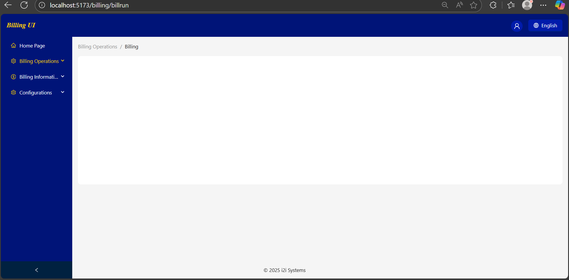
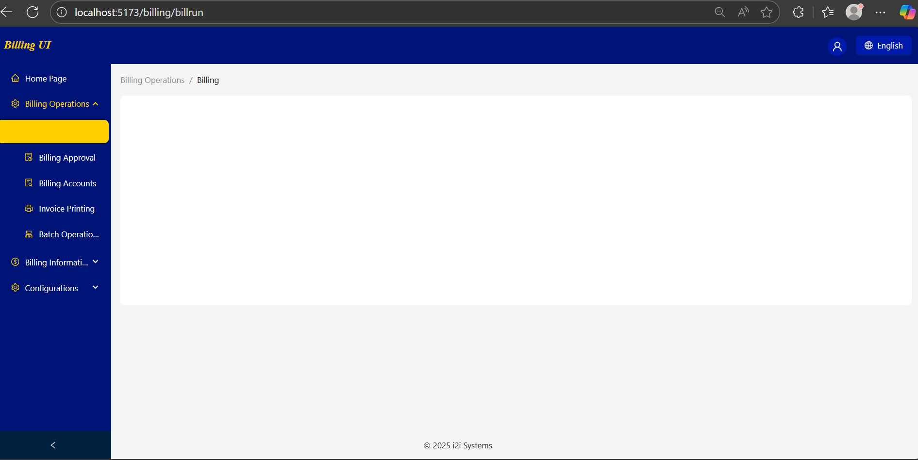
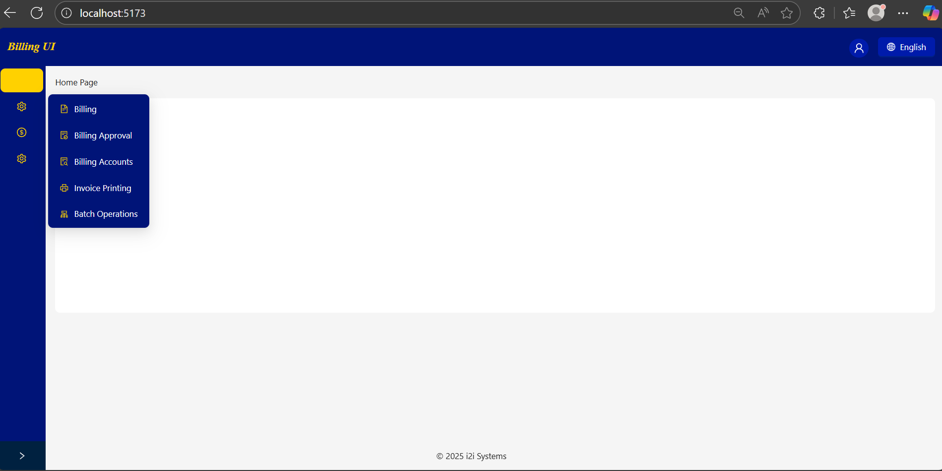
🖼 Preview
Example layouts built with masuno
🌟 Features
- BaseLayout Component: A complete layout including header, sidebar, content area, and footer.
- Multi-level Menus: Supports nested navigation with breadcrumbs.
- Dynamic Breadcrumbs: Automatically tracks menu path and generates breadcrumbs.
- Theme Support: Customize colors, fonts, and sidebar styles.
- Multi-language Support: Pass available languages to the header and manage language state via Jotai.
- Routing Integration: Fully compatible with React Router v7.
- Icon Support: Works seamlessly with Ant Design Icons.
This library is particularly useful for:
- Enterprise dashboards
- Billing and finance applications
- Multi-role admin interfaces
- Applications requiring consistent layout and theme
🛠 Technologies Used
- React 19
- TypeScript
- React Router DOM v7
- Ant Design v5
- Jotai (state management)
Peer Dependencies:
"peerDependencies": {
  "antd": "^5.27.4",
  "jotai": "^2.15.0",
  "react": "^19.1.1",
  "react-dom": "^19.1.1",
  "react-router-dom": "^7.9.4"
}
Installation
npm install masuno
🚀 Usage Example
import React from "react";
import { Route, Routes } from "react-router-dom";
import BaseLayout from "my-react-ui-library/layouts/base-layout";
import { HomeOutlined, FileTextOutlined, SettingOutlined } from "@ant-design/icons";
import { theme } from "my-react-ui-library/config/theme";
import type { MenuItem } from "my-react-ui-library/types";

// Helper function to create menu items
function getItem(
  label: React.ReactNode,
  key: React.Key,
  path?: string,
  children?: MenuItem[],
  icon?: React.ReactNode
): MenuItem {
  return { key, path, children, label, icon } as MenuItem;
}

// Menu configuration
const items: MenuItem[] = [
  getItem('Home Page', '1', '/', undefined, <HomeOutlined />),
  getItem('Billing Operations', 'sub1', undefined, [
    getItem('Billing', '3', '/billing/billrun', undefined, <FileTextOutlined />)
  ], <SettingOutlined />)
];

function App() {
  return (
    <BaseLayout
      theme={theme}
      menuItems={items}
      username="Yagmur"
      footerContent="© 2025 Okan Çezik"
      availableLangs={[
        { key: "EN", label: "English" },
        { key: "FR", label: "Français" },
        { key: "ES", label: "Español" }
      ]}
    >
      <Routes>
        <Route path="/" element={<div>Dashboard content</div>} />
      </Routes>
    </BaseLayout>
  );
}

export default App;
🎨Theme Customization
export const theme = {
  primaryColor: "#001BAB",
  fontFamily: "Tahoma, sans-serif",
  borderRadius: 8,
  headerBackground: "#001478",
  siderTheme: {
    backgroundColor: "#001478",
    itemColor: "white",
    iconColor: "#FFD100",
    hoverBackgroundColor: "#FFD100",
    selectedItemColor: "#FFD100"
  }
};
Props Overview (BaseLayout)
| Prop | Type | Description |
| ---------------- | ----------------- |------------------------------------------------------------------------|
| children | ReactNode | Main content to render inside the layout. |
| menuItems | MenuItem[] | Array of menu items for sidebar navigation. Supports multi-level menus. |
| footerContent | string | Optional footer text. |
| theme | Theme | Theme configuration object for colors, fonts, and sidebar styles. |
| username | string | Username displayed in the header. (login username) |
| availableLangs | LanguageProps[] | List of available languages displayed in the header language selector. |
| onLogout | () => void | Logout callback function. |
| headerImage | ReactNode | Optional logo or image displayed in the header. |