
matts-dinner-component-library
v1.0.7
Published
Bibliothèque de composants React pour interface de kiosque de restauration rapide. Publiée sur npm.

Readme
🍔 Matt's Diner Component Library
Bibliothèque de composants React pour interface de kiosque de restauration rapide. Publiée sur npm.
Le projet
Reproduction de mon design Figma vers Storybook pour une borne de commande tactile type McDonald's/KFC. Cette librairie est consommée par l'application Matt's Diner.
⚠️ Interface Kiosque (1080×1920)
Ce projet simule une borne de commande de restaurant.
Meilleur affichage : Desktop ou tablette en mode portrait.
Installation
npm install matts-dinner-component-libraryimport { Button, Header, ProductCard } from 'matts-dinner-component-library'
import 'matts-dinner-component-library/dist/matts-dinner-component-library.css'Liens
- npm : matts-dinner-component-library
- Storybook live : Netlify
- Code source : GitHub
- App qui consomme la librairie : Matt's Diner
Stack technique
React 19 • Storybook 10 • Vite (library mode) • CSS • npm
Composants (11)
- Badge — Indicateurs de statut (Nouveau, Populaire) avec variantes square/pill et couleurs
- Button — Boutons d'action avec variantes (primary-black, primary-white, danger) et tailles multiples
- CartFooter — Footer avec résumé panier (bounce animation) ou boutons de navigation, intègre le LanguageSelector. Accepte des labels traduits via props
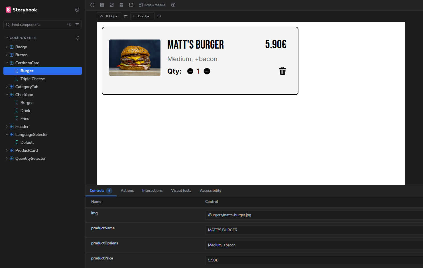
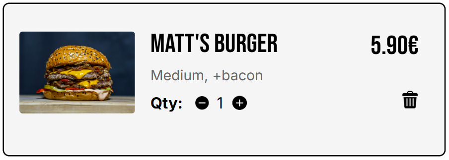
- CartItemCard — Article dans le panier avec image, options, prix et suppression
- CategoryTab — Navigation par catégorie avec highlight de l'onglet actif
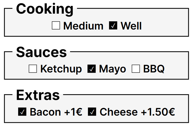
- Checkbox — Personnalisation produit par type (burger, fries, nuggets, hot-drink, cold-drink, ice-cream). Accepte des labels traduits via props
- Header — En-tête avec logo, bouton retour et icône panier (affichage conditionnel)
- LanguageSelector — Drapeaux FR/EN avec animation au clic, remonte la langue choisie via callback
- ProductCard — Carte produit avec image, badge optionnel, nom et prix
- ProductHero — Image héro pour la page détail produit
- QuantitySelector — Sélecteur +/- avec label personnalisable
Architecture
La librairie est conçue pour être indépendante de toute logique métier. Elle ne gère ni les traductions, ni le state global, ni la navigation. Tout est passé via props et callbacks, ce qui permet à l'application consommatrice de garder le contrôle.
Exemple : les labels des boutons dans CartFooter sont passés en props (viewCartLabel, menuLabel, clearCartLabel), permettant la traduction sans installer i18n dans la librairie.
📸 Figma → Storybook
| Composant | Figma | Storybook |
|-----------|-------|-----------|
| CartItemCard | 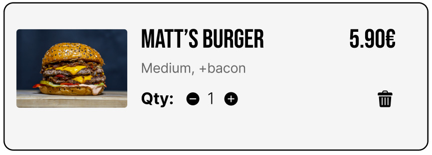 |
|  |
| Checkbox |
|
| Checkbox | 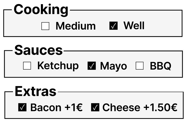 |
|  |
|
Défis techniques résolus
1. Conflits CSS entre composants
- Problème : Classes génériques (
.card-container) créaient des conflits - Solution : Nommage scopé par composant (
.cart-item-card)
2. Chargement Google Fonts dans Storybook
- Problème :
@importCSS instable - Solution :
.storybook/preview-head.html
3. Composants réutilisables et traduisibles
- Problème : Textes hardcodés empêchaient la traduction
- Solution : Props avec fallbacks (ex:
{viewCartLabel || 'VIEW CART'}) pour que l'app passe les textes traduits sans que la librairie dépende d'i18n
4. Publication npm
- Problème :
npm linkne fonctionne pas sur les services de déploiement (Netlify) - Solution : Publication sur npm avec React en
peerDependenciespour éviter les doublons, versioning sémantique
5. Build en mode library avec Vite
- Problème : Bundler les composants et les assets pour la distribution
- Solution : Vite library mode +
cpy-clipour copier les assets dans le dist
Apprentissages
Premier projet de bibliothèque de composants. Basé sur un design réalisé par mes soins.
J'ai appris :
- Architecture de composants React réutilisables via props et callbacks
- Scoping CSS et conventions de nommage
- Configuration Storybook avec stories par variante
- Build en mode library avec Vite
- Publication et versioning npm (semver, peerDependencies)
- Reproduction fidèle de designs Figma
Démarrage
npm install
npm run storybook