
mcp-popup-ui
v1.1.0
Published
MCP server that provides interactive popup UI tools for user input collection
Maintainers
 jens-duttke
Readme
mcp-popup-ui
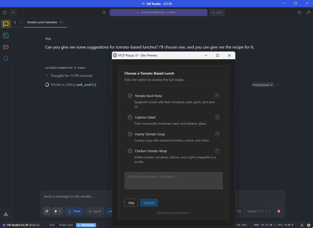
An MCP (Model Context Protocol) server that lets AI assistants ask you questions through a visual popup in your browser - instead of just printing text options.
What This Does
When you chat with an AI assistant (like GitHub Copilot, Claude, or a local LLM), the AI sometimes needs your input - for example, "Which framework do you want?" or "Select the features to include."
Without this tool, the AI would print a numbered list and ask you to type your choice. With mcp-popup-ui, a clean popup opens in your browser where you can click your selection directly.
Two tools are provided:
| Tool | Purpose | UI Element |
|------|---------|------------|
| ask_user | Pick exactly one option | Radio buttons |
| ask_user_multiple | Pick one or more options | Checkboxes |
Installation
Install globally via npm:
npm install -g mcp-popup-uiOr run directly without installing:
npx y- mcp-popup-uiRequirements: Node.js 18 or higher.
Setup
Choose the setup guide for your AI application:
VS Code (GitHub Copilot)
Open your project folder in VS Code
Create or edit the file
.vscode/mcp.json:{ "servers": { "popup-ui": { "command": "npx", "args": ["mcp-popup-ui"] } } }Restart VS Code or reload the window
LM Studio
Open LM Studio settings
Navigate to the MCP Servers section
Add a new server with these settings:
{
  "mcp-popup-ui": {
    "command": "npx",
    "args": ["mcp-popup-ui"]
  }
}
Enable the server and start a new chat
Ollama (via Open WebUI or similar)
Ollama itself does not natively support MCP. However, you can use it with frontends that support MCP, such as Open WebUI with MCP plugins. The configuration depends on your specific frontend - consult its documentation for adding MCP servers.
Claude Desktop
Add to your Claude Desktop configuration file:
- Windows:
%APPDATA%\Claude\claude_desktop_config.json - macOS:
~/Library/Application Support/Claude/claude_desktop_config.json
{
  "mcpServers": {
    "popup-ui": {
      "command": "npx",
      "args": ["mcp-popup-ui"]
    }
  }
}
Restart Claude Desktop after saving.
Copilot Instructions (Optional)
To ensure the AI uses the popup tools automatically instead of listing options in text, add this to your project's .github/copilot-instructions.md:
## User Input Collection

Use MCP tools for user choices:

- `ask_user` - single selection (radio buttons)
- `ask_user_multiple` - multiple selection (checkboxes)

Use these tools when presenting options like framework choices, implementation approaches, or any list of alternatives.
Tool Reference
ask_user
Displays a popup with radio buttons. The user picks exactly one option.
Parameters:
| Parameter | Required | Description |
|-----------|----------|-------------|
| options | Yes | Array of options (minimum 2). Each option has a label (required), optional description, and optional recommended flag. |
| title | No | Heading displayed above the options |
| description | No | Additional text displayed below the title |
| allow_other | No | If true, adds a text field for custom input |
| other_label | No | Label for the custom input option (default: "Other") |
Example call:
{
  "options": [
    { "label": "React", "description": "Component-based UI library" },
    { "label": "Vue", "description": "Progressive JavaScript framework" },
    { "label": "Svelte", "description": "Compile-time framework", "recommended": true }
  ],
  "title": "Choose a Frontend Framework",
  "description": "Select one framework for your project."
}
Response:
{
  "action": "submit",
  "selection": "Svelte"
}
If the user clicks Skip:
{
  "action": "skip"
}
ask_user_multiple
Displays a popup with checkboxes. The user picks one or more options.
Parameters:
| Parameter | Required | Description |
|-----------|----------|-------------|
| options | Yes | Array of options (minimum 2). Each option has a label (required), optional description, and optional recommended flag. |
| title | No | Heading displayed above the options |
| description | No | Additional text displayed below the title |
| allow_other | No | If true, adds a text field for custom input |
| other_label | No | Label for the custom input option (default: "Other") |
Example call:
{
  "options": [
    { "label": "TypeScript", "recommended": true },
    { "label": "ESLint" },
    { "label": "Prettier" },
    { "label": "Jest" }
  ],
  "title": "Select Project Features",
  "description": "Choose all features to include."
}
Response:
{
  "action": "submit",
  "selections": ["TypeScript", "ESLint", "Prettier"]
}
Additional Features
- Skip button: Users can skip any question without selecting an option
- Comments field: Users can add additional notes with their selection
- Explanation request: Users can ask for more details about an option before deciding
- Markdown support: Option descriptions support Markdown formatting
Documentation
- Tool Design Best Practices - Research on LLM tool design patterns
Contributing
See CONTRIBUTING.md for development setup and guidelines.
License
MIT