
meticulous-ui
v3.12.2
Published
A comprehensive React UI component library with a wide range of customizable components, icons, colors, and utilities for building modern web applications.

Maintainers
 xe3110
Keywords
Readme
meticulous-ui



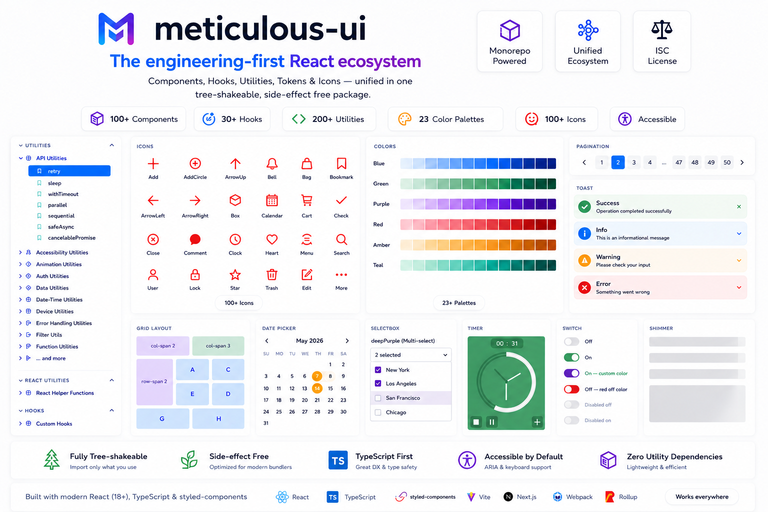
An engineering-first React ecosystem — components, hooks, utilities, tokens, and icons unified in a single tree-shakeable package.
Built for scalable, production-grade applications.
⚡ Fully tree-shakeable
🪶 Side-effect free
🎯 TypeScript-first
♿ Accessible by default
💅 styled-components
Why meticulous-ui?
Modern frontends rely on fragmented ecosystems:
- 🧩 One package for components
- 🪝 Another for hooks
- 🔧 Another for utilities
- 🎨 Another for icons
- 🎯 Another for tokens
This leads to:
- 📦 Dependency bloat
- ⚠️ Inconsistent APIs
- 🏋️ Larger bundles
- 🔧 Growing maintenance overhead
meticulous-ui consolidates all of it into one install while staying fully tree-shakeable — you only pay for what you import.
Why not multiple packages?
Most frontend ecosystems force developers to combine disconnected packages — each with its own API conventions, versioning, peer dependency conflicts, and documentation. The result is a fragmented developer experience that compounds over time.
meticulous-ui treats components, hooks, utilities, tokens, and foundations as a single cohesive system — designed together, versioned together, and documented together. One mental model. One import. One upgrade.
Best suited for
- Enterprise dashboards and internal tools
- Design system foundations
- Frontend platform teams
- TypeScript-heavy projects
- Performance-sensitive applications
Installation
npm install meticulous-ui
# or
yarn add meticulous-ui
Peer dependencies
npm install react@^18 react-dom@^18 styled-components@^6Quick Start
import { Button, Input, Toast, Shimmer, useLocalStorage, validateEmail } from 'meticulous-ui';
import blue from 'meticulous-ui/colors/blue';

function App() {
  const [email, setEmail] = useLocalStorage<string>('email', '');

  const handleSubmit = () => {
    if (!validateEmail(email)) {
      Toast.error('Invalid email');
      return;
    }
    Toast.success('Submitted successfully');
  };

  return (
    <>
      <Shimmer width={200} height={20} />
      <Input label='Email' color='blue' value={email} onChange={(e) => setEmail(e.target.value)} />
      <Button theme={blue} onClick={handleSubmit}>
        Submit
      </Button>
    </>
  );
}
For minimal bundle size, import directly from component paths:
import Button from 'meticulous-ui/components/Button';
import blue from 'meticulous-ui/colors/blue';
meticulous-ui is fully tree-shakeable and side-effect free — optimized for Vite, Webpack, Rollup, and Next.js.
Documentation & Storybook
Full interactive docs: https://meticulous-ui.vercel.app/
- Colors → Tokens: Colors
- Icons → Tokens: Icons
- Hooks → Custom Hooks
- Utilities → Engineering Utilities
- React helpers → React Utilities
Ecosystem Architecture
meticulous-ui is organized into layered abstractions. Higher layers build on lower ones; you can use any layer independently.
┌─────────────────────────────────────────────────┐
│                   Organisms                     │  Complex production-ready UI systems
│         Toast · Pagination · VideoPlayer        │
├─────────────────────────────────────────────────┤
│                   Molecules                     │  Composed interactive components
│      Dropdown · DatePicker · OtpInput           │
├─────────────────────────────────────────────────┤
│                    Atoms                        │  Basic UI building blocks
│       Button · Input · Checkbox · Switch        │
├─────────────────────────────────────────────────┤
│                  Foundations                    │  Layout & application primitives
│              Grid · RootComponent               │
├──────────────────┬──────────────────────────────┤
│      Hooks       │       Utilities              │  Reusable logic, framework-agnostic
│  useLocalStorage │  validateEmail · formatDate  │
├──────────────────┴──────────────────────────────┤
│                   Tokens                        │  Design primitives
│       23 color palettes · 100+ SVG icons        │
└─────────────────────────────────────────────────┘
Components
Core UI
Button · Input · Textarea · Checkbox · RadioGroup · Dropdown · Selectbox · Switch · Link
Feedback & Loading
Toast · ToastContainer · Spinner · Loader · PageLoader · Shimmer
Overlays & Navigation
Modal · Pagination · Carousel
Forms & Productivity
OtpInput · FileUploader · DatePicker
Media
Image · VideoPlayer
Typography
H1–H6 · P
Utility
Timer · RootComponent
Tokens
Colors
23 production-ready palettes (blue, red, green, amber, grey, cider, and more) with multiple shades each.
→ Explore colors
Icons
100+ modern SVG icons across categories: arrows, commerce, social, media, security, UI controls.
→ Explore icons
Hooks
Custom hooks organized by purpose:
| Category | Examples |
| ----------- | -------------------------------------- |
| State | useToggle, useCounter |
| Lifecycle | useMountEffect, usePrevious |
| Storage | useLocalStorage, useSessionStorage |
| DOM/Browser | useMediaQuery, useClickOutside |
| Utility | useDebounce, useThrottle |
Engineering Utilities
Production-focused utility functions organized by domain:
| Category | Examples |
| -------------- | ------------------------------ |
| Validation | validateEmail, validateUrl |
| String | truncate, slugify |
| Number | clamp, formatCurrency |
| Date-time | formatDate, timeAgo |
| API | retry, debounceAsync |
| Auth | token helpers |
| Feature flags | isFeatureEnabled |
| Accessibility | getFocusableElements |
| Performance | memoize, measureTime |
| Error handling | tryCatch, safeJSON |
| Storage | safeGet, safeSet |
React Utilities
Helper functions for scalable React patterns:
lazyImport— code-split any module with a consistent APIcomposeProviders— flatten deeply nested providerswithSuspense— wrap any component with a Suspense boundarymemoCompare— custom comparator forReact.memo
Performance
meticulous-ui is built to have zero performance cost at the bundler level.
- ⚡ Fully tree-shakeable — unused code is eliminated at build time
- 🪶 Side-effect free — safe for aggressive dead code elimination
- 📦 Import only what you use — one component, one hook, or the whole library
- 🔀 ESM + CJS — works with every modern bundler and runtime
- 🚀 Optimized for Vite, Webpack, Rollup, and Next.js — no config needed
// pays for Button only — nothing else ships
import Button from 'meticulous-ui/components/Button';

// or use named imports — tree-shaking handles the rest
import { Button, useLocalStorage } from 'meticulous-ui';
Bundle size: bundlephobia.com/package/meticulous-ui
Philosophy
- Minimal dependencies — no opinion on state management or routing
- Consistent developer experience — predictable APIs across all layers
- Accessibility by default — ARIA + semantic HTML throughout
- Performance-first — tree-shakeable, side-effect free, zero external CSS
- Scalable architecture — layered design you can adopt incrementally
Development Setup
npm install      # install dependencies
npm run dev      # start Storybook dev server
npm run build    # build the library
Contributing
Contributions, bug reports, and feature requests are welcome.
Adding a component
- Create the component under
src/components/<ComponentName>/ - Export it from the component's
index.tsand from the rootsrc/index.ts - Add a Storybook story under
src/stories/ - Use color tokens from
src/colors/— never hardcode hex values
Adding a hook or utility
- Add the function to the appropriate file under
src/hooks/orsrc/utils/ - Export it from the root
src/index.ts - Add a Storybook story or docs entry if it has non-obvious usage
General guidelines
- All public APIs must be typed — no
any - Stories act as documentation; write them for the consumer, not the implementer
- Open an issue or discussion first for significant changes
Changelog
See CHANGELOG.md for release history and migration guides between major versions.
License
ISC