
miles-tree-map
v1.0.42
Published
A React component for rendering interactive treemaps
Maintainers
 dmiles77
Readme
Miles Tree Map
Live Demo - Check out the interactive demo to see the component in action!
A powerful and customizable TreeMap visualization component for React, featuring infinite drill-down capabilities, smooth animations, and extensive customization options. This component is not just a chart, it's a responsive layout that can render custom components within each node, providing a dynamic and interactive user experience. Basically render anything you want based on the hierarchical data structure.
📦 Installation
You can install the package via NPM:
npm install miles-tree-mapOr with Yarn:
yarn add miles-tree-map🚀 Usage
Here's an example of how to use the TreeMap component in a React application:
import React from "react";
import { TreeMap, TreeNode } from "miles-tree-map";
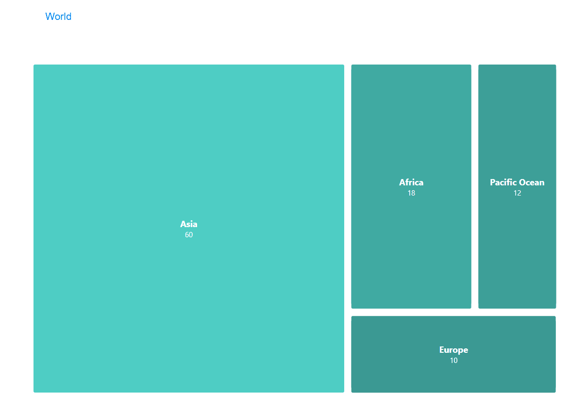
const worldMap = {
"id": "world",
"name": "World",
"customData": { "description": "The entire world population and landmass" },
"children": [
{
"id": "asia",
"name": "Asia",
"customData": { "population": "4.7 billion", "area": "44.58 million km²" },
"children": [
{
"id": "china",
"name": "China",
"customData": { "population": "1.4 billion", "capital": "Beijing" },
"children": [
{
"id": "beijing",
"name": "Beijing",
"value": 20,
"customData": { "population": "21.9 million", "area": "16,410.54 km²" }
},
{
"id": "shanghai",
"name": "Shanghai",
"value": 15,
"customData": { "population": "24.9 million", "area": "6,340.5 km²" }
}
]
},
{
"id": "india",
"name": "India",
"customData": { "population": "1.4 billion", "capital": "New Delhi" },
"children": [
{
"id": "delhi",
"name": "Delhi",
"value": 15,
"customData": { "population": "32.2 million", "area": "1,484 km²" }
},
{
"id": "mumbai",
"name": "Mumbai",
"value": 10,
"customData": { "population": "24.9 million", "area": "603.4 km²" }
}
]
}
]
},
{
"id": "africa",
"name": "Africa",
"customData": { "population": "1.3 billion", "area": "30.37 million km²" },
"children": [
{
"id": "nigeria",
"name": "Nigeria",
"customData": { "population": "223 million", "capital": "Abuja" },
"children": [
{
"id": "lagos",
"name": "Lagos",
"value": 7,
"customData": { "population": "16.6 million", "area": "1,171 km²" }
},
{
"id": "kano",
"name": "Kano",
"value": 3,
"customData": { "population": "4.1 million", "area": "499 km²" }
}
]
},
{
"id": "egypt",
"name": "Egypt",
"customData": { "population": "112 million", "capital": "Cairo" },
"children": [
{
"id": "cairo",
"name": "Cairo",
"value": 5,
"customData": { "population": "21.3 million", "area": "3,085 km²" }
},
{
"id": "alexandria",
"name": "Alexandria",
"value": 3,
"customData": { "population": "5.4 million", "area": "2,679 km²" }
}
]
}
]
},
{
"id": "europe",
"name": "Europe",
"customData": { "population": "748 million", "area": "10.18 million km²" },
"children": [
{
"id": "germany",
"name": "Germany",
"customData": { "population": "84.5 million", "capital": "Berlin" },
"children": [
{
"id": "berlin",
"name": "Berlin",
"value": 4,
"customData": { "population": "3.8 million", "area": "891.7 km²" }
},
{
"id": "munich",
"name": "Munich",
"value": 2,
"customData": { "population": "1.5 million", "area": "310.4 km²" }
}
]
},
{
"id": "france",
"name": "France",
"customData": { "population": "66.5 million", "capital": "Paris" },
"children": [
{
"id": "paris",
"name": "Paris",
"value": 3,
"customData": { "population": "2.1 million", "area": "105.4 km²" }
},
{
"id": "marseille",
"name": "Marseille",
"value": 1,
"customData": { "population": "870,000", "area": "240.6 km²" }
}
]
}
]
},
{
"id": "pacific_ocean",
"name": "Pacific Ocean",
"value": 12,
"customData": { "area": "165.2 million km²", "description": "Largest and deepest ocean" }
}
]
};
const Example: React.FC = () => {
const data: TreeNode = worldMap;
return (
<div style={{width: '100vw', height: '100vh'}}>
<TreeMap data={data} />
</div>
)
}In this example, the worldMap object represents the hierarchical data structure to be visualized. The TreeMap component renders this data, providing an interactive and responsive layout.
Note: The TreeNode interface defines the structure of each node in the tree, including properties like id, name, value, children, and customData.
🔧 Props
| Prop | Type | Default | Description |
|------|------|---------|-------------|
| data | TreeNode | Required | Hierarchical data structure for the tree map |
| renderComponent | (props: ICustomNodeProps) => JSX.Element | undefined | Custom component for node rendering |
| colorRange | string[] | ['#4ecdc4', '#ff6b6b'] | Colors used for node visualization |
| colorRangeBehavior | ColorRangeBehavior | 'heatmap' | Color distribution strategy |
| onNodeClick | (node: TreeNode) => void | undefined | Callback for node click events |
| animationDuration | number | 500 | Duration of transitions in ms |
| breadcrumbEnabled | boolean | true | Show navigation breadcrumbs |
| backButtonEnabled | boolean | true | Show back button in nodes |
| paddingInner | number | 10 | Spacing between nodes |
| paddingOuter | number | 50 | Spacing around the treemap |
| borderRadius | number | 2 | Node corner radius |
| tooltipEnabled | boolean | true | Enable hover tooltips |
| customTooltipPosition | TooltipPosition | 'mouseRight' | Tooltip positioning |
| customTooltipStyle | React.CSSProperties | undefined | Custom tooltip styling |
| tooltipComponentRender | (props: ICustomTooltipProps) => JSX.Element | undefined | Custom tooltip component |
🎨 Color Range Behaviors
The colorRangeBehavior prop supports these options:
oneColor: Single color for all nodesgradient: Smooth transition between colors based on valuediscrete: Distinct colors from the rangetransparent: No background colorborderOnly: Only shows colored borders around nodes with transparent backgrounds; creates a "wireframe" lookrandom: Selects a single random color from predefined color schemes; all nodes get the same colorrandomRangeColor: Creates a gradient using the first and last colors from a randomly selected predefined color schemewild: Selects one of five predefined color schemes (Vibrant, Ocean, Forest, Sunset, or Pastel) and assigns each node a random color from that schemeheatmap: Value-based color intensity
📍 Tooltip Positions
Available customTooltipPosition options:
Mouse-following positions:
mouseRight: Tooltip appears to the right of the cursormouseTop: Tooltip appears above the cursormouseBottom: Tooltip appears below the cursor
Fixed positions:
fixedTopLeft: Fixed at the top-left corner of the TreeMapfixedTopRight: Fixed at the top-right corner of the TreeMapfixedBottomLeft: Fixed at the bottom-left corner of the TreeMapfixedBottomRight: Fixed at the bottom-right corner of the TreeMapfixedTopCenter: Fixed at the top-center of the TreeMapfixedBottomCenter: Fixed at the bottom-center of the TreeMap
Node-relative positions:
nodeTopLeft: Positioned above the top-left corner of the hovered nodenodeTopRight: Positioned above the top-right corner of the hovered nodenodeBottomLeft: Positioned below the bottom-left corner of the hovered nodenodeBottomRight: Positioned below the bottom-right corner of the hovered nodenodeTopCenter: Positioned above the center of the hovered nodenodeBottomCenter: Positioned below the center of the hovered node
Mouse-following and node-relative positions are automatically adjusted to stay within the TreeMap container's boundaries, while fixed positions always remain in the same location regardless of cursor position.
🎯 Custom Components
Custom Node Component
To render custom content within each node, you can provide a renderComponent prop to the TreeMap component. This prop should be a function that returns a JSX element.
import React from "react";
import { TreeMap, TreeNode, ICustomNodeProps } from "miles-tree-map";

const CustomNode: React.FC<{ componentProps: ICustomNodeProps }> = ({ componentProps }) => {
  const { node, width, height, backgroundColor, borderColor, borderWidth, handleBack, history } = componentProps;

  return (
    <div style={{
      width: `${width}px`,
      height: `${height}px`,
      backgroundColor,
      border: borderColor ? `${borderWidth || 1}px solid ${borderColor}` : 'none',
      padding: '5px',
      boxSizing: 'border-box'
    }}>
      <strong>{node.name}</strong>
      {node.customData && <p>{node.customData.description}</p>}
    </div>
  );
};

const App: React.FC = () => (
  <TreeMap
    data={data}
    renderComponent={(props) => <CustomNode componentProps={props} />}
  />
);

export default App;
Custom Tooltip Component
For a customized tooltip, you can provide a tooltipComponentRender prop to the TreeMap component. This function receives enhanced positioning information to help you create perfectly positioned tooltips.
<TreeMap
  data={data}
  tooltipComponentRender={(props) => {
    const {
      node,
      position,            // Raw mouse position
      containerWidth,      // TreeMap container width
      containerHeight,     // TreeMap container height
      calculatedPosition,  // Pre-calculated optimal position (boundary-aware)
      tooltipPosition      // User preference (mouseRight, mouseTop, etc.)
    } = props;

    return (
      <div style={{
        position: 'absolute',
        left: calculatedPosition?.left,
        top: calculatedPosition?.top,
        backgroundColor: 'rgba(0, 0, 0, 0.8)',
        color: 'white',
        padding: '10px',
        borderRadius: '5px',
        maxWidth: '250px'
      }}>
        <h3>{node.name}</h3>
        {node.customData && (
          <pre style={{ margin: "0", whiteSpace: "pre-wrap" }}>
            {JSON.stringify(node.customData, null, 2)}
          </pre>
        )}
      </div>
    );
  }}
/>
The enhanced tooltip props provide both raw positioning data and boundary-aware calculated positions, giving you maximum flexibility for custom tooltips.
📊 Data Structure
interface TreeNode {
  id: string;
  name: string;
  value?: number;
  children?: TreeNode[];
  customData?: Record<string, unknown>;
}
🌟 Features
- Infinite drill-down navigation with smooth transitions
- Breadcrumb navigation for easy backtracking
- Smart tooltips with boundary-aware positioning
- Multiple color schemes including border-only mode
- Responsive layout that adapts to container size
- Custom component rendering for both nodes and tooltips
- React 16.8+ support through 19.0.0
- TypeScript support with comprehensive type definitions
- Customizable animation timing and transitions
- Optimized rendering for large datasets
🔄 Recent Updates
- Enhanced Tooltip System: Tooltips now respect container boundaries and provide comprehensive positioning information to custom tooltip renderers
- Improved Border-Only Mode: Fixed issues with the
borderOnlycolor behavior to properly display node borders - React 19 Support: Added compatibility with React 19.0.0
- Performance Improvements: Enhanced rendering efficiency for large datasets
- Border Style Props: Added support for custom border colors and widths in node components
🛠️ Underlying Libraries
The miles-tree-map component leverages several libraries to provide its functionality:
- React: A JavaScript library for building user interfaces, enabling the creation of reusable UI components.
- D3.js: A powerful library for producing dynamic, interactive data visualizations in web browsers. Specifically, miles-tree-map utilizes the d3-hierarchy module for treemap layouts.
- TypeScript: A statically typed superset of JavaScript that provides optional static typing and class-based object-oriented programming.
⚙️ Compatibility
Compatible with React versions 16.8.0 through 19.0.0.
📧 Support
Found a bug or want to add a feature? Please contact: [email protected]
📜 License
MIT License © 2025 dmiles77
Have fun!