
mk-toast
v2.0.2
Published
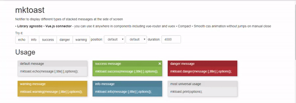
Flash messages (notifications/toast). Library agnostic with VUE.js connector. Smooth CSS animation with no twitching.
Maintainers
 mkant
mkantReadme
mk-toast
Library agnostic notifier with Vue.js connector. Mobile friendly and compact. Smooth CSS animation with no twitching. Typings are included for TypeScript integration and better IDE experience.
Installation
npm install mk-toastInclusion
Build systems
import mktoast from 'mk-toast';
// Don't forget to include css styles from 'mk-toast/dist/mk-toast.css'
Browser
<link  href="nodes_modules/mk-toast/dist/mk-toast.min.css" rel="stylesheet">
<script src="nodes_modules/mk-toast/dist/mk-toast.min.js"></script>
Usage
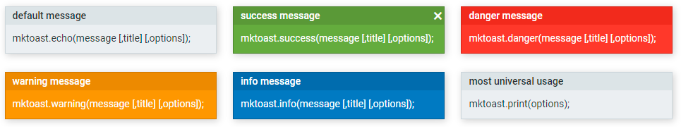
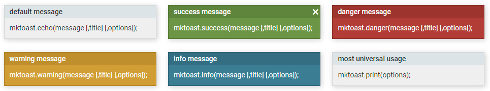
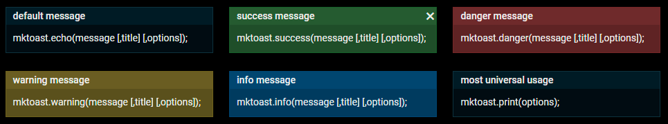
mktoast.echo   (message [,title] [,options]);
mktoast.success(message [,title] [,options]);
mktoast.danger (message [,title] [,options]);
mktoast.warning(message [,title] [,options]);
mktoast.info   (message [,title] [,options]);

// most generic usage
mktoast.print(options);
Vue.js
To use it anywhere inside components (without inclusion in every file), add in main.js:
import mktoastVue from 'mk-toast/vue';
// if you want non-default theme insert it here:
// import "mk-toast/dist/mk-toast-alt.css";
Vue.use(mktoastVue);
You don't have to include default styles in this case, 'cos styles are already included in Vue connector.
Then inside vue component you can use this.$mktoast:
this.$mktoast.echo(message);To use it outside of componets (in vuex actions, for example), use regular es6 approach:
import mktoast from 'mk-toast';
mktoast.echo('your message');
Themes
Default colors are taken from Material Design palette. You only need to include mk-toast/dist/mk-toast.css into your project
Alt colors are taken from w3schools and originally collected by Pantone at New York Fashion week. You have to to include mk-toast/dist/mk-toast-alt.css after default styles.
Dark theme is also included. You have to include mk-toast/dist/mk-toast-dark.css after default styles.
Very small patch for rounded corners mk-toast/dist/mk-toast-rounded.css can be combined with any theme.

Customisation
You need to add your own CSS styles after default styles.
/* basic styles for all messages */
.mktoast-message {
  background-color: grey;
  color: black;
}
.mktoast-message .mktoast-message__title {
  background-color: black;
  color: white;
}
/* danger message */
.mktoast-message_danger {
  background-color: red;
  border-color: brown;
  color: black;
}
.mktoast-message_danger .mktoast-message__title {
  background-color: brown;
  color: white;
}
/* Other style modifiers:
    .mktoast-message_success {}
    .mktoast-message_warning {}
    .mktoast-message_info {}
*/
Options
| option | type | default | comment | | --------- | ------------ | -------------- | ---------------------------------------------------------------------------------------- | | position | string | 'right bottom' | Positioning of mktoast: left center right top bottom | | duration | milliseconds | 5000 | Time to keep toast message on screen | | container | HTMLElement | null | Parent HTMLElement of toast messages, default is document.body | | type | string | 'default' | Used only in mktoast.print(). Types of message: default, info, danger, success, warning. | | message | string | 'empty' | Used only in mktoast.print(). String or html code of message. | | title | string | undefined | Used only in mktoast.print(). String of toast title. |