
modally
v1.1.8
Published
Simple ES6 nested modals
Downloads
141
Maintainers
 stamat
Readme
🪟 Modally 
Your trusty nested modal ally
If there are many different variations of the same functionality, the rule says it's easy to make. And the same goes for web modal dialogues - they are super easy to make.
I created this web modal dialog library as a repo cause I wrote the same code for every project that required modals, over and over again throughout the years, just because it's trivial and I needed "5 minutes" to make it. It's not 5 minutes of course, it never is.
Life is short - make reusable code!
Features
- Simplest one yet - almost everything is automatic (or at least it should be 😅)
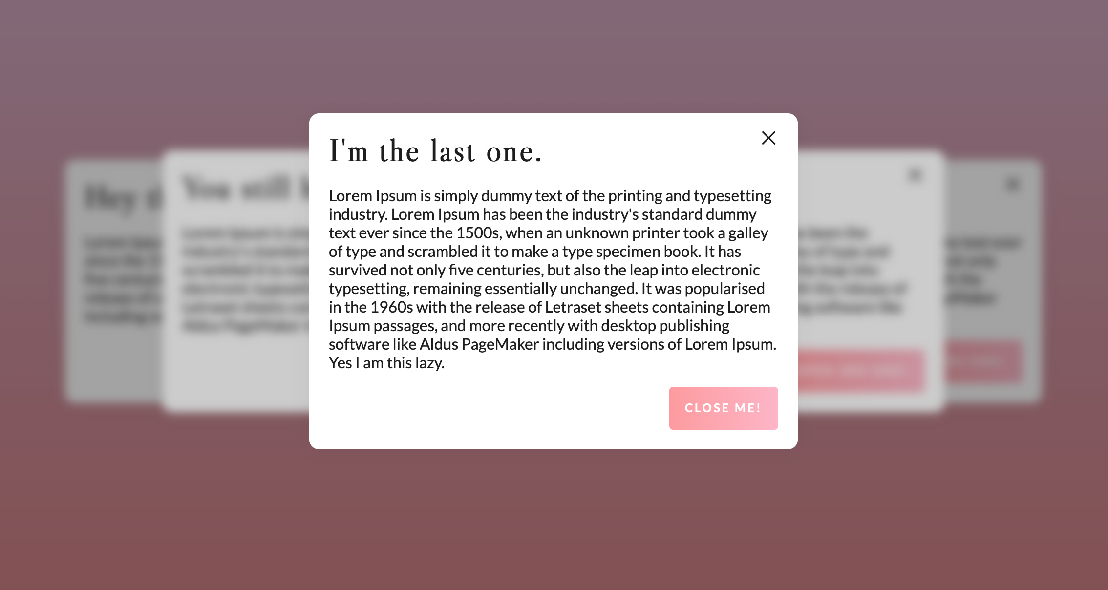
- Nested - automatic detection of the order or parent, no need for additional coding
- ESM and IIFE - use it as a module or as a script
- HTML auto-wrapped
- State body classes
- Vertically centered - doesn't need to be, but it can be
- Scroll blocking
- Video embeddable - automatic Vimeo, Youtube and HTML Video embeds with autoplay
- Image lightbox - automatic image lightbox
- ESC closable
- Hash change detection - automatic modal open on hash change
- Infinitely customizable - go f**king wild 🎉
- Framework agnostic - no dependencies, fully native! You can use it with jQuery if you want to,
$(selector).modally(options)a plugin is available if jQuery is present if you use this library as an IIFE script.
Installation
NPM
npm i modallyYarn
yarn add modallyUse it as a module
import Modally from 'modally';Or as an IIFE script, Modally will be available as a global class, or as a jQuery plugin if jQuery is present $(selector).modally(options)
CDN
As iife files
<script src="https://unpkg.com/modally/dist/modally.min.js"></script>
<link href="https://unpkg.com/modally/dist/modally.min.css" rel="stylesheet">
Or as a remote module
import Modally from 'https://unpkg.com/modally';Usage
Modally works with IDs. You need to apply a unique ID to each modal. If you are creating a modal from an existing element, it's ID will be used. If you are creating a modal with dynamic content (advanced usage), you need to provide an ID.
// TODO: OPENING AND CLOSING MODALS target="_modal:open:modal-id" target="_modal:close:modal-id" explained
// TODO: explain Modally class and the indexing of modals
// TODO: Document the selector option, make a distinction between modally options and modal options
Quick Start
<div id="your-content" hidden><h1>Hello world!</h1></div>
<a href="#your-content" target="_modal"></a>
const modally = new Modally();
//turns your content into a modal, wraps it nicely
modally.add('your-content');Youtube and Vimeo modals
const modally = new Modally();

//creates a video modal which looks for data-video and opens a Youtube or Vimeo embed within your modal
modally.add('your-video-modal', {video: true});
<a href="#your-video-modal" target="_modal" data-video="https://www.youtube.com/watch?v=u9QJo5fBADE">Youtube</a>
<button type="button" target="_modal:open:your-video-modal" data-video="https://vimeo.com/243244233">Vimeo</button>Image lightbox
const modally = new Modally();

//creates an image modal which looks for data-image and opens an image within your modal
modally.add('your-image-modal', {image: true});
<a href="#your-image-modal" target="_modal" data-image="https://picsum.photos/800/600" data-width="800" data-height="600">Image</a>
<a href="#your-image-modal" target="_modal" data-image="https://picsum.photos/600/800" data-width="600" data-height="800">Image 2</a>Advanced Usage
const modally = new Modally();
modally.add('advanced-example');

document.addEventListener('modally:open:advanced-example', function(e) {
	console.log(e.detail); // Modal instance, contains template, target, element (if any), options, etc.
	console.log(e.detail.target); // Target element, the one that triggered the modal open. If it exists that is, otherwise it is undefined. So in the case of this example it will be the <a> element with href="#advanced-example"
	e.detail.template.querySelector('.modally-content').innerHTML = 'Hello world!';
});
<a href="#advanced-example" target="_modal"></a>Properties
Property | Default | Accepts | Description
-------- | ------- | ------- | -----------
landing | document.body | string selector or element | where to append the modal window
disableScroll | true | boolean | Whether to disable scrolling on the body when modal is open
scrollToTop | true | boolean | Whether to scroll to top modal content upon opening a modal
maxWidth | 'none' | 'none' or number | Defines maximum width of the modal window, just like max-width css property
classes | '' | string | Additional classes to add to the modal window
verticalAlign | 'middle' | 'middle' or 'top' or 'bottom' | Vertical orientation of the modal window, like vertical-align css property
closeParent | false | boolean | Whether to close the parent modal window, parent window is automatically selected if a modal open is triggered within another modal
closeOthers | false | boolean | Wether to close all other opened modals upon opening this modal
enableHashChange | true | boolean | Whether to open a modal on hash change
closeOthersOnHashChange | false | boolean | Whether to close all other opened modals upon opening a modal on hash change
updateHash | false | boolean | Whether to update the hash when opening a modal. If set to true, the hash will be updated to the modal ID and the data attributes will be added to the hash as well in case of a video or image modal
video | false | boolean | For creating a video modal
image | false | boolean | For creating an image "lightbox" modal
autoplay | true | boolean | Whether video modal should autoplay
template | default modally template :point-down: | HTML string or element | Template of the modal window
Options can also be assigned via data attributes if you are creating a modal from an element. Attributes are named using the following pattern: modally-<option-name>, like so:
<div id="hello-world" modally-max-width="800" modally-vertical-align="top">
	<h1>Hello world!</h1>
</div>
const modally = new Modally();
modally.add('hello-world');Default template
<div class="modally-wrap">
<div class="modally-table">
<div class="modally-cell">
<div class="modally-underlay modally-close"></div>
<div class="modally" role="dialog" aria-modal="true">
<button tabindex="1" aria-label="Close" class="modally-close modally-close-button">×</button>
<div class="modally-content"></div>
</div>
</div>
</div>
</div>Events
Event | Description ----- | ----------- modally:added | modal was created modally:open | modal is being opening modally:opened | modal is opened modally:close | modal is being closed modally:closed | modal is closed
Modally events are named using the following pattern: namespace:action where namespace is modally and action is one of the above. Or namespace:action:modal-id where modal-id is the ID of the modal that is being opened/closed or added.
All events are dispatched on the document object and contain a detail property with the modal instance.
You can listen to a specific event of a specific modal via it's ID, by creating a listener to the event name consisted of the namespace + action + modal ID, like so:
document.addEventListener('modally:open:your-modal-id', function(e) {
	console.log(e.detail); // Modal instance, contains template, target, element (if any), options, etc.
});
or you can tune to all events of all modals and then check for the modal ID like so:
document.addEventListener('modally:open', function(e) {
	if (e.detail.id === 'your-modal-id') {
		console.log(e.detail); // Modal instance, contains template, target, element (if any), options, etc.
	}
});
Events without the modal ID (namespace + action only) are dispatched on the element that is used for modal creation and becomes it's content (if it exists of course) and on template element as well.
Tested with :heart:

License
MIT License
P.S. Here is an oxymoron for you: I'm one of these people who if they have the time to make something they don't use other people's code, not to have to spend time extending it if god forbids it happens to be needed. Life's not so short now, huh?