
morphing-scroll
v2.10.6
Published
React library for custom object scrolling and scrollbar styling
Downloads
1,290

Readme
〈 Table of contents 〉
〈 About 〉
morphing-scroll is a React library designed to overcome common limitations of native browser scrolling, including:
- Limited design customization
- Inconsistent cross-browser behavior
- Lack of horizontal scrolling support via the mouse wheel
The library includes optimizations for large lists, improving performance and overall scrolling behavior.
〈 Installation 〉
To install the library, use the following command:
npm install morphing-scrollNext, import the MorphScroll component into your React application:
import { MorphScroll } from "morphing-scroll";If you prefer, you can also import the entire library as a single object using the default export:
import Morph from "morphing-scroll";Start using the MorphScroll component by defining the required size prop. For better precision and control, it's recommended to begin by understanding the objectsSize and progressTrigger props, which are explained below.
✦ Note:
- Supports both ESM (
import) and CommonJS (require) builds.- The MorphScroll container can be styled with CSS, but avoid modifying properties that affect the size or positioning of internal elements.
- Components include identifying attributes and MorphScroll internals elements use the
ms-prefix for classes and attributes.- Due to frequent DOM updates for customization, performance may decrease when DevTools are open, as the browser needs extra resources to track changes.
- ! This library is currently under development. APIs and behavior may change in future releases.
〈 API 〉
Props:
— GENERAL —
<MorphScroll {...props} className="custom-class">
  {children}
</MorphScroll>
<MorphScroll {...props}>{children}</MorphScroll>— SCROLL —
type: "slider"; // or "scroll" | "sliderMenu"Default: "scroll" Description: defines how the provided progressElement behaves within progressTrigger and how you interact with it. scroll: the default value and represents a standard scrollbar. slider: displays distinct elements indicating the number of full scroll steps within the list. sliderMenu: like slider, but the progressElement is a menu, an you can provide custom buttons as an array in the progressElement. Example:
<MorphScroll {...props} type="slider">
  {children}
</MorphScroll>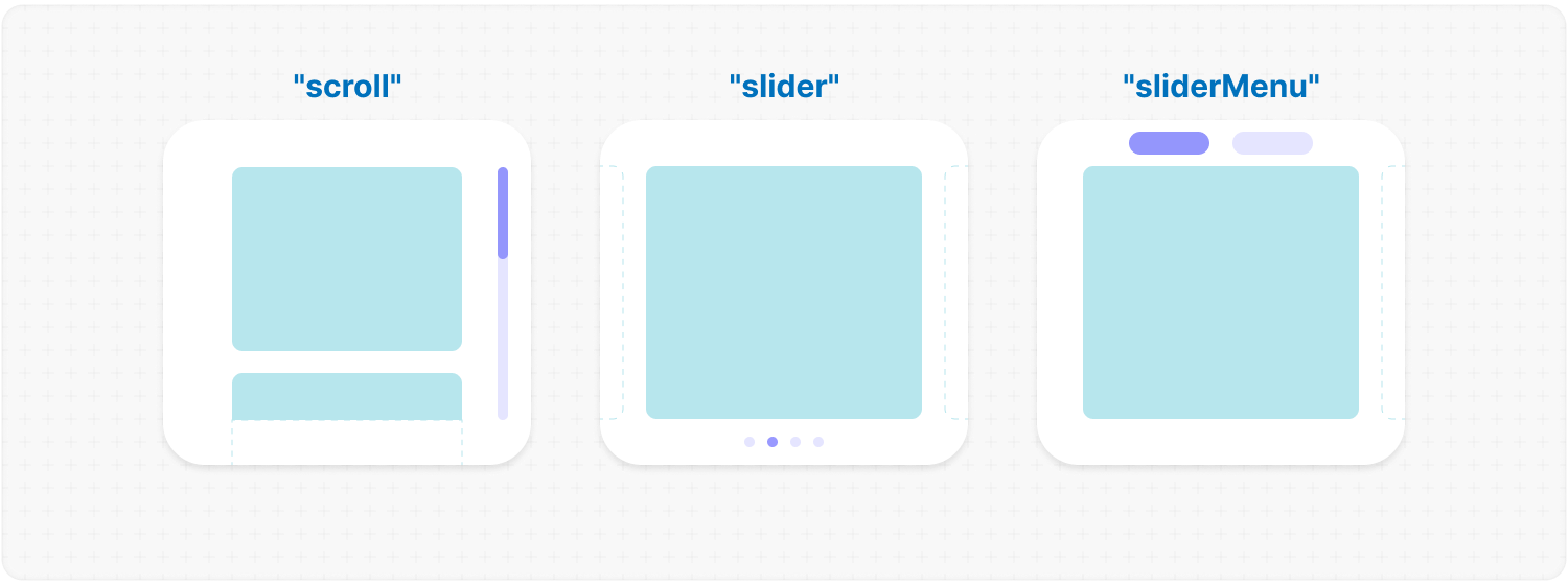
size: "x"; // or "y" | "hybrid"Default: "y" Description: changes the scroll or slider type direction based on the provided value. You can set the value to horizontal, vertical or hybrid positions to customize the component according to your needs. Example:
<MorphScroll {...props} direction="x">
  {children}
</MorphScroll>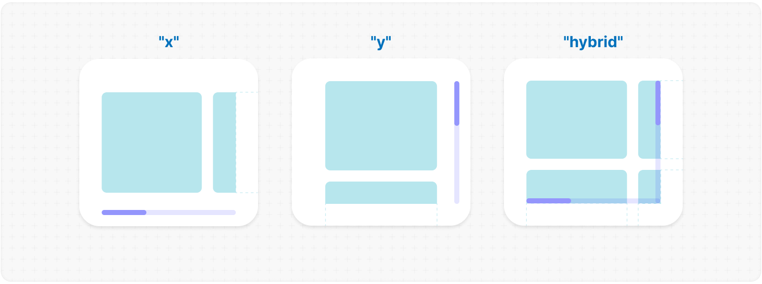
scrollPosition: 10 // or "end" | null | array if direction="hybrid"scrollPosition: {
value: 10; // or "end" | null | array if direction="hybrid"
duration: 400;
updater: true;
}Default: { duration: 200; updater: false } Description: allows you to set custom scroll values. value:
<MorphScroll {...props} scrollPosition={100}>
  {children}
</MorphScroll>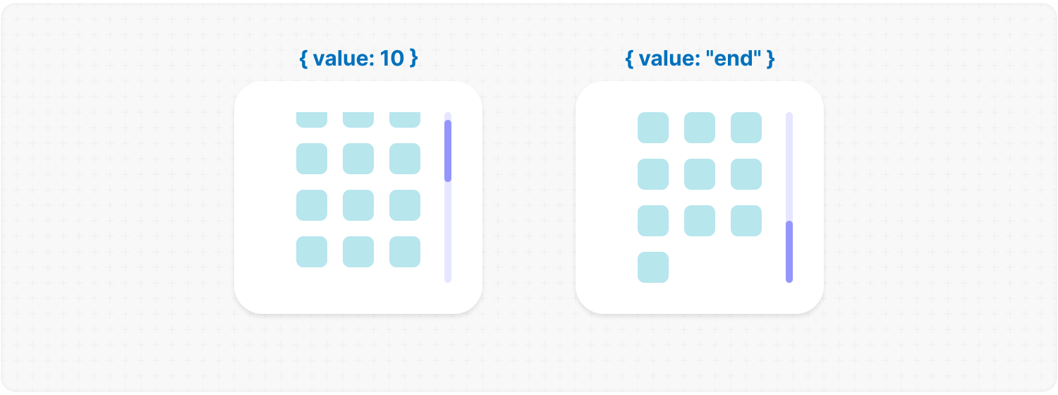
<MorphScroll {...props}
  onScrollValue={
    (left, top) => console.log("Scroll position:", left, top),
  }
>
  {children}
</MorphScroll>
<MorphScroll
{...props}
isScrolling={(motion) => {
console.log(motion ? "Scrolling..." : "Scroll stopped.");
}}
>
{children}
</MorphScroll><MorphScroll
{...props}
onRenderedKeysChange={(keys) => {
console.log("Rendered keys:", keys);
}}
>
{children}
</MorphScroll>— VISUAL —
size: 100; // or [100, 70] | "auto"Description: sets the width and height of the MorphScroll. number: sets a fixed size in pixels. It can be 1 number if you want to set the same width and height, or an array of 2 numbers. "auto": adds the ResizeTracker component to measure the width and height of the area where MorphScroll is added. The dimensions will automatically adjust when the container changes. Example:
<MorphScroll {...props} size={100}>
  {children}
</MorphScroll>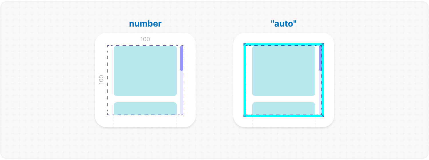
objectsSize: 100; // or [100, 70] | "size" | "firstChild" | "none"Description: defines the [width, height] of cells for each of your objects. number: sets a fixed size for your custom objects. "size": the dimensions will be taken from size. "firstChild": creates a ResizeTracker wrapper for the first child of your list. This wrapper will calculate the size of the first child, and these dimensions will be applied to all cells in the list. This can be useful if you want to change the size of objects in your list dynamically, e.g., when reducing the size of the user's screen. "none": cells will still be created, but MorphScroll will not calculate their sizes-they will simply wrap your objects. ✦ Note: "none" is not compatible with render. Example:
<MorphScroll {...props} objectsSize={[70, 100]}>
  {children}
</MorphScroll>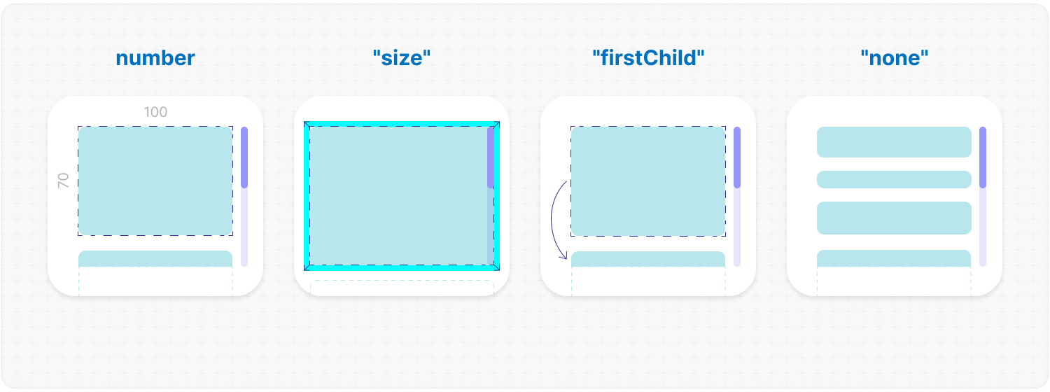
<MorphScroll {...props} crossCount={2}>
  {children}
</MorphScroll>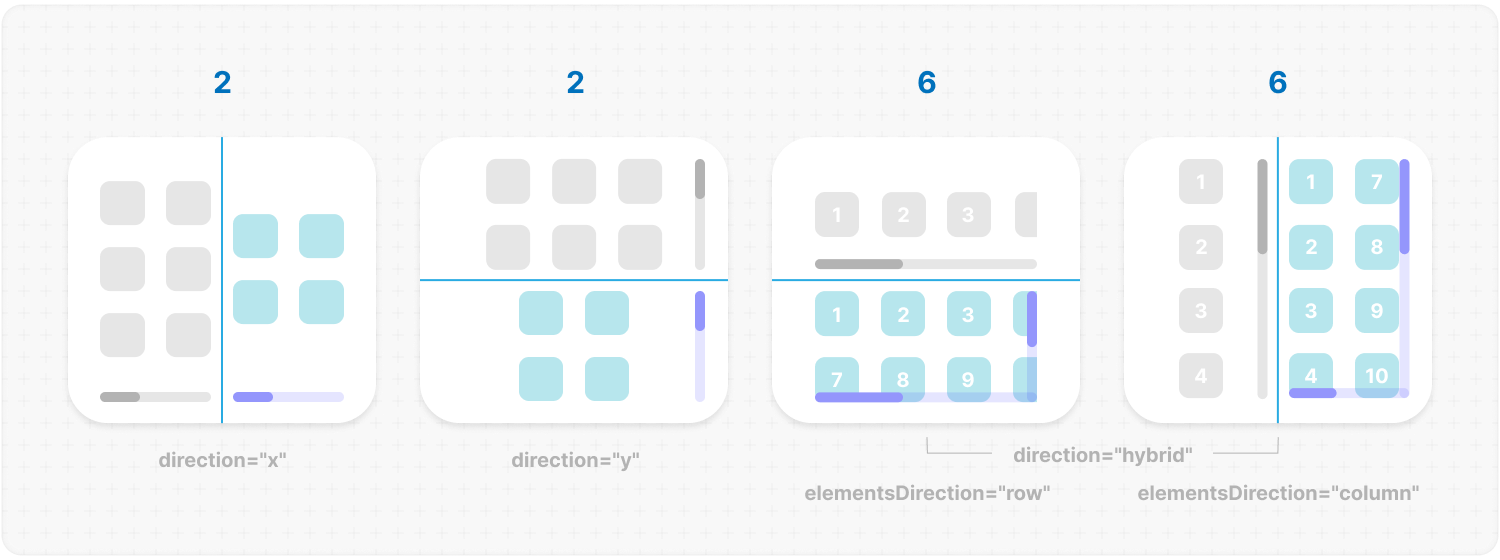
gap: 10; // or [20, 10]Description: allows you to set spacing in pixels between list items for rows and columns. Example:
<MorphScroll {...props} gap={10}>
  {children}
</MorphScroll>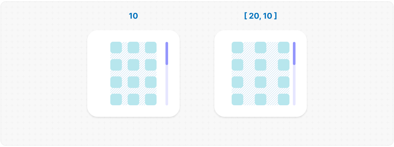
wrapperMargin: 10; // or [v, h] | [t, r, b, l]Description: defines the spacing between the list items and their wrapper, effectively increasing the width or height of the scrollable area. Example:
<MorphScroll {...props} wrapperMargin={10}>
  {children}
</MorphScroll>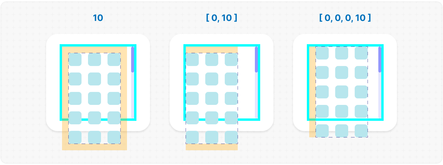
wrapperMinSize: 10 // or "full"// if direction="hybrid"
wrapperMinSize: [
"full",
10,
] // or one value for both sidesDescription: defines the minimum height or width of the .ms-objects-wrapper, to which CSS properties like min-height or min-width will be applied. Example:
<MorphScroll {...props} wrapperMinSize={"full"}>
  {children}
</MorphScroll>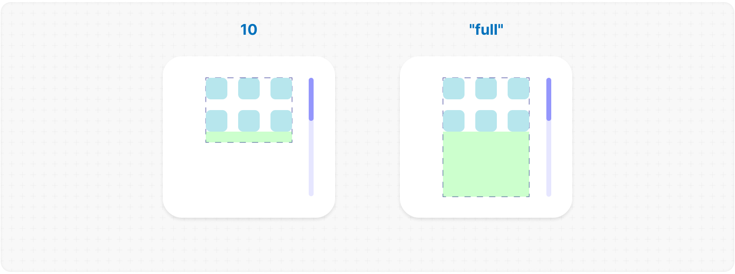
wrapperAlign: "center" // or "start" | "end"wrapperAlign: [
"center",
"start",
] // or one value for both axesDefault: "start" Description: aligns the .ms-objects-wrapper, which contains all the provided elements, relative to the scroll or the size. Example:
<MorphScroll {...props} wrapperAlign="center">
  {children}
</MorphScroll>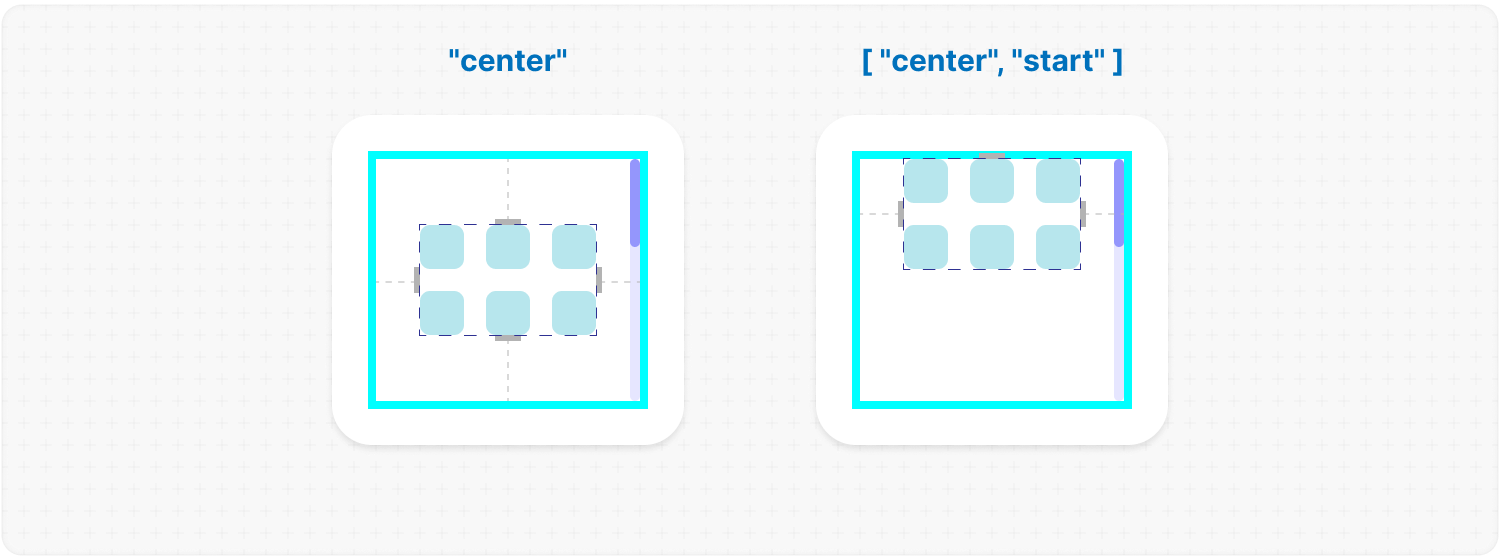
elementsAlign: "center"; // or "start" | "end"Default: "start" Example:
<MorphScroll {...props} elementsAlign="center">
  {children}
</MorphScroll>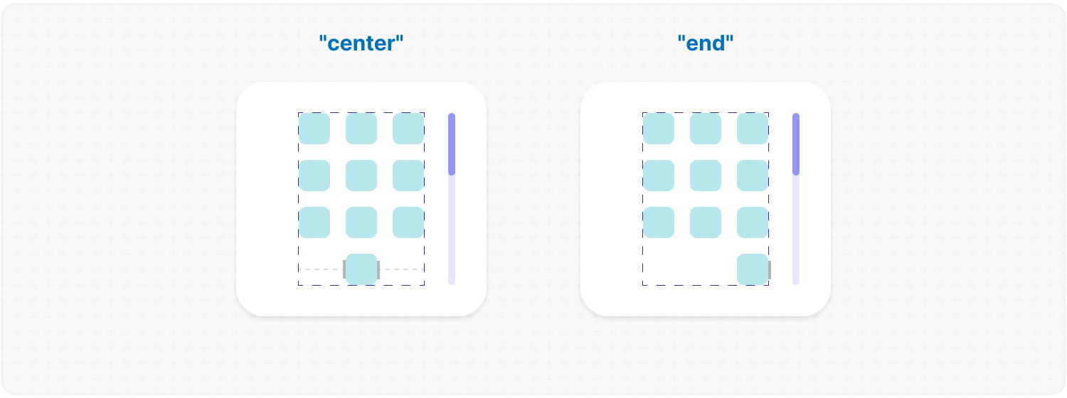
elementsDirection: "row"; // or "column"Default: "row" Description: changes the order of the provided elements based on the provided value. Example:
<MorphScroll {...props} elementsDirection="column">
  {children}
</MorphScroll>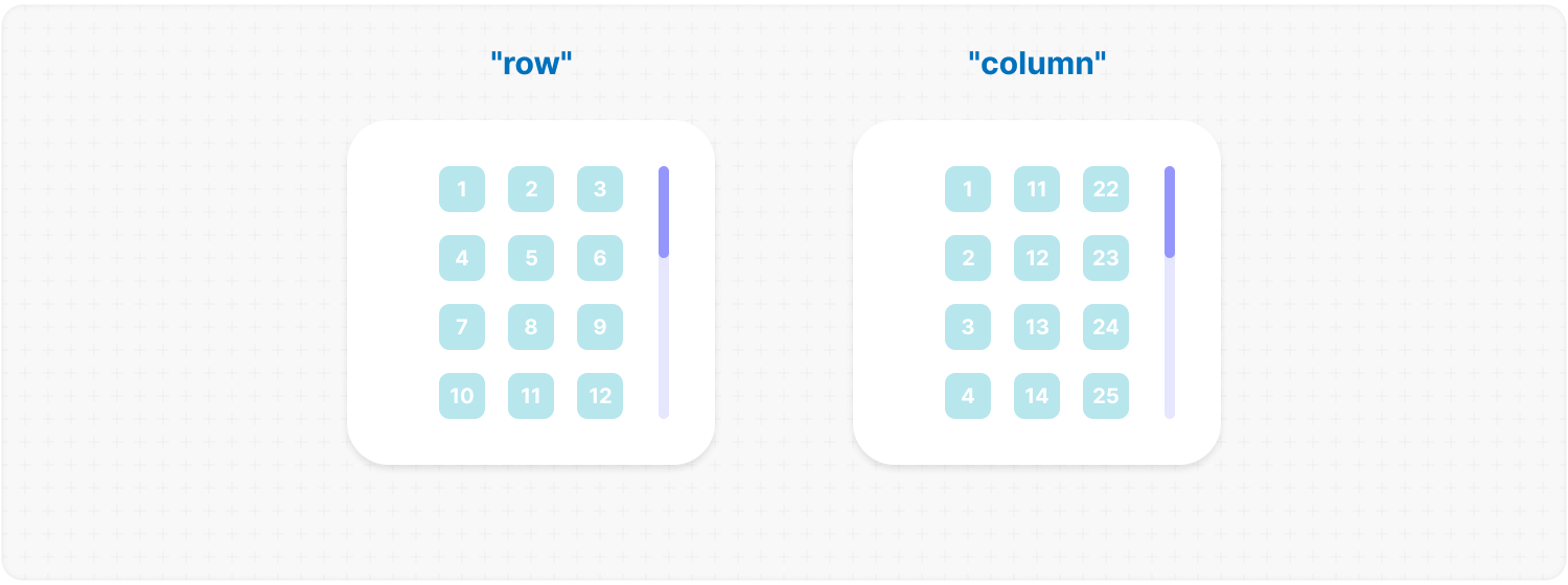
edgeGradient: true // or "#fff"edgeGradient: {
color: "#fff",
size: 60, // default 40px
}Description: parameter creates several edge elements responsible for darkening the edges of the scroll when it overflows. color: property accepts any valid color format. If you provide it, the library will generate a gradient transitioning from the custom color to transparent. If you provide just true, the edge elements will have no color, allowing for custom styling via CSS class .ms-edge. size: property changes the height of the edges for the horizontal and the width of the edges for the vertical. If the edge element is inactive, it gets the "ms-disabled" class. Also, each edge element gets the --edge-visibility variable in the styles with value 0 or 1. Example:
<MorphScroll
  {...props}
  edgeGradient={{ color: "rgba(0, 0, 0, 0.5)", size: 60 }}
>
  {children}
</MorphScroll>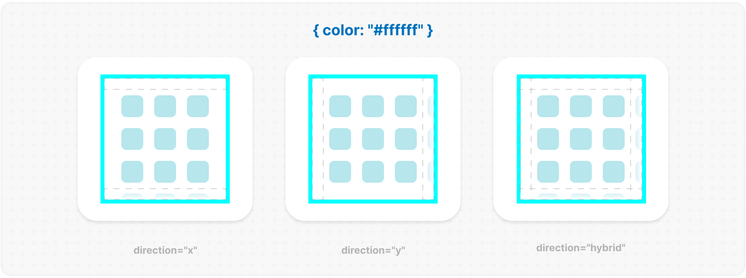
progressTrigger: {
  wheel: true,
  content: true,
  progressElement: true, // or <ScrollThumbComponent />
  arrows: true, // or <ArrowComponent />
}
progressTrigger: {
wheel: {
// if direction="hybrid"
changeDirection: true,
changeDirectionKey: "someKay" // default "KeyX"
},
progressElement: [<Elem1 />, <Elem2 />, <Elem3 />],
arrows: {
element: <ArrowComponent />,
size: 60, // default 40px
contentReduce: true;
loop: true,
}
}Default: { wheel: true } Description: this is one of the most important properties, allowing you to define how users interact with the progress bar and customize its appearance. wheel: determines whether the progress bar responds to mouse wheel scrolling If you use direction="hybrid", you can use:
<MorphScroll
  {...props}
  progressTrigger={{
    wheel: true,
    progressElement: <div className="your-scroll-thumb" />,
  }}
>
  {children}
</MorphScroll>
progressReverse: true; // or [true, false] if direction="hybrid"Description: this parameter changes the position of the progress bar in the opposite direction and depends on the direction property. Example:
<MorphScroll {...props} progressReverse>
  {children}
</MorphScroll>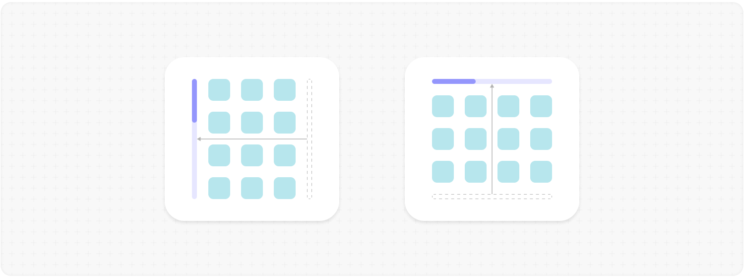
scrollBarOnHover: true;Description: this parameter controls the visibility of the progress bar regardless of the type value. When you use it, the "hover" class is applied to the .ms-bar when the cursor is over it (or the finger touches it on touchscreens), and "leave" is applied when it is no longer hovered. This allows you to easily customize its appearance on interaction. Example:
<MorphScroll {...props} scrollBarOnHover>
  {children}
</MorphScroll>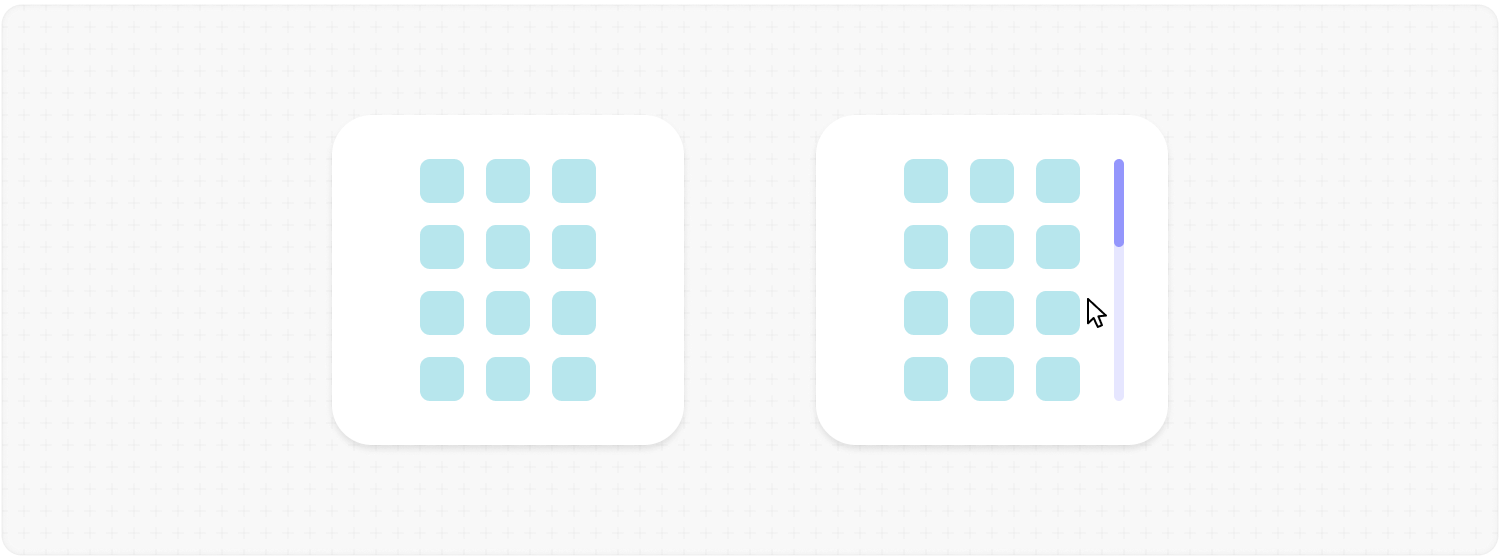
scrollBarEdge: 10; // or [10, 20] for control each bar if direction="hybrid"Description: defines the margin (in px) applied to the edges of the scroll bar, effectively reducing its size. ✦ Note: this parameter is only used when type="scroll" is set. Example:
<MorphScroll {...props} scrollBarEdge={10}>
  {children}
</MorphScroll>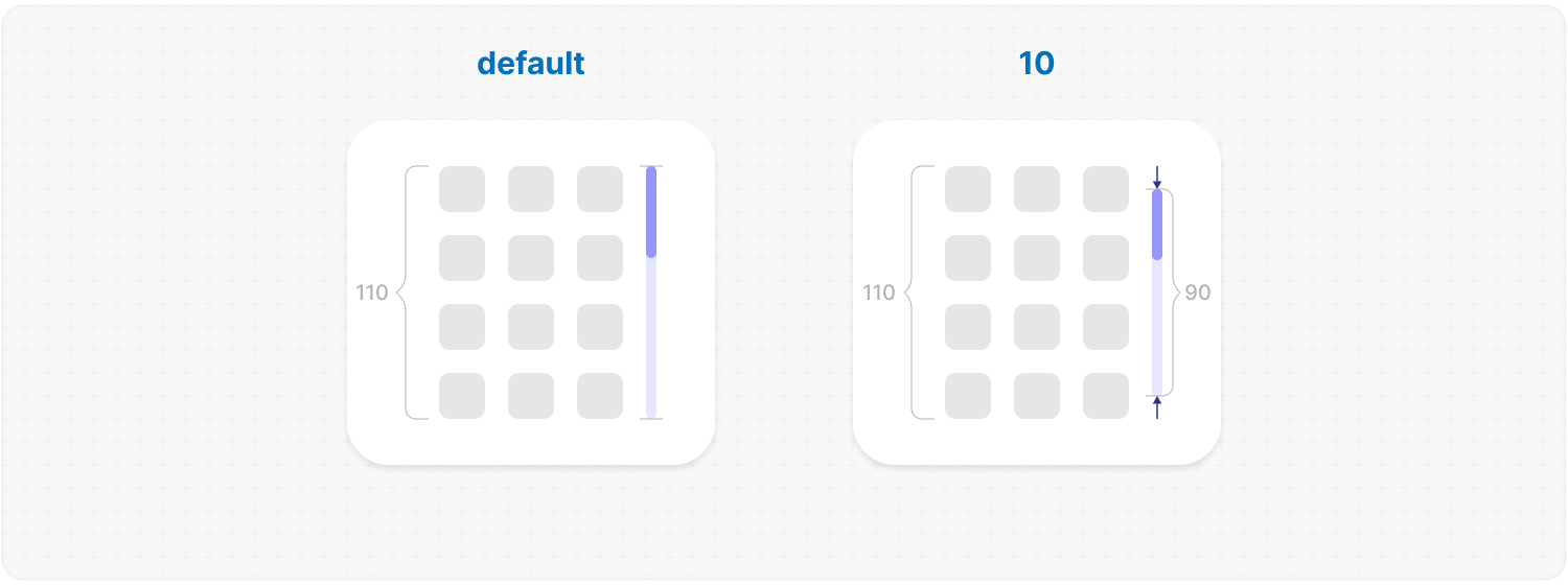
<MorphScroll {...props} thumbMinSize={40}>
  {children}
</MorphScroll>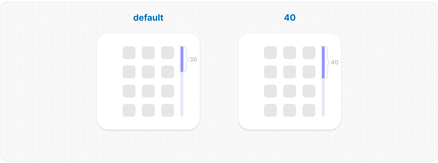
— OPTIMIZATIONS —
render: "lazy" // or "virtual"render: {
type: "lazy", // or "virtual" (required)
rootMargin: 100, // or [v, h] | [t, r, b, l]
stopLoadOnScroll: true,
trackVisibility: true
}Description: this parameter adds a gradual rendering of the content as it enters the viewport. When used, a container is created for each scrollable object, and its absolute positioning is calculated based on scroll position and area dimensions. type:
<MorphScroll {...props} render="virtual">
  {children}
</MorphScroll>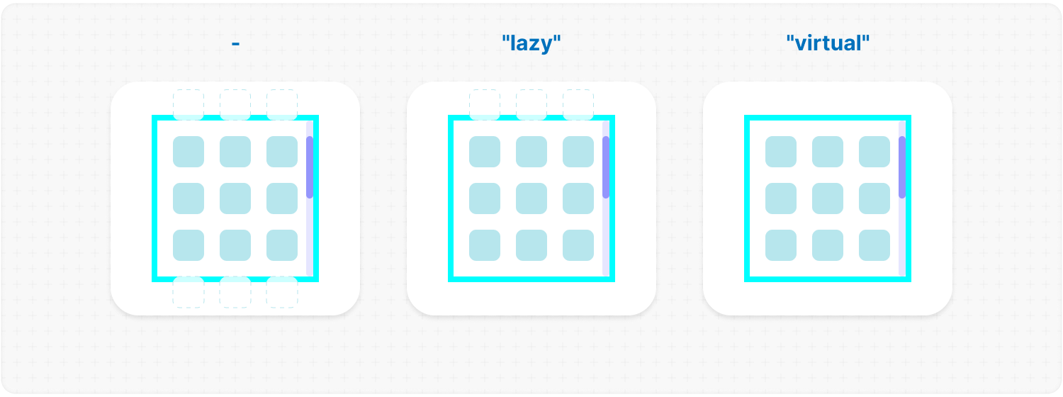
emptyElements: "clear" // or "fallback" | <FallbackComponent />emptyElements: {
mode: "clear", // or "fallback" | <FallbackComponent /> (required)
clickTrigger: ".btn-class", // or { selector: ".btn-class"; delay: 100 };
}Description: this option allows you to remove or replace empty list items during the initial render, or trigger this process via a click action mode:
<MorphScroll {...props} emptyElements="clear">
  {children}
</MorphScroll>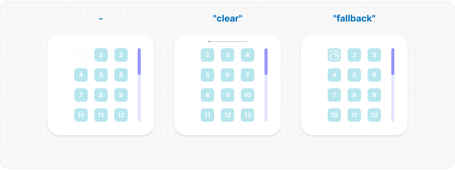
suspending: true;Default: false Description: adds React Suspense to the MorphScroll component for async rendering. Example:
<MorphScroll {...props} suspending>
  {children}
</MorphScroll>
<MorphScroll {...props} fallback={<div>Loading...</div>}>
{children}
</MorphScroll>— ADDITIONAL —
dragScroll: true;Description: enables automatic scrolling when dragging elements near the edges of the container. Scrolling is triggered for elements using the native draggable="true" attribute, or custom drag implementations marked with ms-custom-drag. ✦ Note: while auto-scrolling is active, the container receives the ms-under-drag attribute with directional values (left, top, etc.) depending on the active edge. It can be used for styling. Example:
<MorphScroll {...props} dragScroll>
  {children}
</MorphScroll>
Props:
<ResizeTracker className="custom-class">{children}</ResizeTracker><ResizeTracker>{children}</ResizeTracker><ResizeTracker style={{ backgroundColor: "yellow" }}>{children}</ResizeTracker>measure: "outer"; // or "inner" | "all"Default: "inner" Description: determines what is being measured by automatically applying inline styles that affect width and height. "inner": sets width: "max-content" and height: "max-content", measuring the size of child elements. "outer": measures the parent element by setting minWidth: "100%" and minHeight: "100%". "all": value combines the styles of both "inner" and "outer", allowing measurement of both the parent and child elements. ✦ Note: Be cautious when overriding styles via the style prop, as it may interfere with the styles applied by measure, leading to unexpected behavior. Example:
<ResizeTracker measure="all">{children}</ResizeTracker><ResizeTracker
onResize={(rect) => {
console.log("New size:", rect);
}}
>
{children}
</ResizeTracker>Links:
Props:
<IntersectionTracker className="custom-class">{children}</IntersectionTracker><IntersectionTracker>{children}</IntersectionTracker><IntersectionTracker style={{ backgroundColor: "yellow" }}>
{children}
</IntersectionTracker><IntersectionTracker root={document.getElementById("observer-container")}>
{children}
</IntersectionTracker>rootMargin: 10; // or [v, h] | [t, r, b, l]Description: defines an offset around the root element, expanding or shrinking the observed area. Example:
<IntersectionTracker rootMargin={10}>{children}</IntersectionTracker>threshold: 0.5; // or [0, 0.5, 1]Default: 0 Description: specifies at what percentage of the observed element’s visibility the callback onIntersection should be executed. ✦ Note:
<IntersectionTracker threshold={0.5}>{children}</IntersectionTracker>visibleContent: true;Default: false Description: if set to true, the tracked elements will always be visible, regardless of their actual intersection status. This is useful for testing purposes or when using the onIntersection callback, ensuring that it reliably triggers whenever the element enters the viewport, even if all elements are already visible. Example:
<IntersectionTracker visibleContent>{children}</IntersectionTracker><IntersectionTracker
onIntersection={(entry) => {
if (entry.isIntersecting) loadMoreItems();
}}
>
{children}
</IntersectionTracker>Links: