
msc-circle-progress
v1.0.2
Published
<msc-circle-progress /> provides progress with circle shape. Developers could use it to indicate upload、form complete status for users.
Downloads
225
Maintainers
 meistudioli
Readme
msc-circle-progress
<msc-circle-progress /> provides progress with circle shape. Developers could use it to indicate upload、form complete status for users.
Basic Usage
<msc-circle-progress /> is a web component. All we need to do is put the required script into your HTML document. Then follow <msc-circle-progress />'s html structure and everything will be all set.
- Required Script
<script
  type="module"
  src="https://your-domain/wc-msc-circle-progress.js">
</script>- Structure
Put <msc-circle-progress /> into HTML document. It will have different functions and looks with attribute mutation.
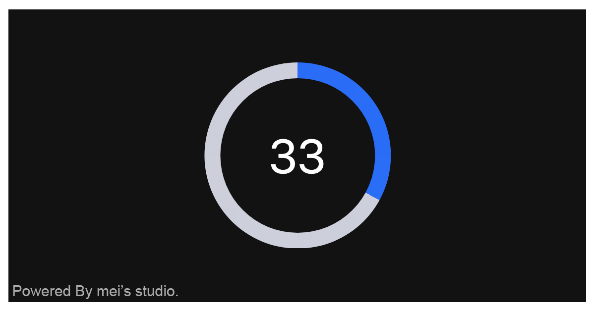
<msc-circle-progress>
  <script type="application/json">
    {
      "size": 16,
      "value": 33,
      "max": 100,
      "round": true
    }
  </script>
</msc-circle-progress>
Otherwise, developers could also choose remoteconfig to fetch config for <msc-circle-progress />.
<msc-circle-progress
  remoteconfig="https://your-domain/api-path"
>
</msc-circle-progress>
JavaScript Instantiation
<msc-circle-progress /> could also use JavaScript to create DOM element. Here comes some examples.
<script type="module">
import { MscCircleProgress } from 'https://your-domain/wc-msc-circle-progress.js';

// use DOM api
const nodeA = document.createElement('msc-circle-progress');
document.body.appendChild(nodeA);
nodeA.value = 50;
nodeA.size = 10;

// new instance with Class
const nodeB = new MscCircleProgress();
document.body.appendChild(nodeB);
nodeB.value = 60;
nodeB.size = 20;

// new instance with Class & default config
const config = {
  size: 20,
  value: 0,
  max: 100
};
const nodeC = new MscCircleProgress(config);
document.body.appendChild(nodeC);
</script>
Style Customization
Developers could apply styles to decorate <msc-circle-progress />'s looking.
<style>
msc-circle-progress {
  --msc-circle-progress-font-size: 16px;
  --msc-circle-progress-font-color: #232a31;
  --msc-circle-progress-color: #0f69ff;
  --msc-circle-progress-placeholder-color: transparent;
}
</style>
Otherwise, apply pseudo class ::part(value) to direct style text element.
<style>
msc-circle-progress::part(value) {
  font-size: 40px;
  color: #fff;
  line-height: 1.5;
}
</style>
Attributes
<msc-circle-progress /> supports some attributes to let it become more convenience & useful.
- size
Set size for <msc-circle-progress />. It will change progress size. Default is 20 (not set).
<msc-circle-progress
  size="20"
>
  ...
</msc-circle-progress>- value
Set value for <msc-circle-progress />. Default is 0 (not set).
<msc-circle-progress
  value="0"
>
  ...
</msc-circle-progress>- max
Set max for <msc-circle-progress />. Default is 100 (not set).
<msc-circle-progress
  max="100"
>
  ...
</msc-circle-progress>- round
It will switch <msc-circle-progress /> bar as round once set. Default is false (not set).
<msc-circle-progress
  round
>
  ...
</msc-circle-progress>
Properties
| Property Name | Type | Description |
| ----------- | ----------- | ----------- |
| size | Number | Getter / Setter for size. Default is 20. |
| value | Number | Getter / Setter for value. Default is 0. |
| max | Number | Getter / Setter for max. Default is 100. |
| round | Boolean | Getter / Setter for round. Default is false. |
Method
| Method Signature | Description | | ----------- | ----------- | | refresh | Force refresh <msc-circle-progress />'s redering. Developers could call this method when <msc-circle-progress /> mutated. |