
msc-dialogs
v1.0.2
Published
<msc-dialogs /> is a common dialog effect. It comes with high customize user interface and show / close animation. It also suitable for all resolution. All we need to do is just put content we like to display as its children and everything will be all set
Downloads
245
Maintainers
 meistudioli
Readme
msc-dialogs
<msc-dialogs /> is a common dialog effect. It comes with high customize user interface and show / close animation. It also suitable for all resolution. All we need to do is just put content we like to display as its children and everything will be all set.
Basic Usage
<msc-dialogs /> is a web component. All we need to do is put the required script into your HTML document. Then follow <msc-dialogs />'s html structure and everything will be all set.
- Required Script
<script
  type="module"
  src="https://unpkg.com/msc-dialogs/mjs/wc-msc-dialogs.js">
</script>- Structure
Put <msc-dialogs /> into HTML document.
<msc-dialogs>
<!-- Put any HTML element you like to display -->
<div class="my-content-wrap">
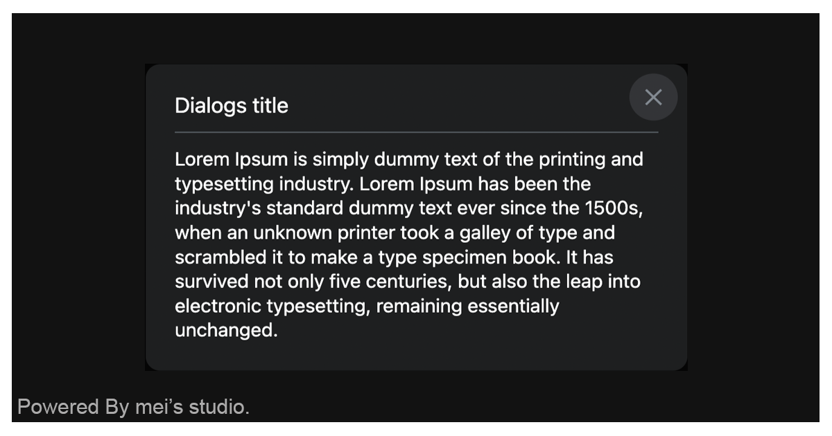
<p class="my-content-wrap__title">Dialogs title</p>
<p class="pretty-paragraph">Lorem Ipsum is simply dummy text of the printing and typesetting industry. Lorem Ipsum has been the industry's standard dummy text ever since the 1500s, when an unknown printer took a galley of type and scrambled it to make a type specimen book. It has survived not only five centuries, but also the leap into electronic typesetting, remaining essentially unchanged. It was popularised in the 1960s with the release of Letraset sheets containing Lorem Ipsum passages, and more recently with desktop publishing software like Aldus PageMaker including versions of Lorem Ipsum.</p>
</div>
</msc-dialogs>JavaScript Instantiation
<msc-dialogs /> could also use JavaScript to create DOM element. Here comes some examples.
<script type="module">
import { MscDialogs } from 'https://unpkg.com/msc-dialogs/mjs/wc-msc-dialogs.js';

const template = document.querySelector('.my-template');

//use DOM api
const nodeA = document.createElement('msc-dialogs');
document.body.appendChild(nodeA);
nodeA.appendChild(template.content.cloneNode(true));

// new instance with Class
const nodeB = new MscDialogs();
document.body.appendChild(nodeB);
nodeB.appendChild(template.content.cloneNode(true));
</script>
Style Customization
<msc-dialogs /> uses CSS custom properties to hook control panel's theme. That means developer could easy change it into the looks you like.
<style>
msc-dialogs {
  --msc-dialogs-background-color: rgba(255 255 255);
  --msc-dialogs-backdrop-background-color: rgba(35 42 49/.6);
  --msc-dialogs-border-radius: 12px;
  --msc-dialogs-margin: 24px;
  --msc-dialogs-padding: 24px;

  --msc-dialogs-button-size: 40;
  --msc-dialogs-button-inset-inline-end: 8px;
  --msc-dialogs-button-inset-block-start: 8px;
  --msc-dialogs-button-icon-color: rgba(95 99 104);
  --msc-dialogs-button-normal-background-color: transparent;
  --msc-dialogs-button-active-background-color: rgba(245 248 250);
  --msc-dialogs-button-active-scale: .8;
}
</style>
Otherwise delevelopers could also add attribute - data-hide-close-button to hide <msc-dialogs />'s close button.
<msc-dialogs data-hide-close-button>
  ...
</msc-dialogs>
Attribute
<msc-dialogs /> supports some attributes to let it become more convenience & useful.
- closedby
Specifies the types of user actions that can be used to close <msc-dialogs />. Valid values are
any、closerequestandnone. The default isany.
any:<msc-dialogs /> can be dismissed using any of the three methods. (light dismiss user action、platform-specific user action、developer-specified mechanism).closerequest:<msc-dialogs /> can be dismissed with a platform-specific user action or a developer-specified mechanism..none:<msc-dialogs /> can only be dismissed with a developer-specified mechanism.
Properties
| Property Name | Type | Description |
| ----------- | ----------- | ----------- |
| open | Boolean | Getter <msc-dialogs />'s open state. |
| closedBy | String | Getter / Setter type of user action to close <msc-dialogs />. Valid values are any、closerequest and none. The default is any. |
Events
| Event Signature | Description |
| ----------- | ----------- |
| msc-dialogs-close | Fired when <msc-dialogs /> closed. |
| msc-dialogs-beforetoggle | Fired before <msc-dialogs /> is shown or hidden. Developers could gather state information through event.detail. |
| msc-dialogs-toggle | Fired when <msc-dialogs /> is shown or hidden. Developers could gather state information through event.detail. |
Mathods
| Mathod Signature | Description | | ----------- | ----------- | | showModal() | Show <msc-dialogs />. | | close() | Close <msc-dialogs />. |