
msc-select-list
v1.0.1
Published
<msc-select-list /> provides a common UI as <select /> and group checkboxs as its drop menu. So user could experience it as usual and have multi-select feature.
Downloads
15
Maintainers
 meistudioli
Readme
msc-select-list
Although <select /> supports attribute multiple to let user select multiple options. But the UI will become list and can't hide anymore. It is not easy for user to know press ctrl & click for multi-select option.
<msc-select-list /> provides a common UI as select and group checkboxs as its drop menu. So user could experience it as usual and have multi-select feature.
Basic Usage
<msc-select-list /> is a web component. All we need to do is put the required script into your HTML document. Then follow 's html structure and everything will be all set.
- Required Script
<script
  type="module"
  src="https://your-domain/wc-msc-select-list.js">
</script>- Structure
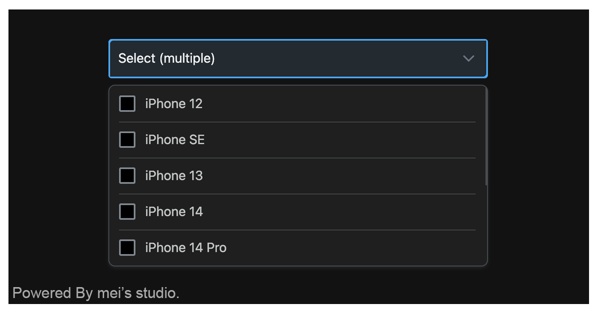
Put <msc-select-list /> into HTML document. It will have different functions and looks with attribute mutation.
<msc-select-list>
  <script type="application/json">
    {
      "options": [
        {
          "content": "iPhone 12",
          "value": "iphone12",
          "checked": true
        },
        {
          "content": "iPhone SE",
          "value": "iphonese",
          "disabled": true
        },
        {
          "content": "iPhone 13",
          "value": "iphone13"
        },
        {
          "content": "iPhone 14",
          "value": "iphone14"
        },
        {
          "content": "iPhone 14 Pro",
          "value": "iphone14pro"
        }
      ],
      "placeholder": "Select (multiple)",
      "size": 5,
      "sound": true,
      "vibrate": true
    }
  </script>
</msc-select-list>
Otherwise, developers could also choose remoteconfig to fetch config for <msc-select-list />.
<msc-select-list
  remoteconfig="https://your-domain/api-path"
>
</msc-select-list>
JavaScript Instantiation
<msc-select-list /> could also use JavaScript to create DOM element. Here comes some examples.
<script type="module">
import { MscSelectList } from 'https://your-domain/wc-msc-select-list.js';

// use DOM api
const nodeA = document.createElement('msc-select-list');
document.body.appendChild(nodeA);
nodeA.options = [
  {
    content: 'iPhone 12',
    value: 'iphone12'
  },
  {
    content: 'iPhone SE',
    value: 'iphonese'
  },
  {
    content: 'iPhone 13',
    value: 'iphone13'
  }
];
nodeA.values = ['iphone12'];

// new instance with Class
const nodeB = new MscSelectList();
document.body.appendChild(nodeB);
nodeB.params = [
  {
    content: 'iPhone 12',
    value: 'iphone12'
  },
  {
    content: 'iPhone SE',
    value: 'iphonese'
  },
  {
    content: 'iPhone 13',
    value: 'iphone13'
  }
];

// new instance with Class & default config
const config = {
  options: [
    {
      content: 'iPhone 12',
      value: 'iphone12',
      checked: true
    },
    {
      content: 'iPhone SE',
      value: 'iphonese',
      disabled: true
    },
    {
      content: 'iPhone 13',
      value: 'iphone13'
    },
    {
      content: 'iPhone 14',
      value: "iphone14"
    }
  ],
  placeholder: 'Select (multiple)',
  size: 5,
  sound: true,
  vibrate: true
};

const nodeC = new MscSelectList(config);
document.body.appendChild(nodeC);
</script>
Storage
<msc-select-list /> will generate an input[type=hidden] as storage and put success selected options' value data as its value. <input /> default name is msc-select-list, developers can switch any name they liked.
<msc-select-list>
  <input type="hidden" name="msc-select-list" value="..." />
</msc-select-list>
Style Customization
Developers could apply styles to decorate <msc-select-list />'s looking.
<style>
msc-select-list {
  /* select */
  --msc-select-list-select-background-color: rgba(255 255 255);
  --msc-select-list-select-text-color: rgba(91 99 106);
  --msc-select-list-select-border-color: rgba(110 119 128);
  --msc-select-list-select-theme-color: rgba(53 116 224);

  /* drop menu */
  --msc-select-list-background-color: rgba(255 255 255);
  --msc-select-list-label-color: rgba(35 42 49);
  --msc-select-list-line-color: rgba(198 198 200);
  --msc-select-list-border-color: rgba(198 198 200);
  --msc-select-list-box-shadow: 0 0 1px rgba(0 0 0/.1), 0 2px 4px rgba(0 0 0/.08);
  --msc-select-list-listing-padding-inline: 12px;
  --msc-select-list-listing-padding-block: 12px;

  /* scroll */
  --msc-select-list-scrollbar-thumb-color: rgba(0 0 0/.2);

  /* checkbox */
  --msc-select-list-checkbox-accent-color: rgba(53 116 224);
  --msc-select-list-checkbox-border-color: rgba(131 138 146);
  --msc-select-list-checkbox-background-color: rgba(255 255 255);
  --msc-select-list-checkbox-checkmark-color: rgba(255 255 255);
  --msc-select-list-checkbox-border-color--disabled: rgba(178 185 192);
  --msc-select-list-checkbox-background-color--disabled: rgba(245 248 250);
  --msc-select-list-checkbox-checkmark-color--disabled: rgba(255 255 255);

  /* ripple */
  --msc-select-list-ripple-color: rgba(0 0 0/.15);

  /* drop menu unit (hover) */
  --msc-select-list-overlay: 29 34 40;
}
</style>
Attributes
<msc-select-list /> supports some attributes to let it become more convenience & useful.
- options
Set options for <msc-select-list />. It should be JSON string. Each element sholud contain content & value (checked & disabled are optional). Default is [] (not set).
<msc-select-list
  options='[{"content":"iPhone 12","value":"iphone12","checked":true},{"content":"iPhone SE","value":"iphonese","disabled":true},{"content":"iPhone 13","value":"iphone13","disabled":true},{"content":"iPhone 14","value":"iphone14"},{"content":"iPhone 14 Pro","value":"iphone14pro"}]'
>
  ...
</msc-select-list>- placeholder
Set placeholder for <msc-select-list />. Default is select please (not set).
<msc-select-list
  placeholder="select please"
>
  ...
</msc-select-list>- size
Set size for <msc-select-list />. Drop menu apply size for how many options display in a fold (max). Default is 5 (not set).
<msc-select-list
  size="5"
>
  ...
</msc-select-list>- sound
Set sound effect for <msc-select-list /> when drop menu tapped.
<msc-select-list
  sound
>
  ...
</msc-select-list>- vibrate
Set vibrate effect for <msc-select-list /> when drop menu tapped.
<msc-select-list
  vibrate
>
  ...
</msc-select-list>
Properties
| Property Name | Type | Description |
| ----------- | ----------- | ----------- |
| options | Array | Getter / Setter for options. Each element sholud contain content & value (checked & disabled are optional). Default is []. ex: selectList.options = [{ content:'option1', value:'option1'}]; |
| values | Array | Getter / Setter for values. ex: selectList.values = ['option1', 'option2']; |
| placeholder | string | Getter / Setter for placeholder. <msc-select-list /> will display this value when no option selected. Default is select please. |
| size | Number | Getter / Setter for size. Drop menu apply size for how many options display in a fold (max). Default is 5. |
| sound | Boolean | Getter / Setter for sound. Set sound effect or not when drop menu tapped. Default is false. |
| vibrate | Boolean | Getter / Setter for vibrate. Set vibrate effect or not when drop menu tapped. Default is false. |
Event
| Event Signature | Description | | ----------- | ----------- | | msc-select-list-change | Fired when user select option. |