
msc-snackbar
v2.0.2
Published
<msc-snackbar /> provide brief messages about app processes at the bottom of the screen. It's a web component and applied Material Design - Snackbar's spec.
Downloads
180
Maintainers
 meistudioli
Readme
msc-snackbar
<msc-snackbar /> provide brief messages about app processes at the bottom of the screen. It's a web component and applied Material Design - Snackbar's spec.
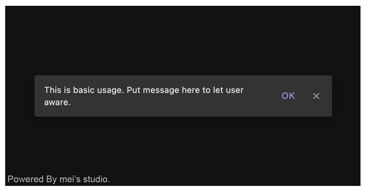
Basic Usage
<msc-snackbar /> is a web component. All we need to do is put the required script into your HTML document. Then follow 's html structure and everything will be all set.
- Required Script
<script
  type="module"
  src="https://unpkg.com/msc-snackbar/mjs/wc-msc-snackbar.js">
</script>- Structure
Put <msc-snacker /> into HTML document. It will have different functions and looks with attribute mutation.
<msc-snackbar>
  <script type="application/json">
    {
      "duration": 99999,
      "actioncontent": "Action"
    }
  </script>
</msc-snackbar>
Otherwise, developers could also choose remoteconfig to fetch config for <msc-snackbar />.
<msc-snackbar
  remoteconfig="https://your-domain/api-path"
>
</msc-snackbar>
JavaScript Instantiation
<msc-snackbar /> could also use JavaScript to create DOM element. Here comes some examples.
<script type="module">
import { MscSnackbar } from 'https://unpkg.com/msc-snackbar/mjs/wc-msc-snackbar.js';

// use DOM api
const nodeA = document.createElement('msc-snackbar');
document.body.appendChild(nodeA);
nodeA.show('Show me the money.');

// new instance with Class
const nodeB = new MscSnackbar();
document.body.appendChild(nodeB);
nodeB.duration = 5;
nodeB.show('Show me the money.');

// new instance with Class & default config
const config = {
  duration: 10,
  actioncontent: 'OK'
};
const nodeC = new MscSnackbar(config);
document.body.appendChild(nodeC);
nodeC.show('Show me the money.');
</script>
Style Customization
Developers could apply styles to decorate <msc-snackbar /> margin distance.
<style>
msc-snackbar {
  --msc-snackbar-action-button-color: rgba(208 188 255);
}
</style>
Otherwise, developers could set data attribute to change layout direction and button display.
<msc-snackbar
  data-direction="stack"
  data-hide-action-button
  data-hide-dismiss-button
>
  ...
</msc-snackbar>
Attributes
<msc-snackbar /> supports some attributes to let it become more convenience & useful.
- duration
Set auto dismiss duration for <msc-snackbar />. Default is 99999 (seconds).
<msc-snackbar
  duration="99999"
>
  ...
</msc-snackbar>- actioncontent
Set action button's content. Default is "Action".
<msc-snackbar
  actioncontent="Action"
>
  ...
</msc-snackbar>
Properties
| Property Name | Type | Description | | ----------- | ----------- | ----------- | | duration | Number | Getter / Setter for duration (seconds) to auto dismiss. | | actioncontent | String | Getter / Setter for action button's content. | | open | Boolean | Getter for <msc-snackbar />'s open state. |
Event
| Event Signature | Description | | ----------- | ----------- | | msc-snackbar-action-click | Fired when <msc-snackbar />'s action has been clicked. | | msc-snackbar-dismiss | Fired when <msc-snackbar /> dismiss behavior occured. |