
mullion
v0.4.0
Published
A tiling layout for a page you already have: it adopts the document, puts it back when the window narrows, and tells a pane nobody is looking at to stop working.

Maintainers
 mishanasledov
Readme
mullion

A tiling layout for a page you already have.
A mullion is the bar that divides a window into panes. This is that, for the web: splits, dividers, tabs, a drawer and key bindings, over a document somebody else wrote.
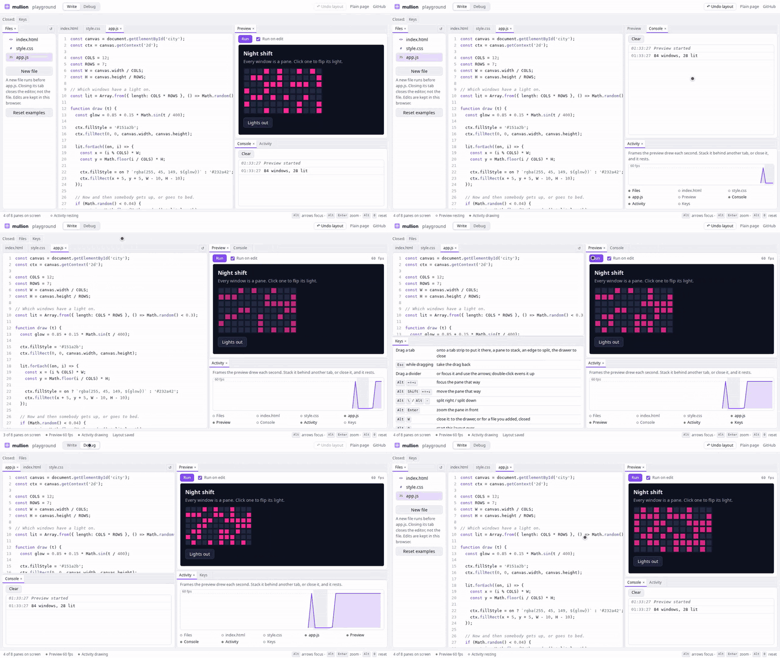
Try it — a small code playground, tiled, on a window wider than 60em; on anything narrower, the same page untiled.
npm install mullionNo dependencies, no framework, no build step. One function and a stylesheet.
What makes it different
Every other tiling layout for the web — golden-layout, dockview, lumino, FlexLayout, rc-dock — asks you to render into its containers, from a configuration object, usually inside a framework. mullion does the opposite three times over.
It adopts the document. Mark elements data-pane and they are moved
into a layout. Every id survives and every component keeps the element it
was handed, so nothing that found a box by name stops finding it.
<section id="editor" data-pane data-pane-title="Editor" data-pane-min="320">
  …whatever was already here…
</section>
Turn it off and you have your page back. Below the threshold — a narrow window, or a screen with only a finger to point with — every element goes back under its own parent, folded the way it was. The untiled page is the fallback, not a second mobile layout, so there is one markup, one stylesheet and one set of tests.
A pane nobody is looking at is told so. onShow is the contract, and
it is the reason tiling can pay for itself rather than cost: two canvases
stacked as tabs draw one picture, not two. A pane is out of sight behind
another tab, in the drawer, behind a zoomed pane, folded, off with its
mode, scrolled more than 100px out of the window when the page is not
tiled, or in a browser tab or window nobody is looking at.
import { createPanes } from 'mullion';
import 'mullion/panes.css';

const panes = createPanes({
  root: document.getElementById('layout'),
  catalog: ['editor', 'console', 'inspector'],
  mode: 'default',
  layouts: {
    default: {
      dir: 'row', size: [0.6, 0.4], kids: [
        { dir: 'col', size: [0.7, 0.3], kids: [
          { tabs: ['editor'] },
          { tabs: ['console'] }] },
        { tabs: ['inspector'] }],
    },
  },
  onShow: (id, on) => { if (id === 'console') tail.running = on; },
});
The layout
A tree of splits and leaves, and it is plain data — yours to store, diff or write by hand:
{ dir: 'row', size: [0.62, 0.38], kids: [
    { dir: 'col', size: [0.7, 0.3], kids: [
        { tabs: ['editor'] },
        { tabs: ['console'] }] },
    { tabs: ['inspector'] }] }
A leaf holding more than one pane is tabs. The panes no leaf holds are the
drawer: listed above the layout, one click from coming back. Nothing
a person does destroys a pane: closing one puts it away, or, for a pane
the page added as ephemeral, asks the page (see
How a pane ends). Panes come and go only when the
page says so, with add and remove, and even then the element is the
page's: mullion makes none and deletes none.
Brought back, from the drawer or by present(), a pane goes where it
was: into the stack it left, or — if it was the last pane in its leaf
and the split around it collapsed — beside the same neighbor, on the same
side, with the same share. Where that neighbor has gone too, it goes to
the pane last focused.
What a layout may hold, how a kept one is read back and what is kept is
written down in docs/layout.md, with cases in
test/layouts.json that any other implementation of the same model can
run.
What a person can do
| | what it does |
|---|---|
| drag a tab | onto a tab strip to put it there, onto a pane to stack, onto an edge to split, onto the drawer to close; Esc to take it back |
| drag a closed pane | out of the drawer, the same way |
| the cross on a tab | close it: to the drawer, or for an ephemeral pane, ask the page |
| ← → Home End on a tab | the tab that way along its strip, or the first or last |
| a divider | drag, or focus it and use the arrows; double-click to even up |
| Alt + arrow | move the focus to the pane that way |
| Alt Shift + arrow | move the pane that way |
| Alt \ / Alt - | split the pane in front off right / down; in a leaf of one, open the first closed pane there |
| Alt Enter | zoom the pane in front to fill the layout, or back |
| Alt W | close the pane in front, as its cross does |
| Alt 0 | forget the saved layout and start over (or the reset button, or reset()) |
In a page that reads right to left, every direction is the one on the screen: the arrow pointing left along a strip is the next tab, a divider goes the way it is dragged, and a pane dropped on or moved off a left edge goes on the left.
Every command is a chord with Alt in it, because wherever the bare
letters already mean something — a text editor, a chat composer, a
keyboard instrument — a tiler that took W for itself would have taken
it. All of them are inert while the focus is in a text box, and the
modifier and the letters are an argument (keys) for a page where that
is still wrong; the arrows are the arrows.
Markup
| attribute | what it says |
|---|---|
| data-pane | this element is a pane |
| data-pane-title | what its tab says (a <details>'s <summary> otherwise) |
| data-pane-min | how narrow a divider may make it, in pixels (240) |
| data-pane-icon | an image for its tab: beside the title in a strip, in place of it in the corner |
| data-pane-off | this pane's mode is not up — set it, or call available() |
data-pane-off and not hidden, deliberately: hidden is a word most
pages are already using for something else, and a layout that read it
would lose panes to an unrelated el.hidden = true and never put them
back.
Options
Everything below is a default rather than a rule.
| option | what it is | default |
|---|---|---|
| root | where the layout is drawn | — |
| catalog | the ids of the panes, in document order | — |
| mode | which named layout to open on | — |
| layouts | one default tree per mode | every pane in one leaf |
| onShow | (id, on) — a pane came into view, or left it | — |
| onLayout | (layout, mode) — the layout changed, by a person or through the handle | — |
| on | tile when the screen allows it | false |
| store | the key a layout is kept under, in storage; the mode is appended | 'panes' |
| editing | extra selector for "a key here is text" | — |
| media | the screen worth tiling on | (min-width: 60em) and (any-pointer: fine) |
| split | a divider's thickness in pixels | 6 |
| leaf | a leaf's own floor in pixels | 64 |
| edge | how much of a leaf's edge is an edge | 0.2 |
| param | query parameter that forces it on or off | 'panes' |
| storage | where a layout is kept; its methods may return promises | localStorage |
| keys | the commands, merged over the defaults | Alt chords |
| strip | 'scroll' keeps tabs and the drawer at their own widths in a row that scrolls | 'shrink' |
| lone | whether a leaf with one tab has a tab strip: false for none, or the ids of the panes that go without one | true |
| header | where the tabs are: a strip across each leaf, or 'corner', over its top corner (see Styling) | 'strip' |
| closed | the drawer's label | 'Closed:' |
| drawer | where the closed panes are listed: a row above the layout (null), an element of yours such as a side menu, or nowhere (false) | null |
| reset | label for a button that starts the layout over, at the end of the first tab strip (the drawer's row when every leaf is bare) | null |
| version | which version of your layouts this is; a layout kept under another is not read back | — |
| later | (id) — whether a pane not here yet will be added, so a kept layout keeps its place | none will |
| onDiscard | (id) — a person closed an ephemeral pane; end it with remove(id), or don't | — |
And the handle it returns: available(id, on), mode(name),
visible(id), present(id, { focus }), close(id), setTitle(id, text),
setIcon(id, src), setHeader(kind),
add(id, { near, focus, keep }), remove(id), panes(),
layout(), setLayout(layout), reset(), overlay(), tiled(),
setLayouts(layouts, { store, split, version }), destroy().
present, close and setTitle are about the layout, and with the tiler
off — a narrow window — present and close do nothing: the page is the
document, and every pane is already on it.
setLayouts swaps in another set of layouts without taking the tiler
down: the layout that is up stays kept under its store, as every change
to it was kept when it was made, and the mode's layout from the new set
replaces it. It is for a page with more than one shape, such as a phone
that has one layout upright and another on its side:
const side = matchMedia('(orientation: landscape)');
side.addEventListener('change', () =>
  panes.setLayouts(side.matches ? SIDEWAYS : UPRIGHT,
                   { store: side.matches ? 'app:side' : 'app:up' }));
On a touch screen, strip: 'scroll', a thicker split and a lone list
naming the pane that should not spend a row on its name (a keyboard, a
toolbar) are the usual changes, with a reset button, since there is no
Alt 0 to press; with a media that admits a coarse pointer, the tiler
runs there too. lone: false goes further and takes the strip off any
pane moved into a leaf of its own, which leaves it no tab to drag or
close by.
The row of closed panes above the layout is height a phone's layout
wants too. drawer puts the list somewhere else: in an element of yours,
such as a side menu, where it is added while the tiler is on and taken
out when it goes off, and nothing else in the element is touched. To
place it among your own items, give it a box of its own in the menu:
<nav id="menu">
  <div id="menu-panes"></div>          <!-- drawer: this -->
  <button id="settings">Settings</button>
</nav>
Or drawer: false draws no list at all, and the menu is entirely yours:
panes() says every pane and where it is, present(id) brings one to
the front or out of the drawer, and onShow and onLayout between them
hear every change a person makes to either. That is also the way to list
every pane in a phone's menu, not only the closed ones, since going to a
pane matters there as much as reopening one:
const menu = () => list.replaceChildren(...panes.panes().map((p) => {
  const item = document.createElement('button');

  item.textContent = titles[p.id];
  item.classList.toggle('open', p.where === 'front');
  item.onclick = () => panes.present(p.id);

  return item;
}));
With no drawer, a tab cannot be dragged there to close it; its cross and
Alt W still do, and a reset button with no tab strip to sit in is not
drawn — reset() is for a menu of your own.
A layout is kept in localStorage under the store and the mode. A page
with accounts keeps it on a server instead: storage takes the same three
methods, and any of them may return a promise.
- The page opens on its default, and the kept layout replaces it when it arrives, unless somebody has moved something first.
- Nothing is written over it while it is on its way. What the page does in the meantime (panes it adds or raises) is done again over it when it comes.
- Writes go one at a time, in the order they were made, and a read waits for the writes before it, so a slow request never puts an old layout back over a new one.
onLayout is told of every change, by a person or through the handle,
with a copy of the tree, which is also what an undo button needs. A
change that changes nothing (a pane raised that was already in front) is
not one:
createPanes({
  // …
  storage: {
    getItem: (k) => fetch(`/prefs/${k}`).then((r) => (r.ok ? r.text() : null)),
    setItem: (k, v) => fetch(`/prefs/${k}`, { method: 'PUT', body: v }),
    removeItem: (k) => fetch(`/prefs/${k}`, { method: 'DELETE' }),
  },
  onLayout: (layout, mode) => history.push({ layout, mode }),
});
setLayout(layout) goes the other way: it puts a layout up for the mode
that is up — a preset, one read out of a link, a step back through that
undo — and keeps it and tells onLayout like any other change. It is read
the way a kept layout is read: a pane the page does not have is dropped,
and a tree that is not the shape of a layout, or that names no pane the
page has, is refused and false is returned.
A kept layout outlives the default it was made from, so when you move a
pane in your defaults, or add one, somebody who has been here before goes
on seeing what they left, with the new pane in the drawer. version is
how you tell them: a layout kept under another version, or kept before
there was one, is not read back, and your new default comes up.
createPanes({ /* … */ version: 3 });Panes the page adds
A page that opens things — files in an editor, a chart per query — has panes that are not in its markup when it loads. It puts the element into the document itself, where it should sit when the window is narrow, and then hands it over:
const el = document.createElement('section');

el.id = `file-${name}`;
el.dataset.pane = '';
el.dataset.paneTitle = name;
document.getElementById('files').append(el);

panes.add(el.id, { near: 'editor' });
Tiled, it goes where a kept layout had it, as a tab in near's leaf, or
where the person last was, in front and with the focus. With
focus: false, for a page putting back what was open last time, a pane
going back into a place kept for it goes back behind whatever was in
front there.
How a pane ends
The page owns what is in a pane, so the page decides when one ends. There are two kinds:
| | lasting | ephemeral |
|---|---|---|
| what it is | every pane in the catalog, and add(id, { keep: true }) | what add takes on otherwise |
| a person closes it | it goes to the drawer | onDiscard(id) asks the page |
| in the drawer | one click from coming back | never |
| a layout comes up without it | it stays in the drawer | it is put back in |
| it ends | when the page calls remove(id) | when the page calls remove(id) |
A person's close of an ephemeral pane — its cross, Alt W, a drop on
the drawer, or close(id) from the page while tiled — moves nothing. It
calls onDiscard, and the page ends the pane with remove, now or after
asking about unsaved changes, or keeps it by doing nothing:
createPanes({
  // …
  onDiscard: async (id) => {
    if (await unsaved(id) && !await confirmDiscard(id))
      return;

    panes.remove(id)?.remove();
  },
});
A page with no onDiscard offers no way to close an ephemeral pane:
no cross, and Alt W does nothing. Nothing here ends a pane on its own.
remove(id) is the only way a pane ends. It leaves the layout the way a
close takes it, onShow hears it go, and its element is put back where
it was in the document and returned — while tiled that is back in the
body, so a page that is done with it removes it in the same breath, as
above. The same id can be added again — and a pane later says will
come back keeps its place while it is gone, so it comes back to it.
panes() lists every pane with its kind, where it is (front,
behind, drawer, off, or document when untiled) and whether it is
visible: what a page needs to keep count, close the oldest, or show
what is open.
Places kept for panes still to come
A kept layout drops the panes the page does not have when it is read,
which is every added pane. later says which ones will come:
createPanes({ /* … */ later: (id) => openFiles.has(id) });and their places are kept, not drawn, until they are added. It is asked
again whenever the layout is kept, so a later that says what really
exists lets go of the place for a file that has since been deleted. And
it is asked when a pane is removed: one that will come back keeps its
place, which is what a component unmounted and mounted again needs (see
Frameworks). So a page ending a pane for good says so
first — out of openFiles, then remove(id) — or its place is kept for
a pane that is not coming.
destroy() is the way back out: every pane under its own parent again,
every listener off the window, and the page as it was found. A page that
mounts this into something it later unmounts needs it, and so does anyone
calling createPanes a second time over the same document — two tilers
answer the same chord twice.
Frameworks
mullion moves elements, and React and Vue each expect the elements they
render to stay where they put them. Let a framework render the
data-pane elements themselves, as ordinary children, and it breaks as
soon as it changes that list: React throws on inserting beside a moved
pane or removing one, and takes the app down with it; Vue loses a pane it
removes, which stays on the screen. With React, events in a pane mullion
has moved outside React's own container stop reaching React at all.
So the rule is that the framework never owns the element mullion moves. Two ways to keep it, both tested with React 19 and Vue 3.5.
The page owns the panes, and the framework renders into them. The
data-pane elements are the page's markup, or made by the page, and a
portal (React) or <Teleport> (Vue) draws inside each. Nothing the
framework does can reach the element mullion moves:
const panes = createPanes({ root, catalog: ['editor', 'console'], mode });

function App () {
  return ['editor', 'console'].map((id) =>
    createPortal(<PaneBody id={id} />, document.getElementById(id), id));
}
// Vue: one Teleport per pane
h(Teleport, { key: id, to: document.getElementById(id) }, h(PaneBody, { id }))A pane opened later is an element made first, then added, then drawn
into; closing it is its portal going and remove(id)?.remove().
The framework renders each pane inside a box of its own, which it keeps, and hands the pane over when it mounts and takes it back before it unmounts. The box never moves, so the framework's own inserts and removals find it where they left it:
function Pane ({ id, children }) {
  const panes = useContext(Tiler);   // the handle, made by a parent

  // A layout effect, so the pane is back in its box before React takes
  // the box out.
  useLayoutEffect(() => {
    panes.add(id, { keep: true, focus: false });
    return () => panes.remove(id);
  }, [panes, id]);

  return (
    <div>
      <section id={id} data-pane="" data-pane-title={id}>{children}</section>
    </div>
  );
}
The parent makes the tiler with catalog: [], since the panes arrive as
components, and with a later that says yes to every pane the layouts
name — so the default's places are kept for them, and so a pane unmounted
and mounted again comes back to its place. React's StrictMode and a
hidden <Activity> both do that.
In Vue the same is a component with onMounted calling add and
onBeforeUnmount calling remove. Under <KeepAlive>, which puts a
component away without unmounting it, onDeactivated has to remove it
and onActivated add it again; without them the pane stays on the
screen while Vue thinks it is gone.
onShow goes into either framework as state: a store read with
useSyncExternalStore in React, a reactive object in Vue.
Styling
panes.css draws the layout and nothing that is in it. Which of your
boxes takes the room a pane has is yours to say — no stylesheet shipped
with a tiler can know that:
body.tiled .panebody > .editor { flex: 1 1 auto; min-height: 0; }
body.tiled .panebody > .toolbar { flex: 0 0 auto; }
The colors are read under this module's own names, each with a fallback, so it stands alone and you can map your theme onto it:
:root {
  --pane-fg: var(--text);       --pane-bg: var(--surface);
  --pane-dim: var(--muted);     --pane-panel: var(--surface-2);
  --pane-line: var(--border);   --pane-held: var(--accent);
}
--pane-held — the selected tab, a divider under the pointer, a drop
target — defaults to AccentColor, the color the page's own sliders and
checkboxes use. That is the system accent where the browser exposes it
(an installed web app, for one) and the browser's default elsewhere. Map
it, as above, to use your own instead.
Your overrides go in a stylesheet loaded after panes.css: its selectors
are ordinary class selectors, so at equal specificity the later rule wins.
--pane-height is the layout's height, 100dvh by default. A page that
tracks visualViewport — because dvh is wrong the moment an on-screen
keyboard appears — should set this instead.
With header: 'corner' there is no strip: a leaf's tabs sit over its top
corner, in sight while the pointer or the focus is in the leaf or a tab
is being dragged. They are the panes' icons (data-pane-icon; the title
for a pane without one), a grip for a pane alone in its leaf, and a cross
for the one in front, and they drag, drop and take the arrow keys as a
strip does. Laid over the pane, they cover whatever its first row has in
that corner, so the leaf carries their width as --pane-corner:
.panecorner .toolbar { margin-inline-end: var(--pane-corner, 0); }Popovers
A pane is a box that scrolls, so a popover inside one is clipped by it.
overlay() returns an element over every pane, at the document's origin,
as wide as the body's containing block and of no height, so an absolutely
positioned child of it is placed and sized as it would be in the body:
import { placePopover } from 'mullion/popover.js';

panes.overlay().append(menu);
placePopover(menu, x, y);   // and held inside the window
The demo
npm run demo # http://127.0.0.1:8080/demo/demo/ is a code playground: an editor per file, a preview, a console,
and a chart of what the preview drew. It is an ordinary page of
sections, and everything mullion does to it is one createPanes call
over them, and a handful of calls back:
- The preview's program is held still while its pane is off the screen,
the chart stops drawing behind a tab, and the Console counts on its
tab what arrived while it was hidden. That is
onShow, doing the job it is for. - New file makes a module that runs before
app.js. Its editor is a pane the page adds, ephemeral: closing its tab closes the editor and not the file, and a visit later it is open again where it was (add,onDiscard,remove,later). - Undo layout keeps each layout
onLayoutreports and puts the last one back withsetLayout. - Plain page in its header turns the tiler off, and
?touchtiles it on a phone, one layout upright and another on its side (setLayouts).
The tests drive a different page, test/fixture/, built for the claims
they make: a fold, a box that scrolls sideways, a popover the pane would
clip.
npm install && npx playwright install chromium firefox webkit
npm test              # the fixture, in Chromium
npm test -- firefox   # or webkit
npm run test:demo     # the playground still works
npm run types         # the declarations, which are hand-written
npm run shot          # the gif above and the demo's link preview, re-recorded (needs ffmpeg)
Browsers
The suite runs in Chromium, Firefox and WebKit. A pane that moves — a
split collapsing around it, a tab dragged to another leaf — is moved
with moveBefore where the browser has it (Chromium and Firefox), so an
<iframe> in it does not load again; where it does not (Safari), it is
an ordinary move, and the <iframe> reloads. Where a box in the pane was
scrolled to is kept either way.
Chromium's renderer has crashed on some of those moves, taking the page with it. mullion works around it, and will until the browser's fix is what people have.
License
MIT. Copyright (c) 2026 Misha Nasledov.