
native-html-tabs
v0.1.6
Published
HTML elements to build tab components. Made with vanilla HTML and JS, so no frameworks or libraries required.
Maintainers
 lanshor
Readme
html-tabs
A tab component solution for plain HTML.
NO libraries, frameworks or transpilers required. You don't even need JS to use it. It works in vanilla HTML and this doesn't have any dependencies. You can use it for your native project happily and customize it easily.
Just type:
<tab-group>
    <tab-title-list>
        <tab-title>Hello 1</tab-title>
        <tab-title>Hello 2</tab-title>
        <tab-title>Hello 3</tab-title>
        <tab-title>Hello 4</tab-title>
    </tab-title-list>
    <tab-content-list>
        <tab-content>World 1</tab-content>
        <tab-content>World 2</tab-content>
        <tab-content>World 3</tab-content>
        <tab-content>World 4</tab-content>
    </tab-content-list>
</tab-group>
to render this:
Setup
Vanilla
Just add html-tabs.js to your document, that will define the new HTML tags.
<script src="html-tabs.js" />Node
First, add the package to your project.
npm install native-html-tabs --saveSecond and last, add the package to the files for which you will use it 🎉
require('native-html-tabs')Usage
After the setup, you will have 5 new HTML tags to use: tab-group, tab-title-list, tab-title, tab-content-list and tab-content.
They should be used following the pattern below:
<tab-group>
    <tab-title-list>
        <tab-title>Hello 1</tab-title>
        <tab-title>Hello 2</tab-title>
        <tab-title>Hello 3</tab-title>
        <tab-title>Hello 4</tab-title>
    </tab-title-list>
    <tab-content-list>
        <tab-content>World 1</tab-content>
        <tab-content>World 2</tab-content>
        <tab-content>World 3</tab-content>
        <tab-content>World 4</tab-content>
    </tab-content-list>
</tab-group>
The first tab-title will be linked to the first tab-content, the second title with the second content, and so on. If you add / remove titles and contents programmatically you will need to ensure that you maintain the desired order / number of elements.
Let's see the elements one by one.
<tab-group>
Defines a group of tabs which share the same content space, so only one of them is rendered at a time.
It can be styled as any other component and accept the standard HTML element attributes.
Special Attributes:
tabs-position: accept the valuestop,bottom,left,right. The default istop. As any attribute, it's safe to change it programmatically at any time.
Examples
<tab-group tabs-position="top">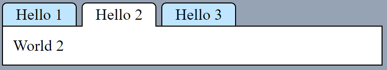
<tab-group tabs-position="bottom">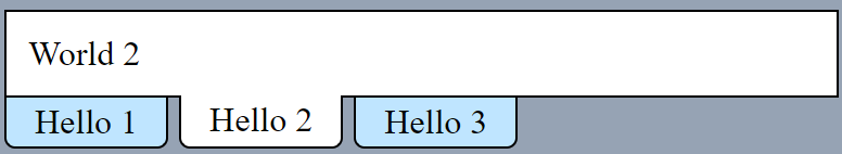
<tab-group tabs-position="left">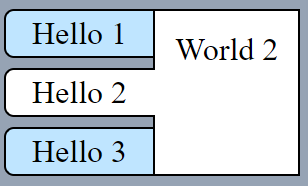
<tab-group tabs-position="right">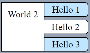
<tab-title-list>
Defines a container for the tab titles. We can define only one per tab-group.
It can be styled as any other component and accept the standard HTML element attributes.
<tab-title>
Defines a tab title. It can include any children set, it's not restricted to text.
It can be styled as any other component and accept the standard HTML element attributes.
Special Attributes:
active: defines if the tab is active and selected, this attribute is set automatically when the user clicks on the tab title. Only one tab-title can be active at a time for a given tab-group.disabled: makes the tab-title disabled, preventing the user to click on it.
You have several options to set a tab as an active programmatically, the common ones are:
// Option 1 (javascript style): Using the click method on the HTML element itself
const tab_title = document.getElementById('my-tab-title-id')
tab_title.click()
// Option 2 (html api style): Set the attribute active manually
const tab_title = document.getElementById('my-tab-title-id')
tab_title.setAttribute('active', '')Whatever method you use, set a tab-title as active will stop any other tab-title to be active automatically.
Examples
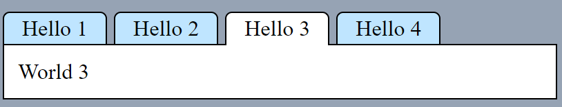
Tab 2 and 4 disabled. Tab 3 active by default.
<tab-group>
    <tab-title-list>
        <tab-title>Hello 1</tab-title>
        <tab-title disabled>Hello 2</tab-title>
        <tab-title active>Hello 3</tab-title>
        <tab-title disabled>Hello 4</tab-title>
        <tab-title>Hello 5</tab-title>
    </tab-title-list>
    <tab-content-list>
        <tab-content>World 1</tab-content>
        <tab-content>World 2</tab-content>
        <tab-content>World 3</tab-content>
        <tab-content>World 4</tab-content>
        <tab-content>World 5</tab-content>
    </tab-content-list>
</tab-group>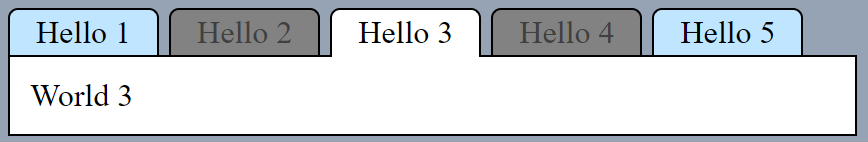
Using random html as title:
<tab-group>
    <tab-title-list>
        <tab-title>Just Text 1</tab-title>
        <tab-title>
            <h1>Pandas!</h1>
            <img src="https://pandas.com/panda.jpg">
        </tab-title>
        <tab-title>Just Text 2</tab-title>
        <tab-title>Just Text 3</tab-title>
        <tab-title>Just Text 4</tab-title>
    </tab-title-list>
    <tab-content-list>
        <tab-content>World 1</tab-content>
        <tab-content>pandas</tab-content>
        <tab-content>World 2</tab-content>
        <tab-content>World 3</tab-content>
        <tab-content>World 4</tab-content>
    </tab-content-list>
</tab-group>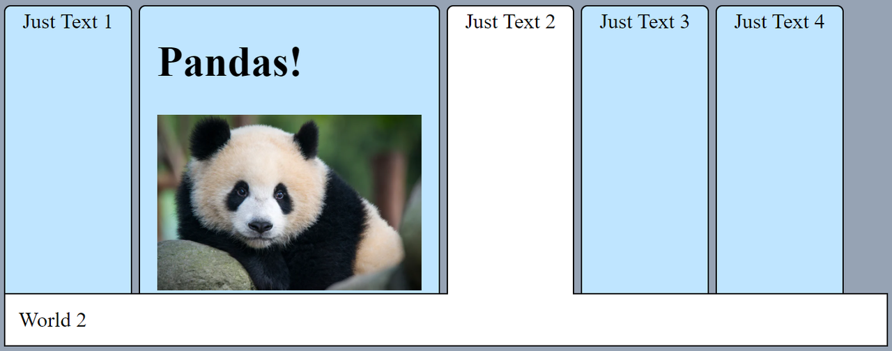
<tab-content-list>
Defines a container for the tab contents. We can define only one per tab-group.
It can be styled as any other component and accept the standard HTML element attributes.
<tab-content>
Defines a tab content.
It can be styled as any other component and accept the standard HTML element attributes.
Special Attributes:
active: defines if the tab content is active (rendered), this attribute is set automatically when the user clicks on the tab title associated to this content. Only one tab-content can be active at a time for a given tab-group.
You have several options to set a tab content as an active programmatically, the common ones are:
// Option 1 (javascript style): Using the click method on the HTML element itself
const tab_title = document.getElementById('my-tab-title-id')
tab_title.click()
// Option 2 (html api style): Set the attribute active manually for the tab title
const tab_title = document.getElementById('my-tab-title-id')
tab_title.setAttribute('active', '')// Option 3 (html api style): Set the attribute active manually for the tab content
const tab_content = document.getElementById('my-tab-content-id')
tab_content.setAttribute('active', '')Whatever method you use, set a tab-content as active will stop any other tab-content to be active automatically.
Styling
All the tags support the standard HTML attributes, so you can add classes to it. Also, they can be styled using CSS selectors for HTML tags.
Let's show this with examples.
- Set the tab tiles colours for normal, active and disabled. Using standard CSS selectors for HTML tags.
tab-title {
    background: pink;
}

tab-title[active] {
    background: wheat;
}

tab-title[disabled] {
    background: palevioletred;
}
- Create dark theme using a "dark" class.
.dark {
    font-family: monospace;
}

.dark tab-content, .dark tab-title[active] {
    background: black;
    color: white;
}

.dark tab-title
{
    color: #aaa;
    background: #555;
}

.dark tab-title[disabled] {
    color:rgb(29, 29, 29);
    text-decoration: line-through;
}
<tab-group class="dark">
<tab-title-list>
<tab-title>Hello 1</tab-title>
<tab-title>Hello 2</tab-title>
<tab-title active>Hello 3</tab-title>
<tab-title disabled>Hello 4</tab-title>
</tab-title-list>
<tab-content-list>
<tab-content>World 1</tab-content>
<tab-content>World 2</tab-content>
<tab-content>World 3</tab-content>
<tab-content>World 4</tab-content>
</tab-content-list>
</tab-group>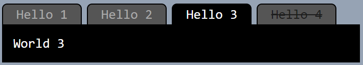
API:
The tab-group element provides a few methods as API to make your life easier. You don't really need to use any of these, with the standard HTML element manipulation ( document.createElement, element.appendChild, etc) you can add / remove tabs or make them disabled / active ( element.setAttribute ) as has been described above. The methods below are offered just as syntactic sugar.
appendTab( tab, content ): Creates a new tab into the tab group. Tab can be either, astringor atab-titleelement. Content can be either, astringor atab-contentelement.getTabTitleList( create_if_not_present = false): Returns thetab-title-listelement of the currenttab-group, so you can add, remove and manipulate tab-title elements easily. An optional boolean parameter (false by default) is accepted to create atab-title-listchild if we don't have any.getTabContentList( create_if_not_present = false): Returns thetab-content-listelement of the currenttab-group, so you can add, remove and manipulate tab-content elements easily. An optional boolean parameter (false by default) is accepted to create atab-content-listchild if we don't have any.setActive( index ): Set the tab with indexindexas active. The valid index range is from 0 to NumberOfTabs-1.setPosition( position ): Changes the tab titles position. Valid positions are:top(default),bottom,left,right.
Custom Events
tab-title and tab-content elements will throw a custom event every time their active attribute changes. The name of this event is activechange. An example of how to use it:
const tab_content = document.getElementById('my-tab-content-id')
/* when the tab-content element is hidden, we remove the children nodes to DOM memory and gain performance (useful for long set of tabs with complex data), when the tab-content element is active, we introduce the content again */
tab_content.addEventListener('activechange', event => {
    if( tab_content.hasAttribute('active') )
        tab_content.innerHTML = render_content()
    else
        tab_content.innerHTML = ''
})