
neo-md
v1.3.3
Published
A modern, highly-configurable React markdown editor with live preview, syntax highlighting, and export capabilities
Maintainers
 atharvdange
Readme
React Markdown Editor
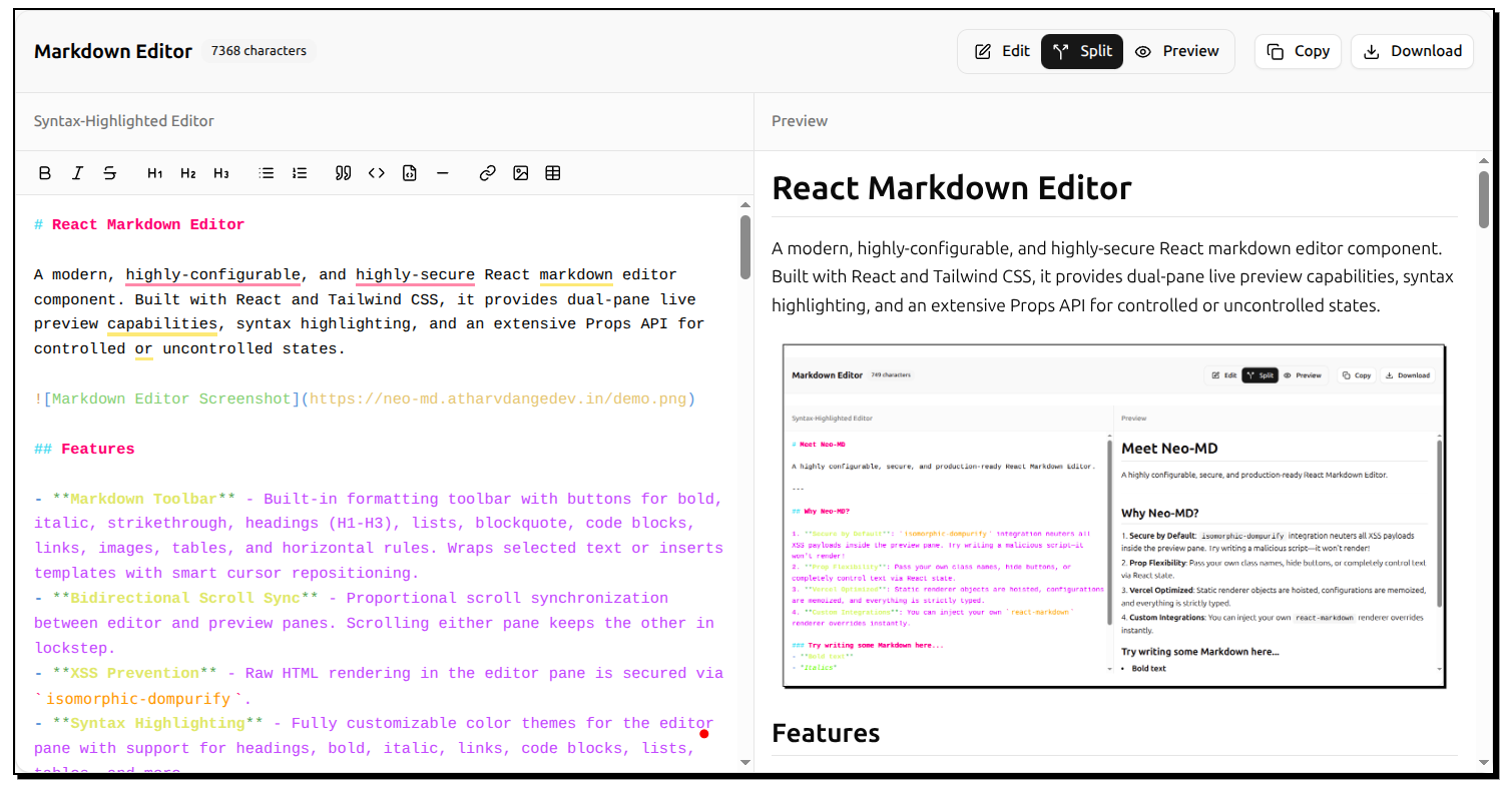
A modern, highly-configurable, and highly-secure React markdown editor component. Built with React and Tailwind CSS, it provides dual-pane live preview capabilities, syntax highlighting, and an extensive Props API for controlled or uncontrolled states.
Features
- Markdown Toolbar - Built-in formatting toolbar with buttons for bold, italic, strikethrough, headings (H1-H3), lists, blockquote, code blocks, links, images, tables, and horizontal rules. Wraps selected text or inserts templates with smart cursor repositioning.
- Reading Time Estimate - Displays estimated reading time based on word count with configurable words-per-minute rate. Helps users gauge content length at a glance.
- Selection Word Count - Real-time statistics for selected text showing character, word, and line counts in a floating tooltip. Perfect for tracking specific sections.
- Multi-Format Export - Export markdown to Markdown (.md) and Plain Text (.txt) formats. Fully customizable format selection per implementation.
- Bidirectional Scroll Sync - Proportional scroll synchronization between editor and preview panes. Scrolling either pane keeps the other in lockstep.
- ASCII & Diagram Support - Precise whitespace preservation in plain text code blocks (
```), ensuring text-based diagrams and ASCII art render exactly as typed without space collapsing. - XSS Prevention - Raw HTML rendering in the editor pane is secured via
isomorphic-dompurify. - Syntax Highlighting - Fully customizable color themes for the editor pane with support for headings, bold, italic, links, code blocks, lists, tables, and more.
- Controlled & Uncontrolled Support - Plug it into external state naturally like a standard input element, or let it manage its own.
- Deep Customizability - Apply your own
classNamestructures mapping to the editor pane, preview pane, and toolbar. - Ref Forwarding - Programmatically trigger focus or grab values using
useImperativeHandleandforwardRef. - Custom Renderers - Inject your own custom React components directly into the
react-markdownDOM rendering pipeline. - Live Preview - Real-time rendering of markdown content with split-pane editing.
- Dark Mode Support - Built-in Tailwind theming compatible with system preferences.
Demo
Installation
npm install neo-md
# or
yarn add neo-md
# or
pnpm add neo-md
# or
bun add neo-md
You must also have react and react-dom installed, as they are peer dependencies.
Usage
Basic Implementation (Uncontrolled)
By default, the editor works out of the box with zero configuration necessary.
import { MarkdownEditor } from "neo-md";

// Important: import the CSS!
import "neo-md/react-markdown-editor.css";

function App() {
  return (
    <div className="h-screen py-8">
      <MarkdownEditor />
    </div>
  );
}
Advanced Implementation (Controlled)
Control the text value, track the current pane view mode, and alter the default toolbar state using the rich Props API.
import { useState, useRef } from "react";
import { MarkdownEditor, MarkdownEditorRef } from "neo-md";
import "neo-md/react-markdown-editor.css";

function App() {
  const [markdown, setMarkdown] = useState("# Initial Text");
  const [view, setView] = useState<"edit" | "preview" | "split">("split");
  const editorRef = useRef<MarkdownEditorRef>(null);

  const focusEditor = () => editorRef.current?.focus();

  const customRenderers = {
    h1: ({ children }) => (
      <h1 className="text-4xl text-blue-500">{children}</h1>
    ),
  };

  return (
    <div className="h-screen py-8">
      <button onClick={focusEditor}>Focus Textarea</button>

      <MarkdownEditor
        ref={editorRef}
        value={markdown}
        onChange={setMarkdown}
        viewMode={view}
        onViewModeChange={setView}
        components={customRenderers}
        showWordCount={false}
        enableCopy={false}
        className="my-custom-wrapper"
        placeholder="Type something amazing..."
      />
    </div>
  );
}
API Reference
The MarkdownEditor component accepts the following props:
| Prop | Type | Default | Description |
| --------------------- | -------------------------------- | -------------------- | ------------------------------------------------------------------------------------------------------------------------------------------------- |
| value | string | undefined | The controlled markdown text. |
| defaultValue | string | (default template) | Initial text for uncontrolled mode. |
| onChange | (value: string) => void | undefined | Callback fired when text changes. |
| viewMode | "edit" \| "preview" \| "split" | undefined | The controlled view mode. |
| defaultViewMode | "edit" \| "preview" \| "split" | "split" | Initial view mode for uncontrolled mode. |
| onViewModeChange | (mode) => void | undefined | Callback fired when a toolbar tab is clicked. |
| className | string | "" | Classes applied to the root container. |
| editorClassName | string | "" | Classes applied to the editor pane wrapper. |
| previewClassName | string | "" | Classes applied to the preview pane wrapper. |
| showToolbar | boolean | true | Shows the top toolbar block. |
| showWordCount | boolean | true | Shows the character counter badge. |
| showReadingTime | boolean | true | Shows the estimated reading time badge. |
| wordsPerMinute | number | 200 | Words per minute for reading time calculation. |
| showSelectionCount | boolean | true | Shows floating tooltip with stats for selected text. |
| showMarkdownToolbar | boolean | true | Shows the markdown formatting toolbar. |
| enableDownload | boolean \| ExportFormat[] | true | Export button with format options. true = all formats (md, txt), false = disabled, or array like ['markdown', 'text'] for specific formats. |
| enableCopy | boolean | true | Toggles the "Copy" button. |
| enableScrollSync | boolean | true | Toggles bidirectional scroll sync between panes. |
| placeholder | string | "Start typing..." | Textbox placeholder text. |
| readOnly | boolean | false | Disables text input and hides the formatting toolbar. |
| maxLength | number | undefined | Hard cap on textarea character length. |
| components | Components | {} | Complete react-markdown DOM rendering overrides. |
| syntaxColors | SyntaxHighlightColors | defaultColors | Custom color theme for syntax highlighting. |
Exposed Methods (MarkdownEditorRef)
Via forwardRef, parents can trigger the following imperatives on the editor:
focus(): Forces browser focus onto the underlying<textarea>.getValue(): Retrieves the current internal markdown string, particularly useful if you run uncontrolled mode and just want the value on submit.
Roadmap
- Table of Contents Sidebar
- Auto-generated from headings
- Clickable navigation
- Collapsible sections
- Sticky/floating mode
- ✅ Reading Time Estimate - Completed
- Based on word count
- Configurable WPM
- ✅ Selection Word Count - Completed
- Character/word/line count
- Minimap (like VS Code)
- Document overview
- Quick scroll navigation
- ✅ Export to Multiple Formats - Completed
- PDF with styling (via browser print)
- Styled HTML
- Plain text
- Markdown
- Multiple Themes
- Predefined color schemes (Monokai, Solarized, etc.)
- Find & Replace
- Search with regex support
- Replace all/one at a time
- Case sensitivity toggle
- Highlight matches in editor
- Link Preview Cards
- Hover over links for preview
- Unfurl metadata (title, description, image)
Contributing
Contributions are welcome! Please see our Contributing Guide for detailed information on how to get started, development workflow, and coding guidelines.
License
This project is licensed under the MIT License.