
nextmag
v1.0.0
Published
NextMagnifierJS - A beautiful, customizable magnifying glass component for Next.js applications
Maintainers
 savevsgames
Readme
NextMagnifierJS
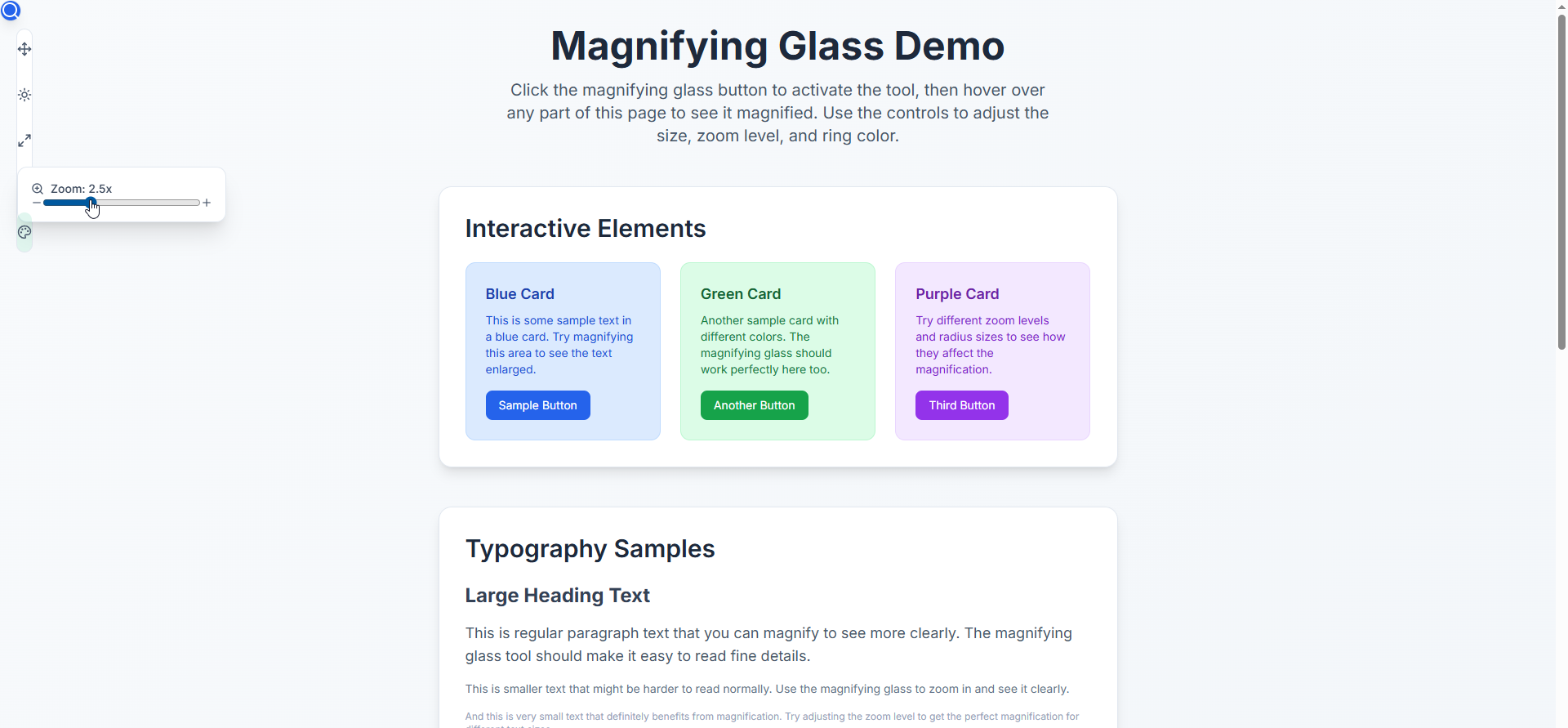
A beautiful, customizable magnifying glass component for Next.js applications that provides an elegant way to zoom in on any part of your webpage.
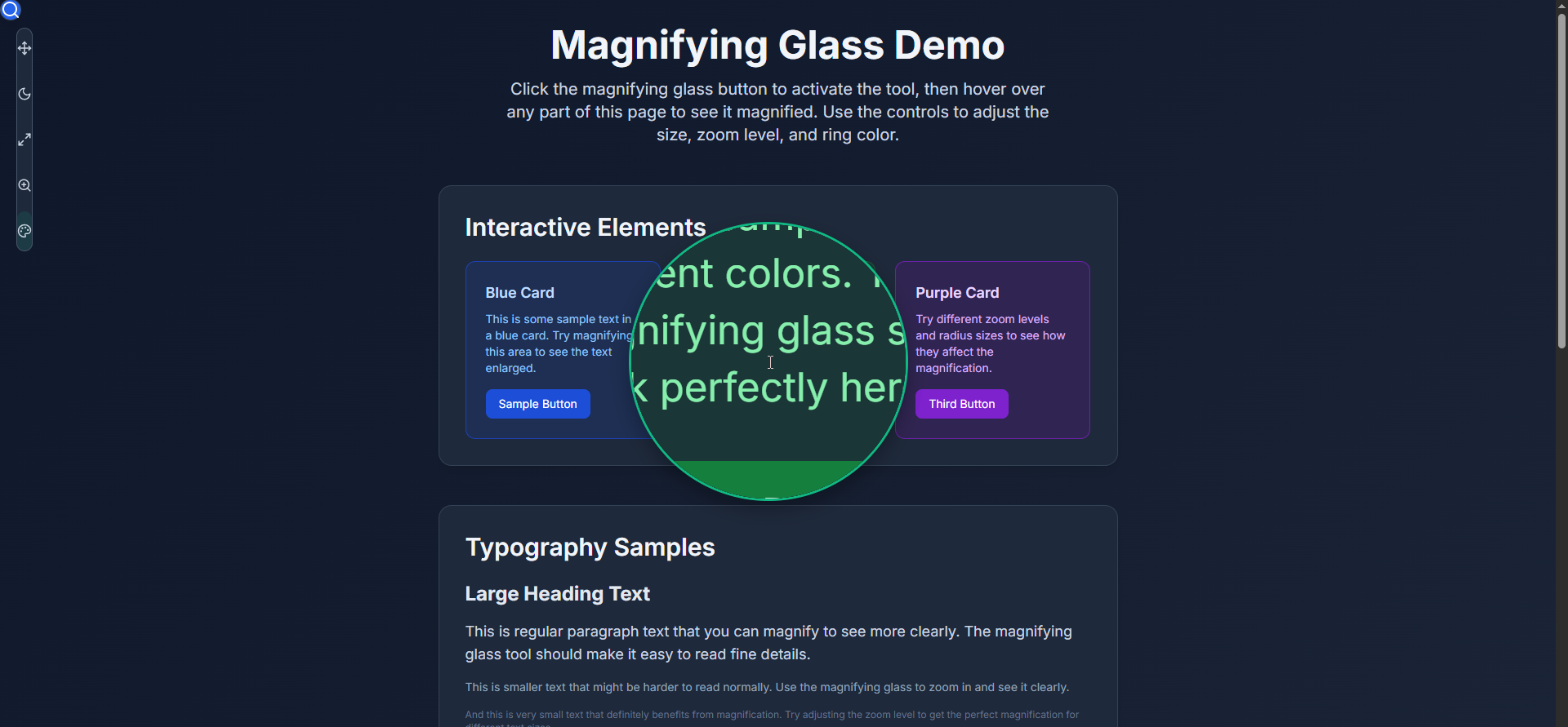
The control panel features a draggable interface with hover-activated submenus for adjusting radius, zoom level, ring color, and theme settings - all designed to stay out of your way while providing powerful customization options!
🚀 Quick Start
npm install nextmag
# or
yarn add nextmag
# or
pnpm add nextmag
✨ Features
🎨 Slim Vertical Design - Modern, polished UI with smooth animations
🔧 Fully Customizable - Adjust size, zoom level, and ring color
🌙 Theme Flexible - Works with any theme system or standalone
📱 Responsive - Perfect on all screen sizes
🎯 Smart Positioning - Automatically avoids control panel overlap
⚡ Performance Optimized - Efficient rendering and memory management
🔧 TypeScript Ready - Full TypeScript support with exported types
🎮 Easy Integration - Drop-in component with minimal setup
📖 Basic Usage
'use client';

import React, { useState } from 'react';
import { MagnifyingGlass, ControlPanel } from 'nextmag';

export default function MyPage() {
  const [isActive, setIsActive] = useState(false);
  const [radius, setRadius] = useState(100);
  const [zoomLevel, setZoomLevel] = useState(2);
  const [ringColor, setRingColor] = useState('#3b82f6');
  const [controlPanelBounds, setControlPanelBounds] = useState();

  return (
    <div>
      {/* Your page content */}
      <h1>My Amazing Content</h1>
      <p>Hover over this text with the magnifying glass active!</p>

      {/* NextMagnifierJS Components */}
      {isActive && (
        <MagnifyingGlass
          radius={radius}
          zoomLevel={zoomLevel}
          ringColor={ringColor}
          controlPanelBounds={controlPanelBounds}
        />
      )}

      <ControlPanel
        isActive={isActive}
        onToggle={() => setIsActive(!isActive)}
        radius={radius}
        onRadiusChange={setRadius}
        zoomLevel={zoomLevel}
        onZoomChange={setZoomLevel}
        ringColor={ringColor}
        onRingColorChange={setRingColor}
        onBoundsChange={setControlPanelBounds}
      />
    </div>
  );
}
🎨 With Theme Integration
If your app uses a theme system (like next-themes), you can integrate it:
'use client';

import { useTheme } from 'next-themes';
import { MagnifyingGlass, ControlPanel } from 'nextmag';

export default function MyPage() {
  const { theme, setTheme } = useTheme();
  // ... other state

  const handleThemeToggle = () => {
    setTheme(theme === 'dark' ? 'light' : 'dark');
  };

  return (
    <div>
      {/* Your content */}

      <ControlPanel
        // ... other props
        currentTheme={theme as 'light' | 'dark'}
        onThemeToggle={handleThemeToggle}
      />
    </div>
  );
}
🔧 API Reference
MagnifyingGlass Props
| Prop | Type | Required | Description |
|------|------|----------|-------------|
| radius | number | ✅ | Size of the magnifying glass (50-200px) |
| zoomLevel | number | ✅ | Magnification level (1.5-5x) |
| ringColor | string | ✅ | Color of the magnifying glass ring |
| controlPanelBounds | object | ❌ | Bounds to avoid overlapping with control panel |
ControlPanel Props
| Prop | Type | Required | Description |
|------|------|----------|-------------|
| isActive | boolean | ✅ | Whether the magnifying glass is active |
| onToggle | () => void | ✅ | Callback when toggle button is clicked |
| radius | number | ✅ | Current radius value |
| onRadiusChange | (value: number) => void | ✅ | Callback when radius changes |
| zoomLevel | number | ✅ | Current zoom level |
| onZoomChange | (value: number) => void | ✅ | Callback when zoom changes |
| ringColor | string | ✅ | Current ring color |
| onRingColorChange | (color: string) => void | ✅ | Callback when color changes |
| onBoundsChange | (bounds: object) => void | ❌ | Callback when panel bounds change |
| initialModalPosition | 'top-right' \| 'near-button' | ❌ | Initial position of control panel |
| currentTheme | 'light' \| 'dark' | ❌ | Current theme (for theme integration) |
| onThemeToggle | () => void | ❌ | Theme toggle callback (shows theme button) |
🎯 Integration Examples
Standalone (No Theme System)
// Just use the basic setup - no theme props needed
<ControlPanel
  isActive={isActive}
  onToggle={() => setIsActive(!isActive)}
  // ... other required props
/>
With Existing Theme System
// Pass your theme state and toggle function
<ControlPanel
  // ... required props
  currentTheme={yourTheme}
  onThemeToggle={yourThemeToggleFunction}
/>
Custom Positioning
<ControlPanel
  // ... other props
  initialModalPosition="top-right" // or "near-button"
/>
🎨 Styling Requirements
NextMagnifierJS requires Tailwind CSS to be configured in your project. Make sure you have:
- Tailwind CSS installed and configured
- The necessary Tailwind classes available in your build
npm install tailwindcss🌟 Advanced Usage
Custom Color Palette
// The component includes these default colors:
// Blue, Red, Green, Yellow, Purple, Cyan, Orange, Gray
// You can set any hex color as the ring color
<ControlPanel
  ringColor="#ff6b6b" // Custom color
  onRingColorChange={setRingColor}
  // ... other props
/>
Performance Tips
// Only render MagnifyingGlass when active for better performance
{isActive && (
  <MagnifyingGlass
    radius={radius}
    zoomLevel={zoomLevel}
    ringColor={ringColor}
    controlPanelBounds={controlPanelBounds}
  />
)}
🔧 TypeScript Support
NextMagnifierJS is built with TypeScript and exports all necessary types:
import {
  MagnifyingGlass,
  ControlPanel,
  MagnifyingGlassProps,
  ControlPanelProps
} from 'nextmag';
🌐 Browser Support
- Chrome/Edge 88+
- Firefox 87+
- Safari 14+
🐛 Issues & Contributing
This is a solo-maintained project. While I don't actively monitor issues daily, I do check periodically and will address bugs when possible.
Contributors welcome! If you'd like to help maintain this project:
- 🍴 Fork the repo and submit PRs for bug fixes or features
- 💬 Help answer questions in issues
- 📖 Improve documentation
- 🧪 Add tests or examples
For urgent issues, consider forking and implementing fixes yourself - PRs are always appreciated! 🙏
Reporting Issues
When reporting bugs, please include:
- Next.js version
- Browser and version
- Steps to reproduce
- Expected vs actual behavior
📝 Requirements
- Next.js 13+
- React 18+
- Tailwind CSS 3+
🤝 Contributing
This project follows standard open-source contribution practices. Feel free to:
- Open issues for bugs or feature requests
- Submit pull requests with improvements
- Help with documentation
Note: As a solo developer, response times may vary, but all contributions are valued and will be reviewed when possible.
📄 License
MIT © NextMagnifierJS - savevsgames