ng-bs-form-builder
v1.2.1
Published
Reactive Form Builder For Angular Using Bootstrap UI Framework

Maintainers
 arjunkhetia
Readme
Angular Bootstrap Form Builder (EmanciTech)
The library is developed by EmanciTech to provides Angular components that help developers to quickly generate Bootstrap Reactive Form from JavaScript object. Component supports validators, help messages and error messages.
Based on ReactiveFormsModule from @angular/forms. Available custom and all angular built-in form elements. Automatically create full customised form with simple javascript object configuration. Also support some of the CSS styling for form attributes.
Installation
Install npm package into your Angular application
$ npm install ng-bs-form-builder --saveOnce installed you need to import the main module
import { NgBsFormBuilderModule } from 'ng-bs-form-builder';

@NgModule({
    imports: [
        NgBsFormBuilderModule
    ]
})
export class AppModule {
Dependencies
Usage
Create your data model object
public formConfig: any = {
    title: "Sample Form",                                  // Form name to display
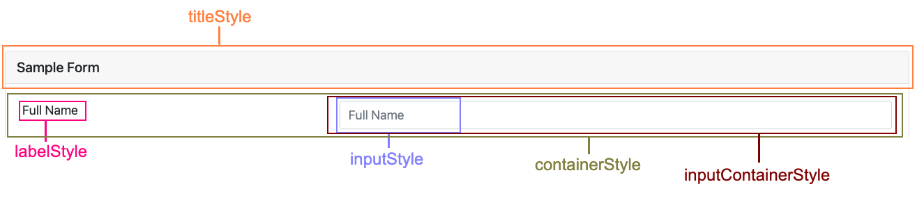
    titleStyle: {                                          // Form title's CSS style properties
      'color': 'blue',
      'background': 'azure'
    },
    controls: {
      saveButton: 'Save',                                    // Save button name
      resetButton: 'Reset'                                   // Reset button name
    },
    fields: [                                                // Defining fields of our form
      {
        type: 'text',                                        // Field type (text, email, password, number, dropdown, radio, checkbox, switch, range, date, time, datetime & file)
        id: 'full-name-element-id',                          // Unique field ID
        name: 'fullName',                                    // Unique field name
        label: 'Full Name',                                  // Field label
        value: '',                                           // Field value
        required: true,                                      // Necessary field or not
        requiredMessage: 'Full Name is required.',           // Required validation error message (Note: only for required field)
        minLength: 5,                                        // Minimum length of field
        minLengthMessage: 'Minimum length is required.',     // Minimum length validation error message (Note: only for minLength enabled field)
        maxLength: 10,                                       // Maximum length of field
        pattern: '^[a-zA-Z0-9]+$',                           // Specify regular expression pattern for the field
        patternMessage: 'Invalid Full Name.',                // Regex pattern validation error message (Note: only for pattern enabled field)
        readonly: true,                                      // Readonly field or not
        multiline: false,                                    // Multiline field or not
        lines: 5,                                            // Number of rows for field (Note: only for multiline input field)
        placeholder: 'Full Name',                            //Placeholder to show inside field
        options: [                                           // Options to populate the field (Note: only for radio, dropdown, checkbox & switch)
          { key: 'male', label: 'Male' },
          { key: 'female', label: 'Female' },
          { key: 'other', label: 'Other' }
        ],
        min: '0',                                            // Minimum field value (Note: only for date & range)
        max: '100',                                          // Maximum field value (Note: only for date & range)
        step: 5,                                             // Step field value (Note: only for range)
        sliderLabel: '$',                                    // Slider label for field (Note: only for range)
        multiple: true,                                      // Multiple file upload support for field (Note: only for file)
        onUpload: this.onUpload.bind(this),                  // Function to call on file upload (Note: only for file)
        onChange: (event: any) => {                          // Function to call on change of input field value
          console.log(event.target.value);
        },
        style: 'row',                                        // Layout type (row & column) (Note: only for checkbox, switch & radio)
        containerStyle: {                                    // Container -> (label + input field) CSS style properties
          'width': '50%',
          'float': 'left'
        },
        labelStyle: {                                        // Field label CSS style properties
          'width': '50%',
          'color': 'orange'
        },
        inputContainerStyle: {                               // InputContainer -> (container + input field) CSS style properties
          'width': '50%'
        },
        inputStyle: {                                        // Input field CSS style properties (Note: only for text, email, password, number date, dropdown & time)
          'color': 'green'
        },
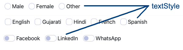
        textStyle: {                                         // Input field text CSS style properties (Note: only for checkbox, radio, range, file & switch)
          'color': 'green'
        }
      }
    ]
}

onUpload(event: any) {                                // Upload function called when any file is selected
  let files: any;
  if (event?.target?.files) {
    files = event.target.files;
  } else {
    files = event
  }
  console.log(files);
}

receiveData(data: any) {                              // Received function called when user press save button
    console.log(data);
}
HTML Form
Snippet below will generate form fields
<ng-bs-form-builder [formConfig]="formConfig" (formData)="receiveData($event)"></ng-bs-form-builder>Form
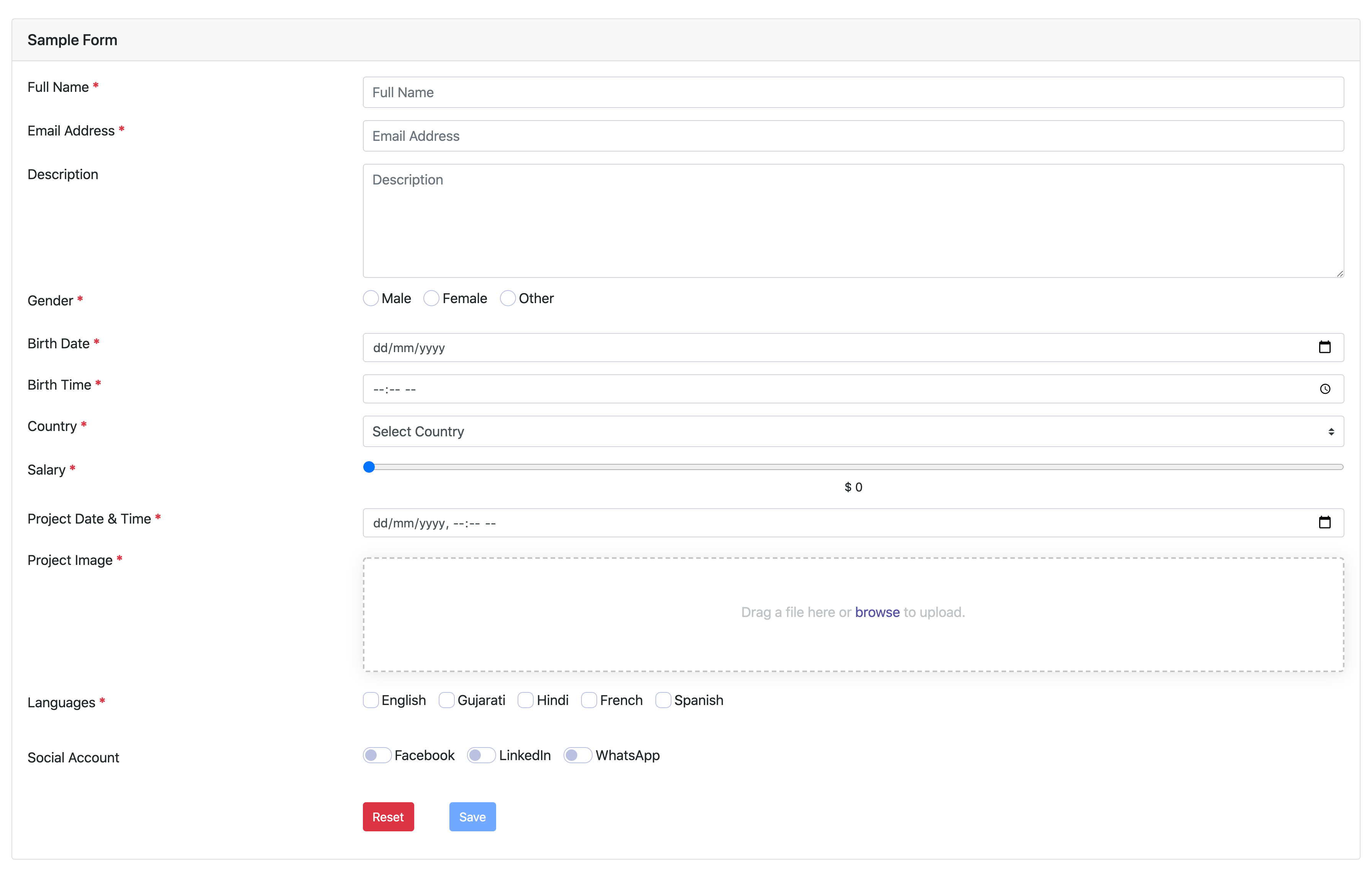
Validation Error Form
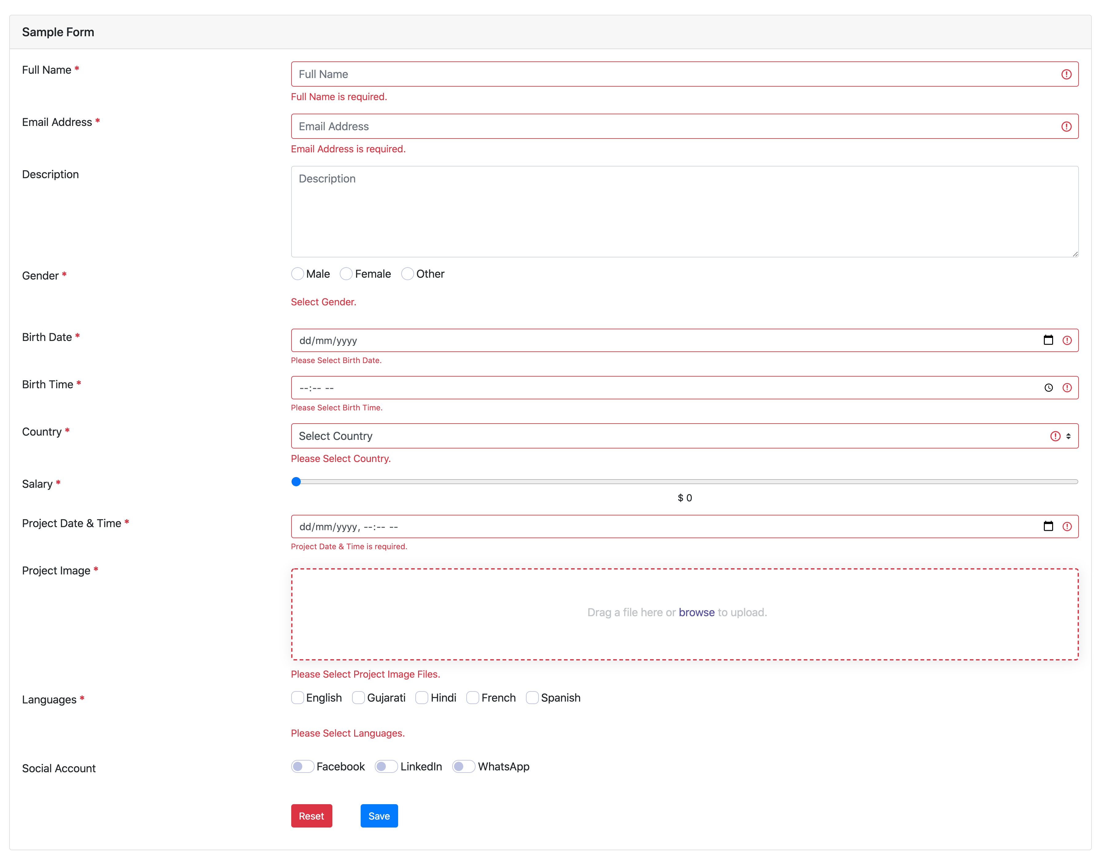
Filled Form
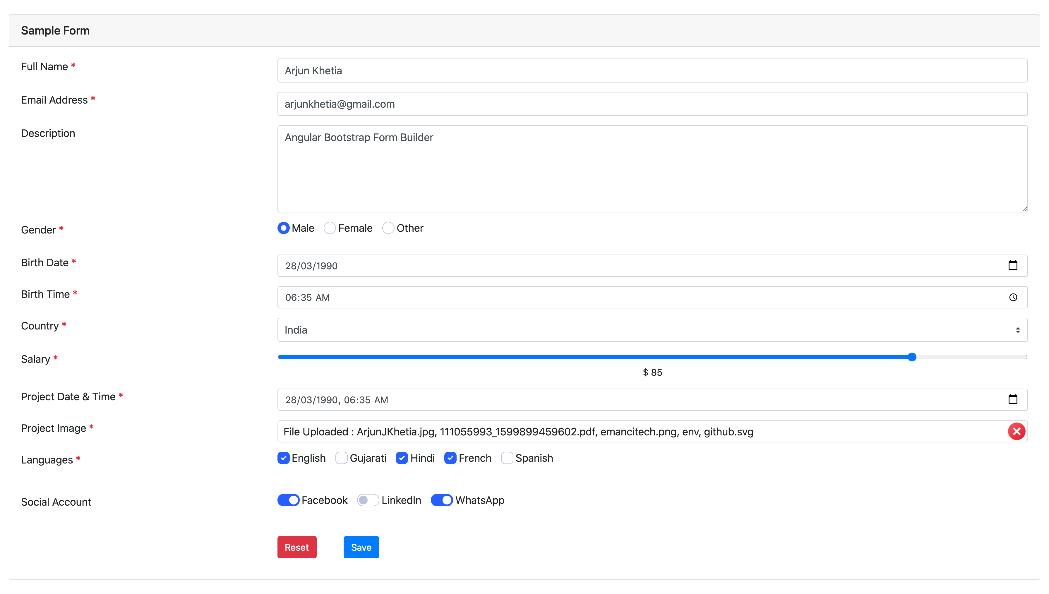
Form Styles