
ng-cards-ap
v1.0.8
Published
I have designed this card package to help people like me searching for a card template to add in their Angular project. This card design consists of various dynamic things which will help you to create different types of card: With Image, without image et
Maintainers
 ananta580
Readme
Ng Cards AP: Beautiful Card with multiple usage (Angular)
I have designed this card package to help people like me searching for a card template to add in their Angular project. This card design consists of various dynamic things which will help you to create different types of card: With Image, without image etc. I am continuously contributing to this thing and If you like this after using, consider give me a star.
Sample Images
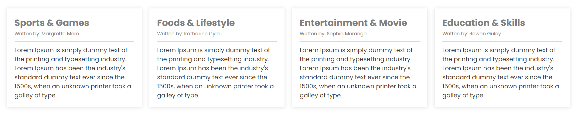
1. Basic / Simple without image
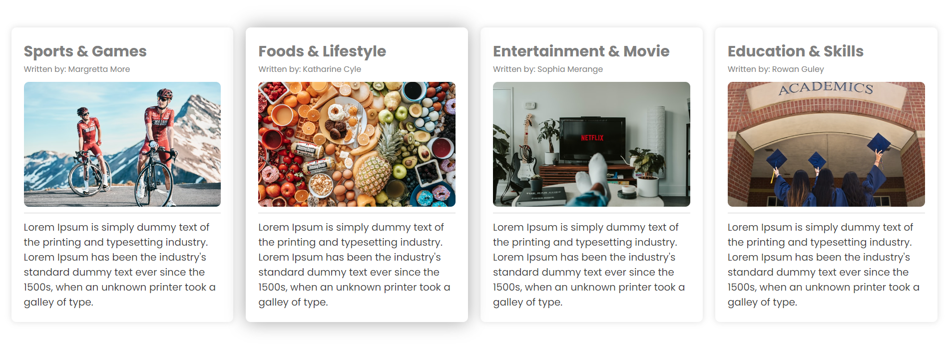
2. With Image and without border

3. With Image and with border
How it works
- Run
npm install ng-cards-apin your angular project which will add this package to your package.json file. - Import
NgCardModulein your Module that will be using this card component. - You have successfully setup the ng-card-ap.
Example, Sample Usage (Basic card)
Insert the below code to the html page where you need the card.
<ng-card-ap
  [Title]="'Food and colors'"
  [Subtitle]="'Written by: Rohn Rose'"
  [Description]="'Some sort of description that will make this card looks better
               and you can showcase your website with good content.'"
>
</ng-card-ap>
Great! This is all you need as part of initial usage.
What's more
Bordered Card
This property will help you add border to your card, so that it can be blend with the other style of your page.
[Border]="true" : Default is false` ---------------------------------------

<ng-card-ap
  [Border]="true"
  [Title]="'Food and colors'"
  [Subtitle]="'Written by: Rohn Rose'"
  [Description]="'Some sort of description that will make this card looks better
               and you can showcase your website with good content.'"
>
</ng-card-ap>
Hoverable Card
This property will help you add hoverable behaviour to your card, it will help you to stylize your boring card.
[Hoverable]="true" : Default is false ---------------------------------------

<ng-card-ap
  [Hoverable]="true"
  [Title]="'Food and colors'"
  [Subtitle]="'Written by: Rohn Rose'"
  [Description]="'Some sort of description that will make this card looks better
               and you can showcase your website with good content.'"
>
</ng-card-ap>
Image Card
Image property in the card is to add Image in the card, there can be a usecase when this kind of thing is required to show image cards
[Image]="'https://upload.wikimedia.org/wikipedia/commons/3/36/Hopetoun_falls.jpg'"
----------------------------------------------------------------------------------

<ng-card-ap
  [Image]="'https://upload.wikimedia.org/wikipedia/commons/3/36/Hopetoun_falls.jpg'"
  [Title]="'Food and colors'"
  [Subtitle]="'Written by: Rohn Rose'"
  [Description]="'Some sort of description that will make this card looks better
               and you can showcase your website with good content.'"
>
</ng-card-ap>
Overall element Usage
What if we combine all these property, you can easily turn off the property to false, if not required by your usecase.
<ng-card-ap
  [Border]="true"
  [Hoverable]="true"
  [Image]="'https://upload.wikimedia.org/wikipedia/commons/3/36/Hopetoun_falls.jpg'"
  [Title]="'Food and colors'"
  [Subtitle]="'Written by: Rohn Rose'"
  [Description]="'Some sort of description that will make this card looks better
               and you can showcase your website with good content.'"
>
</ng-card-ap>