
ng-select-plus
v1.0.3
Published
A modern, feature-rich multi-select dropdown component for Angular 17+ with search functionality, smooth animations, and responsive badge display

Maintainers
 aswanth_ai
Readme
Angular Multi-Select Dropdown
A modern, feature-rich multi-select dropdown component for Angular 17+ with search functionality, smooth animations, and responsive badge display.



📸 Preview
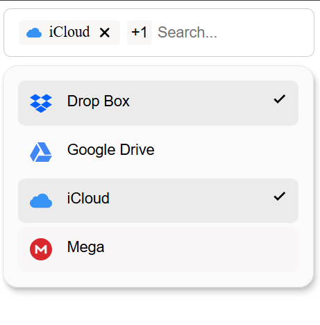
Multi-select dropdown with search, badges, and smooth animations
✨ Features
- 🎯 Multi-Select with Visual Feedback - Checkmark indicators for selected items
- 🔍 Real-time Search & Filter - Instant item filtering as you type
- 📱 Responsive Design - Adaptive badge count based on screen width (1-5 items)
- ✨ Smooth Animations - Elegant add/remove animations using pure CSS
- 🎨 Fully Customizable - Control colors, sizes, and styles via input properties
- 🔗 Two-way Binding - Seamless parent-child synchronization
- 📤 Event Emitters - Get notified of selection changes
- 🎭 BEM Methodology - Clean, maintainable CSS architecture
- 📦 Standalone Components - No module imports needed
- 🌐 Click-outside to Close - Better UX with smart dropdown behavior
📦 Installation
npm install ng-select-plus🚀 Quick Start
1. Import the Component
import { Component } from '@angular/core';
import { SearchInputComponent } from 'ng-select-plus';

@Component({
  selector: 'app-root',
  standalone: true,
  imports: [SearchInputComponent],
  template: `
    <lib-search-input
      [dropDownItems]="items"
      (selectedItemsChange)="onSelectionChange($event)">
    </lib-search-input>
  `
})
export class AppComponent {
  items = [
    { id: 1, name: 'Angular', icon: 'https://cdn.simpleicons.org/angular' },
    { id: 2, name: 'React', icon: 'https://cdn.simpleicons.org/react' },
    { id: 3, name: 'Vue', icon: 'https://cdn.simpleicons.org/vuedotjs' }
  ];

  onSelectionChange(selected: any[]) {
    console.log('Selected items:', selected);
  }
}
2. That's it! 🎉
The component works out of the box with sensible defaults.
📖 API Reference
SearchInputComponent
Input Properties
| Property | Type | Default | Description |
|----------|------|---------|-------------|
| inputPlaceholder | string | 'Search...' | Placeholder text for search input |
| dropDownItems | Array<Item> | [] | Array of items to display |
| backgroundColor | string | 'rgba(249, 247, 247, 0.676)' | Dropdown background color |
| borderRadius | string | '8px' | Border radius for list items |
| maxHeight | string | '400px' | Maximum dropdown height |
| selectedItemColor | string | '#e7e7e7cd' | Background color for selected items |
| hoverColor | string | '#f8f6f6ff' | Hover state background color |
| containerBorderRadius | string | '16px' | Dropdown container border radius |
| selectedBackgroundColor | string | 'rgba(247, 244, 244, 0.812)' | Badge background color |
Output Events
| Event | Type | Description |
|-------|------|-------------|
| selectedItemsChange | Array<Item> | Emitted when selection changes |
Item Interface
interface Item {
  id: number;
  name: string;
  icon?: string; // Optional icon URL
}
🎨 Customization Examples
Basic Customization
<lib-search-input
  [inputPlaceholder]="'Search frameworks...'"
  [dropDownItems]="frameworks"
  [backgroundColor]="'#f0f0f0'"
  [borderRadius]="'12px'"
  [maxHeight]="'300px'"
  (selectedItemsChange)="handleSelection($event)">
</lib-search-input>
Dark Theme
<lib-search-input
  [dropDownItems]="items"
  [backgroundColor]="'#2d2d2d'"
  [selectedItemColor]="'#404040'"
  [hoverColor]="'#353535'"
  [selectedBackgroundColor]="'#1a1a1a'">
</lib-search-input>
Compact Mode
<lib-search-input
  [dropDownItems]="items"
  [maxHeight]="'200px'"
  [borderRadius]="'4px'"
  [containerBorderRadius]="'8px'">
</lib-search-input>
📱 Responsive Behavior
The component automatically adjusts the number of visible badges based on screen width:
| Screen Width | Visible Badges | |--------------|----------------| | ≥ 1024px | 5 badges | | ≥ 768px | 4 badges | | ≥ 450px | 3 badges | | ≥ 390px | 2 badges | | < 390px | 1 badge |
Additional items are shown as a "+N" count badge.
🎬 Animations
Adding Items
- Fade in with scale animation
- Smooth expansion from left
- Duration: 300ms
Removing Items
- Fade out with scale down
- Width collapse for smooth text flow
- Duration: 300ms
🏗️ Architecture
Component Structure
ng-select-plus/
├── search-input.component.ts    # Parent component with badge display
│   ├── Badge rendering with animations
│   ├── Responsive item count logic
│   ├── Input field with click handler
│   └── Dropdown integration
│
└── drop-down.component.ts       # Child component with list display
    ├── Item filtering & sorting
    ├── Multi-select logic
    ├── Selection state management
    └── Customizable styling
Key Design Patterns
- Signals Architecture: Reactive state management with Angular signals
- Two-way Binding: Using
model()for parent-child sync - Computed Values: Automatic derivation of filtered/sorted items
- BEM CSS: Maintainable and scalable styles
- Effect-based Animations: Track state changes for smooth transitions
🔧 Advanced Usage
Programmatic Selection
export class MyComponent {
  @ViewChild(SearchInputComponent) searchInput!: SearchInputComponent;

  selectAll() {
    this.searchInput.selectedItemsForUi.set(this.allItems);
  }

  clearAll() {
    this.searchInput.selectedItemsForUi.set([]);
  }
}
Custom Icons
items = [
  {
    id: 1,
    name: 'GitHub',
    icon: 'https://cdn.simpleicons.org/github'
  },
  {
    id: 2,
    name: 'GitLab',
    icon: 'https://cdn.simpleicons.org/gitlab'
  }
];
Dynamic Items
loadItems() {
  this.http.get<Item[]>('/api/items').subscribe(items => {
    this.items = items;
  });
}
🎯 Browser Support
- Chrome (latest)
- Firefox (latest)
- Safari (latest)
- Edge (latest)
📄 License
MIT License - feel free to use this in your projects!
🙏 Credits
Built with ❤️ using Angular 19.2
📞 Support
If you have any questions or run into issues, please open an issue on GitHub.
Happy Coding! 🚀
Running end-to-end tests
For end-to-end (e2e) testing, run:
ng e2eAngular CLI does not come with an end-to-end testing framework by default. You can choose one that suits your needs.
Additional Resources
For more information on using the Angular CLI, including detailed command references, visit the Angular CLI Overview and Command Reference page.