
ng2-knob-e2e
v1.0.4
Published
Angular 2 Knob Component for e2e

Readme
Knob Widget
Overwrite on https://github.com/spheras/knob for e2e project.
Changelog vs original repo:
- Modified mouse change event - fix for knob arrow placement bug;
- Added step parameter for knob component;
Knob is an Angular component to set values with the typical Knob control (for instance, very used in music hardware). The component is very basic, you just need to configure the range of values admited, and the degrees the knob can manage. This component doesn't suply any skin by itself but you can find some example skins here too: https://github.com/spheras/knob/tree/master/skins
The following are two examples of what you can achieve with this component:


Getting Started
Installing the Component
First of all you'll need to add it to your project as a dependency, i.e. with npm:
npm install ng2-knob-e2e --save
Using the Component
Using Knob widget is pretty simple. First, import the component inside the module of your Angular Application, like this:
import { KnobModule } from 'ng2-knob-e2e';
...
@NgModule({
 ...
   declarations: [
        AppComponent,
        ...
    ],
    imports: [
      BrowserModule,
      FormsModule,
      KnobModule,
      ...
 ...
})
export class AppModule {}
Add the Component to your Application
To start working with the new component, add it to the html part of the component you desire:
@Component({
    selector: 'my-app',
    template: `
  <h3>Knob Use Example</h3>
    <div class="container">
        <knob class="skin1" #myknob1 [min]="10" [max]="200" [value]="80" [startDegree]="200"  [endDegree]="120"></knob>
        <div class="info bpm">{{myknob1.meterValue}} bpm</div>
    </div>
  `,
})
export class App {
    // ...
}
To use correctly the knob, you will need probably a container and a div (like info div in the example) to show the current value of the knob. The container will have the base skin (which is static and don't rotate), and the info will show the meter value of the knob. You can find some examples below.
Input Parameters
<knob [min]="0" [max]="100"\ [value]="50"\ [startDegree]="0"\ [endDegree]="120"> </knob>
min (type: number)
- The minimum value you need for the range of values [min,max]
max (type: number)
- The maximum value you need for the range of values [min,max]
step (type: number)
- knob step which defines minum value for meterValue to change its value
value (type: number)
- The starting value you want for the knob. Consider to put a value between min and max.
startDegree (type: number)
- The knob rotate from a start degree to an end degree. This is the start degree.
endDegree (type: number)
- The knob rotate from a start degree to an end degree. This is the end degree.
intensive (type: boolean)
- true (default) if you want to be notified on each small change by the change event. If not, you will be notified only after the end of modification.
Public Methods
setInitialValue (value: number)
- If you need to set the initial value by code, or set a value by code you can do it calling this function. Don't forget to pass a value between the range [min,max]. Example:
 @ViewChild('myKnob1') knob: KnobComponent;

 doSomething() {
    let someValue:number=50;
    this.knob.setInitialValue(someValue);
 }
Output Events
The component emit an event at every change value of the knob. You can listen to these events using the change property with the $event property received.
<knob class="skin1" #myknob1 [min]="10" [max]="200" [step]="10" [value]="80" [startDegree]="200" [endDegree]="120" (change)="console.log($event);"></knob>Double Binding ngModel
You can use the component just binding the value with the ngModel property. This way, you'll probably don't need the change event or setInitialValue or value property. For instance:
<knob class="skin1" [min]="10" [max]="200" [startDegree]="200"  [endDegree]="120" [(ngModel)]="myknob1_meterValue"></knob>
<div class="info bpm">{{myknob1_meterValue}} bpm</div>
<button (click)="myknob1_meterValue = 150">Set 150</button>
In this example, the knob is linked with the myknob1_metervalue variable from your controller. Whenever the knob change its value, or the variable is modified, everything will be updated.
Run the example application locally
git clone https://github.com/spheras/knob.gitcd knobnpm installnpm start# Default Browser should open automatically on http://localhost:3000
License
Examples
Remember: These skins are just examples, you can do your own skin and share with us! Skins have at least 2 parts, preferably using SVG format:
- The Base Skin, which is static (doesn't rotate)
- The Front Skin, which is linked with the internal knob div, and is rotating
Anyway, if you want to use one of our skins, just go to the skin folder (https://github.com/spheras/knob/tree/master/skins) and get what you need.
Study the following examples to understand better how to use them:
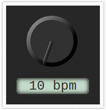
Skin 1
import { Component, NgModule } from '@angular/core'
import { FormsModule } from '@angular/forms';
import { BrowserModule } from '@angular/platform-browser';
@Component({
selector: 'my-app',
styles: [`
h3{
color:red;
}
.container{
width: 144px;
overflow: hidden;
border: 7px solid #FAFAFA;
padding: 20px;
box-shadow: 0px 0px 4px rgba(0,0,0,0.5);
background: #272727;
float:left;
margin:40px;
}
.info.bpm{
font-size: 2em;
border: 1px solid #555555;
width: 141px;
margin-top: 22px;
box-shadow: inset 0px 0px 11px rgba(0,0,0,1);
background: #c3dac9;
text-align: center;
font-family: monospace;
border-radius: 7px;
color: #333333;
}
knob{
background-size:contain;
margin-left: 20px;
width:100px;
height:100px;
display:block;
}
knob.skin1{
background:url('skins/skin1_back.svg');
background-size: contain;
}
knob.skin1 /deep/ .knob{
background:url('skins/skin1_front.svg');
background-size: contain;
}
`],
template: `
<h3>Angular 2 Knob Component</h3>
<div class="container">
<knob class="skin1" #myknob1 [min]="10" [max]="200" [value]="80" [startDegree]="200" [endDegree]="120"></knob>
<div class="info bpm">{{myknob1.meterValue}} bpm</div>
</div>
`,
})
export class AppComponent {
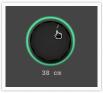
}Skin 2
import { Component, NgModule } from '@angular/core'
import { FormsModule } from '@angular/forms';
import { BrowserModule } from '@angular/platform-browser';
@Component({
selector: 'my-app',
styles: [`
h3{
color:red;
}
.container{
width: 144px;
overflow: hidden;
border: 7px solid #FAFAFA;
padding: 20px;
box-shadow: 0px 0px 4px rgba(0,0,0,0.5);
background: #272727;
float:left;
margin:40px;
}
.container.cm{
background: #444444;
}
.info.cm{
color: #AAAAAA;
font-family: monospace;
text-align: center;
margin-top: 7px;
font-weight: bold;
}
knob{
background-size:contain;
margin-left: 20px;
width:100px;
height:100px;
display:block;
}
knob.skin2{
background:url('skins/skin2_back.svg');
background-size: contain;
}
knob.skin2 /deep/ .knob{
background:url('skins/skin2_front.svg');
background-size: contain;
}
`],
template: `
<h3>Angular 2 Knob Component</h3>
<div class="container cm">
<knob class="skin2" #myknob2 [min]="0" [max]="500" [value]="30" [startDegree]="0" [endDegree]="360"></knob>
<div class="info cm">{{myknob2.meterValue}} cm</div>
</div>
`,
})
export class AppComponent {
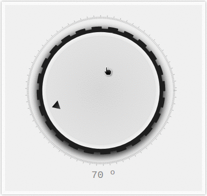
}Skin 3
import { Component, NgModule } from '@angular/core'
import { FormsModule } from '@angular/forms';
import { BrowserModule } from '@angular/platform-browser';
@Component({
selector: 'my-app',
styles: [`
h3{
color:red;
}
.container{
width: 144px;
overflow: hidden;
border: 7px solid #FAFAFA;
padding: 20px;
box-shadow: 0px 0px 4px rgba(0,0,0,0.5);
background: #272727;
float:left;
margin:40px;
}
.container.degree{
background: #F0F0F0;
width: 350px;
}
.info.degree{
color: #888888;
font-family: monospace;
text-align: center;
margin-top: 7px;
font-size: 20px;
}
knob{
background-size:contain;
margin-left: 20px;
width:100px;
height:100px;
display:block;
}
knob.skin3{
background:url('skins/skin3_back.svg');
background-size: contain;
width:300px;
height:300px;
}
knob.skin3 /deep/ .knob{
background:url('skins/skin3_front.svg');
background-size: contain;
width:300px;
height:300px;
}
`],
template: `
<h3>Angular 2 Knob Component</h3>
<div class="container degree">
<knob class="skin3" #myknob3 [min]="0" [max]="100" [value]="45" [startDegree]="0" [endDegree]="360"></knob>
<div class="info degree">{{myknob3.meterValue}} º</div>
</div>
`,
})
export class AppComponent {
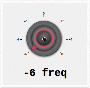
}Skin 4
import { Component, NgModule } from '@angular/core'
import { FormsModule } from '@angular/forms';
import { BrowserModule } from '@angular/platform-browser';

@Component({
    selector: 'my-app',
    styles: [`
    h3{
        color:red;
    }
    .container{
        width: 144px;
        overflow: hidden;
        border: 7px solid #FAFAFA;
        padding: 20px;
        box-shadow: 0px 0px 4px rgba(0,0,0,0.5);
        background: #272727;
        float:left;
        margin:40px;
    }
    .container.freq{
        background: #F0F0F0;
        width: 248px;
    }
    .info.freq{
        font-family: monospace;
        text-align: center;
        font-weight: bold;
        font-size: 36px;
        text-shadow: 0px 0px 2px rgba(0,0,0,0.5);
    }
    knob{
        background-size:contain;
        margin-left: 20px;
        width:100px;
        height:100px;
        display:block;
    }
    knob.skin4{
        background:url('skins/skin4_back.svg');
        background-size: contain;
        width:200px;
        height:200px;
    }
    knob.skin4 /deep/ .knob{
        background:url('skins/skin4_front.svg');
        background-size: contain;
        width:200px;
        height:200px;
    }
        `],
    template: `
  <h3>Angular 2 Knob Component</h3>
    <div class="container freq">
        <knob class="skin4" #myknob4 [min]="-6" [max]="6" [value]="3" [startDegree]="228"  [endDegree]="130"></knob>
        <div class="info freq">{{myknob4.meterValue}} freq</div>
    </div>
      `,
})
export class AppComponent {

}
Skin 5
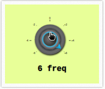
import { Component, NgModule } from '@angular/core'
import { FormsModule } from '@angular/forms';
import { BrowserModule } from '@angular/platform-browser';

@Component({
    selector: 'my-app',
    styles: [`
    h3{
        color:red;
    }
    .container{
        width: 144px;
        overflow: hidden;
        border: 7px solid #FAFAFA;
        padding: 20px;
        box-shadow: 0px 0px 4px rgba(0,0,0,0.5);
        background: #272727;
        float:left;
        margin:40px;
    }
    .container.freq2{
        background: #e8ff98;
        width: 148px;
    }
    .info.freq2{
        font-family: monospace;
        text-align: center;
        font-weight: bold;
        font-size: 16px;
        text-shadow: 0px 0px 2px rgba(0,0,0,0.5);
    }
    knob{
        background-size:contain;
        margin-left: 20px;
        width:100px;
        height:100px;
        display:block;
    }
    knob.skin5{
        background:url('skins/skin4_back.svg');
        background-size: contain;
        width:100px;
        height:100px;
    }
    knob.skin5 /deep/ .knob{
        background:url('skins/skin5_front.svg');
        background-size: contain;
        width:100px;
        height:100px;
    }
        `],
    template: `
  <h3>Angular 2 Knob Component</h3>
    <div class="container freq2">
        <knob class="skin5" #myknob5 [min]="-6" [max]="6" [value]="-6" [startDegree]="228"  [endDegree]="130"></knob>
        <div class="info freq2">{{myknob5.meterValue}} freq</div>
    </div>
      `,
})
export class AppComponent {

}