
ngx-checkboxpills
v1.6.1
Published
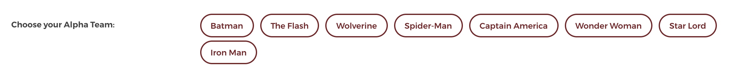
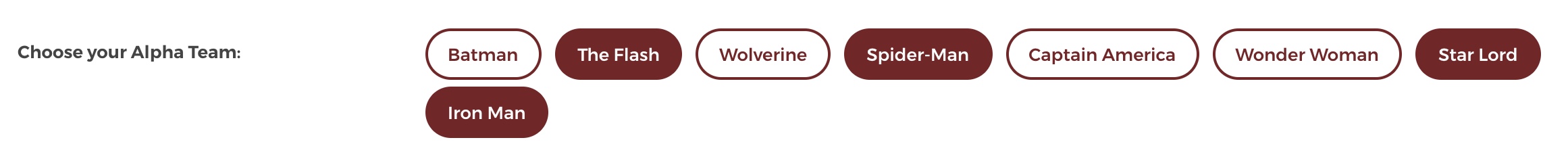
pills type checkbox groups with customizable functionalites
Maintainers
 iamntg93
Readme
Install from NPM
npm install ngx-checkboxpills --saveExample Usage
1. Import it in the Module
Import the CheckboxPillModule in the AppModule or the Module in which you want to have this control.
import { CheckboxPillModule } from 'ngx-checkboxpills';2. Define the array to display in the Component
Define the input array in the component.ts file
export class SuperHeroComponent {
    superHeroList: any;  //input array
    ntgUniverse = {
      superHeros: [],  // selected output array
      galaxies: [],
      planets: []
    }

    constructor() {

        this.superHeroList = [
        {
          '_id': 1002,
          'heroName': 'Batman'
        },
        {
          '_id': 1003,
          'heroName': 'The Flash'
        },

        .....

        {
          '_id': 1008,
          'heroName': 'Iron Man'
        }];

    }

    //output Listener event
    selectedSuperHeros(superHeroArray) {
        console.log("superHeroArray ", superHeroArray);
        //do whatever you want to alter the output
    }
}
3. Use it in the Template
Use the app-checkbox-pill in the Template or TemplateUrl in the component.
<app-checkbox-pill
      (pillsSelectedChange)="selectedSuperHeros($event)"
      [pillIdVariable]="'_id'" [pillTextVariable]="'heroName'"
      [inputArray]="superHeroList" [(pillsSelected)]="ntgUniverse.superHeros"
      [activePillBGColor]="'#712626'" [activePillFontColor]="'#fff'">
</app-checkbox-pill>
Example
Parameters
| Param | Type | Required | Description | | --- | --- | --- | --- | | inputArray | Array of Objects | Yes | This should be an array of objects, which is used to display the data in the pills. The objects in the array should contain an unique id and text to display. | | pillIdVariable | String | Yes | This will be the variable name you are using for the unique id. | | pillTextVariable | String | Yes | This will be the variable name you are using for the display text. | | pillsSelected | Array of Objects | Yes | This will be the output variable used to store the selected pills objects | | activePillBGColor | String | No | This variable is used for theming, should be a string of hex color value. default color value is #712626 | | activePillFontColor | String | No | This variable is used for theming(font color when the pill is selected), should be a string of hex color value. default color value is #fff | | pillsSelectedChange | function | Yes | This function is used as an output listener. |
License
This project is licensed under the terms of the MIT license.