
ngx-focus-carousel
v0.0.2
Published
An Angular carousel component with a focus/zoom effect — the center card enlarges as you scroll. Supports custom templates.
Downloads
266
Maintainers
 sambhu_ss
Readme
ngx-focus-carousel
An Angular carousel component with a focus/zoom scroll effect — the card closest to the center automatically enlarges while others stay small. Supports both default image mode and fully custom templates.
Features
- Scroll-based focus effect — center card zooms in smoothly
- Default mode with image cards + title overlay
- Custom template mode — render anything you want per card
- "Show All" dialog with a grid view of all items
- Built with Angular Material (
mat-card,mat-dialog) - Standalone component — no module needed
- Works with Angular 16+
Installation
npm install ngx-focus-carouselPeer dependencies (you need these in your project):
npm install @angular/material @angular/cdkUsage
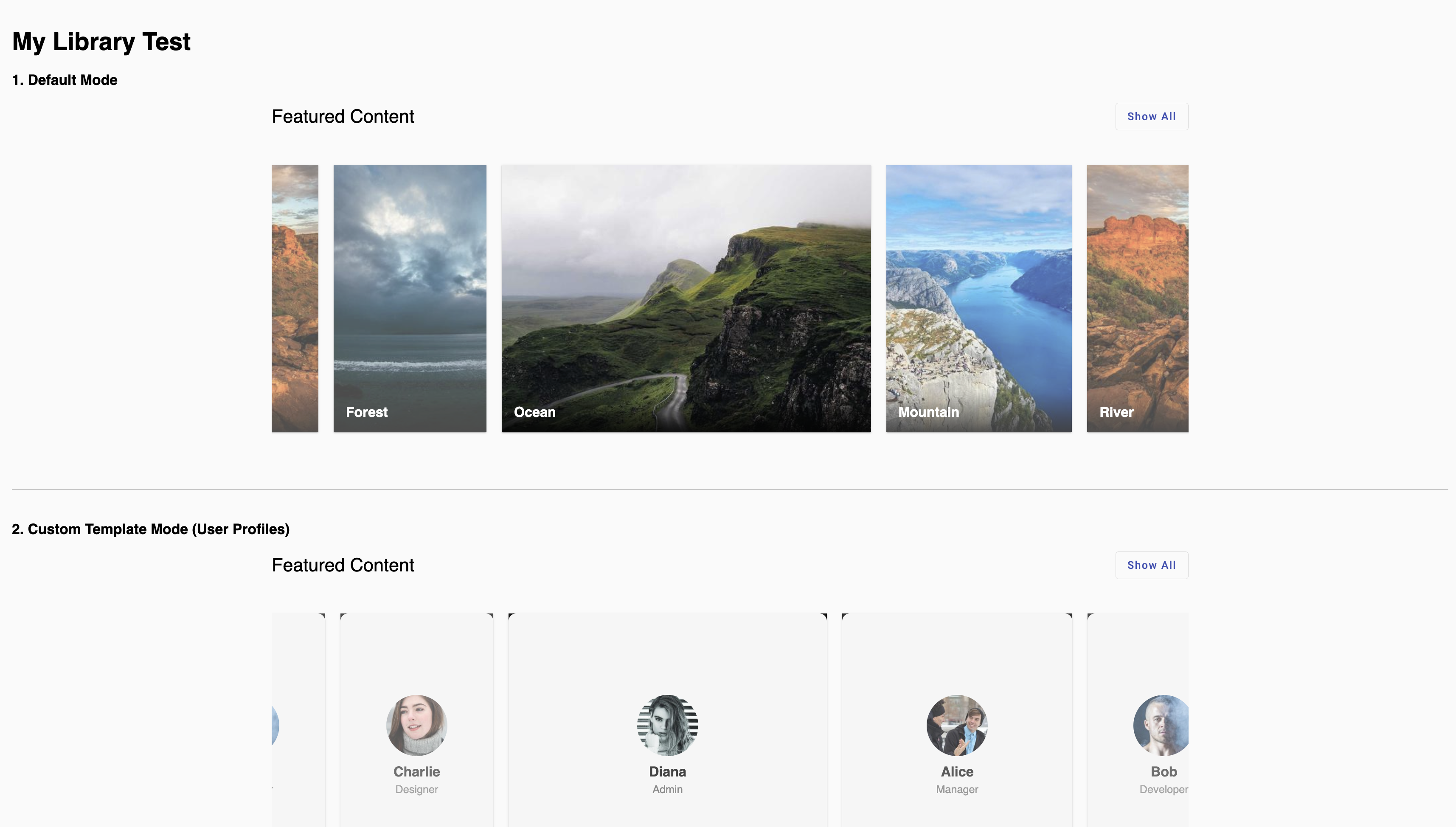
1. Default Mode (Image Cards)
import { NgxFocusCarouselComponent, CarouselItem } from 'ngx-focus-carousel';

@Component({
  standalone: true,
  imports: [NgxFocusCarouselComponent],
  template: `
    <ngx-focus-carousel [items]="data" (itemClick)="onItemClick($event)">
    </ngx-focus-carousel>
  `
})
export class MyComponent {
  data: CarouselItem[] = [
    { title: 'Mountain', img: 'https://picsum.photos/id/1015/600/400' },
    { title: 'River',    img: 'https://picsum.photos/id/1016/600/400' },
    { title: 'Forest',   img: 'https://picsum.photos/id/1019/600/400' },
    { title: 'Ocean',    img: 'https://picsum.photos/id/1018/600/400' },
  ];

  onItemClick(item: CarouselItem) {
    console.log('Clicked:', item);
  }
}
2. Custom Template Mode
Use ng-template #itemTemplate to render whatever you want inside each card:
@Component({
  standalone: true,
  imports: [NgxFocusCarouselComponent],
  template: `
    <ngx-focus-carousel [items]="profiles">
      <ng-template #itemTemplate let-item>
        <div style="text-align: center; padding: 20px;">
          <img [src]="item.avatar" style="width: 80px; border-radius: 50%;">
          <h3>{{ item.name }}</h3>
          <p>{{ item.role }}</p>
        </div>
      </ng-template>
    </ngx-focus-carousel>
  `
})
export class MyComponent {
  profiles: CarouselItem[] = [
    { name: 'Alice', role: 'Manager',   avatar: 'https://i.pravatar.cc/150?img=1' },
    { name: 'Bob',   role: 'Developer', avatar: 'https://i.pravatar.cc/150?img=3' },
  ];
}
API
Inputs
| Input | Type | Description |
|---------|-------------------|---------------------------------|
| items | CarouselItem[] | Array of data items to display |
Outputs
| Output | Type | Description |
|-------------|----------------------------|-----------------------------------|
| itemClick | EventEmitter<CarouselItem> | Emits when a card is clicked |
CarouselItem Interface
interface CarouselItem {
  title?: string;       // Used in default mode
  img?: string;         // Used in default mode
  [key: string]: any;   // Any custom properties for your template
}
License
MIT