
ngx-i24-color-picker
v0.0.3
Published
A lightweight plugin to pick a color.
Maintainers
 yaseenref
Readme
NgxI24ColorPickerLib


A lightweight plugin to pick a color.
Features
- highly customizable
- very easy to implement
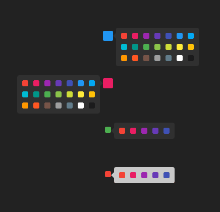
Demo
Get started
Installation
$ npm i ngx-i24-color-pickerExample
TS
Module
import { NgxI24ColorPickerModule } from "ngx-i24-color-picker";
@NgModule({
  declarations: [AppComponent],
  imports: [BrowserModule, NgxI24ColorPickerModule],
  bootstrap: [AppComponent],
})
export class AppModule {}
Component
import { Component } from "@angular/core";
@Component({
  selector: "app-root",
  templateUrl: "./app.component.html",
  styleUrls: ["./app.component.scss"],
})
export class AppComponent {
  o1 = {
    boxBg: "#303030",
    showBox: true,
  };
}
HTML
<ngx-i24-color-picker
  [boxBg]="o1.boxBg"
  [showBox]="o1.showBox"
></ngx-i24-color-picker>
Options
| Property | Default | Description | | ------------------- | --------------------------------------- | ----------------------------------------------- | | ds | [ '#f44336', '#e91e63', '#9c27b0', ...] | The list of colors | | position | 'right' | The position of selection box ('right', 'left') | | value | '#2196f3' | The initial value of the preview box | | previewWidth | '20px' | The width of the preview box | | previewHeight | '20px' | The height of the preview box | | previewBorderRadius | '3px' | The border radios of the preview box | | boxGap | '10px' | The distance between the colors items | | boxWidth | '164' | The width of the colors box | | boxBg | '#fafafa' | The background color of the colors box | | boxPadding | '10px' | The padding of the colors box | | boxBorderRadius | '4px' | The border radios of the colors box | | arrowWidth | '6px' | The width of the arrow | | itemWidth | '12px' | The width of the color item | | itemHeight | '12px' | The height of the color item | | itemBorderRadius | '3px' | The border radios of the color item | | showBox | false | The initial value of the colors box |
Events
selectedChanged- triggered on change the selection
Other Projects
| Name | Link | Description| | - | - | - | | ngx-i24-circular-progress | Link | A lightweight plugin to render a simple, animated circular progress bar. | | ngx-i24-progress-bar | Link | A lightweight plugin to render a simple, animated progress bar. | | ngx-weekday-picker | Link | Lightweight plugin to a pick weekday. | | ngx-i24-color-picker | Link | A lightweight plugin to pick a color. | | ngx-i24-checkbox | Link | A lightweight plugin to display a modern checkbox. |
Support

Copyright
Copyright (c) 2022 Yaseen Alrefaee, contributors. Released under the MIT