
ngx-mat-date-input
v20.1.2
Published
An Angular Material library for entering a date.

Readme
NgxMatDateInput
An Angular Material library for entering a date.


- Split a date into 3 input fields, day, month and year, then reassemble and save them into a given formControl.
- Automatically add
0in front of the day/month number. - Control the form value with the max number for day & month
- Remove
.andefrom the possible input. - Does automatically focus the next field when needed.
- Based on the Vitaly Friedman article, Designing Birthday Picker UX: Simpler Is Better
| fill | outlined |
| ----------------------------------------------------------------------------------------------------- | ------------------------------------------------------------------------------------------------------- |
| 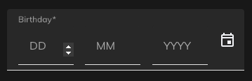 |
| 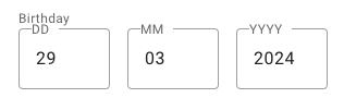 |
|
Supports:
- Angular >=15
- Angular Material >=15
Demo
- https://stackblitz.com/~/github.com/rbalet/ngx-mat-date-input
Installation
npm i ngx-mat-date-input
Usage
Import
Add NgxMatDateInputComponent to your component file:
imports: [NgxMatDateInputComponent];Example
- Add
floatLabelto yourmat-form-field - Use a preset
formControlName - This
formControlNamewill be automatically updated, therefore giving you the possibility to add your ownmat-errorsee the comment
<form #f="ngForm" [formGroup]="dateForm">
  <mat-form-field
    floatLabel="always"
  >
    <!-- <mat-label>Date</mat-label> -->

    <!--
      <mat-datepicker-toggle matIconPrefix [for]="myDatePicker">
        <mat-icon matDatepickerToggleIcon>calendar_today</mat-icon>
      </mat-datepicker-toggle>
      <mat-datepicker touchUi #myDatePicker></mat-datepicker>
    -->

    <ngx-mat-date-input
      formControlName="date"
      id="date"
    >
    <!-- [matDatepicker]="myDatePicker" -->
    </ngx-mat-date-input>

    <!-- <mat-icon matSuffix>event</mat-icon>
    <mat-error *ngIf="dateForm?.get('date').invalid">
      {{ Invalide error message }}
    </mat-error> -->
  </mat-form-field>
</form>
Options
| Options | Type | Default | Description |
| --------------- | ----------------------------------------------- | -------------------------------------- | -------------------------------------- |
| formControlName | FormControl | undefined | Control to be updated |
| autocomplete | "on" or "off" | "on" | Use the default browser autofill |
| labels | string[] | ["DD", "MM", "YYYY"] | Label used by the mat-input |
| placeholders | string[] | ["", "", ""] | with an s |
| required | boolean | undefined | |
| disabled | boolean | undefined | |
| min | date | undefined | Activate min validators on each fields |
| fields | {day: boolean, month: boolean, year: boolean} | {day: true, month: true, year: true} | Show specifies fields |
Css variable
| Name | Default | Explanation |
| ------------------------------ | ------- | --------------------------------- |
| --ngx-mat-date-input-gap | 16px | Change the gap between the inputs |
| --ngx-mat-date-input-padding | 0 | Padding around the form |
Auto formatting
Month
- Max 12
Day
- Month: 2 -> max 29
- Month: 4, 6, 9 & 11 -> max 30
- Month: else -> max 31
Authors and acknowledgment
- maintainer Raphaël Balet
