
ngx-mat-form-components
v0.6.1
Published
###Features

Readme
Material Form Components
###Features
- Stylized material design form components.
- Components with dynamic input and output properties.
- Components:
- Input
- Select
- Datepicker
- Textfield
- Dropzone
- Button
A simpler way to build your material design form and make your source code cleaner.
###Install
$ npm install --save ngx-mat-form-components###Usage
Import the module
// in app.module.ts
import { BrowserModule } from '@angular/platform-browser';
import { NgModule } from '@angular/core';
import { AppComponent } from './app.component';
import { MatFormComponentsModule } from 'ngx-mat-form-components';

@NgModule({
  declarations: [
    AppComponent
  ],
  imports: [
    BrowserModule,
    MatFormComponentsModule
  ],
  providers: [],
  bootstrap: [AppComponent]
})
export class AppModule { }
###Input
// in app.component.html

<mfc-input></mfc-input>
####Input Options | Property @Input() | Type | Description | Default | :------------ |:--------:| -----:| ----:| | [formGroup] | FormGroup | The FormGroup which the input belongs | null | | [formcontrolname] | String | The input FormGroupName | null | | [type] | String | Type of input element to display. | text | | [label] | String | Input label | null | | [placeholder] | String | Input placeholder | null | | [mask] | String | Stylized mask| null | | [translate] | String | Translation of messages | "pt" |
####Input Example
  <mfc-input
		  [formGroup]="formGroupName"
		  label="Name"
		  placeholder="type your name here"
		  type="text"
		  formcontrolname="name"
		  fxFlex="20" >
  </mfc-input>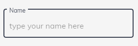
Translate options: - PORTUGUESE ('pt') - ENGLISH ('en') - SPANISH ('es')
Mask options: - CPF ('cpf') - CNPJ ('cnpj') - CPF OR CNPJ ('cpf_cnpj') - PHONE BRAZIL ('phone_br') - CEP ('cep') - DATE ('date')
  <mfc-input
		  [formGroup]="formGroupName"
		  label="Name"
		  placeholder="type your name here"
		  type="text"
		  formcontrolname="name"
		  mask="phone"
		  fxFlex="20" >
  </mfc-input>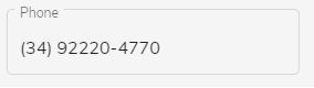
###Select
// in app.component.html
<mfc-select></mfc-select>
####Select Options
| Property @Input() | Type | Description | Default | :------------ |:--------:| -----:| ----:| | [formGroup] | FormGroup | The FormGroup which the input belongs | null | | [formcontrolname] | String | The input FormGroupName | null | | [label] | String | The input Label | null | | [searchField] | String | Display the search bar and sets the variable in which the search will be done | text | | [valueField] | String | Sets which field will be the value of the select | null | | [displayField] | String | Sets which field will be the displayed field | null | | [data] | array | Array with the data to be displayed in the select| null | | [translate] | String | Translation of messages | "pt" |
- Translate options: - PORTUGUESE ('pt') - ENGLISH ('en') - SPANISH ('es')
####Select Example
<mfc-select
		[formGroup]="formGroupName"
		searchField="name"
		label="Clinics"
		formcontrolname="clinic"
		valueField="id"
		displayField="name"
		[data]="dataClinic"
		fxFlex="30">
</mfc-select>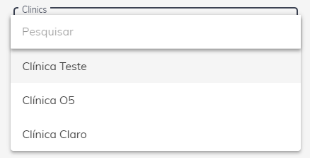
<mfc-select
		[formGroup]="formGroupName"
		label="Clinics"
		formcontrolname="clinic"
		valueField="id"
		displayField="name"
		[data]="dataClinic"
		fxFlex="30">
</mfc-select>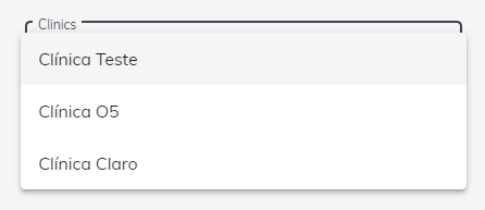
###DatePicker
// in app.component.html
<mfc-datepicker></mfc-datepicker>
####DatePicker Options
| Property @Input() | Type | Description | Default | :------------ |:--------:| -----:| ----:| | [formGroup] | FormGroup | The FormGroup which the datepicker belongs | null | | [formcontrolname] | String | The datepicker FormGroupName | null | | [label] | String | The datepicker Label | null | | [placeholder] | String | The datepicker placeholder | text | | [translate] | String | Translation of messages | "pt" |
- Translate options: - PORTUGUESE ('pt') - ENGLISH ('en') - SPANISH ('es')
####DatePicker Example
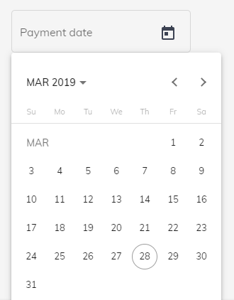
<mfc-datepicker
		[formGroup]="formGroupName"
		label="Payment date"
		formcontrolname="date"
		fxFlex="30">
</mfc-datepicker>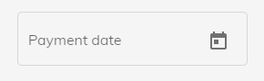
###TextField
// in app.component.html
<mfc-textfield></mfc-textfield>
####TextField Options
| Property @Input() | Type | Description | Default | :------------ |:--------:| -----:| ----:| | [formGroup] | FormGroup | The FormGroup which the textfield belongs | null | | [formcontrolname] | String | The textfield FormGroupName | null | | [label] | String | The textfield Label | null | | [placeholder] | String | The textfield placeholder | text | | [minRows] | String | matAutosizeMinRows | "1" | | [maxRows] | String | matAutosizeMaxRows | "3" | | [translate] | String | Translation of messages | "pt" |
- Translate options: - PORTUGUESE ('pt') - ENGLISH ('en') - SPANISH ('es')
####TextField Example
<mfc-textfield
			[formGroup]="formGroup"
			formcontrolname="date"
			label="Text"
			fxFlex="30">
</mfc-textfield>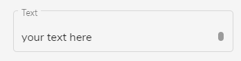
<mfc-textfield
			[formGroup]="formGroup"
			formcontrolname="date"
			label="Text"
			minRows="2"
			maxRows="5"
			fxFlex="30">
</mfc-textfield>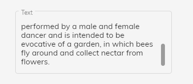
###Button
// in app.component.html
<mfc-button></mfc-button>
####Button Options
| Property @Input() | Type | Description | Default | :------------ |:--------:| -----:| ----:| | [label] | String | The button Label | null | | [color] | String | The button text color | null | | [background] | String | The button background color | null | | [icon] | String | The mat icon name | null | | [width] | String | The button width | null | | [height] | String | The button height | null | | [fontSize] | String | The button text fontsize | null | | [iconSize] | String | The icon size | null |
| Property @Output() | Type | Description | | :------------ |:--------:| -----:| ----:| | (click) | event | The button click event |
####Button Example
<mfc-button
			(click)="edit()"
			icon="edit"
			background="#039be5"
			color="white"
			width="100px"
			height="40px"
			label="Edit">
</mfc-button>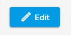
###Dropzone
// in app.component.html
<mfc-dropzone></mfc-dropzone>
| Property @Input() | Type | Description | Default | :------------ |:--------:| -----:| ----:| | [maxFilesize] | Number | Maximum file size | 10 | | [acceptedFiles] | String | The types of files accepted | '.png, .jpeg, .jpg, .pdf, .doc, .docx, .xls, .cvs' | | [resetOption] | Boolean | Reset button to dropzone | true | | [resetLabel] | String | The string of reset buttom | 'Limpar' | | [resetColor] | String | The reset buttom text color | null | | [resetBackground] | String | The reset buttom background color | null | | [msgDrop] | String | The dropzone message | 'Clique ou araste o arquivo aqui!' | | [msgFileTooBig] | String | Message for files larger than allowed | 'Arquivo muito grande! (Max: 10MB)' | | [msgInvalidFileType] | String | Message for files not allowed | 'Tipo de arquivo inválido!' | | [msgRemoveConfirmation] | String | Removal confirmation message | 'Confirma a remoção?' |
#####To get files
####Dropzone Example
<mfc-dropzone
			acceptedFiles=".png, .jpeg, .jpg"
			dropMessage="Click or drag the file here!"
			msgFileTooBig="Very large file!"
			msgInvalidFileType="Type not allowed"
			msgRemoveConfirmation="Confirm delete?"
</mfc-dropzone>