
ngx-material-entity
v20.0.7
Published
With NgxMaterialEntity you can define how to display entities directly on their properties by using a multitude of decorators for them. You can then use the input component to display the value solely based on the entity and the propertyKey.
Maintainers
 tim-fabian
Readme
NgxMaterialEntity
With NgxMaterialEntity you can define how to display entities directly on their properties by using a multitude of decorators for them. You can then use the input component to display the value solely based on the entity and the propertyKey.
If the predefined decorators dont quite fit your needs you can also build your own.
The library also offers a table component which generates complete CRUD-functionality right out of the box.
NgxMaterialEntity aims to have a fast way to get started with a lot of default options which can be overriden to allow high customization aswell.
Table of Contents
- NgxMaterialEntity
- Table of Contents
- Requirements
- Basic Usage
- PropertyDecorators
- base
- @string default
- @string dropdown
- @string textbox
- @string autocomplete
- @number default
- @number dropdown
- @boolean toggle
- @boolean checkbox
- @boolean dropdown
- @date default
- @date dateRange
- @date datetime
- @object default
- @array
- @array entity
- @array string chips
- @array string chips autocomplete
- @array date
- @array date time
- @array date range
- @file data
- @file
- @file default
- @file image
- @custom
- NgxMatEntityInput Configuration
- NgxMatEntityTable Configuration
Requirements
This package relies on the angular material library to render its components.
Basic Usage
Create your entity
Create your entity and define Metadata directly on the properties:
:warning: IMPORTANT: You need to always create an entity with the "new" keyword. Otherwise the metadata on the properties won't get generated.
import { Entity, EntityUtilities, string } from 'ngx-material-entity';

// The "extends Entity" can be left out.
// The abstract Entity-Class provides an id out of the box.
export class MyEntity extends Entity {

    /**
     * ↓ myString is a string
     * ↓ which should be displayed inline
     * ↓ and has the label 'My String'
    */
    @string({
        displayName: 'My String',
        displayStyle: 'line'
    })
    myString: string;

    constructor(entity?: MyEntity) {
        super();
        // this helper-method sets all values from the provided entity.
        // It can be used universally.
        EntityUtilities.new(this, entity);
    }

}
For a list of all property decorators and their configuration options see PropertyDecorators.
Use the input for your entity property
You can import the NgxMatEntityInputModule anywhere in your code:
import { NgxMatEntityInputModule } from 'ngx-material-entity';

...
    imports: [
        NgxMatEntityInputModule
    ]
...
In the html you can then define:
<ngx-mat-entity-input [entity]="myEntity" [propertyKey]="myString">
</ngx-mat-entity-input>
That's it!
This snippet automatically generates an material input for "myString" based on the metadata you defined earlier. For a list of further configuration options for the input see PropertyInput Configuration.
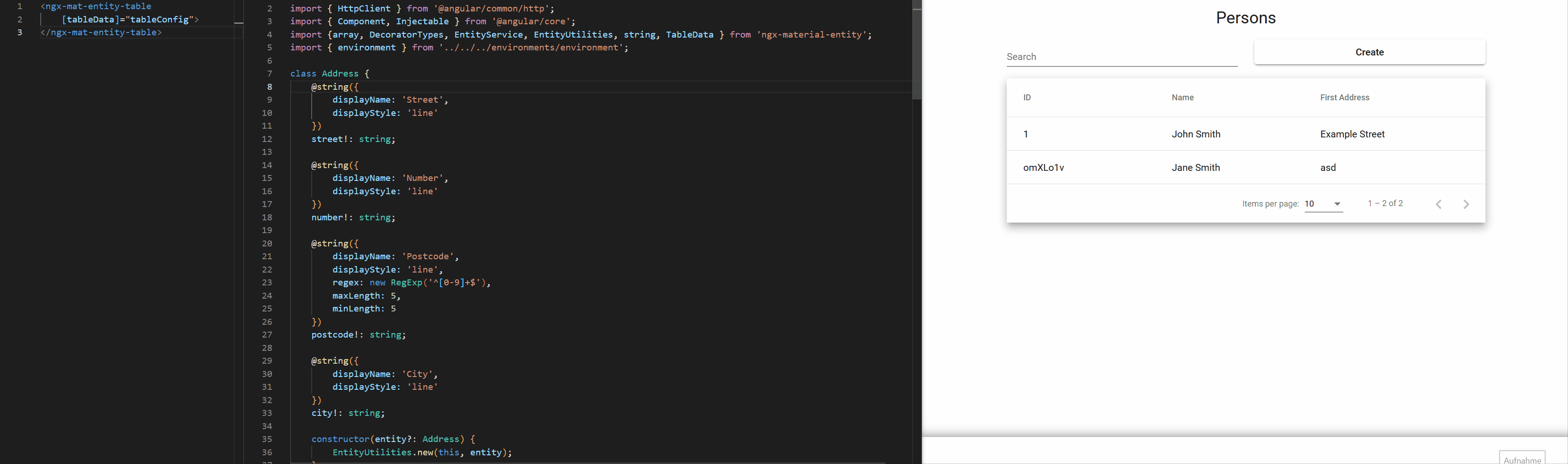
Generate a complete CRUD Table for your entity
It is pretty easy to use the input component inside a for-loop that iterates over every key of an entity to build a complete form for that entity. We thought this approach a bit further and build a complete CRUD table component with support for:
- omitting values for creating or updating entities
- layouting & responsive design
- multi select actions
- validation
The component is usable out of the box but offers a lot of customization aswell.
Create a Service for your entity
In order to use the table component you have to define a service that handles http-Requests for the entity and extends from the abstract EntityService-Class:
// ↓ It's required that the service can be injected
@Injectable({
    providedIn: 'root'
})
export class MyEntityService extends EntityService<MyEntity> {
    baseUrl: string = `${environment.apiUrl}/my-entity`;
    idKey: keyof MyEntity;

    constructor(private readonly httpClient: HttpClient) {
        super(httpClient);
    }

    // All the create, read, update and delete logic is already implemented, but you can of course override it.
}
Define the Table-Element
Import the NgxMatEntityTableComponent anywhere in your code:
import { NgxMatEntityTableComponent } from 'ngx-material-entity';

...
    imports: [
        NgxMatEntityTableComponent
    ]
...
In your ts you can then define the table configuration data, eg.:
const tableData: TableData<MyEntity> = {
    baseData: {
        title: 'My Entities', // The title above the table
        displayColumns: [
            {
                displayName: 'id',
                value: (entity: MyEntity) => entity.id
            },
            {
                displayName: 'My String',
                value: (entity: MyEntity) => entity.myString
            }
        ],
        EntityClass: MyEntity,
        EntityServiceClass: MyEntityService,
    },
    createDialogData: {
        title: 'Create My Entity'
    },
    editDialogData: {
        title: (entity: MyEntity) => `My Entity #${entity.id}`
    }
};
In the html you can then define:
<ngx-mat-entity-table [tableData]="tableData">
</ngx-mat-entity-table>
For a list of all configuration options see NgxMatEntityTable Configuration.
PropertyDecorators
The property decorators contain all the metadata of an entity property.
base
Contains information that is universally defined on every property.
export abstract class PropertyDecoratorConfig {
    /**
     * Whether or not the Property is displayed at all.
     *
     * @default true
     */
    display?: boolean;
    /**
     * The name of the property used as a label for form fields.
     */
    displayName!: string;
    /**
     * Whether or not the Property is required.
     *
     * @default true
     */
    required?: boolean;
    /**
     * Whether or not the property gets omitted when creating new Entities.
     *
     * @default false
     */
    omitForCreate?: boolean;
    /**
     * Whether or not the property gets omitted when updating Entities.
     *
     * @default false
     */
    omitForUpdate?: boolean;
    /**
     * Defines the width of the input property when used inside the default create or edit dialog.
     * Has 3 values for different breakpoints for simple responsive design based on bootstrap (1-12).
     * The first value sets the columns for the screen size lg, the second for md and the third for sm.
     *
     * @default [6, 6, 12]
     */
    defaultWidths?: [Col, Col, Col];
    /**
     * Specifies the how to position this property when using default create/edit dialogs.
     *
     * @default { row: -1,  order: -1} (Adds the property at the end)
     */
    position?: Position
}
@string default
The "default" display of a string value. Inside a single line mat-input.
export interface DefaultStringDecoratorConfig extends StringDecoratorConfig {
    displayStyle: 'line',
    /**
     * The minimum required length of the string.
     */
    minLength?: number,
    /**
     * The maximum required length of the string.
     */
    maxLength?: number,
    /**
     * A regex used for validation.
     */
    regex?: RegExp
}
@string dropdown
Displays a string as a dropdown where the user can input one of the defined dropdownValues.
export interface DropdownStringDecoratorConfig extends StringDecoratorConfig {
    displayStyle: 'dropdown',
    /**
     * The values of the dropdown, consisting of a name to display and the actual value
     * Can also receive a function to determine the values.
     */
    dropdownValues: DropdownValue<string>[]
}
@string textbox
Displays a string as a textbox.
export interface TextboxStringDecoratorConfig extends StringDecoratorConfig {
    displayStyle: 'textbox',
    /**
     * The minimum required length of the string.
     */
    minLength?: number,
    /**
     * The maximum required length of the string.
     */
    maxLength?: number
}
@string autocomplete
Just like the default @string, but the user has additional autocomplete values to quickly input data.
export interface AutocompleteStringDecoratorConfig extends StringDecoratorConfig {
    displayStyle: 'autocomplete',
    /**
     * The autocomplete values.
     */
    autocompleteValues: string[],
    /**
     * The minimum required length of the string.
     */
    minLength?: number,
    /**
     * The maximum required length of the string.
     */
    maxLength?: number,
    /**
     * A regex used for validation.
     */
    regex?: RegExp
}
@number default
The "default" display of a number value. Inside a single line mat-input.
export interface DefaultNumberDecoratorConfig extends NumberDecoratorConfig {
    displayStyle: 'line',
    /**
     * The minimum value of the number.
     */
    min?: number,
    /**
     * The maximum value of the number.
     */
    max?: number
}
@number dropdown
Displays the numbers in a dropdown
export interface DropdownNumberDecoratorConfig extends NumberDecoratorConfig {
    displayStyle: 'dropdown',
    /**
     * The values of the dropdown, consisting of a name to display and the actual value.
     */
    dropdownValues: DropdownValue<number>[]
}
@boolean toggle
Displays the boolean value as a MatSlideToggle
export interface ToggleBooleanDecoratorConfig extends BooleanDecoratorConfig {
    displayStyle: 'toggle'
}
@boolean checkbox
Displays the boolean value as a MatCheckbox
export interface CheckboxBooleanDecoratorConfig extends BooleanDecoratorConfig {
    displayStyle: 'checkbox'
}
@boolean dropdown
Displays the boolean value as a MatCheckbox
export interface DropdownBooleanDecoratorConfig extends BooleanDecoratorConfig {
    displayStyle: 'dropdown',
    /**
     * The name of the true value if displayStyle dropdown is used.
     */
    dropdownTrue: string,
    /**
     * The name of the false value if displayStyle dropdown is used.
     */
    dropdownFalse: string
}
@date default
Displays a date value as an mat-datepicker.
export interface DefaultDateDecoratorConfig extends DateDecoratorConfig {
    displayStyle: 'date',
    /**
     * A function to get the minimum value of the date.
     */
    min?: (date?: Date) => Date,
    /**
     * A function to get the maximum value of the date.
     */
    max?: (date?: Date) => Date,
    /**
     * A filter function to do more specific filtering. This could be the removal of e.g. All weekends.
     */
    filter?: DateFilterFn<Date | null | undefined>
}
@date dateRange
Displays the selection of a time period as the daterange-picker.
export interface DateRangeDateDecoratorConfig extends DateDecoratorConfig {
    displayStyle: 'daterange',
    /**
     * A function to get the minimum value of the start date.
     */
    minStart?: (date?: Date) => Date,
    /**
     * A function to get the maximum value of the start date.
     */
    maxStart?: (date?: Date) => Date,
    /**
     * A function to get the minimum value of the end date.
     */
    minEnd?: (date?: Date) => Date,
    /**
     * A function to get the maximum value of the end date.
     */
    maxEnd?: (date?: Date) => Date,
    /**
     * A filter function to do more specific filtering on the disallowed end date values. This could be the removal of e.g. All weekends.
     */
    filter?: DateFilterFn<Date>,
    /**
     * The placeholder for the start date of the date range picker.
     *
     * @default "Start"
     */
    placeholderStart?: string,
    /**
     * The placeholder for the end date of the date range picker.
     *
     * @default "End"
     */
    placeholderEnd?: string
}
@date datetime
Displays the date as a datetime input.
export interface DateTimeDateDecoratorConfig extends DateDecoratorConfig {
    displayStyle: 'datetime',
    /**
     * The selectable times.
     */
    times?: DropdownValue<Time>[],
    /**
     * The name to use as a label for the time form field.
     *
     * @default 'Time'
     */
    timeDisplayName?: string,
    /**
     * A function to get the minimum value of the date.
     */
    minDate?: (date?: Date) => Date,
    /**
     * A function to get the maximum value of the date.
     */
    maxDate?: (date?: Date) => Date,
    /**
     * A filter function to do more specific date filtering. This could be the removal of e.g. All weekends.
     */
    filterDate?: DateFilterFn<Date | null | undefined>,
    /**
     * A function to get the minimum value of the time.
     */
    minTime?: (date?: Date) => Time,
    /**
     * A function to get the maximum value of the time.
     */
    maxTime?: (date?: Date) => Time,
    /**
     * A filter function to do more specific time filtering. This could be e.g. The removal of lunch breaks.
     */
    filterTime?: ((time: Time) => boolean) | (() => boolean)
}
@object default
Displays an entity object inline.
export interface DefaultObjectDecoratorConfig<EntityType extends object> extends ObjectDecoratorConfig<EntityType> {
    /**
     * The class of the object. Is used to call the constructor so that all metadata is initialized.
     */
    EntityClass!: EntityClassNewable<EntityType>;

    /**
     * How to display the object.
     *
     * The objects properties are added as input fields in an section of the entity.
     * Useful if the object only contains a few properties (e.g. A address on a user).
     */
    displayStyle!: 'inline';
}
@array
/**
 * Interface definition for the @array metadata.
 */
abstract class ArrayDecoratorConfig extends PropertyDecoratorConfig {
    /**
     * How to display the string.
     */
    displayStyle!: 'table' | 'chips';

    /**
     * The type of the items inside the array.
     */
    itemType!: DecoratorTypes;
}
@array entity
/**
 * Definition for an array of Entities.
 */
export interface EntityArrayDecoratorConfig<EntityType extends object> extends ArrayDecoratorConfig {
    itemType: DecoratorTypes.OBJECT,
    displayStyle: 'table',

    /**
     * The EntityClass used for generating the create inputs.
     */
    EntityClass: EntityClassNewable<EntityType>,

    /**
     * The definition of the columns to display. Consists of the displayName to show in the header of the row
     * and the value, which is a function that generates the value to display inside a column.
     */
    displayColumns: DisplayColumn<EntityType>[],

    /**
     * The data for the add-item-dialog.
     * Can be omitted when adding items inline.
     */
    createDialogData?: CreateData,

    /**
     * Whether or not the form for adding items to the array
     * should be displayed inline.
     *
     * @default true
     */
    createInline?: boolean,

    /**
     * The label for the add button when createInline is true.
     *
     * @default 'Add'
     */
    addButtonLabel?: string,

    /**
     * The label for the remove button when createInline is true.
     *
     * @default 'Remove'
     */
    removeButtonLabel?: string,

    /**
     * The error-message to display when the array is required but contains no values.
     */
    missingErrorMessage?: string
}
@array string chips
/**
 * Definition for an array of strings displayed as a chips list.
 */
export interface StringChipsArrayDecoratorConfig extends ArrayDecoratorConfig {
    itemType: DecoratorTypes.STRING,
    displayStyle: 'chips',

    /**
     * The icon used to remove an entry from the array.
     *
     * @default faCircleMinus
     */
    deleteIcon?: IconDefinition,
    /**
     * The minimum required length of the string.
     */
    minLength?: number,
    /**
     * The maximum required length of the string.
     */
    maxLength?: number,
    /**
     * A regex used for validation.
     */
    regex?: RegExp
}
@array string chips autocomplete
/**
 * Definition for an array of autocomplete strings displayed as a chips list.
 */
export interface AutocompleteStringChipsArrayDecoratorConfig extends ArrayDecoratorConfig {
    itemType: DecoratorTypes.STRING_AUTOCOMPLETE,
    displayStyle: 'chips',

    /**
     * The icon used to remove an entry from the array.
     *
     * @default faCircleMinus
     */
    deleteIcon?: IconDefinition,
    /**
     * The autocomplete values.
     */
    autocompleteValues: string[],
    /**
     * The minimum required length of the string.
     */
    minLength?: number,
    /**
     * The maximum required length of the string.
     */
    maxLength?: number,
    /**
     * A regex used for validation.
     */
    regex?: RegExp
}
@array date
/**
 * Definition for an array of Dates.
 */
export interface DateArrayDecoratorConfig extends ArrayDecoratorConfig {
    itemType: DecoratorTypes.DATE,

    /**
     * The definition of the columns to display. Consists of the displayName to show in the header of the row
     * and the value, which is a function that generates the value to display inside a column.
     */
    displayColumns: DisplayColumn<Date>[],

    /**
     * The label for the add button.
     *
     * @default 'Add'
     */
    addButtonLabel?: string,

     /**
      * The label for the remove button.
      *
      * @default 'Remove'
      */
    removeButtonLabel?: string,

    /**
     * The error-message to display when the array is required but contains no values.
     */
    missingErrorMessage?: string,

    /**
     * A function to get the minimum value of the date.
     */
    min?: (date?: Date) => Date,

    /**
     * A function to get the maximum value of the date.
     */
    max?: (date?: Date) => Date,

    /**
     * A filter function to do more specific filtering. This could be the removal of e.g. All weekends.
     */
    filter?: DateFilterFn<Date | null | undefined>
}
@array date time
/**
 * Definition for an array of DateTimes.
 */
export interface DateTimeArrayDecoratorConfig extends ArrayDecoratorConfig {
    itemType: DecoratorTypes.DATE_TIME,

    /**
     * The definition of the columns to display. Consists of the displayName to show in the header of the row
     * and the value, which is a function that generates the value to display inside a column.
     */
    displayColumns: DisplayColumn<Date>[],

    /**
     * The label for the add button.
     *
     * @default 'Add'
     */
    addButtonLabel?: string,

     /**
      * The label for the remove button.
      *
      * @default 'Remove'
      */
    removeButtonLabel?: string,

    /**
     * The error-message to display when the array is required but contains no values.
     */
    missingErrorMessage?: string,

    /**
     * The selectable times.
     */
    times?: DropdownValue<Time>[],

    /**
     * The name to use as a label for the time form field.
     *
     * @default 'Time'
     */
    timeDisplayName?: string,

    /**
     * A function to get the minimum value of the date.
     */
    minDate?: (date?: Date) => Date,

    /**
     * A function to get the maximum value of the date.
     */
    maxDate?: (date?: Date) => Date,

    /**
     * A filter function to do more specific date filtering. This could be the removal of e.g. All weekends.
     */
    filterDate?: DateFilterFn<Date | null | undefined>,

    /**
     * A function to get the minimum value of the time.
     */
    minTime?: (date?: Date) => Time,

    /**
     * A function to get the maximum value of the time.
     */
    maxTime?: (date?: Date) => Time,

    /**
     * A filter function to do more specific time filtering. This could be e.g. The removal of lunch breaks.
     */
    filterTime?: ((time: Time) => boolean) | (() => boolean)
}
@array date range
/**
 * Definition for an array of DateRanges.
 */
export interface DateRangeArrayDecoratorConfig extends ArrayDecoratorConfig {
    itemType: DecoratorTypes.DATE_RANGE,

    /**
     * The definition of the columns to display. Consists of the displayName to show in the header of the row
     * and the value, which is a function that generates the value to display inside a column.
     */
    displayColumns: DisplayColumn<DateRange>[],

    /**
     * The label for the add button.
     *
     * @default 'Add'
     */
    addButtonLabel?: string,

     /**
      * The label for the remove button.
      *
      * @default 'Remove'
      */
    removeButtonLabel?: string,

    /**
     * The error-message to display when the array is required but contains no values.
     */
    missingErrorMessage?: string,

    /**
     * A function to get the minimum value of the start date.
     */
    minStart?: (date?: Date) => Date,
    /**
     * A function to get the maximum value of the start date.
     */
    maxStart?: (date?: Date) => Date,
    /**
     * A function to get the minimum value of the end date.
     */
    minEnd?: (date?: Date) => Date,
    /**
     * A function to get the maximum value of the end date.
     */
    maxEnd?: (date?: Date) => Date,
    /**
     * A filter function to do more specific filtering on the disallowed end date values. This could be the removal of e.g. All weekends.
     */
    filter?: DateFilterFn<Date>,
    /**
     * The placeholder for the start date of the date range picker.
     *
     * @default "Start"
     */
    placeholderStart?: string,
    /**
     * The placeholder for the end date of the date range picker.
     *
     * @default "End"
     */
    placeholderEnd?: string
}
@file data
/**
 * The type of any property annotated with @file.
 */
export type FileData = FileDataWithFile | FileDataWithUrl;
@file
abstract class FileDecoratorConfig extends PropertyDecoratorConfig {
    /**
     * Specifies whether or not the decorated property can have multiple files.
     */
    multiple!: boolean;

    /**
     * The type of the upload.
     */
    type!: 'image' | 'other';

    /**
     * The icon used to remove a file from the input.
     *
     * @default faCircleMinus
     */
    deleteIcon?: string;

    /**
     * Whether or not the file should be displayed inside a preview.
     *
     * @default true
     */
    preview?: boolean;

    /**
     * Specifies allowed File types like 'image/jpg' etc.
     * Allows every file type if not set.
     */
    allowedMimeTypes?: string[];

    /**
     * The error dialog to display when the user inputs files that are not of the allowed mime types.
     */
    mimeTypeErrorDialog?: ConfirmDialogData;

    /**
     * The maximum allowed size of a single file in MB.
     *
     * @default 10
     */
    maxSize?: number;

    /**
     * The error dialog to display when the user inputs a single file that is bigger than the 'maxSize' value.
     */
    maxSizeErrorDialog?: ConfirmDialogData;

    /**
     * The maximum allowed size of all files in MB.
     *
     * @default 100
     */
    maxSizeTotal?: number;

    /**
     * The error dialog to display when the user inputs files which are in total bigger than the 'maxSizeTotal' value.
     */
    maxSizeTotalErrorDialog?: ConfirmDialogData;

    /**
     * Defines whether or not a dropdown box is displayed.
     *
     * @default true // when multiple is set to true.
     * false // when multiple is set to false.
     */
    dragAndDrop?: boolean;
}
@file default
/**
 * Definition for a default file.
 */
export interface DefaultFileDecoratorConfig extends FileDecoratorConfig {
    type: 'other',
    preview?: false
}
@file image
/**
 * Definition for a image file.
 */
export interface ImageFileDecoratorConfig extends FileDecoratorConfig {
    // eslint-disable-next-line jsdoc/require-jsdoc
    type: 'image',
    /**
     * Specifies allowed File types like image/jpg etc. In a comma separated string.
     *
     * @default ['image/*']
     */
    allowedMimeTypes?: string[],
    /**
     * Url to the file that gets displayed in the preview when no file has been selected yet.
     */
    previewPlaceholderUrl?: string
}
@custom
Wit the custom decorator you have the freedom to build your own input components.
metadata
The @custom decorator gives you the option to provide additional metadata. It also uses generics to provide type safety for you:
// Somewhere outside the entity
// This is the additional metadata to provide for the property.
interface MyCustomMetadata {
    random: () => string
}
.
.
.
// Somewhere inside the entity
@custom<string, MyCustomMetadata, MyEntity>({
    customMetadata: {
        // This is type safe because we defined two lines above that the custom metadata has the type "MyCustomMetadata"
        random: () => (Math.random() + 1).toString(36).substring(7)
    },
    displayName: 'Random Value',
    component: CustomInputComponent // will be defined below
})
randomValue!: string;
component
The component needs to extend the NgxMatEntityBaseInputComponent:
@Component({
    selector: 'custom-input-component',
    templateUrl: './custom-input.component.html',
    styleUrls: ['./custom-input.component.scss']
})
export class CustomInputComponent
    extends NgxMatEntityBaseInputComponent<MyEntity, DecoratorTypes.CUSTOM, string, MyCustomMetadata>
    implements OnInit {
    // Define your logic here.
    // The base class already provides the entity and key values and handles getting the metadata.
    // This is also type safe because we defined above that the custom metadata has the type "MyCustomMetadata"
    // and the entity has the type "MyEntity"
}
NgxMatEntityInput Configuration
With the property input you can generate an input field based on the metadata you defined on your property. Configuration options are:
/**
 * The entity on which the property exists. Used in conjunction with the "propertyKey"
 * to determine the property for which the input should be generated.
 */
@Input()
entity!: EntityType;

/**
 * The name of the property to generate the input for. Used in conjunction with the "entity".
 */
@Input()
propertyKey!: keyof EntityType;

/**
 * (optional) A custom function to generate the error-message for invalid inputs.
 */
@Input()
getValidationErrorMessage!: (model: NgModel) => string;

/**
 * Whether to hide a value if it is omitted for creation.
 * Is used internally for the object property.
 */
@Input()
hideOmitForCreate?: boolean;

/**
 * Whether to hide a value if it is omitted for editing.
 * Is used internally for the object property.
 */
@Input()
hideOmitForEdit?: boolean;
NgxMatEntityTable Configuration
With the ngx-mat-entity-table component you can create a complete CRUD functionality for your entities.
As this component is highly configurable and allows you to either create your own create and edit implementations or use the default out of the box dialogs for that.
/**
 * The base data of the ngx-mat-entity-table.
 */
export interface BaseData<EntityType extends object> {
    /**
     * The title of the table.
     */
    title: string,
    /**
     * The definition of the columns to display. Consists of the displayName to show in the header of the row
     * and the value, which is a function that generates the value to display inside a column.
     */
    displayColumns: DisplayColumn<EntityType>[],
    /**
     * The Class of the service that handles the entities.
     * Needs to be injectable and an extension of the "EntityService"-Class.
     */
    EntityServiceClass: EntityServiceClassNewable<EntityType>,
    /**
     * The Class of the entities to manage.
     */
    EntityClass?: EntityClassNewable<EntityType>,
    /**
     * The label on the search bar. Defaults to "Search".
     */
    searchLabel?: string,
    /**
     * The label on the button for adding new entities. Defaults to "Create".
     */
    createButtonLabel?: string,
    /**
     * Takes a custom edit method which runs when you click on a entity.
     * If you don't need any special editing of entries you can also omit this.
     * In that case a default edit dialog is generated.
     */
    edit?: (entity: EntityType) => unknown,
    /**
     * Takes a method to run when you click on the new button.
     * If you don't need anything special you can also omit this.
     * In that case a default create dialog is generated.
     */
    create?: (entity: EntityType) => unknown,
    /**
     * Defines how the search string of entities is generated.
     */
    searchString?: (entity: EntityType) => string,
    /**
     * Defines whether or not the user can add new entities.
     *
     * @default () => true
     */
    allowCreate?: () => boolean,
    /**
     * Defines whether or not the user can view this specific entity.
     *
     * @default () => true
     */
    allowRead?: (entity: EntityType) => boolean,
    /**
     * Defines whether or not the user can edit this specific entity.
     *
     * @default () => true
     */
    allowUpdate?: (entity: EntityType) => boolean,
    /**
     * Whether or not the user can delete this specific entity.
     */
    allowDelete?: (entity: EntityType) => boolean,
    /**
     * All Actions that you want to run on multiple entities can be defined here.
     * (e.g. Download as zip-file or mass delete).
     */
    multiSelectActions?: MultiSelectAction<EntityType>[],
    /**
     * The Label for the button that opens all multi-actions.
     */
    multiSelectLabel?: string
}

/**
 * The data of the default create-dialog.
 */
export interface CreateData {
    /**
     * The title of the default create-dialog.
     */
    title?: string,
    /**
     * The label on the create-button of the default create-dialog. Defaults to "Create".
     */
    createButtonLabel?: string,
    /**
     * The label on the cancel-button for the default create-dialog. Defaults to "Cancel".
     */
    cancelButtonLabel?: string,
    /**
     * Whether or not the creation of an entry should require a confirm dialog.
     */
    createRequiresConfirmDialog?: boolean,
    /**
     * The data used to generate a confirmation dialog for the create action.
     */
    confirmCreateDialogData?: ConfirmDialogData
}

/**
 * The data of the default edit-dialog.
 */
export interface EditDialogData<EntityType extends object> {
    /**
     * The title of the default edit-dialog.
     */
    title?: (entity: EntityType) => string,
    /**
     * The label on the confirm-button of the default edit-dialog. Defaults to "Save".
     */
    confirmButtonLabel?: string,
    /**
     * The label on the delete-button of the default edit-dialog. Defaults to "Delete".
     */
    deleteButtonLabel?: string,
    /**
     * The label on the cancel-button for the default edit-dialog. Defaults to "Cancel".
     */
    cancelButtonLabel?: string,
    /**
     * Whether or not the deletion of an entry should require a confirm dialog.
     */
    deleteRequiresConfirmDialog?: boolean,
    /**
     * Whether or not the editing of an entry should require a confirm dialog.
     */
    editRequiresConfirmDialog?: boolean,

    /**
     * The data used to generate a confirmation dialog for the delete action.
     */
    confirmDeleteDialogData?: ConfirmDialogData,

    /**
     * The data used to generate a confirmation dialog for the delete action.
     */
    confirmEditDialogData?: ConfirmDialogData
}

/**
 * All the configuration data required to display a ngx-mat-entity-table.
 */
export interface TableData<EntityType extends object> {
    /**
     * The base data for the table-component.
     * Includes stuff like the title for the table, what to display inside the rows etc.
     */
    baseData: BaseData<EntityType>,
    /**
     * The data for the default create-dialog.
     * Can be omitted when specifying a custom "create" method inside the baseData.
     */
    createDialogData?: CreateData,
    /**
     * The data for the default edit-dialog.
     * Can be omitted when specifying a custom "edit" method inside the baseData.
     */
    editDialogData?: EditDialogData<EntityType>
}
Display Columns
The definition of a column inside the table.
export interface DisplayColumn<EntityType extends object> {
    /**
     * The name inside the header.
     */
    displayName: string,
    /**
     * A method to get the value inside an row.
     */
    value: (entity: EntityType) => string
}
Multiselect Actions
Multiselect Actions appear on the right upper corner and allow you to do actions on all selected entries.
export interface MultiSelectAction<EntityType extends object> {
    /**
     * The name of the action.
     */
    displayName: string,
    /**
     * The action itself.
     */
    action: (selectedEntities: EntityType[]) => Promise<unknown>,
    /**
     * A method that defines whether or not the action can be used.
     *
     * @default true
     */
    enabled?: (selectedEntities: EntityType[]) => boolean,
    /**
     * A method that defines whether or not a confirm dialog is needed to run the action.
     *
     * @default false
     */
    requireConfirmDialog?: (selectedEntities: EntityType[]) => boolean,
    /**
     * The data used to generate a confirmation dialog for the multiSelect action.
     */
    confirmDialogData?: ConfirmDialogData
}
Edit/Create in seperate page
When handling entities that have a lot of properties, you might don't want to edit everything inside a dialog but in a separate page.
For that case, this library has a generic edit page. It works flawlessly with the table component, but you need to adjust some things. The same procedure can also be used to define a create page.
1. In the base data entry of your table config add defaultEdit: 'page'
2. Add the route on which the entity should be edited:
import { defaultEditDataRoute, EditDataRoute, NGX_EDIT_DATA_ENTITY, NGX_EDIT_DATA_ENTITY_SERVICE, PageEditData } from 'ngx-material-entity';

//...

const editMyEntityData: PageEditData<MyEntity> = {
    editData: {
        title: (entity: MyEntity) => `My Entity #${entity.id}`
    }
};

const editDataRoute: EditDataRoute = {
    ...defaultEditDataRoute,
    providers: [
        {
            provide: NGX_EDIT_DATA_ENTITY_SERVICE,
            useExisting: MyEntityService
        },
        {
            provide: NGX_EDIT_DATA_ENTITY,
            useValue: MyEntity
        },
        {
            provide: NGX_EDIT_DATA,
            useValue: editMyEntityData
        }
    ]
};
The defaultEditDataRoute just provides values for things like path, title or loadComponent out of the box.
The providers array is needed for the route to access the relevant entity service, entity class and the configuration data.
3. Use a custom route (optional)
By default, the configuration above will open any entities on the path entities/:id.
At some point you probably want to open them on different paths, eg. my-entities/:id for the example above.
In order to do that you need to add the custom path at two different places:
- In the relevant EntityService:
override readonly editBaseRoute: string = 'my-entities';
//...
const editDataRoute: EditDataRoute = { ...defaultEditDataRoute, path: 'my-entities/:id', providers: [ { provide: NGX_EDIT_DATA_ENTITY_SERVICE, useExisting: MyEntityService }, { provide: NGX_EDIT_DATA_ENTITY, useValue: MyEntity } ] };
### 4. Require confirmation before leaving page with unsaved changes (optional)
If you want the user to confim abandoning their changes you can simply add the `UnsavedChangesGuard` to your route:

```typescript
import { defaultEditDataRoute, EditDataRoute, NGX_EDIT_DATA_ENTITY, NGX_EDIT_DATA_ENTITY_SERVICE, PageEditData, UnsavedChangesGuard } from 'ngx-material-entity';

//...

const editDataRoute: EditDataRoute = {
    ...defaultEditDataRoute,
    path: 'my-entities/:id',
    providers: [
        {
            provide: NGX_EDIT_DATA_ENTITY_SERVICE,
            useExisting: MyEntityService
        },
        {
            provide: NGX_EDIT_DATA_ENTITY,
            useValue: MyEntity
        }
    ],
    canDeactivate: [UnsavedChangesGuard]
};