
ngx-slide-modal
v1.5.1
Published
A Bootstrap slide modal module which fits perfectly for implementing welcome modal.
Maintainers
 hongthang152
Readme
Bootstrap Slide Modal for Angular 🔥 🔥 🔥
A Bootstrap slide modal module which fits perfectly for implementing welcome modal.
Installation 🚴♂️
npm install ngx-slide-modal --save
This package requires Bootstrap CSS.If you have not installed Bootstrap CSS, put this CDN on your index.html header tag 📚:
// index.html

<head>
...
    <link rel="stylesheet" href="https://stackpath.bootstrapcdn.com/bootstrap/4.3.1/css/bootstrap.min.css" integrity="sha384-ggOyR0iXCbMQv3Xipma34MD+dH/1fQ784/j6cY/iJTQUOhcWr7x9JvoRxT2MZw1T" crossorigin="anonymous">
</head>
Example Usage ❓
Add the NgxSlideModalModule to module imports to use the ngx-slide-modal component. 🙉
...
import { NgxSlideModalModule } from 'ngx-slide-modal';
...
@NgModule({
  declarations: [
    ...
  ],
  imports: [
    ...
    NgxSlideModalModule
    ....
  ],
  providers: [],
  bootstrap: [...]
})
export class YourModule { }
Use ngx-slide-modal component inside any of your component template which shares the same module. 🍇
Put the modal-title directive for the title of the modal and modal-body directive for the body of the modal. 💌
The order of the panels will always be in sequential order if there are multiple panel bodies. 📦
<ngx-slide-modal
isVisible="true"
num_of_panel="3"
slide_title="true"
[show_dot]="true"
>
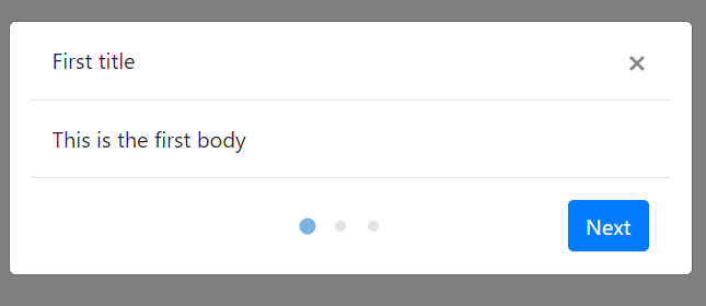
<div modal-title>
First title
</div>
<div modal-title>
Second title
</div>
<div modal-title>
Third title
</div>
<div modal-body>
This is the first body
</div>
<div modal-body>
This is the second body
</div>
<div modal-body>
Hello there
</div>
</ngx-slide-modal >Things to note ⚠️
NgxSlideModalwill only show up whenisVisibleis set to true. 😎- The number of elements with
modal-bodydirective has to match thenum_of_panelinput.🤞 - If
slide_titleinput is set totrue, the num of elements withmodal-titledirective also has to match thenum_of_panelinput 🐵 - Element with
modal-bodydirective has to have block display, which meansdivis an ideal element for wrapping the content of the modal body. 😃
API 🔧
Input 🚩
| Name | Type | Default | Description
| --- | ----------- | ------- | -------
| isVisible | boolean | false | Whether the modal is visible or not 👻. We support two-way data binding ⛖
| num_of_panel | number | 1 | The total number of panels. 🔢
| slide_title | boolean | false | Whether the title slides along with the modal body. If it is set to false, the slide title will stay still while the panel body changes.
| active_panel | number | 1 | The initial active panel index will always be 1. You can set the current active panel to any number less than the num_of_panel input 😌
| show_dot | boolean | false | Whether the navigation dot is visible or not. 🧿
| animate_speed | number | 300 | The speed for the slide panel transition animation ⚡
| next_button_text | string | Next | The text for the next button that is used to change the active panel ⏭️
| close_button_text | string | Close | The text for the close button that is used to close the panel ❌
Output 🏳️
| Name | Type | Default | Description
| --- | ----------- | ------- | -------
| onNext | EventEmitter | | Specify a EventEmitter that will be emitted when a user clicks the next button. The EventEmitter will pass the new active panel index to the function parameter 🍳.
| onClose | EventEmitter | | Specify a EventEmitter that will be emitted when a user clicks the close modal button 🏀