
ngx-swipeable-panel
v1.0.7
Published
Swipeable panel for Angular
Maintainers
 dinol
dinolReadme
ngx-swipeable-panel
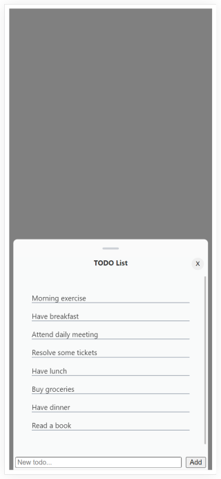
Swipeable panel for Angular
Demo
Check out demo
Install
npm install ngx-swipeable-panel --saveUsage
Importing library
import { SwipeablePanelModule } from 'ngx-swipeable-panel';

@NgModule({
  ...
  imports: [
    ...
    SwipeablePanelModule
  ]
})
Usage in HTML template:
This library currently provides directive to create a Swipeable panel element.
DIRECTIVE USAGE
When using the directive you need to provide your own theming. Swipeable panel directive can be used in correctly structured div element with optional custom configuration:
<!--Example styling-->
<style>
  .container {
    background-color: gray;
    height: calc(100vh - 16px);
    display: flex;
    flex-direction: column;
    position: relative;
  }

  .swipeable {
    background-color: rgb(250 250 250);
    border-top-left-radius: 8px;
    border-top-right-radius: 8px;
    margin: 0px 8px;
  }

  .swipeable-content {
    display: flex;
    flex-direction: column;
    flex-grow: 1;
    height: 100%;
  }

  .swipeable-handler {
    background-color: rgb(130 145 160);
    margin: 16px auto;
    height: 4px;
    min-height: 4px;
    width: 32px;
    border-radius: 8px;
    opacity: 0.4;
  }
</style>

<div class="container"> <!--position: relative; must be set to swipeable panel parent -->
  <div class="swipeable" ngxSwipeablePanel>
    <div class="swipeable-content">
      <div class="swipeable-handler"></div>
      <div class="custom-content-container">
      <!--...-->
      </div>
    </div>
  </div>
</div>
Directive inputs:
[style]                                       // Use to set custom styles to swipeable panel (default: '').

[enabled]                                     // Disables swipeable panel (default: true).

[snapTreshold]                                // Defines values in '%' from the top of the parent container, around the center of the parent
                                              // container and at the bottom of the parent container to which swipeable panel should snap. (default: undefined)

[swipeHeightWhenClosed]                       // Swipeable panel visible area in 'px' when it's closed. (default: 0)

[cssTransition]                               // Use to set custom css transition when interacting with swipeable panel. (default: top 500ms ease 0s)
Directive events:
(swipeStart)                                  // Event triggered on mouse left button down or touch start event.

(swipping)                                    // Event triggered on mouse move or touch move event when swipping is active.

(swipeEnd)                                    // Event triggered on mouse up or touch end event when swipping is active.

(positionChange)                              // Event triggered when visible area of swipeable panel changes.
Directive functions:
close()                                       // Closes swipeable panel.

setPosition(value: number): void              // Sets position of swipeable panel (offset from the top of parent container in '%').

snapToPosition(value: number): void           // Tries to snap swipeable panel to position (offset from the top of parent container in '%').

getCurrentPositionPercentage(): number        // Gets current position in '%'.
This functions can be accessed through the directive reference.
Directive properties:
get isClosed(): boolean                       // Indicates whether swipeable panel is closed.

get swipeablePanel(): HTMLDivElement          // Gets the reference to swipeable panel native element.

get swipeablePanelParentHeight(): number      // Gets the height in 'px' of swipeable panel parent container.

get canSnapToTop(): boolean                   // Indicates whether swipeable panel can snap to top.

get canSnapToCenter(): boolean                // Indicates whether swipeable panel can snap to center.

get canSnapToBottom(): boolean                // Indicates whether swipeable panel can snap to bottom.

get canUpdatePosition(): boolean              // Indicates whether swipeable panel can change position.

position(): number                            // Gets or sets the current position in '%'.
                                              // Don't change this property programatically since it's updated by
                                              // swipeable panel internals.