
ngx-time-duration-picker
v2.0.3
Published
A generic time duration picker Angular 2+ component
Downloads
222
Maintainers
 zarini
Readme
ngx-time-duration-picker
A generic time duration picker Angular component (v. 2.0.0+)
Installation
To install this library, run:
$ npm install ngx-time-duration-picker --saveRequirements
usage
Import the NgxTimeDurationPickerModule in your app.module and add it to the imports array.
You need to import the Angular FormsModule and ReactiveFormsModule as well.
and then from your Angular AppModule:
import { BrowserModule } from '@angular/platform-browser';
import { NgModule } from '@angular/core';

import { AppComponent } from './app.component';

// Import the library
import { NgxTimeDurationPickerModule } from 'angular2-time-duration-picker';

@NgModule({
  declarations: [
    AppComponent
  ],
  imports: [
    BrowserModule,
    ...
    NgxTimeDurationPickerModule
  ],
  providers: [],
  bootstrap: [AppComponent]
})
export class AppModule { }
Once your library is imported, you can use its components in your Angular application:
Add the ngx-time-duration-picker component to the page where you want to use the picker, with disired Time unit ngx-time-duration-picker-unit.
<time-duration-picker [inputDisabled]=false returnedValueUnit="second" (onChange)="onNumberChanged($event)" class="row">
  <time-duration-picker-unit class="col-md-12" [name]="'second'"></time-duration-picker-unit>
</time-duration-picker>
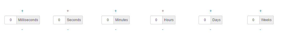
<ngx-time-duration-picker returnedValueUnit="hour" (OnChange)="onValueChanged($event)">
  <ngx-time-duration-picker-unit name="millisecond" min="0" max="999" step="1"></ngx-time-duration-picker-unit>
  <ngx-time-duration-picker-unit name="second" min="0" max="60" step="1"></ngx-time-duration-picker-unit>
  <ngx-time-duration-picker-unit name="minute" min="0" max="60" step="1"></ngx-time-duration-picker-unit>
  <ngx-time-duration-picker-unit name="hour" min="0" max="60" step="1"></ngx-time-duration-picker-unit>
  <ngx-time-duration-picker-unit name="day" min="0" max="60" step="1"></ngx-time-duration-picker-unit>
  <ngx-time-duration-picker-unit name="week" min="0" max="60" step="1"></ngx-time-duration-picker-unit>
</ngx-time-duration-picker>
time-duration-picker Field Schema
| Attribute | Type | Required | Description |
| :------------- |:-------------| :-----:| :-----|
| returnedValueUnit | [input] String | No | The unit of returned Value. default: 'second' |
| inputDisabled | [input] Boolean | No | Defines if the input input should be disabled / editable by the user. default: true |
| OnChange | (output) Number | No | The onChange event of the component. Emits the value of the picker every time the user has clicked the - or + button. |
time-duration-picker-unit Field Schema
| Attribute | Type | Required | Description |
| :------------- |:-------------| :-----:| :-----|
| name | [input] String | Yes | The units of the picker, supported values: 'week', 'day', 'hour', 'minute', 'second' and 'millisecond' |
| label | [input] String | No | The label of the picker, default: name capitalized |
| min | [input] number | No | The Minimum value can be set, default: 0 |
| max | [input] number | No | The Maximum value can be set, default: (check the code) |
| step | [input] number | No | The step value, default: 1 |
| inputDisabled | [input] Boolean | No | Defines if the input input should be disabled / editable by the user. default: true |
| OnChange | (output) Number | No | The onChange event of the component. Emits the value of the picker every time the user has clicked the - or + button. |
License
MIT © Mohammad Nuairat