
ngx-venue-map
v0.0.3
Published
Interactive venue seating map component for Angular applications
Downloads
22
Maintainers
 vvtrung
Readme
🏟️ ngx-venue-map
Interactive venue seating map component for Angular applications
Perfect for sports venues, concert halls, theaters, and event booking platforms
If you like this project, ☕ buy me a coffee
✨ Features
- 🔍 Zoom & Pan - Smooth zooming and panning with mini-map navigation
- 🎨 Customizable Themes - Built-in themes and full customization support
- 🏷️ Grade-based Pricing - Support for different seating categories and pricing
- 🎪 Multiple Venue Types - Stadiums, theaters, concert halls, and more
- 🔧 TypeScript Support - Fully typed with comprehensive interfaces
- 📦 Tree-shakable - Import only what you need
- 🎭 Event Handling - Rich event system for seat selection and interaction
🚀 Quick Start
Installation
npm install ngx-venue-mapBasic Usage
// app.component.ts
import { Component } from '@angular/core';
import { VenueMapComponent, Grade, MapConfiguration } from 'ngx-venue-map';

@Component({
  selector: 'app-root',
  standalone: true,
  imports: [VenueMapComponent],
  template: `
    <app-venue-map
      [grades]="grades"
      [mapConfiguration]="mapConfig"
      (selectGrade)="onGradeSelected($event)"
    />
  `
})
export class AppComponent {
  grades: Grade[] = [
    {
      id: '1',
      name: 'VIP Section',
      abbreviation: 'VIP',
      price: 150,
      disabled: false,
      settings: [
        {
          color: '#FFD700',
          circle: { x: 400, y: 300, textColor: '#000' },
          points: [
            { x: 350, y: 250 },
            { x: 450, y: 250 },
            { x: 450, y: 350 },
            { x: 350, y: 350 }
          ]
        }
      ]
    },
    {
      id: '2',
      name: 'Premium Section',
      abbreviation: 'PRM',
      price: 100,
      disabled: false,
      settings: [
        {
          color: '#C0C0C0',
          circle: { x: 600, y: 300, textColor: '#000' },
          points: [
            { x: 550, y: 250 },
            { x: 650, y: 250 },
            { x: 650, y: 350 },
            { x: 550, y: 350 }
          ]
        }
      ]
    }
  ];

  mapConfig: MapConfiguration = {
    path: '/assets/venue-map.png',
    width: 1600,
    height: 1200,
    offsetHeight: 106,
    fontSize: 20,
    // Configuration will be merged with defaults
  };

  onGradeSelected(event: { grade: Grade, shapeIndex?: number }) {
    console.log('Selected grade:', event.grade);
    console.log('Shape index:', event.shapeIndex);
  }
}
🗂️ Multi-Image Support
The venue map component supports both single images and multi-part images for large or high-resolution maps.
Single Image Configuration
const singleImageConfig: MapConfiguration = {
  path: '/assets/venue-map.png',  // Single image path
  width: 1600,
  height: 1200
};
Multi-Image Configuration
For large maps that need to be split into multiple parts, use an array of image paths with the naming pattern col_row.ext:
const multiImageConfig: MapConfiguration = {
  path: [
    '/assets/map/parts/0_0.png',  // Top-left
    '/assets/map/parts/0_1.png',  // Bottom-left
    '/assets/map/parts/1_0.png',  // Top-right
    '/assets/map/parts/1_1.png'   // Bottom-right
  ],
  width: 1600,  // Total width of combined image
  height: 1200  // Total height of combined image
};
File Naming Convention
Multi-part images must follow the pattern {col}_{row}.{extension}:
0_0.png- Column 0, Row 0 (top-left)0_1.png- Column 0, Row 1 (bottom-left)1_0.png- Column 1, Row 0 (top-right)1_1.png- Column 1, Row 1 (bottom-right)
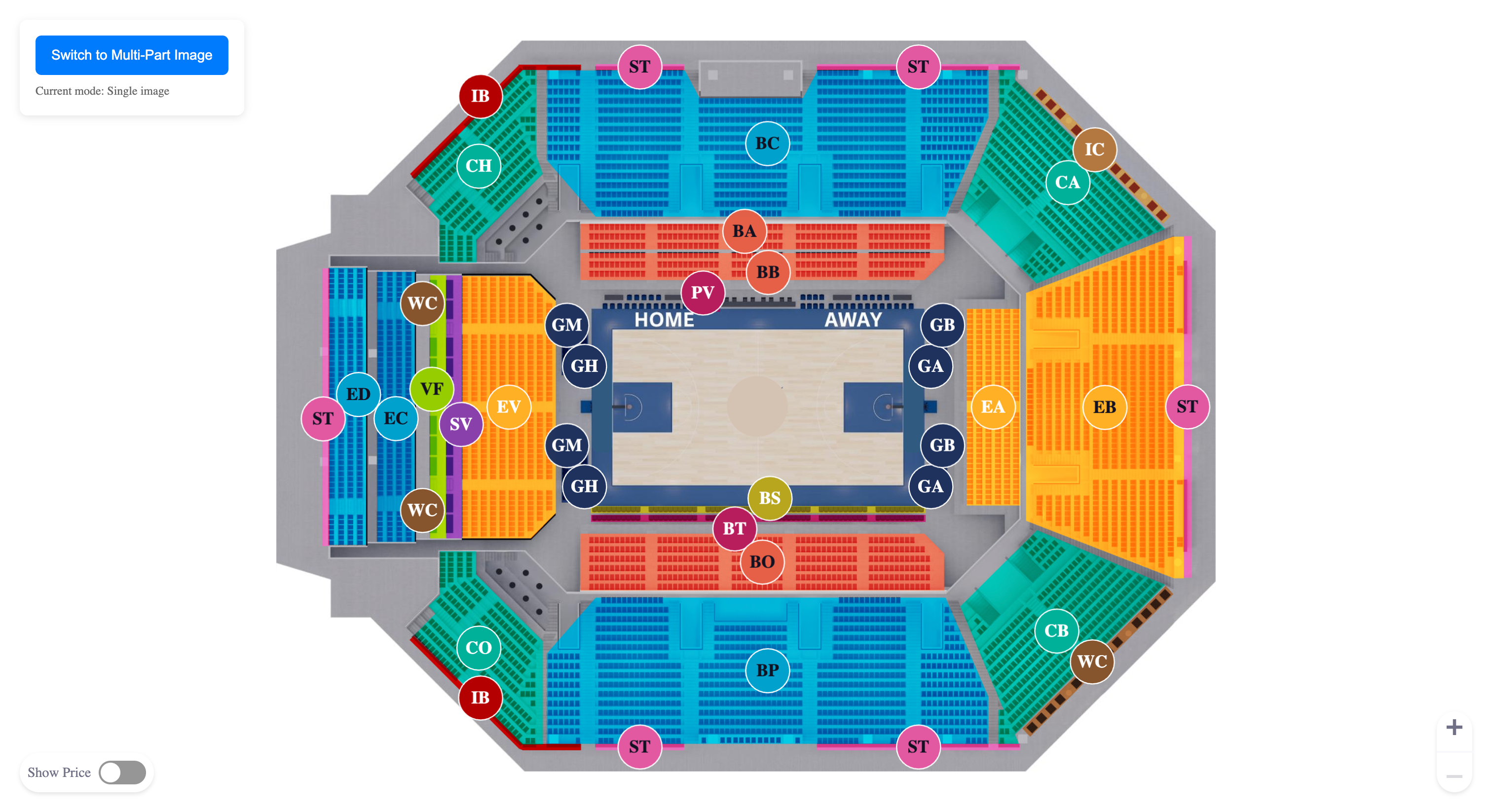
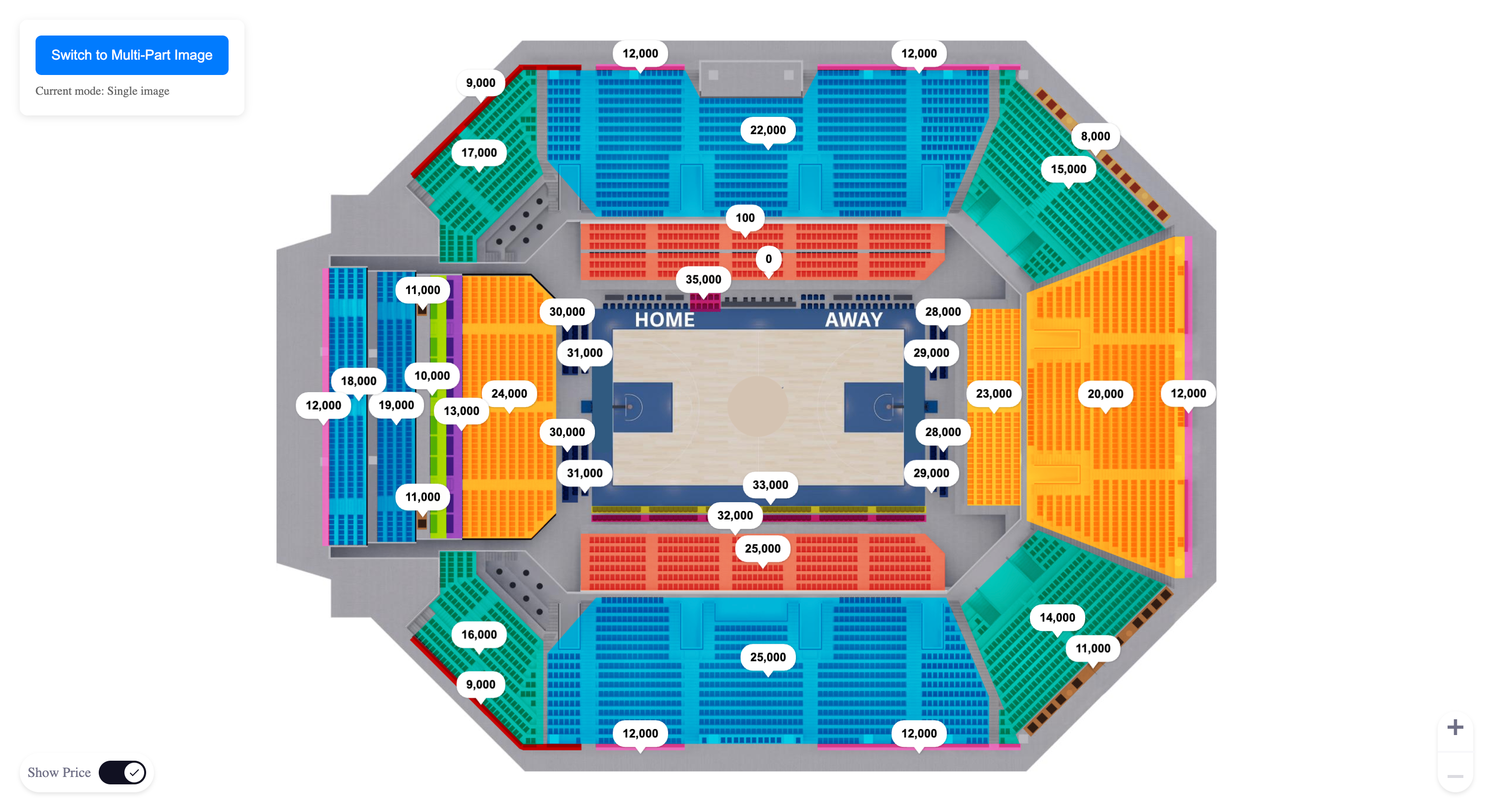
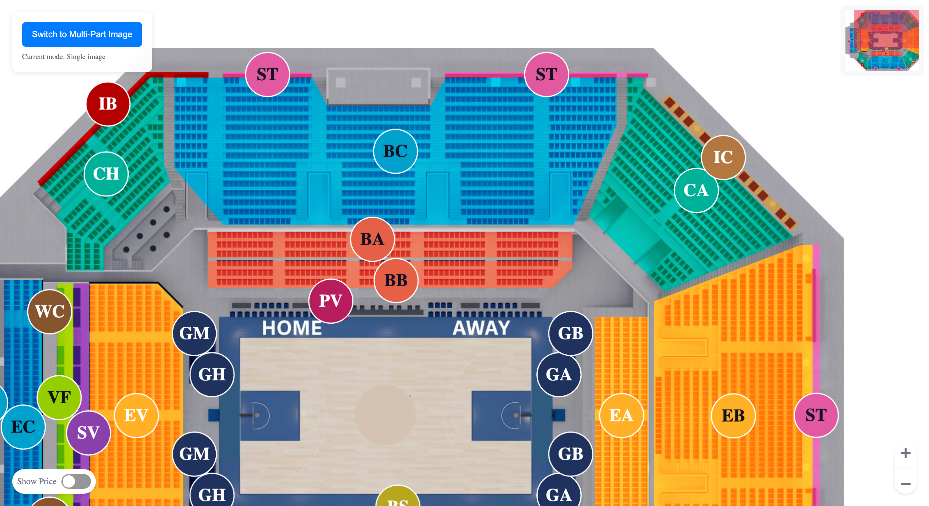
📷 Example Venue Map
📖 API Reference
Component Selector
<app-venue-map></app-venue-map>Inputs
| Property | Type | Default | Description |
|----------|------|---------|-------------|
| grades | Grade[] | [] | Array of seating grades/categories with their visual settings |
| mapConfiguration | Partial<MapConfiguration> & Pick<MapConfiguration, 'width' \| 'height' \| 'path'> | DEFAULT_MAP_CONFIG | Map display and behavior configuration |
| theme | Partial<StadiumMapTheme> | DEFAULT_STADIUM_MAP_THEME | Visual theme for the map |
| reloadMap | boolean | true | Whether to reload the map when inputs change |
| focusedGradePart | FocusedGradePart | undefined | Specific grade part to focus on |
Outputs
| Event | Type | Description |
|-------|------|-------------|
| selectGrade | { grade: Grade, shapeIndex?: number } | Emitted when a grade section is selected |
Core Types
interface Grade {
  id: string;                    // Unique identifier for the grade
  name: string;                  // Display name of the grade
  abbreviation: string;          // Short abbreviation (displayed on map)
  price: number;                 // Price for this grade
  disabled: boolean;             // Whether this grade is selectable
  settings: GradeSetting[];      // Visual settings for grade areas
}

interface GradeSetting {
  color: string;                 // Fill color for the grade area
  circle: {                      // Circle marker configuration
    x: number;                   // X coordinate for circle center
    y: number;                   // Y coordinate for circle center
    textColor: string;           // Text color for abbreviation
  };
  points: Point[];               // Polygon points defining the grade area
}

interface Point {
  x: number;                     // X coordinate
  y: number;                     // Y coordinate
}

interface MapConfiguration {
  // Required properties
  path: string | string[];       // Path to venue map image (single) or array of paths (multi-part)
  width: number;                 // Map width in pixels
  height: number;                // Map height in pixels

  // Optional properties (will use defaults if not provided)
  offsetHeight?: number;         // Vertical offset (default: 106)
  fontSize?: number;             // Text size (default: 20)

  // Shape configurations
  bubble?: SizeShape;            // Price bubble configuration
  corner?: SizeShape;            // Corner marker configuration
  arrow?: SizeShape;             // Arrow indicator configuration
  circle?: SizeShape;            // Circle marker configuration

  // Interaction configurations
  zoom?: ZoomConfiguration;      // Zoom behavior settings
  minimap?: MiniMapConfiguration; // Mini-map settings
}

interface StadiumMapTheme {
  // Canvas colors
  canvasBackgroundColor: string;

  // Grade visualization
  gradeStrokeColor: string;
  gradeTextColor: string;

  // Price display
  priceBackgroundColor: string;
  priceTextColor: string;
  priceBubbleStrokeColor: string;

  // Interactive elements
  miniMapViewportColor: string;

  // Seat states
  availableSeatColor: string;
  unavailableSeatColor: string;
  selectedSeatColor: string;
  selectedSeatBorderColor: string;
  availableSeatBorderColor: string;
  disabledSeatColor: string;

  // Special seat types
  premiumSeatColor: string;
  premiumSeatHoverColor: string;
  goldSeatColor: string;

  // UI elements
  shadowColor: string;
  darkTextColor: string;
}
🎨 Customization
Custom Themes
const customTheme: Partial<StadiumMapTheme> = {
  canvasBackgroundColor: '#1a1a1a',
  gradeStrokeColor: '#ffffff',
  gradeTextColor: '#ffffff',
  priceBackgroundColor: '#333333',
  priceTextColor: '#ffffff',
  selectedSeatColor: '#ff6b35',
  selectedSeatBorderColor: '#ff6b35',
  miniMapViewportColor: '#ff6b35'
};

// Apply to component
<app-venue-map [theme]="customTheme" [grades]="grades" [mapConfiguration]="mapConfig" />
Advanced Configuration
const advancedConfig: MapConfiguration = {
  path: '/assets/my-venue.png',
  width: 1920,
  height: 1080,
  offsetHeight: 120,
  fontSize: 16,
  zoom: {
    min: 1,
    max: 3.0,
    step: 0.2,
    showMiniMapAtLevel: 1.5
  },
  minimap: {
    scale: 0.15,
    opacity: 0.7
  },
  bubble: {
    width: 140,
    height: 45,
    stroke: 2,
    cornerRadius: 8,
    padding: 8,
    offsetLeft: 0,
    offsetTop: -50
  },
  circle: {
    width: 60,
    height: 60,
    stroke: 3,
    padding: 12,
    offsetLeft: 0,
    offsetTop: 0,
    cornerRadius: 0
  }
};
Integration in Your Project
- Import the component:
import { VenueMapComponent } from 'ngx-venue-map';- Add to your module or standalone component:
@Component({
  // ...
  imports: [VenueMapComponent], // For standalone components
  // ...
})
Prepare your venue map image:
- Place your venue/venue map image in your
publicorassetsfolder - Ensure the image has good resolution (recommended: 1600x1200 or higher)
- Supported formats: PNG, JPG, SVG
- Place your venue/venue map image in your
Define your seating grades:
- Map out the coordinate points for each seating area
- Choose appropriate colors for each grade
- Set pricing and availability
📦 Bundle Information
- Dependencies:
- Angular 20+
- fabric.js 5.3.0+
- lodash-es 4.17+
- uuid 9.0+
- Peer Dependencies:
@angular/common,@angular/core - Tree-shakable: Yes
- Side Effects: None
🌐 Browser Support
| Chrome | Firefox | Safari | Edge | IE | |--------|---------|--------|------|-----| | ✅ 80+ | ✅ 75+ | ✅ 13+ | ✅ 80+ | ❌ |
Note: This library uses modern Canvas APIs and ES6+ features. For older browser support, ensure proper polyfills are included.
🤝 Contributing
We welcome contributions! Please follow these steps:
- Fork the repository
- Create a feature branch:
git checkout -b feature/amazing-feature - Make your changes and add tests
- Commit your changes:
git commit -m 'Add amazing feature' - Push to the branch:
git push origin feature/amazing-feature - Open a Pull Request
📄 License
This project is licensed under the MIT License - see the LICENSE file for details.
🙏 Acknowledgments
- Built with Angular 20+
- Canvas rendering powered by Fabric.js
- Utility functions from Lodash
- TypeScript support throughout
📞 Support & Community
- 🐛 Issues: GitHub Issues
- 💬 Discussions: GitHub Discussions
Made with ❤️ for the Angular community
If you find this library useful, please consider giving it a ⭐ on GitHub!