
nih-gantt
v0.1.2
Published
Lightweight SVG Gantt chart for React — frappe-gantt inspired, zero UI dependencies
Maintainers
 nihuel
Readme
nih-gantt
A lightweight, interactive SVG Gantt chart for React. Inspired by frappe-gantt but built from scratch with modern React, zero UI dependencies, and full dark/light theme support.
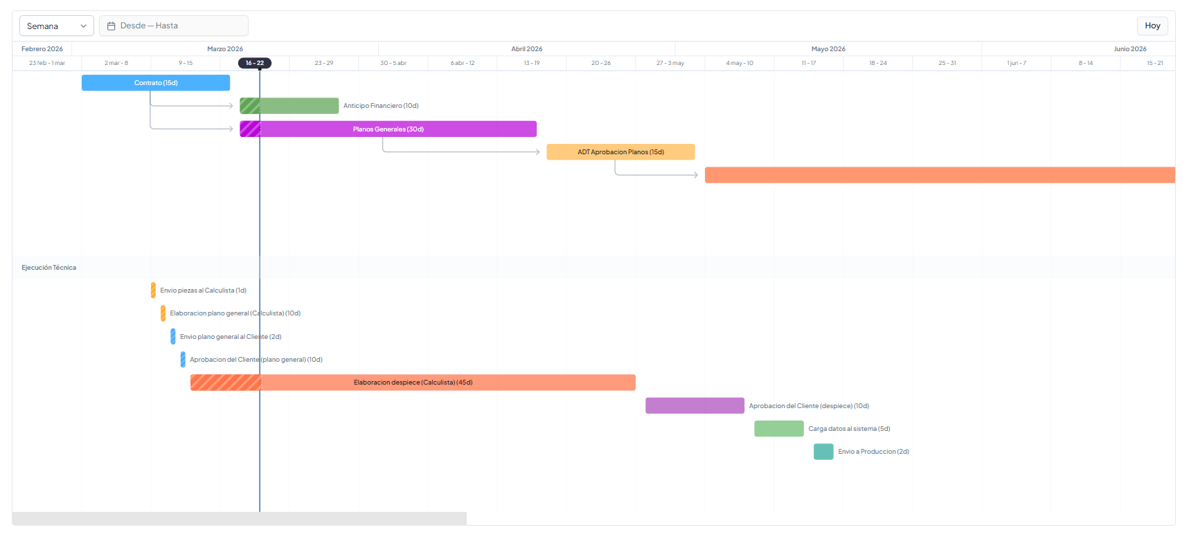
Features
- Pure SVG rendering — no canvas, no DOM manipulation, no heavy dependencies
- Dark/light theme — uses CSS variables with sensible defaults
- Interactive drag — resize bars from edges or move entire bars with cascade dependency recalculation
- Progress tracking — animated stripe pattern for in-progress tasks, expected vs real progress comparison
- Frappe-gantt style arrows — curved SVG dependency arrows between tasks
- View modes — Day, Week, Month, Year with Ctrl+scroll zoom
- Today marker — vertical line + header pill highlight
- Header highlight — shows which columns a hovered task spans
- Smart tooltips — follows cursor, never overlaps bars, auto-flips at edges
- Group headers — section separators for organizing tasks into groups
- Compact variant —
GanttMinifor inline previews - Click vs drag detection — 5px threshold distinguishes navigation clicks from drag operations
Install
npm install nih-gantt
# or
pnpm add nih-gantt
# or
bun add nih-gantt
Peer dependencies: react >= 18, react-dom >= 18, date-fns >= 3
Compatibility
- React: supports React 18 and 19.
- Package formats: ships both ESM and CommonJS builds. Modern bundlers will use ESM automatically, while older toolchains can consume the CJS entry.
- SSR: safe to import in SSR environments. Browser-only APIs are only used at runtime on the client.
- Browsers: designed for modern browsers with SVG, Pointer Events,
requestAnimationFrame, andResizeObserver. - Date input: pass task dates as ISO calendar strings (
YYYY-MM-DD) for stable parsing across environments.
CommonJS example:
const { GanttChart } = require('nih-gantt');Quick Start
import { GanttChart } from 'nih-gantt';

const tasks = [
  {
    id: 'design',
    name: 'Design',
    start: '2026-03-01',
    end: '2026-03-15',
    durationDays: 14,
    progress: 60,
    color: '#0090FF',
  },
  {
    id: 'develop',
    name: 'Development',
    start: '2026-03-16',
    end: '2026-04-15',
    durationDays: 30,
    progress: 0,
    color: '#59A14F',
    dependencies: ['design'],
  },
];

function App() {
  return (
    <div style={{ height: '500px' }}>
      <GanttChart
        tasks={tasks}
        viewMode="Week"
        showProgress
        showExpectedProgress
        onClick={(task) => console.log('Clicked:', task.name)}
      />
    </div>
  );
}
Components
<GanttChart />
Full interactive Gantt chart with headers, arrows, tooltips, and optional toolbar.
interface GanttChartProps {
  tasks: GanttTask[];
  viewMode?: 'Day' | 'Week' | 'Month' | 'Year';  // default: 'Week'
  onViewChange?: (mode: ViewMode) => void;
  onClick?: (task: GanttTask) => void;
  readonly?: boolean;                               // default: true
  showProgress?: boolean;                           // show progress bar with stripes
  showExpectedProgress?: boolean;                   // show expected progress line based on today
  dateRange?: { from: Date; to: Date };
  onDateRangeChange?: (range: { from: Date; to: Date }) => void;
  moveDependencies?: boolean;                       // cascade on resize (default: true)
  onDateChange?: (task: GanttTask, newStart: string, newEnd: string, mode: 'resize' | 'move') => void;
  className?: string;
  theme?: Partial<GanttTheme>;
  emptyText?: string;
  renderToolbar?: (ctx: { scrollToToday: () => void }) => React.ReactNode;
  renderTooltip?: (task: GanttTask) => React.ReactNode;
}
<GanttMini />
Compact preview variant for inline use. No headers, no arrows, no drag.
interface GanttMiniProps {
  tasks: GanttTask[];
  height?: number;
  showTooltip?: boolean;   // default: true
  showProgress?: boolean;  // default: false
  className?: string;
  style?: React.CSSProperties;
  label?: string;          // default: 'Preview'
  completedLabel?: string; // default: 'completed'
}
Data Types
interface GanttTask {
  id: string;
  name: string;
  start: string;              // ISO date 'YYYY-MM-DD'
  end: string;                // ISO date
  durationDays: number;
  progress: number;           // 0-100
  dependencies?: string[];    // IDs of tasks this depends on
  color?: string;             // hex color
  description?: string;
  completed?: boolean;
  actualStart?: string;
  actualEnd?: string;
  isGroupHeader?: boolean;    // renders as section separator
  groupLabel?: string;
  section?: string;
}
Theming
nih-gantt uses CSS custom properties with fallback defaults. Override by passing a theme prop or setting CSS variables:
<GanttChart
  tasks={tasks}
  theme={{
    card: '#ffffff',
    border: '#e2e8f0',
    foreground: '#1a1a2e',
    background: '#fafafa',
    mutedForeground: '#64748b',
    accent: '#ebf2fc',
    primary: '#1d5ba3',
    muted: '#f1f5f9',
  }}
/>
Or use CSS variables (automatically detected):
:root {
  --color-card: #ffffff;
  --color-border: #e2e8f0;
  --color-foreground: #1a1a2e;
  --color-background: #fafafa;
  --color-muted-foreground: #64748b;
  --color-accent: #ebf2fc;
  --color-primary: #1d5ba3;
  --color-muted: #f1f5f9;
}
Custom Toolbar
The chart doesn't include a built-in toolbar — use renderToolbar to add your own controls:
<GanttChart
  tasks={tasks}
  renderToolbar={({ scrollToToday }) => (
    <div style={{ display: 'flex', gap: 8 }}>
      <select onChange={(e) => setViewMode(e.target.value)}>
        <option value="Day">Day</option>
        <option value="Week">Week</option>
        <option value="Month">Month</option>
        <option value="Year">Year</option>
      </select>
      <button onClick={scrollToToday}>Today</button>
    </div>
  )}
/>
Drag Resize & Move
Set readonly={false} to enable drag interactions:
- Edge handles — drag left/right edges to resize
- Center drag — drag the bar body to move (preserves duration)
- Cascade — dependent tasks shift automatically when
moveDependencies={true} - Click vs drag — 5px threshold distinguishes clicks from drags
<GanttChart
  tasks={tasks}
  readonly={false}
  moveDependencies
  onDateChange={(task, newStart, newEnd, mode) => {
    console.log(`${mode}: ${task.name} → ${newStart} to ${newEnd}`);
  }}
  onClick={(task) => {
    // Only fires on click, not after drag
    navigate(`/tasks/${task.id}`);
  }}
/>
Utilities
import { toGanttTask, getExpectedProgress, VIEW_OPTIONS } from 'nih-gantt';

// Map your data model to GanttTask
const task = toGanttTask({
  id: '1', nombre: 'Phase 1', duracionDias: 30, orden: 1,
  color: '#0090FF', fechaInicio: '2026-03-01', fechaFin: '2026-03-31',
});

// Calculate expected progress based on today
const expected = getExpectedProgress(task); // 0-100

// Spanish view mode labels
VIEW_OPTIONS; // [{ value: 'Day', label: 'Dia' }, ...]
Group Headers
Organize tasks into sections with visual separators:
const tasks = [
  { id: '1', name: 'Task A', start: '...', end: '...', durationDays: 10, progress: 0 },
  { id: '2', name: 'Task B', start: '...', end: '...', durationDays: 5, progress: 0 },
  {
    id: '__section__',
    name: '', start: '', end: '',
    durationDays: 0, progress: 0,
    isGroupHeader: true,
    groupLabel: 'Phase 2',
  },
  { id: '3', name: 'Task C', start: '...', end: '...', durationDays: 20, progress: 0 },
];
License
MIT