
nodes-connector
v0.1.2
Published
Framework-agnostic core and React bindings for rendering node boards with many-to-many connectors.
Downloads
59

Maintainers
 kzares
Readme
nodes-connector
nodes-connector is an npm package for building node boards, geometric nodes, and many-to-many connectors.
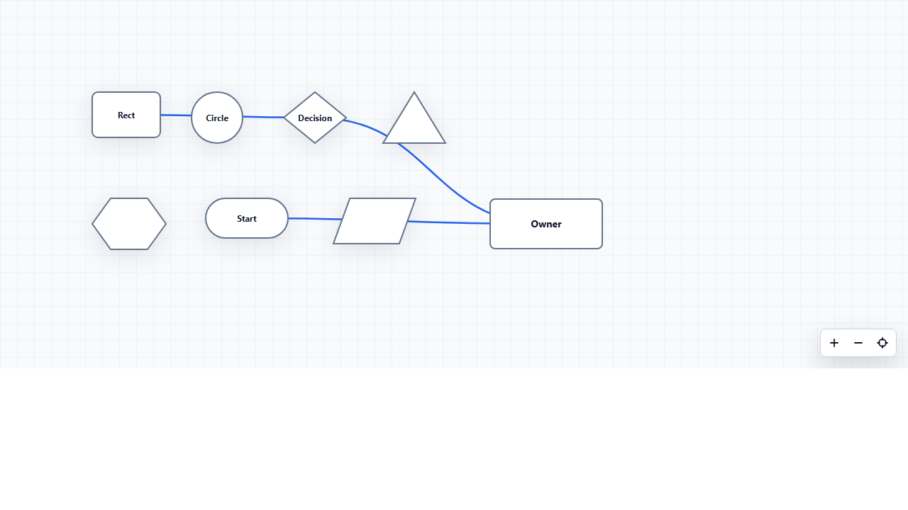
The package is split into two layers:
nodes-connector/core: framework-agnostic reusable logic.nodes-connector/react: React components and bindings.
The main goal is to let you save and restore a graph from an API or database, render it in React, edit it visually, and customize the UI without rewriting the graph logic.
Links
- Repository: https://github.com/kzares-dev/nodes-connector
- Interactive documentation: https://kzares-dev.github.io/nodes-connector/
- Issues: https://github.com/kzares-dev/nodes-connector/issues
- npm package: https://www.npmjs.com/package/nodes-connector
Screenshots
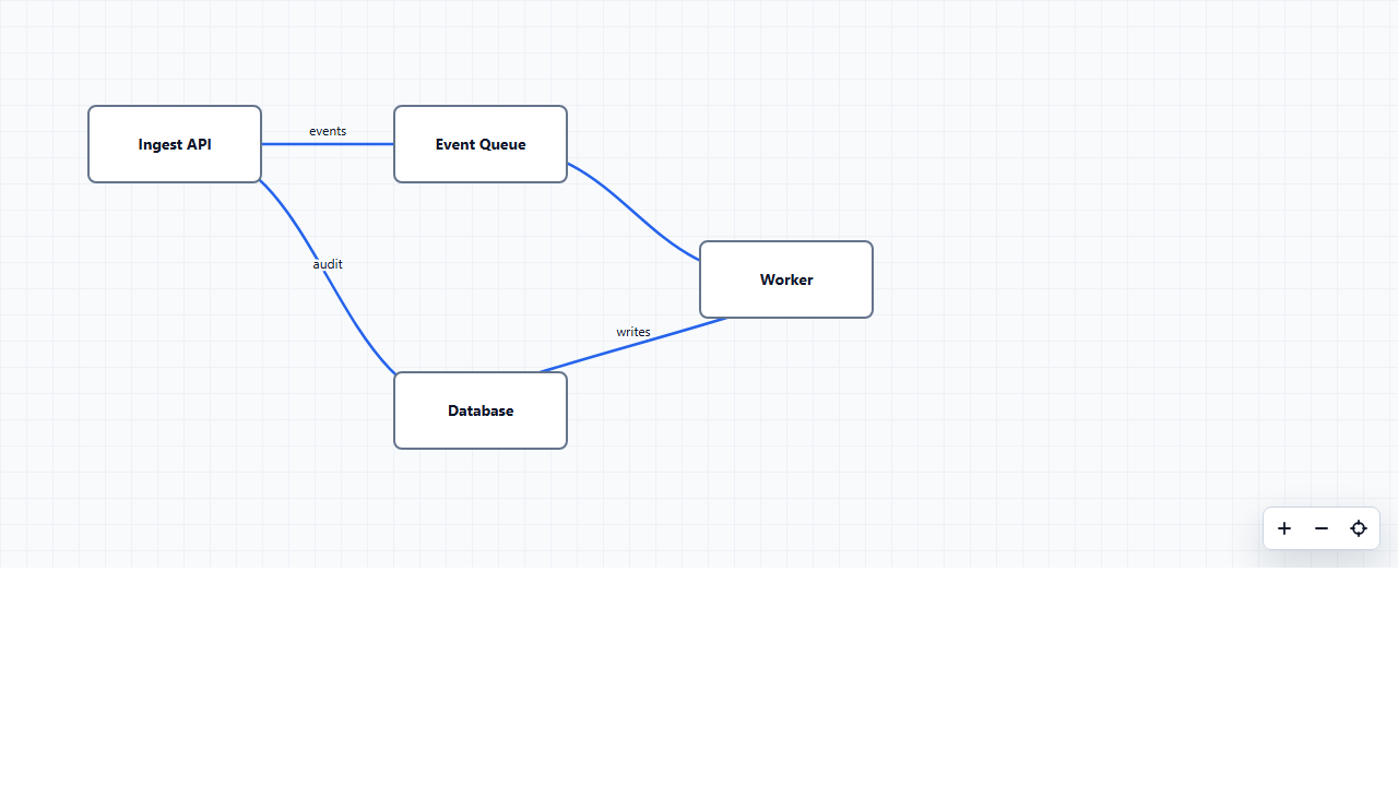
Controlled Board
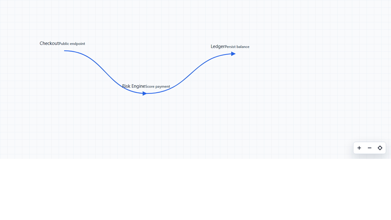
Custom Nodes
Geometric Nodes
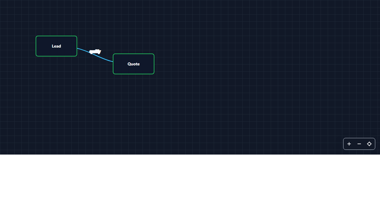
Theme Customization
Installation
npm install nodes-connectorIn React, import the components and base CSS:
import { Board, Connector, Element, Node } from "nodes-connector/react";
import "nodes-connector/react/styles.css";
Concepts
Board
Board is the main canvas. It handles:
- node and connector rendering
- background drag panning
- wheel zoom
- compact navigation controls
- context menus
- node and element creation
- text editing
- resize
- controlled and uncontrolled state
Node
Node represents a normal graph node.
By default, it renders as a rectangular geometry. If it receives children, it is treated as a custom node and does not apply the default visual chrome; you control its UI through className, contentClassName, style, or renderNode.
Element
Element represents an SVG geometric node. It is not decorative: it behaves like a graph node.
It can:
- connect with
Connector - be used as
fromorto - move with drag
- open a context menu
- edit text on double click
- resize
- be deleted together with its connections
Built-in types:
"rectangle" | "circle" | "diamond" | "triangle" | "hexagon" | "pill" | "parallelogram"You can also register custom shapes with shapes.
Connector
Connector defines a relationship between two ids. Those ids can belong to either Node or Element.
<Connector from="input" to="decision" />Controlled Data Usage
This is the recommended approach when the board state will be persisted in an API or database.
import { useState } from "react";
import { Board } from "nodes-connector/react";
import "nodes-connector/react/styles.css";

const initialNodes = [
  { id: "api", label: "API", x: 80, y: 80 },
  { id: "db", label: "Database", x: 360, y: 180 }
];

const initialConnections = [{ id: "api-db", from: "api", to: "db" }];

export function FlowEditor() {
  const [nodes, setNodes] = useState(initialNodes);
  const [connections, setConnections] = useState(initialConnections);

  return (
    <Board
      editable
      nodes={nodes}
      connections={connections}
      onNodesChange={setNodes}
      onConnectionsChange={setConnections}
    />
  );
}
Declarative JSX Usage
You can also declare the board with JSX components:
<Board editable>
  <Node id="source" label="Source" x={96} y={96} />
  <Node id="transform" x={376} y={220}>
    <strong>Transform</strong>
  </Node>
  <Element id="decision" type="diamond" x={640} y={180} width={110} height={90} label="OK?" />

  <Connector from="source" to="transform" />
  <Connector from="transform" to="decision" />
</Board>
React Native Usage
nodes-connector also exposes a React Native entrypoint:
import { Board, Connector, Element, Node } from "nodes-connector/react-native";Install the native peer dependencies in your app:
npm install react-native-svgFor Expo projects:
npx expo install react-native-svgBasic usage:
import { useState } from "react";
import { Board } from "nodes-connector/react-native";

const initialNodes = [
  { id: "app", label: "App", x: 80, y: 100 },
  { id: "api", label: "API", x: 320, y: 180 }
];

const initialConnections = [{ from: "app", to: "api" }];

export function NativeFlow() {
  const [nodes, setNodes] = useState(initialNodes);
  const [connections, setConnections] = useState(initialConnections);

  return (
    <Board
      editable
      nodes={nodes}
      connections={connections}
      onNodesChange={setNodes}
      onConnectionsChange={setConnections}
      style={{ flex: 1 }}
    />
  );
}
Declarative usage works too:
<Board editable>
  <Node id="start" label="Start" x={80} y={120} />
  <Element id="decision" type="diamond" label="OK?" x={300} y={110} />
  <Connector from="start" to="decision" />
</Board>
React Native behavior differs from web where the platform differs:
- long press a node to start a connection
- tap another node to finish the connection
- long press the board background to add a node
- drag the board background to pan
- use the exposed
useBoard()hook to build native controls
There is a runnable Expo demo in examples/native-demo:
cd examples/native-demo
npm install
npx expo start --host lan --port 8082
Editing Interactions
When editable is enabled:
- drag a node to move it
- drag the background to pan the board
- use the wheel to zoom
- right click a node to open its context menu
- right click an empty board area to create nodes or geometric elements
- double click a default or geometric node to enter edit mode
- edit text and resize the container while in edit mode
- press
Escapeto cancel a connection draft
To create connections:
- Right click the source node.
- Select
Add connection. - Move the mouse toward another node.
- Left click the target node.
Custom Nodes
If you pass children to Node, the container does not apply the default visual styles. This lets you use regular CSS, Tailwind, or your design system.
<Board editable>
  <Node
    id="checkout"
    x={90}
    y={110}
    width={220}
    height={96}
    className="rounded-md border border-green-300 bg-white p-3"
    contentClassName="grid gap-1"
  >
    <CheckoutCard />
  </Node>

  <Node id="ledger" x={420} y={180} className="my-ledger-node">
    <LedgerCard />
  </Node>

  <Connector from="checkout" to="ledger" />
</Board>
Custom nodes still support:
- drag
- context menu
- connections
- deletion
- double-click resize
Geometric Nodes
<Board editable>
  <Element id="input" type="parallelogram" x={110} y={120} width={128} height={64} label="Input" />
  <Element id="process" type="rectangle" x={330} y={120} width={128} height={64} label="Process" />
  <Element id="decision" type="diamond" x={550} y={110} width={104} height={88} label="OK?" />

  <Connector from="input" to="process" />
  <Connector from="process" to="decision" />
</Board>
Element is stored separately in elements, but participates in the graph just like Node.
const [elements, setElements] = useState([
  { id: "start", type: "pill", label: "Start", x: 100, y: 120, width: 120, height: 56 }
]);

<Board editable elements={elements} onElementsChange={setElements} />;
Visual Customization
CSS Variables
You can change the theme without replacing components:
.my-board {
  --nodes-connector-bg: #111827;
  --nodes-connector-grid: #1f2937;
  --nodes-connector-text: #f9fafb;
  --nodes-connector-node-bg: #0f172a;
  --nodes-connector-node-stroke: #22c55e;
  --nodes-connector-connection: #38bdf8;
  --nodes-connector-menu-bg: #111827;
  --nodes-connector-menu-border: #334155;
  --nodes-connector-focus: #22c55e;
}
<Board className="my-board" nodes={nodes} connections={connections} />renderNode
Replace the visual content of default and custom nodes:
<Board
  nodes={nodes}
  renderNode={({ node, editing }) => (
    <div className={editing ? "node editing" : "node"}>
      <strong>{node.label}</strong>
      <small>{node.id}</small>
    </div>
  )}
/>
renderElement
Customize the SVG of an element:
<Board
  elements={elements}
  renderElement={({ element, width, height }) => (
    <rect
      width={width}
      height={height}
      rx={12}
      fill={element.fill ?? "#eef2ff"}
      stroke={element.stroke ?? "#4f46e5"}
    />
  )}
/>
renderConnection
Customize how connections are drawn:
<Board
  connections={connections}
  renderConnection={({ path, remove }) => (
    <>
      <path d={path} stroke="rgba(15, 23, 42, .15)" strokeWidth={8} fill="none" />
      <path d={path} stroke="#0f766e" strokeWidth={3} fill="none" onClick={remove} />
    </>
  )}
/>
Custom Shapes
Register new geometries with shapes.
const cloudShape = {
  type: "cloud",
  render: ({ element, width, height }) => (
    <path
      d={`M ${width * 0.28} ${height * 0.72}
        H ${width * 0.78}
        C ${width * 0.95} ${height * 0.72}, ${width * 0.95} ${height * 0.42}, ${width * 0.75} ${height * 0.42}
        C ${width * 0.7} ${height * 0.16}, ${width * 0.32} ${height * 0.18}, ${width * 0.3} ${height * 0.42}
        C ${width * 0.1} ${height * 0.38}, ${width * 0.08} ${height * 0.72}, ${width * 0.28} ${height * 0.72}
        Z`}
      fill={element.fill ?? "#eff6ff"}
      stroke={element.stroke ?? "#2563eb"}
    />
  )
};

<Board editable shapes={[cloudShape]}>
  <Element id="cloud-api" type="cloud" x={130} y={130} width={150} height={90} label="Cloud API" />
</Board>;
Context Menu
Controlled Creation
Use factories when an app owns ids, labels, dimensions, or metadata for newly created items. The right-click Add node action and useBoard().addNode() both use nodeFactory.
<Board
  editable
  nodes={nodes}
  elements={elements}
  onNodesChange={setNodes}
  nodeFactory={({ world, graphNodes }) => {
    const id = getNextId(graphNodes);

    return {
      id,
      label: id,
      x: world.x - 38,
      y: world.y - 38,
      width: 76,
      height: 76,
      meta: { source: "board" }
    };
  }}
/>
Custom Actions
Add actions without replacing the entire menu:
const duplicateAction = {
  id: "duplicate",
  label: "Duplicate",
  scope: "item",
  onSelect: ({ itemId }) => {
    // duplicate the item in your controlled state
  }
};

<Board editable contextActions={[duplicateAction]} />;
Native Action Overrides
Keep the native menu layout while replacing or hiding specific built-in actions:
<Board
  editable
  actionOverrides={{
    "add-node": ({ context }) => addAppNode(context.world),
    "add-rectangle": ({ context }) => addAppElement("rectangle", context.world)
  }}
  hiddenActions={["add-diamond", "add-triangle", "add-hexagon"]}
/>
Menu Content
Use renderContextMenuContent to render only the items inside the package's positioned .nodes-connector-context-menu wrapper:
<Board
  editable
  renderContextMenuContent={({ context, actions }) => (
    <>
      {actions.map((action) => (
        <button key={action.id} disabled={action.disabledValue} onClick={() => action.onSelect(context)}>
          {action.label}
        </button>
      ))}
    </>
  )}
/>
Fully Custom Menu
Use renderContextMenu when you want to replace the full menu container. Position the menu with context.board or your own layout:
<Board
  editable
  renderContextMenu={({ context, actions }) => (
    <div className="my-menu" style={{ left: context.board.x, top: context.board.y }}>
      {actions.map((action) => (
        <button
          key={action.id}
          disabled={action.disabledValue}
          onClick={() => action.onSelect(context)}
        >
          {action.label}
        </button>
      ))}
    </div>
  )}
/>
External Toolbar With useBoard
useBoard() lets you create custom controls inside Board.
function Toolbar() {
  const board = useBoard();

  return (
    <div className="toolbar">
      <button onClick={board.zoomIn}>Zoom +</button>
      <button onClick={board.zoomOut}>Zoom -</button>
      <button onClick={board.addNode}>Add node</button>
      <span>{Math.round(board.viewport.zoom * 100)}%</span>
    </div>
  );
}

<Board editable showNavigationControls={false}>
  <Toolbar />
</Board>;
Validators
Add business rules with validators.
const noDbAsSource = ({ connections }) =>
  connections.some((connection) => connection.from === "db")
    ? ["Database cannot start connections."]
    : [];

<Board
  editable
  validators={[noDbAsSource]}
  onSnapshotError={(errors) => console.log(errors)}
/>;
Events
Board exposes callbacks for integrations:
<Board
  onNodeClick={(node) => console.log("node", node)}
  onElementClick={(element) => console.log("element", element)}
  onBeforeConnect={({ connection, fromRect, toRect }) => {
    const weight = Math.round(Math.hypot(toRect.x - fromRect.x, toRect.y - fromRect.y));

    return {
      ...connection,
      label: String(weight),
      meta: { weight }
    };
  }}
  onConnect={(connection) => console.log("connect", connection)}
  onGraphChange={({ graphNodes, connections }) => saveGraph({ graphNodes, connections })}
  onDelete={(id, type) => console.log("delete", id, type)}
/>;
Core Utilities
nodes-connector/core exports pure functions for usage outside React:
import {
  applyGridLayout,
  buildAdjacency,
  connectSnapshot,
  createHistory,
  deserializeSnapshot,
  getConnectionWeight,
  pushHistory,
  redoHistory,
  serializeSnapshot,
  undoHistory
} from "nodes-connector/core";

const snapshot = {
  nodes: [{ id: "a", label: "A", x: 0, y: 0 }],
  elements: [],
  connections: []
};

const laidOut = applyGridLayout(snapshot);
const json = serializeSnapshot(laidOut);
const restored = deserializeSnapshot(json);
const history = pushHistory(createHistory(snapshot), restored);
const adjacency = buildAdjacency(restored, {
  directed: false,
  weight: (connection) => getConnectionWeight(connection)
});
Main Props
| Prop | Type | Description |
| --- | --- | --- |
| nodes | NodeRenderItem[] | Controlled node state. |
| connections | ConnectionData[] | Controlled connection state. |
| elements | ElementRenderItem[] | Controlled geometric node state. |
| defaultNodes | NodeRenderItem[] | Initial uncontrolled nodes. |
| defaultConnections | ConnectionData[] | Initial uncontrolled connections. |
| defaultElements | ElementRenderItem[] | Initial uncontrolled geometric nodes. |
| editable | boolean | Enables drag, resize, and context menus. |
| pannable | boolean | Allows background drag panning. |
| zoomable | boolean | Allows wheel zoom. |
| defaultViewport | { x, y, zoom } | Initial viewport. |
| showNavigationControls | boolean | Shows compact controls in the bottom-right corner. |
| renderNode | (props) => ReactNode | Custom node renderer. |
| renderElement | (props) => ReactNode | Custom geometry renderer. |
| renderConnection | (props) => ReactNode | Custom connection renderer. |
| renderContextMenuContent | (props) => ReactNode | Custom menu items inside the native positioned wrapper. |
| renderContextMenu | (props) => ReactNode | Full context menu replacement. |
| shapes | ShapeDefinition[] | Custom shape registry. |
| contextActions | ContextAction[] | Extra context menu actions. |
| actionOverrides | Record<string, ActionOverride> | Replace built-in action behavior by id. |
| hiddenActions | string[] | Hide built-in or custom context menu actions by id. |
| nodeFactory | (context) => NodeRenderItem | Creates nodes for built-in add-node paths. |
| elementFactory | (context) => ElementRenderItem | Creates elements for built-in add-element paths. |
| createId | (context) => string | Naming hook used by built-in creation when no factory id is provided. |
| createLabel | (context) => string | Label hook used by built-in creation when no factory label is provided. |
| validators | BoardValidator[] | Validation rules. |
| onNodesChange | (nodes) => void | Node change callback. |
| onElementsChange | (elements) => void | Geometric node change callback. |
| onConnectionsChange | (connections) => void | Connection change callback. |
| onBeforeConnect | (context) => ConnectionData \| null | Customize or cancel a new connection before insertion. |
| onGraphChange | (state) => void | Receives nodes, elements, unified graph nodes, and connections after graph changes. |
Storybook
The project includes detailed examples:
npm run storybookOpen:
http://localhost:6006/Interactive Storybook is published with GitHub Pages:
https://kzares-dev.github.io/nodes-connector/Recommended sections:
nodes-connector/Introductionnodes-connector/Boardnodes-connector/Customization
Deploy Storybook To GitHub Pages
This repository includes a GitHub Actions workflow at .github/workflows/storybook-pages.yml.
The workflow runs on every push to main and:
- installs dependencies with
npm ci - runs
npm run test - builds Storybook with
npm run build:storybook - uploads
storybook-staticas a GitHub Pages artifact - deploys it to GitHub Pages
The production documentation URL is:
https://kzares-dev.github.io/nodes-connector/To publish the code to GitHub for the first time:
git init -b main
git add .
git commit -m "Initial commit"
git remote add origin https://github.com/kzares-dev/nodes-connector.git
git push -u origin main
Then configure GitHub Pages:
- Open the repository on GitHub.
- Go to
Settings->Pages. - Under
Build and deployment, setSourcetoGitHub Actions. - Push to
mainor runDeploy Storybook to GitHub Pagesmanually from theActionstab.
After the workflow finishes, the Storybook URL will be shown in the deployment summary.
Development
npm install
npm run typecheck
npm run build
npm run build:storybook
npx playwright install chromium
npm run screenshots:docs
npm run test
npm run test runs the library typecheck and build.
npm run screenshots:docs regenerates the README/npm screenshots from the latest storybook-static build. Run npx playwright install chromium once before capturing screenshots on a new machine.