
notifications-kd
v1.2.3
Published
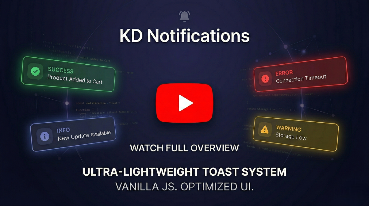
A standalone, ultra-lightweight, responsive & mobile-friendly toast notification system with a modern, elegant UI and zero dependencies.
Maintainers
 khvichadev
Readme
KD Notifications (notifications-kd)
A highly optimized, ultra-lightweight toast notification system with a modern, elegant UI, fully responsive mobile support, and zero dependencies.
Installation
Via NPM (Bundlers):
npm install notifications-kdVia CDN (Direct Browser Usage):
<script src="https://cdn.jsdelivr.net/npm/notifications-kd"></script>

<script src="https://unpkg.com/notifications-kd"></script>
Features
- ✨ Elegant & Modern UI: Beautifully crafted default themes featuring Glassmorphism modals and smooth
requestAnimationFrametransitions. - 🚀 Zero Dependencies: Pure Vanilla JS. No jQuery, no external CSS.
- 🛡️ Secure: Built-in DOM-based XSS protection (strict whitelisting,
<svg>/<math>blocking, and control-character sanitization). - 🎨 Smart Auto-Theming: Automatically detects host environment (Light/Dark mode) and reads modern CSS space-separated syntax to adapt seamlessly.
- 📍 Smart Positioning: Place toasts anywhere (center, top-left, bottom-right, etc.) with strict CSS unit validation for custom offsets.
- ♿ Highly Accessible: Comprehensive Focus Trap, automatic Focus Restoration (WCAG standard), Esc-key support, and OS-level
prefers-reduced-motionintegration. - 📱 Responsive & Mobile-Ready: Fully adaptive layout with native Safe Area (
env(safe-area-inset-*)) support for modern devices (e.g., iPhone Notch). - ⚡ High Performance: Optimized DOM manipulation, race-condition prevention, and strict memory management.
Usage
Include the library in your project:
import KDNotification from "notifications-kd";(Or simply load the notifications-kd.js file via a <script> tag in browser environments).
Basic Info Toast
KDNotification.show({
  type: "info",
  message: "Operation completed successfully.",
  position: "top-right",
});
Rich Toast with Title & Auto-dismiss
KDNotification.show({
  type: "success",
  title: "Profile Updated",
  message: "Your changes have been saved.",
  duration: 4000,
  position: "bottom-left",
});
Interactive Modal (Promises)
KDNotification.show({
  type: "warning",
  title: "Delete File?",
  message: "Are you sure you want to permanently delete this file?",
  isModal: true, // Blocks background clicks and escapes
  position: "center",
  buttons: [
    { text: "Yes, Delete", className: "kd-btn-danger", value: "deleted" },
    { text: "Cancel", value: "cancelled" },
  ],
}).then((res) => {
  if (res === "deleted") {
    console.log("File deleted!");
  }
});
API Options
| Parameter | Type | Default | Description |
| ----------- | ------------- | ---------- | --------------------------------------------------------------------------------------------- |
| type | String | 'info' | 'info', 'success', 'error', 'warning', 'processing' |
| title | String | '' | Optional title for a rich UI layout |
| message | String | '' | The main content of the notification (Safe HTML supported) |
| duration | Number | 3000 | Auto-dismiss time in ms (0 disables auto-dismiss) |
| position | String | 'center' | 'center', 'top-left', 'top-right', 'bottom-left', 'bottom-right' |
| theme | String | 'auto' | 'auto' (detects background), 'light', or 'dark' |
| isModal | Boolean | false | If true, blocks background interaction and requires manual dismissal. |
| buttons | Array | null | Array of button objects { text, value, className, onClick } (Safe HTML supported in text) |
| icon | String | null | Custom SVG string to override the default icon |
| style | Object | {} | Custom inline CSS properties or CSS variables |
| offsetX/Y | String/Number | '50px' | Custom distance from screen edges (supports all CSS units with validation). |
Methods
KDNotification.show(options): Displays the notification and returns aPromise. Resolves with the clicked button'svalue, ornull/trueon auto-dismiss or overlay click.KDNotification.close(): Programmatically dismisses the currently active notification. Ideal for hidingprocessingtoasts after a background task (like an API call) finishes.
Customization & CSS
You can globally override default styles via the :root pseudo-class, or locally per toast using the style option API:
--kd-toast-anim-duration: Controls the enter/leave animation speed. Accurately parses both seconds (e.g.,0.3s) and milliseconds (e.g.,300ms) (Default:250ms).--kd-z-toast: Controls the z-index of the toast overlay (Default:2147483647).--kd-mobile-offset-x: Controls the horizontal distance from screen edges on mobile devices (Default:12px).--kd-mobile-offset-y: Controls the vertical distance from screen edges on mobile devices (Default:16px).--kd-mobile-max-width: Controls the maximum width of the toast on mobile devices (Default:420px).
💡 Best Practice: It is strongly recommended to use the
styleAPI or CSS variables for customization. Please avoid targeting internal CSS classes directly in your stylesheet, as the internal HTML structure may evolve in future minor updates and could break your custom overrides.
Contact & Support
If you have any questions, bug reports, or feature requests, please open an issue on the GitHub repository.
License
MIT License © KhvichaDev