
nuxt-confirm-dialog
v1.1.0
Published
A beautiful, framework-agnostic confirm dialog module for Nuxt 3 and Nuxt 4 — no Vuetify required.
Maintainers
 osameh_ir
Readme
nuxt-confirm-dialog
A beautiful, zero-dependency confirm dialog module for Nuxt 3 and Nuxt 4 — no Vuetify or icon-font required. Drop it in, call useConfirmDialog().confirmDelete(...), await the result.
- 🎨 Polished look — dark radial gradient, colored borders per type, decorative top icon, blurred backdrop
- 🧩 Standalone — no Vuetify, no MDI, no extra CSS framework
- ⚡️ Auto-mounted — no boilerplate, just call
useConfirmDialog().confirmDelete('item') - 🎯 Promise-based API —
await dialog.show({...})returns the action; convenience methods returnboolean - 🧠 Fully typed — written in TypeScript with full IntelliSense
- 🔘 1 / 2 / 3 button layouts — default Cancel/Confirm or custom buttons with named actions
- ⌨️ Keyboard friendly —
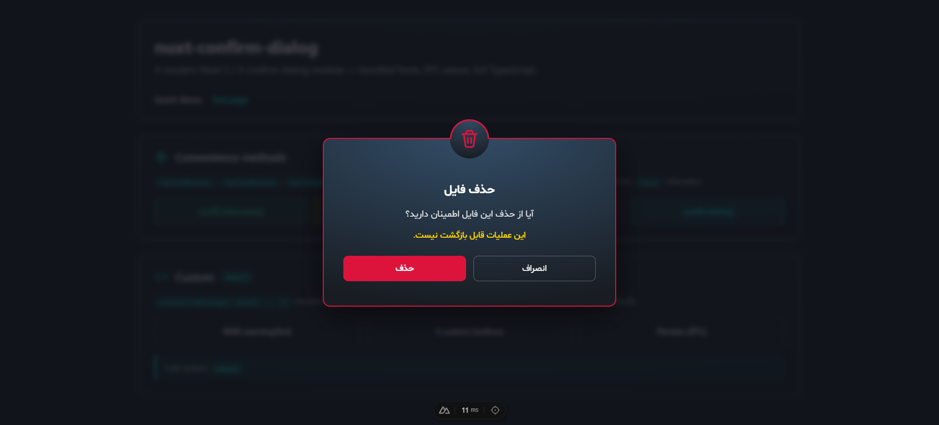
Esccancels, focus is trapped while open and restored on close - 🔤 Modern typography — bundled Shabnam for Persian/Arabic + Inter for Latin (both opt-out)
- 🌐 Auto RTL — dialogs containing Arabic/Persian script switch to
dir="rtl"automatically - ♿ Accessible —
role="alertdialog",aria-modal,aria-labelledby,aria-describedby
Table of contents
- Installation
- Quick start
- Module options
- Composable API —
useConfirmDialog() - Custom buttons
- Component API
- Types
- Theme
- Customization
- TypeScript
- Development
- License
For deeper technical reference (architecture, design rationale, contributing), see docs/.
Installation
npm install nuxt-confirm-dialog
# or
pnpm add nuxt-confirm-dialog
# or
yarn add nuxt-confirm-dialog
// nuxt.config.ts
export default defineNuxtConfig({
modules: ['nuxt-confirm-dialog'],
})That's it — useConfirmDialog() is auto-imported and a <ConfirmDialogContainer> is mounted automatically on the client.
Quick start
<script setup lang="ts">
const dialog = useConfirmDialog()

const onDelete = async () => {
  if (await dialog.confirmDelete('user "alice"')) {
    await api.deleteUser('alice')
  }
}

const onSave = async () => {
  const action = await dialog.show({
    type: 'info',
    title: 'Save changes?',
    message: 'You have unsaved edits.',
    buttons: [
      { text: 'Cancel',     action: 'cancel',  variant: 'outlined', color: 'default' },
      { text: "Don't save", action: 'discard', variant: 'flat',     color: 'default' },
      { text: 'Save',       action: 'save',    variant: 'flat',     color: 'info' },
    ],
  })
  // action: 'cancel' | 'discard' | 'save'
}
</script>

<template>
  <button @click="onDelete">Delete</button>
  <button @click="onSave">Save</button>
</template>
The bundled playground exercises every feature — convenience methods, custom show(), custom buttons, and Persian RTL:
Module options
Configure under the confirmDialog key in nuxt.config.ts:
export default defineNuxtConfig({
  modules: ['nuxt-confirm-dialog'],
  confirmDialog: {
    autoMount: true,
    closeOnBackdropClick: false,
    escapeToCancel: true,
    prefix: 'Confirm',
    loadShabnamFont: true,
    loadInterFont: true,
  },
})
| Option | Type | Default | Description |
| ---------------------- | --------- | ----------- | ----------- |
| autoMount | boolean | true | When true, mounts a <ConfirmDialogContainer> automatically on the client. Set false to mount it yourself. |
| closeOnBackdropClick | boolean | false | If true, clicking the dim backdrop cancels the dialog. Default is persistent (clicks on the backdrop are ignored). |
| escapeToCancel | boolean | true | If true, pressing the Escape key cancels the dialog. |
| prefix | string | 'Confirm' | Component name prefix. Default makes components <ConfirmDialog> and <ConfirmDialogContainer>. |
| theme | 'dark' \| 'light' | 'dark' | Initial visual theme. Switch at runtime with useConfirmDialog().setTheme(...) or override per-container with the theme prop. |
| loadShabnamFont | boolean | true | Inject the bundled Persian "Shabnam" font (5 weights, woff2). unicode-range ensures the file is only downloaded when Arabic/Persian script appears. |
| loadInterFont | boolean | true | Add Inter (Google Fonts) as the modern English UI typeface via a <link> in the head. |
Composable API — useConfirmDialog()
const dialog = useConfirmDialog()show(options)
Display a dialog. Returns Promise<string> resolving with the action name — 'confirm', 'cancel', or any custom action you defined in the buttons array. The promise always resolves — it never rejects.
const action = await dialog.show({
  type: 'warning',
  title: 'Heads up',
  message: 'Continue?',
  warningText: 'This will replace existing data.',
})
if (action === 'confirm') { /* user confirmed */ }
| Option | Type | Required | Default |
| ------------- | ----------------------------------------------- | -------- | ------------- |
| type | 'success' \| 'warning' \| 'error' \| 'info' | no | 'warning' |
| title | string | yes | — |
| message | string | yes | — |
| warningText | string \| null | no | null |
| confirmText | string | no | 'Confirm' |
| cancelText | string | no | 'Cancel' |
| buttons | ConfirmDialogButton[] \| null | no | null |
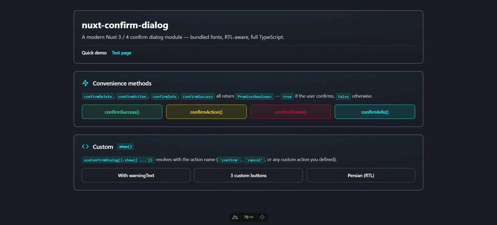
Convenience methods
All return Promise<boolean> — true if the user confirms, false otherwise.
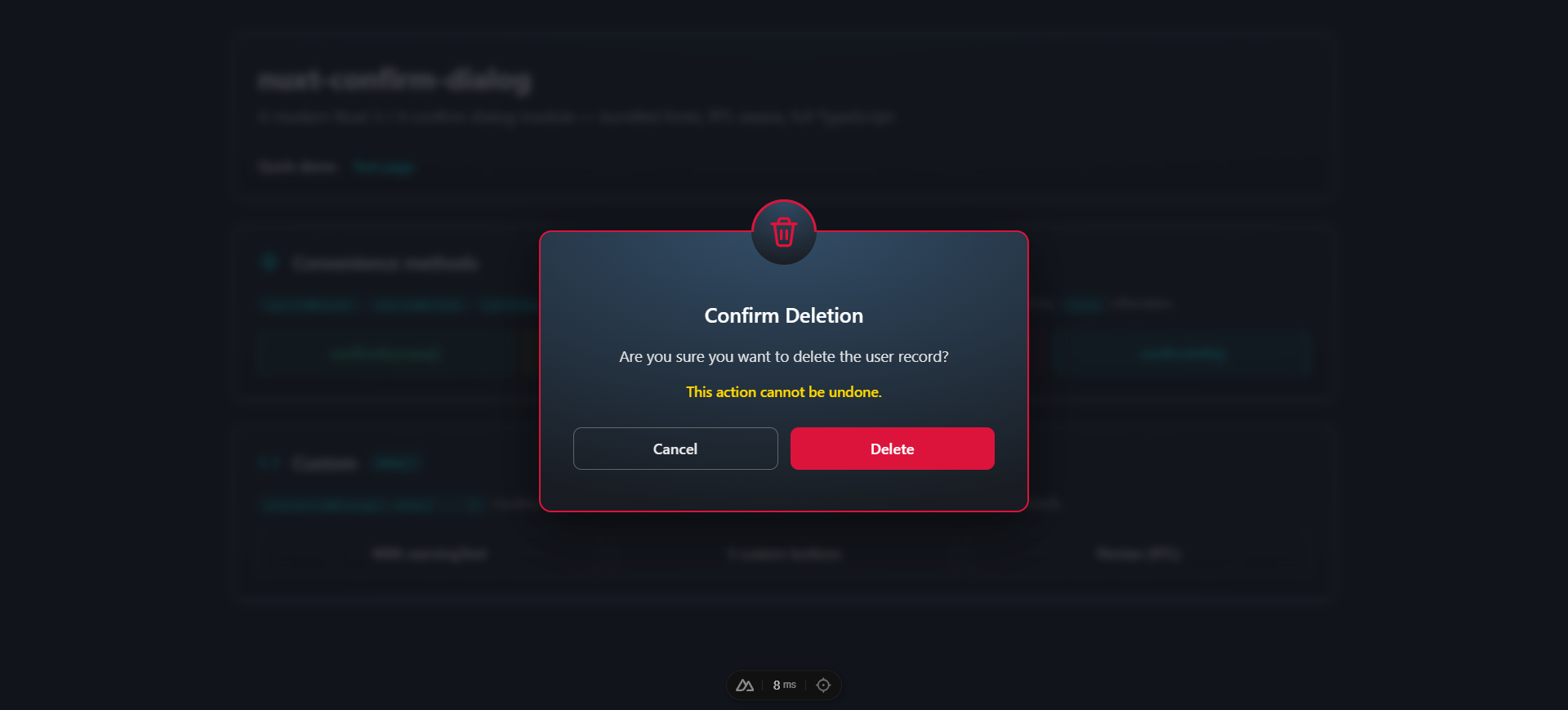
await dialog.confirmDelete(itemName?, customMessage?, customWarning?)  // red theme
await dialog.confirmAction(title, message, confirmText?, cancelText?)  // yellow theme
await dialog.confirmInfo(title, message, confirmText?, cancelText?)    // cyan theme
await dialog.confirmSuccess(title, message, confirmText?, cancelText?) // green theme
currentDialog
Reactive Ref<ConfirmDialogInstance | null> holding the active dialog. Useful for custom containers or status indicators.
<span v-if="dialog.currentDialog.value">Dialog is open</span>Internal action methods
confirm(), cancel(), action(name) — these are called by the container to settle the active promise. You rarely need them directly unless building a custom container.
Custom buttons
Pass a buttons array to override the default Cancel/Confirm pair. Supports 1, 2, or 3 buttons. Each button is { text, action?, variant?, color? }:
await dialog.show({
  type: 'info',
  title: 'Save changes?',
  message: 'You have unsaved edits.',
  buttons: [
    { text: 'Cancel',     action: 'cancel',  variant: 'outlined', color: 'default' },
    { text: "Don't save", action: 'discard', variant: 'flat',     color: 'default' },
    { text: 'Save',       action: 'save',    variant: 'flat',     color: 'info' },
  ],
})
// resolves with 'cancel' | 'discard' | 'save'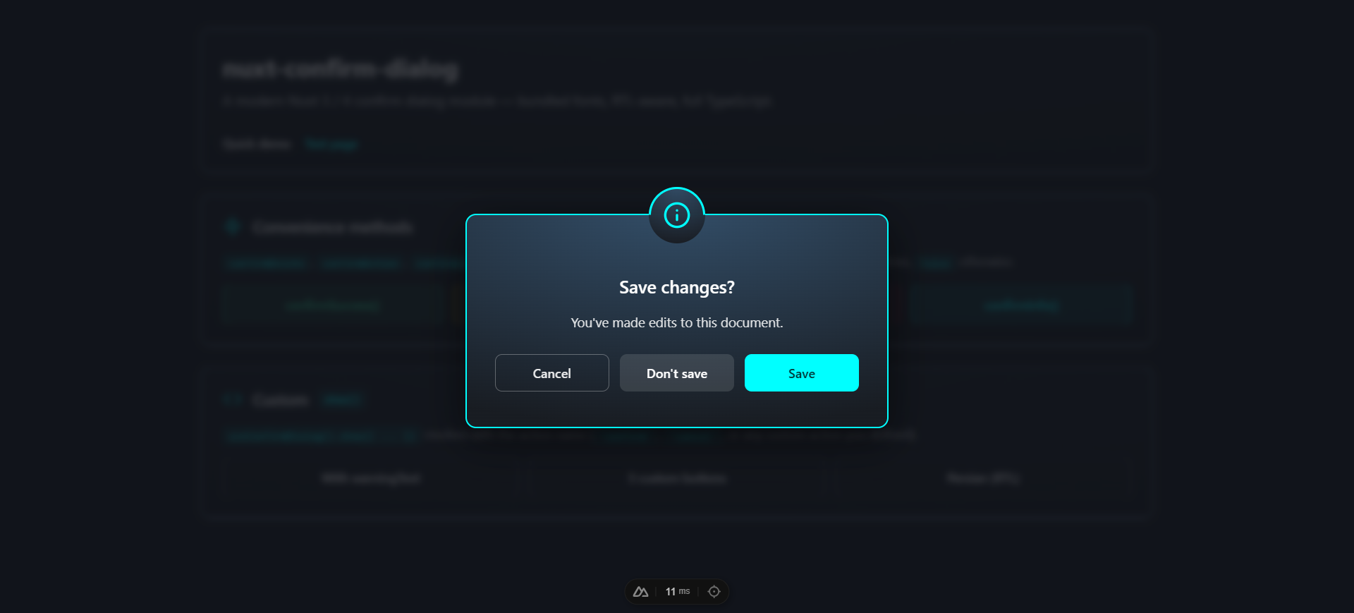
| Field | Type | Default |
| --------- | ------------------------------------------------------------- | -------------------------------------- |
| text | string | required |
| action | string | 'confirm' |
| variant | 'flat' \| 'outlined' | 'outlined' for cancel, else 'flat' |
| color | 'success' \| 'warning' \| 'error' \| 'info' \| 'default' | dialog type for confirm buttons |
Component API
<ConfirmDialogContainer>
The container that renders the active dialog. Auto-mounted by default — only use this directly if autoMount: false.
| Prop | Type | Default | Description |
| ---------------------- | --------- | ------- | ----------- |
| teleport | boolean | true | Render into document.body via <Teleport> so the overlay always covers the viewport. Disable only for special cases. |
| closeOnBackdropClick | boolean | false | Backdrop click cancels the dialog. |
| escapeToCancel | boolean | true | Escape key cancels the dialog. |
<ConfirmDialog>
The single-dialog component. You normally don't render this directly — useConfirmDialog() and <ConfirmDialogContainer> handle it. Exposed for static / non-composable usage.
Props mirror show(options) plus modelValue (boolean) for v-model. Emits: update:modelValue, confirm, cancel, action.
<ConfirmDialog
  v-model="open"
  type="error"
  title="Delete file?"
  message="This is permanent."
  @confirm="handleConfirm"
  @cancel="handleCancel"
/>
Types
| Type | Color (border + icon) | Recommended use |
| ----------- | --------------------- | ---------------------------------------------- |
| success | #30e0a1 (green) | Positive confirmation (publish, complete) |
| warning | #FFD700 (yellow) | Default — caution required |
| error | #DC143C (red) | Destructive actions (delete, reset) |
| info | #00FFFF (cyan) | Informational confirmations |
Each type has a matching inline SVG icon (no icon-font required).
Theme
Ships with a dark theme (default) and a light theme. Switch globally at runtime, or override per-container.
// nuxt.config.ts — initial theme
confirmDialog: { theme: 'light' }
<script setup lang="ts">
const dialog = useConfirmDialog()
console.log(dialog.theme.value) // 'dark' or 'light'
dialog.setTheme('light')
// Optional: follow the user's system preference
const sync = () => dialog.setTheme(
window.matchMedia('(prefers-color-scheme: dark)').matches ? 'dark' : 'light',
)
sync()
window.matchMedia('(prefers-color-scheme: dark)').addEventListener('change', sync)
</script>Per-container override (useful for an always-light dialog inside a dark dashboard):
<ConfirmDialogContainer theme="light" />The theme prop, when set, takes precedence over useConfirmDialog().theme. The four type-color borders (#30e0a1 / #FFD700 / #DC143C / #00FFFF) stay constant in both themes — only the card background, overlay backdrop, message text, and outlined button neutrals swap.
Customization
The auto-mounted container lives at #nuxt-confirm-dialog-root. Override styles globally by targeting that root:
/* assets/css/main.css */
#nuxt-confirm-dialog-root .dialog-card {
  max-width: 560px;
  border-radius: 16px;
}

#nuxt-confirm-dialog-root .dialog-error {
  border-color: #ef4444;
}
Fonts
Two fonts are loaded by default:
- Inter (English / Latin) — Google Fonts via
<link>. Disable withloadInterFont: false. - Shabnam (Persian / Arabic) — bundled woff2 (5 weights), gated by
unicode-range. Disable withloadShabnamFont: false.
The dialog uses the same stack as the nuxt-toast-notification library:
font-family:
  'Inter',
  'Shabnam',
  system-ui,
  -apple-system,
  BlinkMacSystemFont,
  'Segoe UI Variable Text',
  'Segoe UI',
  Roboto,
  'Helvetica Neue',
  Arial,
  sans-serif;
Right-to-left support
When the title, message, or warning text contains Arabic / Persian script, the dialog auto-switches to dir="rtl". The detection is per-instance — you can mix LTR and RTL dialogs in the same app without configuration.
Manual mounting
// nuxt.config.ts
confirmDialog: { autoMount: false }
<!-- app.vue -->
<template>
<NuxtLayout><NuxtPage /></NuxtLayout>
<ConfirmDialogContainer />
</template>The state is global — multiple containers all subscribe to the same active dialog (only one dialog can be active at a time, by design).
TypeScript
The module ships full type definitions:
import type {
  ConfirmDialogType,         // 'success' | 'warning' | 'error' | 'info'
  ConfirmDialogOptions,      // arg shape for show()
  ConfirmDialogButton,       // { text, action?, variant?, color? }
  ConfirmDialogInstance,     // shape of currentDialog.value
} from 'nuxt-confirm-dialog'
ModuleOptions is also exported.
Development
npm install
npm run dev:prepare
npm run dev            # playground at http://localhost:3000

npm run lint
npm run test
npm run prepack        # build dist/
The playground at playground/ exercises every feature — types, button configurations, real-world examples, and Persian / RTL.
CI
GitHub Actions runs lint (Node 22) and tests + build (Node 20 and 22) on every push and PR against main.