
nuxt-toast-notification
v1.1.0
Published
A beautiful, framework-agnostic toast notification module for Nuxt 3 and Nuxt 4 — no Vuetify required.
Downloads
366
Maintainers
 osameh_ir
Readme
nuxt-toast-notification
A beautiful, zero-dependency toast notification module for Nuxt 3 — no Vuetify or icon-font required. Drop it in, call useToast(), and you're done.
- 🎨 Polished look — dark radial gradient, colored borders per type, blurred backdrop
- 🧩 Standalone — no Vuetify, no MDI, no extra CSS framework
- ⚡️ Auto-mounted — no boilerplate, just call
useToast().success(...) - 🧠 Fully typed — written in TypeScript with full IntelliSense
- 🪟 6 positions —
top-left,top-center,top-right,bottom-left,bottom-center,bottom-right - 🔤 Modern typography — bundled Shabnam for Persian/Arabic + Inter for Latin (both opt-out)
- 🎛 Configurable — max visible, default timeout, position, prefix, fonts
- 🌐 Auto RTL — toasts containing Arabic/Persian script switch to
dir="rtl"automatically: close button moves to the left, icon spacing flips, Shabnam renders the text - 🧹 One-click "Hide all" — when 2+ toasts are visible, a button (matching the toast width) appears above the stack to clear them all in one click
Table of contents
- Installation
- Quick start
- Module options
- Composable API —
useToast() - Component API
- Toast types
- Positions
- Theme
- Manual mounting
- Customization
- TypeScript
- Development
- License
For deeper technical reference (architecture, design rationale, contributing), see docs/.
Installation
# npm
npm install nuxt-toast-notification

# pnpm
pnpm add nuxt-toast-notification

# yarn
yarn add nuxt-toast-notification
Then add it to your nuxt.config.ts:
export default defineNuxtConfig({
  modules: ["nuxt-toast-notification"],
});
That's it — useToast() is auto-imported and a <ToastContainer> is mounted automatically on the client.
Quick start
<script setup lang="ts">
const toast = useToast();
const onSave = async () => {
try {
await api.save();
toast.success("Saved", "Your changes have been saved.");
} catch (e) {
toast.error("Save failed", "Could not reach the server. Try again.");
}
};
</script>
<template>
<button @click="onSave">Save</button>
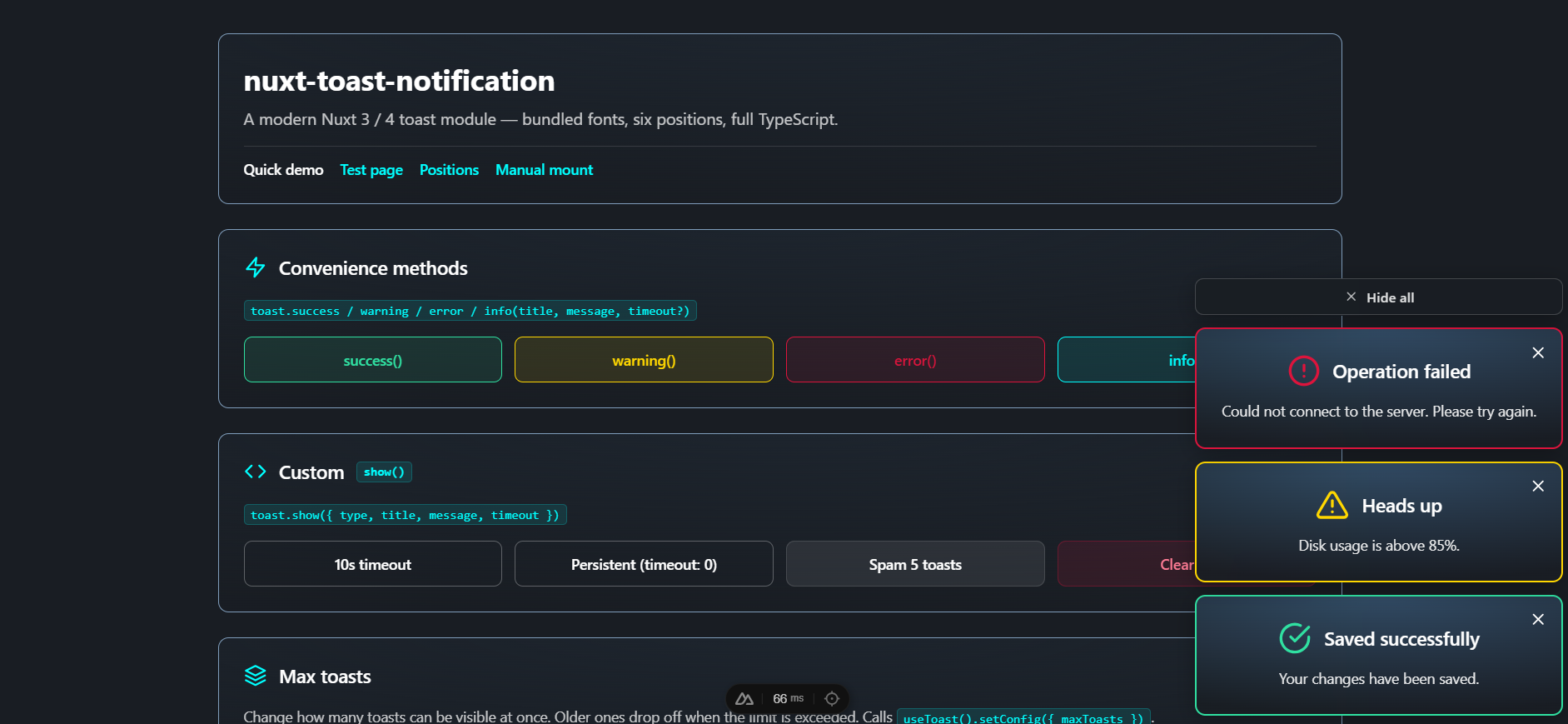
</template>The bundled playground exercises every feature — convenience methods, custom show(), runtime maxToasts control, and live state:
Module options
Configure under the toast key in nuxt.config.ts:
export default defineNuxtConfig({
  modules: ["nuxt-toast-notification"],
  toast: {
    position: "bottom-right",
    maxToasts: 3,
    defaultTimeout: 5000,
    theme: "dark",
    prefix: "Toast",
    autoMount: true,
  },
});
| Option | Type | Default | Description |
| ---------------- | ------------------------------------------------------------------------------------------------- | ---------------- | ------------------------------------------------------------------------------------------------------- |
| position | 'top-left' \| 'top-center' \| 'top-right' \| 'bottom-left' \| 'bottom-center' \| 'bottom-right' | 'bottom-right' | Where the auto-mounted container sits on screen. |
| maxToasts | number | 3 | Maximum number of visible toasts. Older ones drop off the front when exceeded. |
| defaultTimeout | number | 5000 | Default auto-dismiss delay in ms. Use 0 per-call to keep a toast until manually closed. |
| theme | 'dark' \| 'light' | 'dark' | Initial visual theme. Can be changed at runtime via useToast().setTheme(...) or per-container with the theme prop. |
| prefix | string | 'Toast' | Component name prefix. With the default, components are <ToastNotification> and <ToastContainer>. |
| autoMount | boolean | true | When true, mounts a <ToastContainer> automatically on the client. Set false to mount it yourself. |
| loadShabnamFont| boolean | true | Inject the bundled Persian "Shabnam" font (5 weights, woff2). Uses unicode-range so the file is only downloaded for documents that contain Arabic / Persian characters. |
| loadInterFont | boolean | true | Add Inter (Google Fonts) as the modern English UI typeface via a <link> in the head. Set false to self-host fonts or avoid the network request. |
Composable API — useToast()
const toast = useToast();Returns an object with the following members:
show(options)
Display a toast. Returns the toast id (a number) so you can dismiss it later with remove(id).
const id = toast.show({
  type: "info",
  title: "Heads up",
  message: "Build started.",
  timeout: 8000, // optional; falls back to defaultTimeout
});
| Option | Type | Required | Default |
| --------- | ---------------------------------------------------------- | -------- | ----------------------- |
| type | 'success' \| 'healthy' \| 'warning' \| 'error' \| 'info' | no | 'info' |
| title | string | yes | — |
| message | string | yes | — |
| timeout | number (ms; 0 = persistent) | no | module defaultTimeout |
'success'is an alias for'healthy'— both render the same green theme.
Convenience methods
toast.success(title, message, timeout?)  // green
toast.warning(title, message, timeout?)  // yellow
toast.error(title, message, timeout?)    // red
toast.info(title, message, timeout?)     // cyan
Each returns the toast id.
remove(id)
Manually dismiss a single toast by id.
const id = toast.info("Long task", "Working on it...");
// later:
toast.remove(id);
clear()
Dismiss every visible toast.
toast.clear();toasts
A reactive Ref<ToastInstance[]> holding the current visible toasts. Use it for custom UIs or status indicators.
<template>
  <span v-if="toast.toasts.value.length">
    {{ toast.toasts.value.length }} active
  </span>
</template>
config and setConfig(partial)
Reactive read-only view of the current runtime config plus a setter to update it at runtime — useful for in-app preferences or admin panels:
<script setup lang="ts">
const { config, setConfig } = useToast();

// Show current limit anywhere in your UI
// {{ config.maxToasts }} reactively updates

// Let users adjust it
const onChange = (n: number) => setConfig({ maxToasts: n });
</script>
| Field | Type | Description |
| ---------------- | -------- | ---------------------------------------------------------------------------------------------------------------- |
| maxToasts | number | Visible limit. Decreasing this value immediately drops the oldest toasts until the stack fits the new limit. |
| defaultTimeout | number | Auto-dismiss delay (ms) for toast.show(...) calls that don't pass timeout. |
setConfig accepts a Partial<ToastConfig> — pass only the fields you want to change.
Component API
<ToastContainer>
The container that renders the active toast list. Auto-mounted by default — only use this directly if autoMount: false or you want a second container.
| Prop | Type | Default | Description |
| ---------- | ------------------------------------------------------------------------------------------------- | ---------------- | -------------------------------------------------------------------------------------------------------------------------------------------------------------------------------------------------------------------------------------------------------- |
| position | 'top-left' \| 'top-center' \| 'top-right' \| 'bottom-left' \| 'bottom-center' \| 'bottom-right' | 'bottom-right' | Where the container sits on screen. |
| teleport | boolean | true | Render the container into document.body via <Teleport> so position: fixed always references the viewport. Without this, an ancestor with backdrop-filter, transform, filter, or will-change becomes the containing block and the toast offsets break. Set false only if you have a specific reason to keep the container in its original DOM location. |
| showHideAllButton | boolean | true | When true, a "Hide all" button is shown at the top of the stack whenever 2 or more toasts are visible. Click it to clear every toast at once. Set false to disable. |
| hideAllLabel | string | 'Hide all' | Text on the "Hide all" button. Override per-container, or pass a localized label (e.g. 'پاک کردن همه'). |
<ToastContainer position="top-right" /><ToastNotification>
The single-toast component. You normally don't render this directly — useToast() and <ToastContainer> handle it. Exposed for cases where you want to embed a static toast inline.
| Prop | Type | Required | Default |
| ------------ | ---------------------------------------------------------- | -------- | -------- |
| modelValue | boolean | no | false |
| type | 'success' \| 'healthy' \| 'warning' \| 'error' \| 'info' | no | 'info' |
| title | string | yes | — |
| message | string | yes | — |
| timeout | number | no | 5000 |
Emits update:modelValue (so v-model works for show/hide).
<ToastNotification
  v-model="visible"
  type="warning"
  title="Embedded toast"
  message="This one isn't managed by the composable."
/>
Toast types
| Type | Color (border + icon) | Use when… |
| --------------------- | --------------------- | ------------------------------------------- |
| healthy (success) | #30e0a1 (green) | An action succeeded. |
| warning | #FFD700 (yellow) | Something needs attention but isn't broken. |
| error | #DC143C (red) | An action failed or a problem occurred. |
| info | #00FFFF (cyan) | Neutral information, status updates, hints. |
Each type has a matching inline SVG icon (no icon-font required).
Positions
Six positions are supported. You can set the default globally via toast.position in nuxt.config.ts, and override per-container via the position prop on <ToastContainer>:
<ToastContainer position="top-center" />┌────────────────────────────────────────────┐
│ top-left top-center top-right │
│ │
│ │
│ │
│ │
│ bottom-left bottom-center bottom-right │
└────────────────────────────────────────────┘Theme
The library ships with a dark theme (default) and a light theme. Switch globally at runtime, or override per-container.
// Set the initial theme via module options
// nuxt.config.ts
toast: { theme: 'light' }
<script setup lang="ts">
const toast = useToast()
// Read the current theme reactively
console.log(toast.theme.value) // 'dark' or 'light'
// Switch globally — every <ToastContainer> on the page reactively updates
toast.setTheme('light')
// Common pattern: follow the user's system preference
const sync = () => toast.setTheme(
window.matchMedia('(prefers-color-scheme: dark)').matches ? 'dark' : 'light',
)
sync()
window.matchMedia('(prefers-color-scheme: dark)').addEventListener('change', sync)
</script>Per-container override (useful for e.g. an always-light toast inside a dark dashboard):
<ToastContainer theme="light" />The theme prop, when set, takes precedence over useToast().theme.
The four type-color borders (#30e0a1 / #FFD700 / #DC143C / #00FFFF) stay constant in both themes — they're part of the brand identity. Only neutrals (card background, text, close button, Hide-all button) swap.
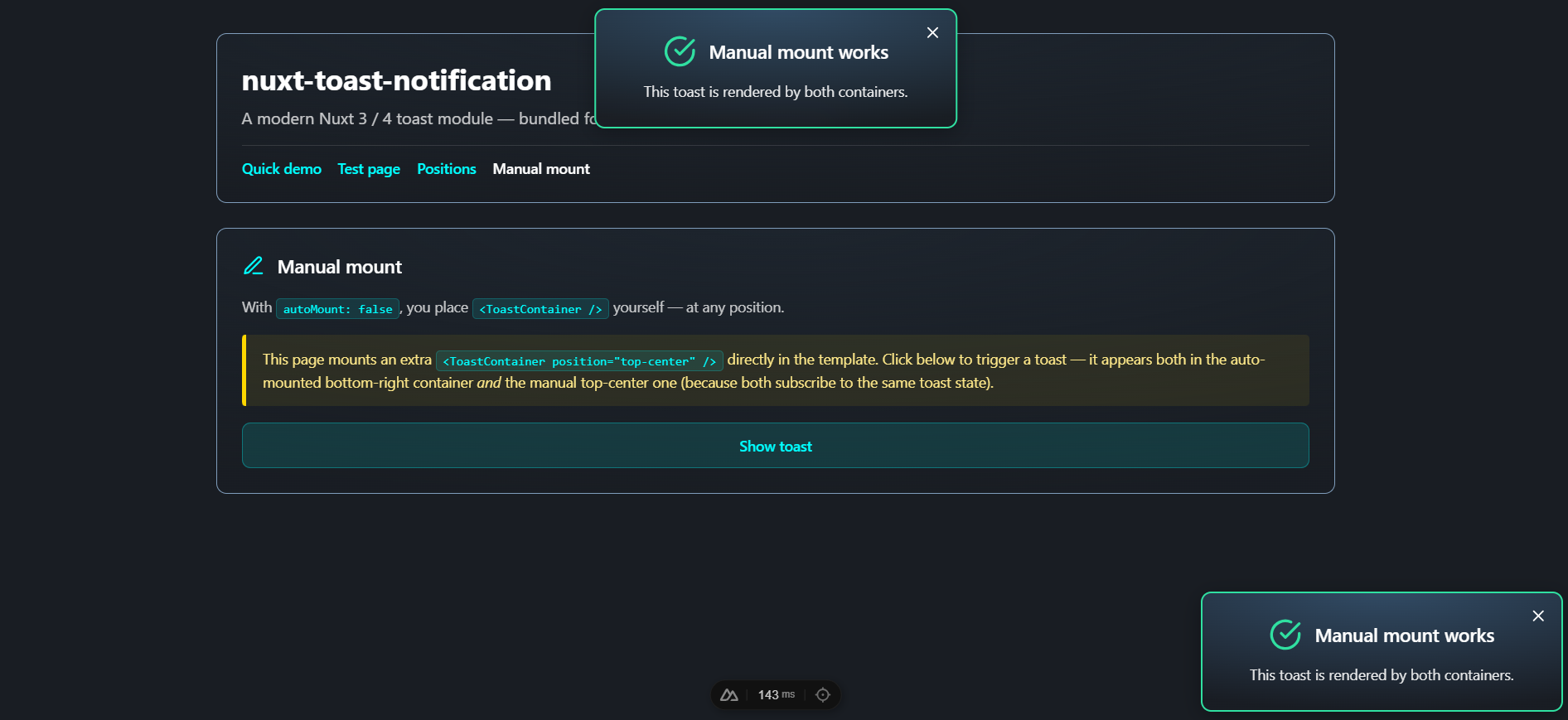
Manual mounting
If you want full control over where the container lives — e.g., inside a specific layout, or with multiple containers in different positions — disable auto-mount:
// nuxt.config.ts
export default defineNuxtConfig({
  modules: ["nuxt-toast-notification"],
  toast: { autoMount: false },
});
Then place a <ToastContainer> yourself, wherever you want it:
<!-- app.vue or layouts/default.vue -->
<template>
  <NuxtLayout>
    <NuxtPage />
  </NuxtLayout>

  <ToastContainer position="bottom-right" />
</template>
You can mount more than one — they'll all subscribe to the same toast state, so a single useToast().info(...) call shows up in every container:
Customization
All styles are in <style scoped> blocks inside the components. Because they use scoped class names like .toast-card, .toast-healthy, etc., you can override them from your global stylesheet using :deep() from a parent component, or by targeting #nuxt-toast-notification-root:
/* override toast width */
#nuxt-toast-notification-root .toast-card {
  min-width: 280px;
  max-width: 380px;
}

/* change the success border color */
#nuxt-toast-notification-root .toast-healthy {
  border-color: #10b981;
}
Fonts
Two fonts are configured by default:
- Inter (English / Latin): loaded from Google Fonts via a
<link rel="stylesheet">. Disable withloadInterFont: false. - Shabnam (Persian / Arabic): bundled inside the package as woff2 (5 weights — Thin/Light/Regular/Medium/Bold) and registered with
unicode-rangeso the browser only downloads the files when the page actually contains Arabic-script characters. Disable withloadShabnamFont: false.
The font stack used by toast text is:
font-family:
  'Inter',           /* Latin, modern */
  'Shabnam',         /* Persian / Arabic */
  system-ui,
  -apple-system,
  BlinkMacSystemFont,
  'Segoe UI Variable Text',
  'Segoe UI',
  Roboto,
  'Helvetica Neue',
  Arial,
  sans-serif;
If you self-host fonts or want a different typeface, disable the loaders and override font-family on .toast-card, .toast-title, and .toast-message from your own stylesheet.
Right-to-left support
When the toast title or message contains Arabic / Persian script, the component sets dir="rtl" on the card automatically — the close button moves to the left, icon spacing flips, and Shabnam renders the text:
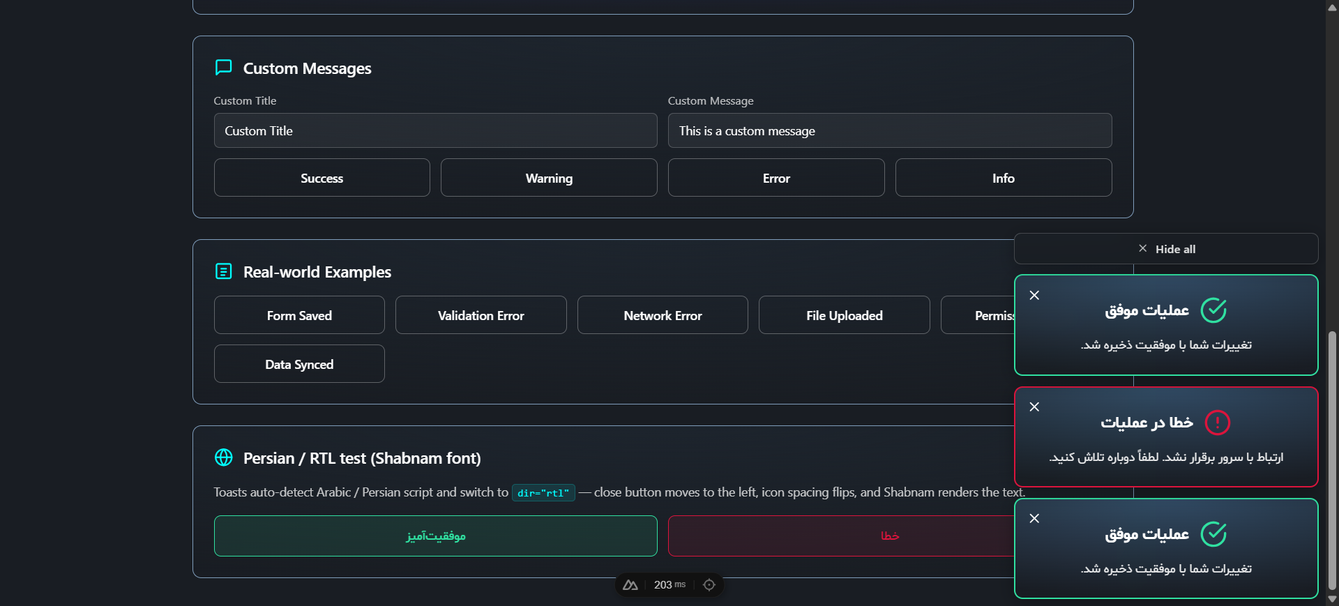
LTR and RTL toasts can coexist in the same stack without configuration:
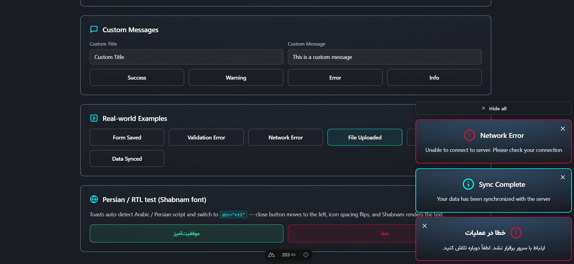
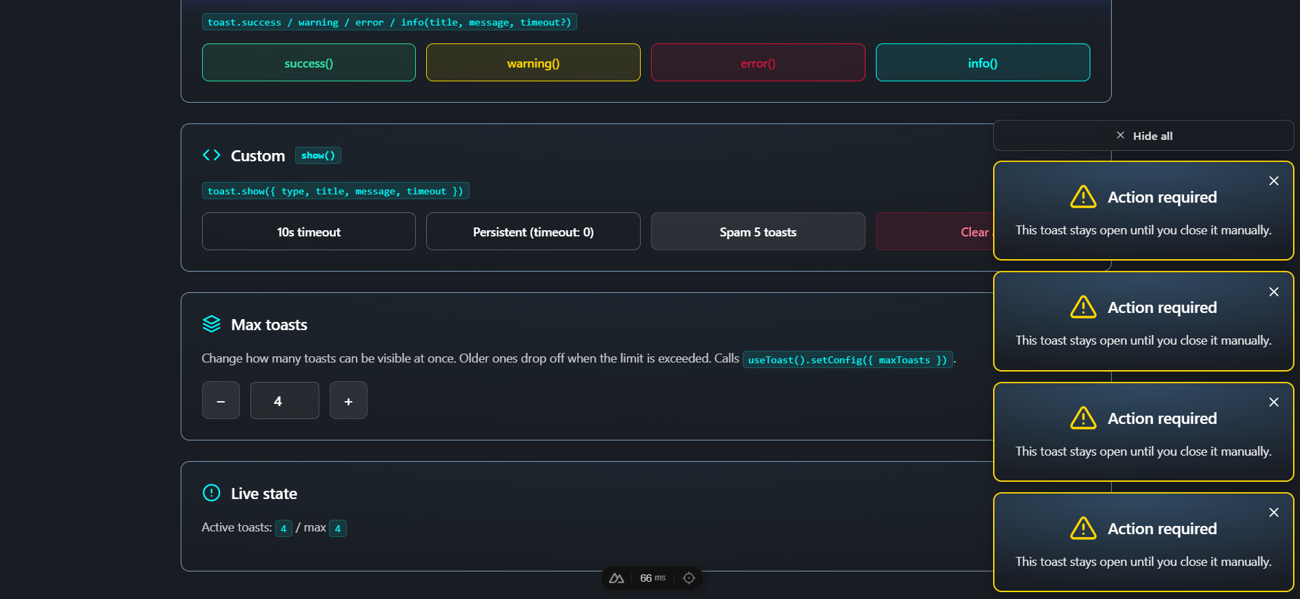
Persistent toasts and Hide all
Toasts created with timeout: 0 stay open until dismissed. When two or more are visible — persistent or not — a "Hide all" button appears above the stack to clear them all at once:
TypeScript
The module ships full type definitions. The exported types you may want to import:
import type {
  ToastType, // 'success' | 'healthy' | 'warning' | 'error' | 'info'
  ToastOptions, // arg shape for show()
  ToastInstance, // shape of a toast in the toasts ref
} from "nuxt-toast-notification";
Module options are also exported as ModuleOptions.
Development
This repo is a Nuxt module with a runnable playground.
# Install dependencies
npm install

# Generate stubs and prepare playground
npm run dev:prepare

# Start the playground at http://localhost:3000
npm run dev

# Lint
npm run lint
npm run lint:fix

# Run tests
npm run test            # one-shot
npm run test:watch      # watch mode
npm run test:coverage   # with coverage report (output: coverage/)

# Build the module for publishing
npm run prepack
The playground at playground/ exercises every type, position, and the manual-mount flow — use it as living documentation.
Testing
Tests use Vitest with happy-dom and @vue/test-utils. Coverage:
test/useToast.test.ts— composable:show/remove/clear, convenience methods,maxToastscap, auto-dismiss timing,_setToastConfig.test/ToastNotification.test.ts— single-toast component: types/colors, close button,v-model, accessibility.test/ToastContainer.test.ts— container: positions, multi-toast rendering, reactivity, close-via-button removes from state.
CI
GitHub Actions (.github/workflows/ci.yml) runs on every push and PR against main across Node 18, 20, and 22:
npm cinpm run dev:preparenpm run lintnpm run testnpm run prepack
.
├── src/
│   ├── module.ts                         # Nuxt module entry
│   └── runtime/
│       ├── assets/
│       │   ├── fonts/Shabnam/            # bundled Persian font (5 weights, woff2)
│       │   └── styles/toast-fonts.css    # @font-face declarations
│       ├── components/
│       │   ├── ToastNotification.vue
│       │   └── ToastContainer.vue
│       ├── composables/
│       │   └── useToast.ts
│       └── plugin.client.ts              # auto-mount client plugin
├── playground/
│   ├── nuxt.config.ts
│   ├── app.vue
│   └── pages/
│       ├── index.vue                     # quick demo
│       ├── test.vue                      # full test page covering every feature
│       ├── positions.vue                 # all positions
│       └── manual.vue                    # autoMount: false example
├── test/
│   ├── useToast.test.ts
│   ├── ToastNotification.test.ts
│   └── ToastContainer.test.ts
├── .github/workflows/ci.yml              # CI pipeline
├── eslint.config.mjs                     # ESLint flat config
├── vitest.config.ts                      # Vitest config
├── package.json
├── tsconfig.json
├── README.md
└── LICENSE