
onscroll-curved-carousel
v1.0.0
Published
Scroll-driven curved carousel for React. Cards ride the rim of a wheel and rotate through the viewport as you scroll. Zero dependencies.

Maintainers
 robinbn
Readme
onscroll-curved-carousel
Scroll-driven curved carousel for React. Cards ride the rim of a wheel below the viewport and rotate through as you scroll, receding with scale, opacity, and blur as they leave the centre.
Zero runtime dependencies. 3.3 KB gzipped. React 18+.
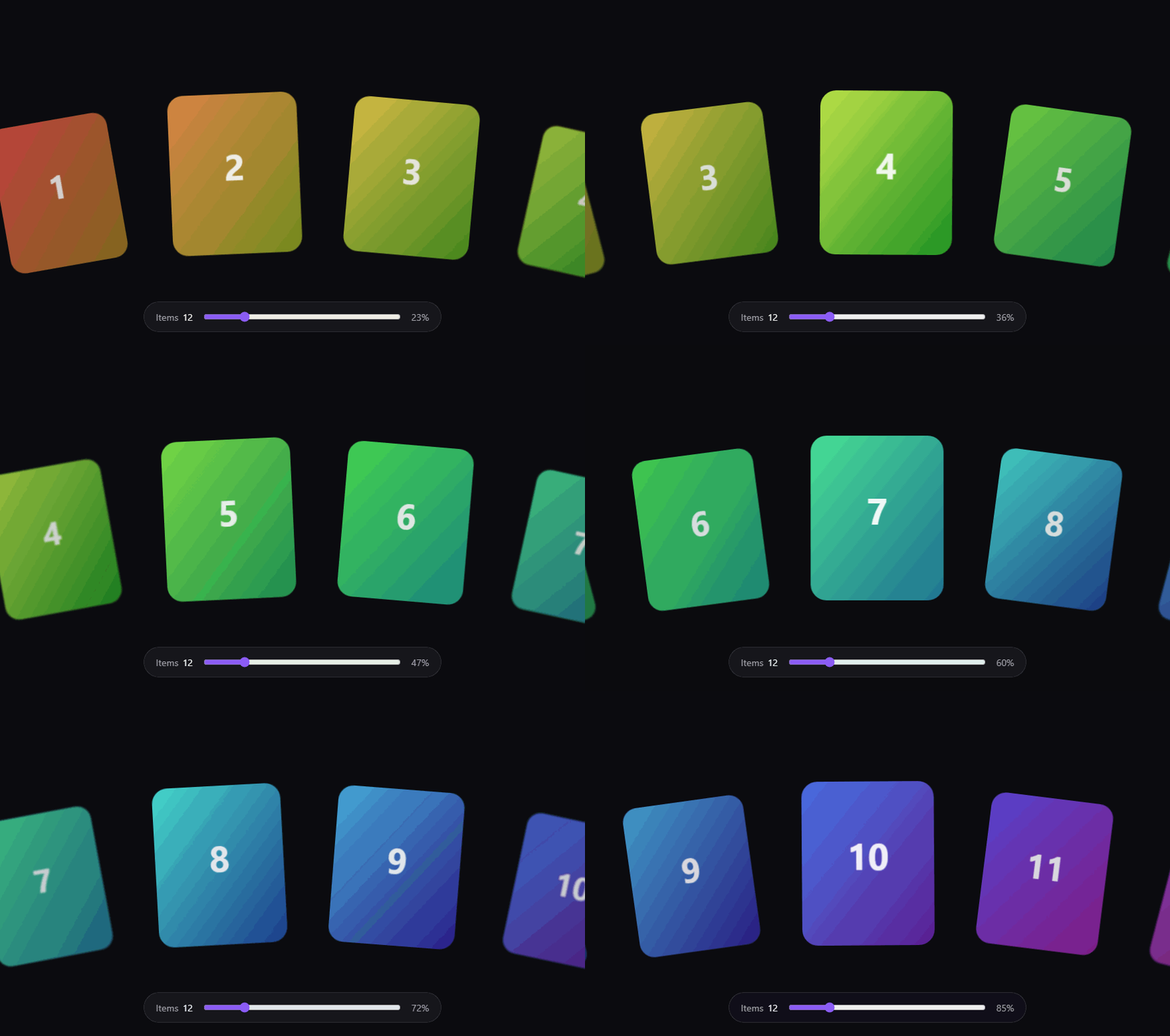
→ Try the live demo
Scroll it, then drag the slider from 3 items to 50 without the code changing.
npm i onscroll-curved-carouselWorks in the Next.js App Router as-is — the bundles ship a "use client" directive, so you can
import it straight into a Server Component without standing up your own client boundary.
import { CurvedCarousel } from 'onscroll-curved-carousel'
import 'onscroll-curved-carousel/styles.css'

<CurvedCarousel items={images} />
That's the whole integration. Three items or fifty, same code.
What goes in items
One item, one card. The array length is N.
// 1. Just URLs
<CurvedCarousel items={['/a.jpg', '/b.jpg', '/c.jpg']} />

// 2. Objects, for alt text and links
<CurvedCarousel items={[
  { src: '/a.jpg', alt: 'Toffee',  href: '/apps/toffee' },
  { src: '/b.jpg', alt: 'Hoichoi', href: '/apps/hoichoi' },
]} />
src is required; alt, href, and title are optional. With href the image is wrapped in a
link.
When a card is more than an image, render it yourself:
<CurvedCarousel
  items={platforms}
  renderItem={(item) => (
    <a href={item.href}>
      <img src={item.src} alt="" />
      <span className="badge">{item.name}</span>
    </a>
  )}
/>
Whatever you return fills the card box, so you always have a known frame to design inside. Images nested deeper than the card's direct content — a logo badge, an icon — are left alone, because sizing those would be guessing at your design.
For full control of the markup, use the hook and pass count instead of items.
Why this one
Every other curved carousel on npm is drag, click, or autoplay driven. This one is linked to scroll position — the section pins, and how far you've scrolled is how far the wheel has turned.
It also does the depth properly. Cards don't just sit on an arc; they scale down, fade, and blur as they rotate away, so the wheel reads as a physical object with a Z axis rather than a fan of flat rectangles.
How it works
Each card's angle is index × pitch + φ. The first two terms never change, so JavaScript
publishes exactly one live value per frame — how far the wheel has turned — and CSS derives
every card from it:
--cw-phi        published by JS, every frame
--cw-progress   published by JS, every frame
Two setProperty calls per frame, whatever N is. React never re-renders while you scroll.
Pinning is position: sticky, which is why there's no scroll library in here.
R          = radiusFactor · viewportWidth        the one free parameter
pitch      = 2 · atan((cardW + gap) / (2R))      angular step between cards
θᵢ         = i · pitch                            card i's rest angle
lead       = leadFactor · halfWindow            where the first card starts
sweep      = (N−1)·pitch + lead + trail           total angular travel
φ(p)       = lead − p · sweep                     how far the wheel has turned
angleᵢ(p)  = θᵢ + φ(p)                            0 is dead centre
halfWindow = asin(viewportW / 2R) + pitch         the visible arc
tᵢ         = min(1, |angleᵢ| / halfWindow)        0 centre, 1 edge → depth
Section height comes from sweep, not from N — keying it to the item count makes three cards
consume a full screen of scrolling for about fourteen degrees of rotation.
lead is a multiple of halfWindow rather than an absolute angle, for the same reason. A fixed
30° lead against a 13° window means the first card starts more than twice the arc off-screen, so
you scroll through roughly 500px of nothing before it begins to fade in — and it means something
different on a phone than on a desktop, because halfWindow scales with viewport and card size.
All angles are unitless numbers of degrees, never <angle>. CSS calc() divides only by a
number, so calc(10deg / 5deg) is invalid — and tᵢ is exactly that division. * 1deg is
applied only where something rotates.
Styling
Override a variable. Never copy a rule.
.my-wheel {
  --cw-radius-factor: 3.2;    /* higher = flatter arc, lower = tighter wheel */
  --cw-scale-falloff: 0.4;    /* how much edge cards shrink */
  --cw-opacity-falloff: 0.55; /* how much they fade */
  --cw-blur-max: 5px;         /* how much they blur; 0 disables */
  --cw-blur-steps: 6;         /* raise for a continuous ramp */
  --cw-gap: 2rem;             /* grid gap in the static fallback */
}
<CurvedCarousel items={images} className="my-wheel" />The transform chain stays ours, so we can change it without breaking your overrides.
Full variable contract
Frozen at v1.0.0. All registered with @property, so they're typed values rather than re-parsed
strings.
| Variable | Type | Written by | Notes |
|---|---|---|---|
| --cw-phi | number | JS, per frame | degrees, unitless. The only live input. |
| --cw-progress | number | JS, per frame | 0..1 through the section |
| --cw-radius | length | JS, on resolve | px |
| --cw-pitch | number | JS, on resolve | degrees, unitless |
| --cw-window | number | JS, on resolve | degrees, unitless |
| --cw-card-w / --cw-card-h | length | JS, on resolve | px |
| --cw-section-height | length | JS, on resolve | px |
| --cw-index | number | render | static, per card |
| --cw-a | number | CSS, derived | this card's angle |
| --cw-depth | number | CSS, derived | 0 centre, 1 edge |
| --cw-radius-factor | number | you | default 2.3 |
| --cw-scale-falloff | number | you | default 0.22 |
| --cw-opacity-falloff | number | you | default 0.3 |
| --cw-blur-max | length | you | default 2px |
| --cw-blur-steps | number | you | default 6 |
| --cw-gap | length | you | default 1.5rem |
One gotcha. Registered custom properties are interpolatable, so a
transition: allon your cards would ease--cw-phiover 300ms and smear every frame. The default stylesheet setstransition-property: noneon.cw-itemfor exactly this reason. If you override it, be specific about which properties transition.
The hook
The component is the hook
<CurvedCarousel> isn't a different implementation. It's about 35 lines that call
useCurvedWheel and then write the JSX for you:
export function CurvedCarousel({ items, renderItem, className, label, ...wheel }) {
  const { getRootProps, getViewportProps, getTrackProps, getItemProps } =
    useCurvedWheel({ ...wheel, count: items.length })

  return (
    <section {...getRootProps()} aria-label={label}>
      <div {...getViewportProps()}>
        <ul {...getTrackProps()}>
          {items.map((item, i) => (
            <li key={i} {...getItemProps(i)}>
              {renderItem ? renderItem(item, i) : <DefaultCard item={item} />}
            </li>
          ))}
        </ul>
      </div>
    </section>
  )
}
The hook renders nothing at all. It measures your DOM, does the trigonometry, and writes two CSS custom properties onto your root element every frame. You supply the HTML; it tells you which class and ref belong on which element.
So using the hook is never a downgrade or a fallback path. It's the same engine with the markup handed back to you.
Why three elements
This looks like ceremony until you see what each one does. No two can be merged.
<section  cw-root>       height: 3020px      THE SCROLL RUNWAY
  <div    cw-viewport>   height: 100svh      THE WINDOW  (position: sticky)
    <ul   cw-track>      0 x 0 at the hub    THE PIVOT   cards rotate around this
      <li cw-item>                           one card
      <li cw-item>

  numbers above: 12 cards on a 1440x900 screen
cw-root has to be tall. Its height is how far you scroll — that 3020px is the scroll
budget, computed from the total angular sweep (88° here, at 24px per degree, plus one screen).
cw-viewport has to be exactly one screen, and sticky. That's the pin. A single element
cannot be 3020px and 900px at the same time, which is the whole reason root and viewport are
separate rather than one div.
cw-track is a zero-size point pushed down to the wheel's hub — 3312px below the middle of
the screen at this size. Every card does rotate(θ) translateY(-radius) outward from there.
Drop cw-viewport and nothing pins — the section just scrolls past. Drop cw-track and every
card rotates around its own centre instead of the hub, so they spin in place rather than ride
an arc.
Which one do I need?
| Your card is... | Use |
|---|---|
| an image, optionally linked | <CurvedCarousel items={...} /> |
| custom markup, standard structure | <CurvedCarousel renderItem={...} /> |
| custom markup and custom structure | useCurvedWheel |
Most "I need custom cards" cases are the middle row, and renderItem handles them without
touching the hook.
You need the hook when the section itself needs something the component has nowhere to put — most often a heading that lives inside the pinned area, above the wheel, and stays while the cards turn:
'use client'
import { useCurvedWheel } from 'onscroll-curved-carousel'
import 'onscroll-curved-carousel/styles.css'

export function Platforms({ platforms }) {
  const { getRootProps, getViewportProps, getTrackProps, getItemProps } =
    useCurvedWheel({ count: platforms.length })

  return (
    <section {...getRootProps()}>
      <div {...getViewportProps()}>

        {/* Yours. Inside the pin, not a card. The component has no slot for this. */}
        <h2 className="platforms-title">
          Life immersed in work, play and everything in between
        </h2>

        <ul {...getTrackProps()}>
          {platforms.map((p, i) => (
            <li key={p.id} {...getItemProps(i)}>
              <a href={p.href}>
                <img src={p.cover} alt="" />
                <span className="badge">
                  <img src={p.logo} alt="" />
                  {p.name}
                </span>
              </a>
            </li>
          ))}
        </ul>

      </div>
    </section>
  )
}
The spreads are unremarkable: {...getRootProps()} expands to ref={...} className="cw-root".
Add your own props alongside them freely.
What each getter returns
| | Returns | Notes |
|---|---|---|
| getRootProps() | { ref, className: 'cw-root' } | the tall section |
| getViewportProps() | { ref, className: 'cw-viewport' } | must be a child of the root |
| getTrackProps() | { ref, className: 'cw-track' } | must be a child of the viewport |
| getItemProps(i) | { className, data-cw-index, style } | style is only --cw-index, and it never changes |
| progressRef | { current: number } | 0..1 through the section |
| geometryRef | { current: Geometry \| null } | resolved pitch, radius, sweep, halfWindow |
Nothing here changes between renders. getItemProps hands back identity and static values —
never a live style. Progress is a ref, not state. That is what makes "React never re-renders
while you scroll" a property of the shape rather than a rule you have to remember, and it is why
the wheel holds 60fps at fifty cards.
Reacting to scroll position
progressRef.current is readable any time, but it won't tell you when it changed. For that use
onProgress, which fires on every frame the wheel moves:
const titleRef = useRef<HTMLHeadingElement>(null)

useCurvedWheel({
  count: platforms.length,
  onProgress: (p) => {
    // Every frame. Write to the DOM directly — calling setState here
    // unthrottled would re-render your whole tree 60 times a second and
    // undo the reason this API is shaped the way it is.
    if (titleRef.current) titleRef.current.style.opacity = String(1 - p * 2)
  },
})
That is how you drive a heading fade, a counter, or a progress bar off the wheel without giving up the no-re-render guarantee. If you genuinely need progress in React state, throttle it — round to whole percents and bail when the value hasn't changed, which is what the demo does.
Options
| Option | Default | What it does |
|---|---|---|
| count | required | number of cards |
| cardWidth / cardHeight | derived from viewport | px |
| gap | cardWidth / 3 | px between card edges along the rim |
| radiusFactor | 2.3 | R = radiusFactor × viewport width. Lower is a tighter arc |
| lead | derived | absolute degrees the first card starts off-centre. Overrides leadFactor |
| leadFactor | 0.6 | lead as a multiple of the visible arc. Above 1.0 means scrolling past an empty screen |
| trail | 0 | degrees past centre the last card settles |
| pxPerDegree | 24 | page scroll per degree of rotation |
| maxSectionHeight | none | hard ceiling in px |
| smoothing | 0.12 | seconds to catch up. 0 locks to the scrollbar |
| onProgress | none | called with 0..1. Never triggers a render |
What happens when it can't run
The default render is a readable grid. Wheel styles live behind a [data-cw-active]
attribute that JS only sets once geometry has resolved.
That one gate covers JavaScript disabled, the server-rendered first paint, a slow hydration, a
thrown effect, and prefers-reduced-motion — all with the same mechanism.
This matters more here than for a typical scroll animation. When positions are the animation, "no animation" doesn't leave you a static carousel; it leaves you an empty 600vh hole. So the grid is the floor, and the wheel is the enhancement.
Troubleshooting
The section scrolls past and nothing moves.
An ancestor is breaking position: sticky. overflow: hidden / auto / scroll on any
ancestor stops it sticking, and transform, filter, perspective, contain, or
will-change: transform move what it sticks to. overflow-x: hidden on body is the usual
culprit — use overflow-x: clip instead.
In development the package walks your ancestors on mount and names the offending element in the console, so you shouldn't have to hunt for it.
It doesn't work with Lenis / Locomotive / a scrollable div.
It should. Progress comes from getBoundingClientRect() measured against the nearest scrolling
ancestor, not from window.scrollY, precisely so smooth-scroll libraries and nested scrollports
work without configuration. If it doesn't, that's a bug worth filing.
Frame drops with a lot of cards. Set --cw-blur-max: 0. Blur is the one term that forces a
repaint rather than riding the compositor.
Browser support
Needs @property (Chrome 85+, Safari 16.4+, Firefox 128+) and CSS round(). Without round()
the blur term falls back to no blur; everything else still works. Falls back to the grid anywhere
the gate never gets set.
Links
License
MIT