
open-loopback
v0.1.6
Published
**Beautiful, embeddable feedback widget for React.**


Readme
open-loopback
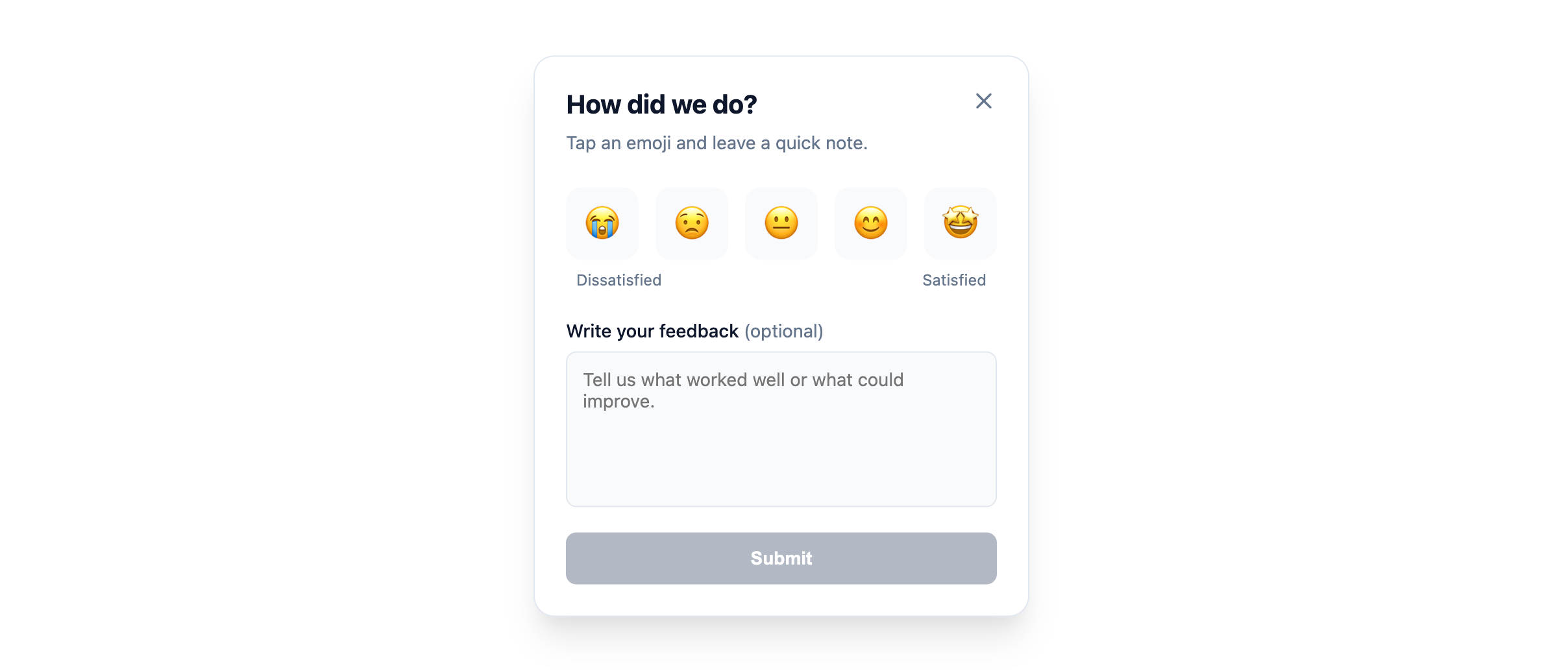
Beautiful, embeddable feedback widget for React.
open-loopback is a polished, themeable feedback component you can drop into any React app.
It supports modal and embedded layouts, emoji/star/number ratings, rich theming (including dark mode), and both controlled and uncontrolled usage.
Installation
npm install open-loopback
# or
yarn add open-loopback
# or
pnpm add open-loopback
Peer dependencies
Make sure your project has:
- react ≥ 16.8.0
- react-dom ≥ 16.8.0
Quick Start
Modal widget (uncontrolled)
import React from "react";
import { Loopback } from "open-loopback";
import "open-loopback/style.css"; // include styles

export function App() {
  return (
    <div>
      <h1>My App</h1>
      <Loopback
        sourceId="my-product"
        variant="modal"
        position="bottom-right"
        defaultOpen={false}
      />
    </div>
  );
}
Embedded widget (inline card)
import React from "react";
import { Loopback } from "open-loopback";
import "open-loopback/style.css";

export function FeedbackSection() {
  return (
    <section style={{ maxWidth: 420, margin: "0 auto", padding: 24 }}>
      <Loopback
        sourceId="docs-section"
        variant="embedded"
        ratingType="emoji"
        content={{
          title: "How helpful was this page?",
          subtitle: "Your feedback helps us improve.",
        }}
      />
    </section>
  );
}
Component Overview
The main export is:
Loopback– the feedback UI componentLoopbackProps– TypeScript props interface (re-exported)
You'll typically import it like:
import { Loopback } from "open-loopback";…and once at app entry:
import "open-loopback/style.css";Props
LoopbackProps
sourceId (
string, required)
Unique identifier for the feedback source (e.g."homepage-hero","pricing-page","docs-search").variant (
"modal" | "embedded")"modal": Floating trigger button + overlay card."embedded": Renders the card inline where you place the component.- Default:
"modal".
position (
"bottom-right" | "bottom-left" | "center")
Position of the modal trigger/overlay.
Default:"bottom-right".ratingType (
"emoji" | "star" | "number")
How the rating scale is displayed.
Default:"emoji".ratingItems (
LoopbackRatingItem[])
Custom rating items if you want your own scale.Each
LoopbackRatingItemis:- value (
number) - label (
ReactNode)
If omitted, the widget uses:
- Emojis 😭 → 🤩 for
"emoji", - 1–5 numeric scale for
"star"/"number".
- value (
isOpen (
boolean)
Control prop for the modal’s open state.
When set, the component becomes controlled – you must handle open/close state yourself and respond toonClose.defaultOpen (
boolean)
Initial open state for uncontrolled modal usage.
Default:false.onClose (
() => void)
Called when the widget should close (close button or after a successful submit).
Use this to toggle your ownisOpenstate when in controlled mode.showTrigger (
boolean)
Show the floating trigger button forvariant="modal"in uncontrolled mode.- Set to
falseif you want to render your own button and controlisOpenmanually. - Default:
true.
- Set to
triggerAriaLabel (
string)
Accessible label for the trigger button.
Default:"Open feedback".theme (
LoopbackTheme)
Theming options (see Theming below).content (
LoopbackContent)
Custom copy and labels, e.g. headings, helper text, button labels.metadata (
Record<string, unknown>)
Optional custom data to send along with the feedback. Automatically merged with default metadata (url,referrer).
| Prop | Type | Default | Description |
| ------------------- | ------------------------- | ------- | ------------------------------------------------------- |
| cardStyle | CSSProperties | - | Optional inline styles for the main widget card. |
| triggerStyle | CSSProperties | - | Optional inline styles for the floating trigger button. |
| submitButtonStyle | CSSProperties | - | Optional inline styles for the submit button. |
| ratingButtonStyle | CSSProperties | - | Optional inline styles for the rating buttons. |
| headerStyle | CSSProperties | - | Optional inline styles for the header container. |
| textareaStyle | CSSProperties | - | Optional inline styles for the textarea. |
| metadata | Record<string, unknown> | - | Custom data payload for submissions. |
Key Features
- Character Limit: Feedback text is capped at 1000 characters. A counter is provided to guide the user.
- Automatic Metadata: By default, the widget captures page context:
url(current window location)referrer(originating page)
- Error Handling: Graceful error states and retry UI for failed submissions.
Theming
We use standard CSS variables for styling. You can override these in your global CSS or via the theme prop.
The library automatically derives hover colors (darkening by 10% for primary, 5% for accent) using color-mix. You can override this behavior by setting --lb-primary-hover or --lb-accent-hover explicitly.
<Loopback
  theme={{
    primaryColor: "#E11D48", // Rose-600
    backgroundColor: "#ffffff",
    textColor: "#0f172a",
    starColor: "#cbd5e1", // Optional: customize inactive star color
    starActiveColor: "#fbbf24", // Optional: customize active star color
  }}
/>
Exported Types
We export several types to help with TypeScript development:
LoopbackPropsLoopbackThemeFeedbackPositionFeedbackRatingTypeLoopbackRatingItemLoopbackContent
LoopbackTheme
- primaryColor? (
string) – Accent color (buttons, active states). - backgroundColor? (
string) – Card background. - textColor? (
string) – Primary text color. - accentColor? (
string) – Subtle accent background. - borderColor? (
string) – Card + input border color. - borderRadius? (
string) – Radius for the card and elements. - fontFamily? (
string) – Custom font stack. - darkMode? (
boolean) – Opt into a dark-friendly style; fills in sensible dark defaults. - zIndex? (
number) – Stack order for modal overlay and trigger.
Example
<Loopback
  sourceId="checkout"
  variant="modal"
  position="center"
  ratingType="star"
  theme={{
    primaryColor: "#f97316",
    backgroundColor: "#020617",
    textColor: "#e5e7eb",
    darkMode: true,
    borderRadius: "16px",
    zIndex: 9999,
  }}
/>
Under the hood, the widget maps these values to CSS variables like:
--lb-primary--lb-bg--lb-text--lb-border--lb-font-family--lb-z-index- etc.
You can further customize styling in your own CSS by targeting:
.lb-root.lb-widget-overlay.lb-widget-trigger.lb-widget-card.lb-textarea.lb-submit-btn- …
Controlled vs Uncontrolled
You can let the widget manage its own open/close state or wire it to your own UI.
Uncontrolled (simplest)
<Loopback
  sourceId="homepage"
  variant="modal"
  defaultOpen={false}
  showTrigger={true}
/>
The widget:
- Draws its own trigger button.
- Handles open/close internally.
Controlled (custom trigger)
import React from "react";
import { Loopback } from "open-loopback";
import "open-loopback/style.css";

export function ControlledExample() {
  const [open, setOpen] = React.useState(false);

  return (
    <>
      <button onClick={() => setOpen(true)}>Give feedback</button>

      <Loopback
        sourceId="pricing"
        variant="modal"
        isOpen={open}
        onClose={() => setOpen(false)}
        showTrigger={false} // hide built-in trigger
      />
    </>
  );
}
License
MIT
You’re free to use, modify, and embed open-loopback in your own projects.